
EDA | Correlation | PCA | Feature Engineering | XGBoost
This project was my first externally assessed piece of data analytics work. I had 4 days to explore a dataset and come up with an end-to-end machine learning model (receive user inputs and make a prediction). The dataset consists of approximately 15000 rows and 20 parameters (from bag color to travel mode to attendance rate) on Secondary 4 (15-16 year old) students. The feedback from the assessors was that overall, it was very well done and they were particularly impressed by the PCA breakdown (although for this instance it did not generate new features).
I spent 1.5 days on this section of the work and another 2.5 days on creating and deploying the machine learning model (this was my first time working on deployment - bash scripts and YAML files were foreign concepts so I decided to allocate more time to the deployment of the model. The entire Jupyter Notebook is available below. To check out the deployed machine learning model, look out for Part 2 of this project!
The problem given is to create a classification model and regression model based on final test results so that schools can intervene and support students in need before their actual O-levels.
Through this EDA, the following should be achieved:
sqlite3 and pandas are used to quickly convert the database file into an easily manipulable dataframe in the notebook.
import sqlite3
import pandas as pd
import os
# EDA may be run on Anaconda Jupyter Notebooks
# There are known issues with the current working directory being different from the actual directory of the notebook
# It is best to specify the file path explicitly to avoid errors
# Note that because the original database stored on a server has been removed I am using a local copy.
path = "C:\\Users\jooer\OneDrive\Desktop\AIAP_ASSESSMENT\data\score.db"
os.chdir(path)
conn = sqlite3.connect(path)
df = pd.read_sql_query("SELECT * FROM 'score'", conn)
import pandas as pd
# Quick scan of the data to confirm all attributes are in place, notice that the dataset is relatively small
os.chdir('C:\\Users\jooer\OneDrive\Desktop\CODE\AIAP_ASSESSMENT_SUBMISSION\AIAP_ASSESSMENT\data')
df = pd.read_csv('score.csv')
| index | number_of_siblings | direct_admission | CCA | learning_style | student_id | gender | tuition | final_test | n_male | n_female | age | hours_per_week | attendance_rate | sleep_time | wake_time | mode_of_transport | bag_color | |
|---|---|---|---|---|---|---|---|---|---|---|---|---|---|---|---|---|---|---|
| 0 | 0 | 0 | Yes | Sports | Visual | ACN2BE | Female | No | 69.0 | 14.0 | 2.0 | 16.0 | 10.0 | 91.0 | 22:00 | 6:00 | private transport | yellow |
| 1 | 1 | 2 | No | Sports | Auditory | FGXIIZ | Female | No | 47.0 | 4.0 | 19.0 | 16.0 | 7.0 | 94.0 | 22:30 | 6:30 | private transport | green |
| 2 | 2 | 0 | Yes | None | Visual | B9AI9F | Male | No | 85.0 | 14.0 | 2.0 | 15.0 | 8.0 | 92.0 | 22:30 | 6:30 | private transport | white |
| 3 | 3 | 1 | No | Clubs | Auditory | FEVM1T | Female | Yes | 64.0 | 2.0 | 20.0 | 15.0 | 18.0 | NaN | 21:00 | 5:00 | public transport | yellow |
| 4 | 4 | 0 | No | Sports | Auditory | AXZN2E | Male | No | 66.0 | 24.0 | 3.0 | 16.0 | 7.0 | 95.0 | 21:30 | 5:30 | public transport | yellow |
| ... | ... | ... | ... | ... | ... | ... | ... | ... | ... | ... | ... | ... | ... | ... | ... | ... | ... | ... |
| 15895 | 15895 | 1 | No | Clubs | Visual | XPECN2 | Female | No | 56.0 | 12.0 | 14.0 | 16.0 | 9.0 | 96.0 | 22:00 | 6:00 | private transport | black |
| 15896 | 15896 | 1 | Yes | None | Auditory | 7AMC7S | Male | Yes | 85.0 | 17.0 | 5.0 | 16.0 | 7.0 | 91.0 | 22:30 | 6:30 | private transport | white |
| 15897 | 15897 | 1 | Yes | Sports | Auditory | XKZ6VN | Female | Yes | 76.0 | 7.0 | 10.0 | 15.0 | 7.0 | 93.0 | 23:00 | 7:00 | walk | red |
| 15898 | 15898 | 1 | No | Clubs | Visual | 2OU4UQ | Male | Yes | 45.0 | 18.0 | 12.0 | 16.0 | 3.0 | 94.0 | 23:00 | 7:00 | walk | yellow |
| 15899 | 15899 | 2 | Yes | None | Visual | D9OKLV | Male | No | 87.0 | 11.0 | 7.0 | 16.0 | 9.0 | 91.0 | 23:00 | 7:00 | walk | yellow |
15900 rows × 18 columns
Different methods are used to determine the characteristics of each feature and their relationships with one another
# Conduct profiling of attributes and overall dataset with pandas_profiling, due to the small dataset, a full report can be generated
from pandas_profiling import ProfileReport
profile_report = ProfileReport(df)
# Quickly get a summary of the data using pandas_profiling, this specific dataset was small enough for us to get a full summary report on the data
# The warnings consolidated (under the 'Warnings' tab) by pandas_profiling are very useful for immediately identifying abnormalities and confirming expectations of the data
# For this case, the dataset report generated in less than 1 minute.
profile_report
student_id has a high cardinality: 15000 distinct values High cardinality High cardinality of student_id is expected as each student should have a different id, however it is noted that there are students who appear in the dataset multiple times since the dataset has 15900 rows, this might mean duplicate entries exist.
n_male is highly correlated with n_female High correlation n_female is highly correlated with n_male High correlation This correlation is expected as the number of male and female students in each class should scale with the class sizes of mixed schools Note: If there are n_male == 0 or n_female == 0 cases, it might be an identifier for single-sex schools and a possible additional feature
hours_per_week is highly correlated with final_test High correlation 'hours_per_week' is a numerical representation of effort to study, the correlation is expected and likely to be positive
wake_time is highly correlated with mode_of_transport and sleep_time High correlation The correlation between 'wake_time' and mode_of_transport' suggests that some mode of transports require students to wake up later, needs further analysis to determine the actual relationship The correlation between 'wake_time' and 'sleep_time' is expected as students who need to wake up earlier are likely to need to sleep earlier Note: mode_of_transport likely requires One-Hot-Encoding, there are distinct categories that are not strictly ordinal (in terms of time taken to get to school none of the modes are strictly faster than the others) i.e. you may walk a short time to get to school although walking is slower that private transportation
number_of_siblings is highly correlated with final_test High correlation This negative correlation is interesting and explainable (family resource distribution, distraction levels) and indicates this is an important feature for predicting scores
n_female is highly correlated with gender High correlation This correlation may just be indicating that the gender of the student indicates that there are students of that gender in the class
direct_admission is highly correlated with final_test High correlation This correlation is interesting and needs further analysis to determine if the direct admission is positively or negatively to final test scores Note: The effect of direct_admission may highly dependent on the CCA the direct_admission is for, it may be useful to classify the CCAs into sports and non-sports categories later on if that has not been done and use this feature in combination with direct_admission
final_test is highly correlated with hours_per_week and 3 other fields High correlation The 4 fields are attendance rate, number of siblings, hours of study per week and direct admission state Direct admission state will require additional analysis to determine its actual relation with test score
final_test has 495 (3.1%) missing values Missing No choice but to let this data go, any form of imputation will corrupt the dataset with a bias towards the imputation method.
attendance_rate has 778 (4.9%) missing values Missing Imputation may be good as 4.9% is quite substantial.
n_male has 360 (2.3%) zeros Zeros n_female has 997 (6.3%) zeros Zeros Confirms that there are students from single-sex schools Note_1: In Singapore, there are quite a few single-sex schools that perform relatively well academically. A positive correlation is expected between the school type (reflected by the n_male and n_female) and the test score. However, interestingly the dataset states that the data is from a single school, indicating that the school has some classes with only one gender and other classes with mixed-gender. This may not really be the case, but regardless, it may be useful to add a single_sex_class binary feature to capture this possibility Note_2: Both n_male and n_female are slightly negatively correlated with the final test score, indicating that perhaps the class size is affecting the final test score (high class size, lower score - regardless of gender). Adding an additional feature that explicitly sums the n_male and n_female to give class size is likely to help the models explicitly capture the relationship between the features
tuition A boolean feature that will need analysis to determine its relationship to the test score but the Phik (φk) correlation heat map has shown a positive correlation between tuition and test scores
bag_color 99.99% a feature to be removed
learning_style A categorical feature (audio/visual) that will need analysis to determine its relationship to the test score and whether it should be removed Note: This classification may not be so useful as there have been studies that show that there is no such differentiation, however, it may have resulted in some different treatment of the students or some behavioral/psychological effect on the students who think they are audio/visual learners https://journals.sagepub.com/doi/full/10.1111/j.1539-6053.2009.01038.x
Student ID cannot possibly affect the score in a useful way, but can bag color really affect test scores?
Let us deal with the possible duplicate entries in student_id first.
# Remove entries that definitely will not be able to help us with prediction
df.dropna(subset=['final_test'], inplace=True)
print(len(df))
# Check out the duplicate entries first and foremost
duplicate_rows = df[df.duplicated(['student_id'],
keep=False)].sort_values(by=['student_id'])
duplicate_rows
15405
| df_index | number_of_siblings | direct_admission | CCA | learning_style | student_id | gender | tuition | final_test | n_male | n_female | age | hours_per_week | attendance_rate | sleep_time | wake_time | mode_of_transport | bag_color | |
|---|---|---|---|---|---|---|---|---|---|---|---|---|---|---|---|---|---|---|
| 5534 | 5534 | 0 | No | Clubs | Auditory | 00811H | Female | Yes | 88.0 | 21.0 | 4.0 | 15.0 | 8.0 | 92.0 | 23:00 | 7:00 | walk | green |
| 12290 | 12290 | 0 | No | Clubs | Auditory | 00811H | Female | Yes | 88.0 | 21.0 | 4.0 | 15.0 | 8.0 | 92.0 | 23:00 | 7:00 | walk | white |
| 13541 | 13541 | 1 | No | Arts | Visual | 0195IO | Female | No | 52.0 | 8.0 | 22.0 | 16.0 | 15.0 | 99.0 | 22:00 | 6:00 | private transport | yellow |
| 12270 | 12270 | 1 | No | Arts | Visual | 0195IO | Female | No | 52.0 | 8.0 | 22.0 | 16.0 | 15.0 | 99.0 | 22:00 | 6:00 | private transport | yellow |
| 4303 | 4303 | 0 | No | Clubs | Auditory | 02RSAH | Female | Yes | 64.0 | 12.0 | 9.0 | 15.0 | 17.0 | 97.0 | 22:00 | 6:00 | private transport | yellow |
| ... | ... | ... | ... | ... | ... | ... | ... | ... | ... | ... | ... | ... | ... | ... | ... | ... | ... | ... |
| 7511 | 7511 | 0 | No | None | Auditory | ZUGVXE | Female | No | 67.0 | 24.0 | 3.0 | 16.0 | 9.0 | 91.0 | 21:30 | 5:30 | public transport | red |
| 9953 | 9953 | 1 | No | Arts | Auditory | ZZICEC | Female | Yes | 54.0 | 11.0 | 13.0 | 15.0 | 12.0 | 93.0 | 22:00 | 6:00 | private transport | blue |
| 4429 | 4429 | 1 | No | Arts | Auditory | ZZICEC | Female | Yes | 54.0 | 11.0 | 13.0 | 15.0 | 12.0 | 93.0 | 22:00 | 6:00 | private transport | green |
| 1241 | 1241 | 0 | No | None | Visual | ZZNA57 | Male | No | 72.0 | 23.0 | 5.0 | 16.0 | 13.0 | 95.0 | 21:30 | 5:30 | public transport | green |
| 15113 | 15113 | 0 | No | None | Visual | ZZNA57 | Male | No | 72.0 | 23.0 | 5.0 | 16.0 | 13.0 | 95.0 | 21:30 | 5:30 | public transport | red |
1692 rows × 18 columns
# Time to remove the duplicate entries. By some weird 'error' the bag color is different for the duplicate student_id cases
# Since it is extremely likely that bag color is going to be removed from the features later on, duplicates will first be removed on everything except bag_color
df.drop_duplicates(subset=[
'number_of_siblings', 'direct_admission', 'CCA', 'learning_style',
'student_id', 'gender', 'attendance_rate', 'tuition', 'final_test',
'n_male', 'n_female', 'age', 'hours_per_week', 'sleep_time', 'wake_time',
'mode_of_transport'
],
inplace=True,
ignore_index=True)
df
| df_index | number_of_siblings | direct_admission | CCA | learning_style | student_id | gender | tuition | final_test | n_male | n_female | age | hours_per_week | attendance_rate | sleep_time | wake_time | mode_of_transport | bag_color | |
|---|---|---|---|---|---|---|---|---|---|---|---|---|---|---|---|---|---|---|
| 0 | 0 | 0 | Yes | Sports | Visual | ACN2BE | Female | No | 69.0 | 14.0 | 2.0 | 16.0 | 10.0 | 91.0 | 22:00 | 6:00 | private transport | yellow |
| 1 | 1 | 2 | No | Sports | Auditory | FGXIIZ | Female | No | 47.0 | 4.0 | 19.0 | 16.0 | 7.0 | 94.0 | 22:30 | 6:30 | private transport | green |
| 2 | 2 | 0 | Yes | None | Visual | B9AI9F | Male | No | 85.0 | 14.0 | 2.0 | 15.0 | 8.0 | 92.0 | 22:30 | 6:30 | private transport | white |
| 3 | 3 | 1 | No | Clubs | Auditory | FEVM1T | Female | Yes | 64.0 | 2.0 | 20.0 | 15.0 | 18.0 | NaN | 21:00 | 5:00 | public transport | yellow |
| 4 | 4 | 0 | No | Sports | Auditory | AXZN2E | Male | No | 66.0 | 24.0 | 3.0 | 16.0 | 7.0 | 95.0 | 21:30 | 5:30 | public transport | yellow |
| ... | ... | ... | ... | ... | ... | ... | ... | ... | ... | ... | ... | ... | ... | ... | ... | ... | ... | ... |
| 14637 | 15895 | 1 | No | Clubs | Visual | XPECN2 | Female | No | 56.0 | 12.0 | 14.0 | 16.0 | 9.0 | 96.0 | 22:00 | 6:00 | private transport | black |
| 14638 | 15896 | 1 | Yes | None | Auditory | 7AMC7S | Male | Yes | 85.0 | 17.0 | 5.0 | 16.0 | 7.0 | 91.0 | 22:30 | 6:30 | private transport | white |
| 14639 | 15897 | 1 | Yes | Sports | Auditory | XKZ6VN | Female | Yes | 76.0 | 7.0 | 10.0 | 15.0 | 7.0 | 93.0 | 23:00 | 7:00 | walk | red |
| 14640 | 15898 | 1 | No | Clubs | Visual | 2OU4UQ | Male | Yes | 45.0 | 18.0 | 12.0 | 16.0 | 3.0 | 94.0 | 23:00 | 7:00 | walk | yellow |
| 14641 | 15899 | 2 | Yes | None | Visual | D9OKLV | Male | No | 87.0 | 11.0 | 7.0 | 16.0 | 9.0 | 91.0 | 23:00 | 7:00 | walk | yellow |
14642 rows × 18 columns
# Additionally there are numerous cases where for a specifid student_id attendance rate is NaN for one entry and not NaN for the other
# There should only be one attendance rate per student so we will remove cases where student_id is the same and attendance rate is NaN
df['attendance_rate'] = df['attendance_rate'].fillna(-1)
duplicate_rows = df[df.duplicated(['student_id'],
keep=False)].sort_values(by=['student_id'])
df.drop(duplicate_rows.loc[df['attendance_rate'] == -1].index, inplace=True)
df
| df_index | number_of_siblings | direct_admission | CCA | learning_style | student_id | gender | tuition | final_test | n_male | n_female | age | hours_per_week | attendance_rate | sleep_time | wake_time | mode_of_transport | bag_color | |
|---|---|---|---|---|---|---|---|---|---|---|---|---|---|---|---|---|---|---|
| 0 | 0 | 0 | Yes | Sports | Visual | ACN2BE | Female | No | 69.0 | 14.0 | 2.0 | 16.0 | 10.0 | 91.0 | 22:00 | 6:00 | private transport | yellow |
| 1 | 1 | 2 | No | Sports | Auditory | FGXIIZ | Female | No | 47.0 | 4.0 | 19.0 | 16.0 | 7.0 | 94.0 | 22:30 | 6:30 | private transport | green |
| 2 | 2 | 0 | Yes | None | Visual | B9AI9F | Male | No | 85.0 | 14.0 | 2.0 | 15.0 | 8.0 | 92.0 | 22:30 | 6:30 | private transport | white |
| 3 | 3 | 1 | No | Clubs | Auditory | FEVM1T | Female | Yes | 64.0 | 2.0 | 20.0 | 15.0 | 18.0 | -1.0 | 21:00 | 5:00 | public transport | yellow |
| 4 | 4 | 0 | No | Sports | Auditory | AXZN2E | Male | No | 66.0 | 24.0 | 3.0 | 16.0 | 7.0 | 95.0 | 21:30 | 5:30 | public transport | yellow |
| ... | ... | ... | ... | ... | ... | ... | ... | ... | ... | ... | ... | ... | ... | ... | ... | ... | ... | ... |
| 14637 | 15895 | 1 | No | Clubs | Visual | XPECN2 | Female | No | 56.0 | 12.0 | 14.0 | 16.0 | 9.0 | 96.0 | 22:00 | 6:00 | private transport | black |
| 14638 | 15896 | 1 | Yes | None | Auditory | 7AMC7S | Male | Yes | 85.0 | 17.0 | 5.0 | 16.0 | 7.0 | 91.0 | 22:30 | 6:30 | private transport | white |
| 14639 | 15897 | 1 | Yes | Sports | Auditory | XKZ6VN | Female | Yes | 76.0 | 7.0 | 10.0 | 15.0 | 7.0 | 93.0 | 23:00 | 7:00 | walk | red |
| 14640 | 15898 | 1 | No | Clubs | Visual | 2OU4UQ | Male | Yes | 45.0 | 18.0 | 12.0 | 16.0 | 3.0 | 94.0 | 23:00 | 7:00 | walk | yellow |
| 14641 | 15899 | 2 | Yes | None | Visual | D9OKLV | Male | No | 87.0 | 11.0 | 7.0 | 16.0 | 9.0 | 91.0 | 23:00 | 7:00 | walk | yellow |
14559 rows × 18 columns
# Additionally there are numerous cases where for a specifid student_id final test score is NaN for one entry and not NaN for the other
# There should only be one final_test score per student so we will remove cases where student_id is the same and final_test score is NaN
df['final_test'] = df['final_test'].fillna(-1)
duplicate_rows = df[df.duplicated(['student_id'],
keep=False)].sort_values(by=['student_id'])
df.drop(duplicate_rows.loc[df['final_test'] == -1].index, inplace=True)
df
| df_index | number_of_siblings | direct_admission | CCA | learning_style | student_id | gender | tuition | final_test | n_male | n_female | age | hours_per_week | attendance_rate | sleep_time | wake_time | mode_of_transport | bag_color | |
|---|---|---|---|---|---|---|---|---|---|---|---|---|---|---|---|---|---|---|
| 0 | 0 | 0 | Yes | Sports | Visual | ACN2BE | Female | No | 69.0 | 14.0 | 2.0 | 16.0 | 10.0 | 91.0 | 22:00 | 6:00 | private transport | yellow |
| 1 | 1 | 2 | No | Sports | Auditory | FGXIIZ | Female | No | 47.0 | 4.0 | 19.0 | 16.0 | 7.0 | 94.0 | 22:30 | 6:30 | private transport | green |
| 2 | 2 | 0 | Yes | None | Visual | B9AI9F | Male | No | 85.0 | 14.0 | 2.0 | 15.0 | 8.0 | 92.0 | 22:30 | 6:30 | private transport | white |
| 3 | 3 | 1 | No | Clubs | Auditory | FEVM1T | Female | Yes | 64.0 | 2.0 | 20.0 | 15.0 | 18.0 | -1.0 | 21:00 | 5:00 | public transport | yellow |
| 4 | 4 | 0 | No | Sports | Auditory | AXZN2E | Male | No | 66.0 | 24.0 | 3.0 | 16.0 | 7.0 | 95.0 | 21:30 | 5:30 | public transport | yellow |
| ... | ... | ... | ... | ... | ... | ... | ... | ... | ... | ... | ... | ... | ... | ... | ... | ... | ... | ... |
| 14637 | 15895 | 1 | No | Clubs | Visual | XPECN2 | Female | No | 56.0 | 12.0 | 14.0 | 16.0 | 9.0 | 96.0 | 22:00 | 6:00 | private transport | black |
| 14638 | 15896 | 1 | Yes | None | Auditory | 7AMC7S | Male | Yes | 85.0 | 17.0 | 5.0 | 16.0 | 7.0 | 91.0 | 22:30 | 6:30 | private transport | white |
| 14639 | 15897 | 1 | Yes | Sports | Auditory | XKZ6VN | Female | Yes | 76.0 | 7.0 | 10.0 | 15.0 | 7.0 | 93.0 | 23:00 | 7:00 | walk | red |
| 14640 | 15898 | 1 | No | Clubs | Visual | 2OU4UQ | Male | Yes | 45.0 | 18.0 | 12.0 | 16.0 | 3.0 | 94.0 | 23:00 | 7:00 | walk | yellow |
| 14641 | 15899 | 2 | Yes | None | Visual | D9OKLV | Male | No | 87.0 | 11.0 | 7.0 | 16.0 | 9.0 | 91.0 | 23:00 | 7:00 | walk | yellow |
14559 rows × 18 columns
df.loc[df['final_test'] == -1]
| df_index | number_of_siblings | direct_admission | CCA | learning_style | student_id | gender | tuition | final_test | n_male | n_female | age | hours_per_week | attendance_rate | sleep_time | wake_time | mode_of_transport | bag_color |
|---|
df.loc[df['attendance_rate'] == -1]
| df_index | number_of_siblings | direct_admission | CCA | learning_style | student_id | gender | tuition | final_test | n_male | n_female | age | hours_per_week | attendance_rate | sleep_time | wake_time | mode_of_transport | bag_color | |
|---|---|---|---|---|---|---|---|---|---|---|---|---|---|---|---|---|---|---|
| 3 | 3 | 1 | No | Clubs | Auditory | FEVM1T | Female | Yes | 64.0 | 2.0 | 20.0 | 15.0 | 18.0 | -1.0 | 21:00 | 5:00 | public transport | yellow |
| 9 | 9 | 2 | No | Arts | Auditory | 3MOMA6 | Male | Yes | 60.0 | 13.0 | 9.0 | 16.0 | 16.0 | -1.0 | 22:30 | 6:30 | private transport | green |
| 56 | 58 | 1 | No | Clubs | Visual | GF3FCX | Male | No | 51.0 | 19.0 | 11.0 | 15.0 | 18.0 | -1.0 | 22:30 | 6:30 | private transport | black |
| 60 | 62 | 0 | Yes | None | Auditory | 68GQ7S | Male | Yes | 85.0 | 12.0 | 9.0 | 16.0 | 8.0 | -1.0 | 23:00 | 7:00 | walk | red |
| 83 | 85 | 0 | No | Arts | Auditory | B6U6DY | Female | Yes | 94.0 | 18.0 | 3.0 | 16.0 | 8.0 | -1.0 | 23:00 | 7:00 | walk | yellow |
| ... | ... | ... | ... | ... | ... | ... | ... | ... | ... | ... | ... | ... | ... | ... | ... | ... | ... | ... |
| 14548 | 15790 | 0 | No | Clubs | Auditory | GJR1LN | Male | No | 61.0 | 21.0 | 1.0 | 15.0 | 20.0 | -1.0 | 22:00 | 6:00 | private transport | green |
| 14582 | 15827 | 0 | Yes | Arts | Visual | F90UM0 | Female | No | 84.0 | 19.0 | 1.0 | 16.0 | 10.0 | -1.0 | 23:00 | 7:00 | walk | green |
| 14587 | 15832 | 2 | No | Arts | Auditory | D5GK79 | Male | Yes | 74.0 | 14.0 | 9.0 | 15.0 | 9.0 | -1.0 | 21:00 | 5:00 | public transport | black |
| 14606 | 15854 | 0 | No | Clubs | Auditory | 05OOPM | Male | Yes | 60.0 | 19.0 | 2.0 | 15.0 | 10.0 | -1.0 | 21:00 | 5:00 | public transport | red |
| 14632 | 15888 | 0 | Yes | Clubs | Auditory | SD8VXP | Female | Yes | 73.0 | 11.0 | 9.0 | 16.0 | 12.0 | -1.0 | 22:30 | 6:30 | private transport | black |
674 rows × 18 columns
# Replace back the -1 values with NaN to prevent later analysis from being affected by the -1
import numpy as np
df['attendance_rate'] = df['attendance_rate'].replace(-1, np.nan)
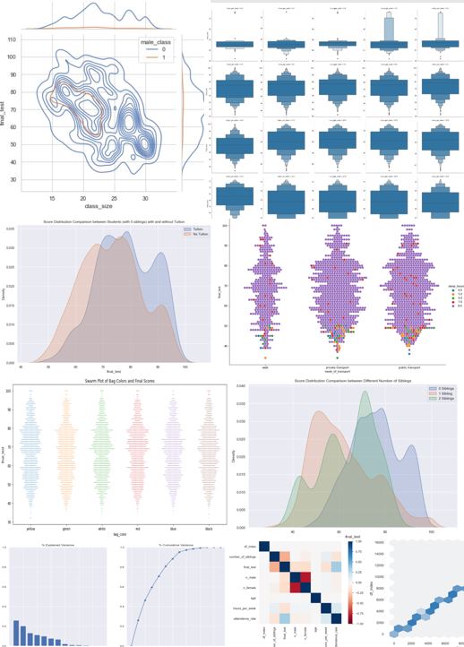
After going through that exercise, there are no more duplicate student_ids. But there are still entries with missing attendance rate and final test scores. Whether it is better to impute this data in a certain way, leave them or remove them entirely is best figured out by validating the model before and after the adjustments.
import seaborn as sns
import matplotlib.pyplot as plt
plt.figure(figsize=(14, 7))
sns.swarmplot(x=df['bag_color'], y=df['final_test'],
s=1).set_title('Swarm Plot of Bag Colors and Final Scores')
Text(0.5, 1.0, 'Swarm Plot of Bag Colors and Final Scores')

Swarm plot visually indicates no difference in score distributions between bag colors (Note: colors not colored to color)
(df.groupby(['bag_color']).agg(
{'final_test': ['mean', 'count', 'median', 'min', 'count', 'std', 'var']}))
| final_test | |||||||
|---|---|---|---|---|---|---|---|
| mean | count | median | min | count | std | var | |
| bag_color | |||||||
| black | 67.356468 | 2435 | 68.0 | 32.0 | 2435 | 13.893606 | 193.032287 |
| blue | 67.087917 | 2400 | 68.0 | 32.0 | 2400 | 13.799711 | 190.432034 |
| green | 66.598844 | 2423 | 67.0 | 32.0 | 2423 | 14.169321 | 200.769644 |
| red | 67.560132 | 2428 | 68.0 | 34.0 | 2428 | 13.886974 | 192.848051 |
| white | 67.144909 | 2367 | 68.0 | 32.0 | 2367 | 13.904202 | 193.326837 |
| yellow | 67.372706 | 2506 | 68.0 | 32.0 | 2506 | 14.184947 | 201.212732 |
Statistics agrees with logic and confirms negligible differences in distributions between bag color and test scores as well. This feature does not give information on test scores and will very likely be removed before model building.
# Noticed earlier that CCA has some labels that differ superficially that should be combined
df["CCA"].replace(
{
"ARTS": "Arts",
"SPORTS": "Sports",
"CLUBS": "Clubs",
"NONE": "None"
},
inplace=True)
set(df["CCA"])
{'Arts', 'Clubs', 'None', 'Sports'}
plt.figure(figsize=(14, 7))
sns.swarmplot(x=df['CCA'], y=df['final_test'],
s=1).set_title('Swarm Plot of CCA and Final Scores')
Text(0.5, 1.0, 'Swarm Plot of CCA and Final Scores')

Visually, it is clear that having no CCA results in higher test scores.
(df.groupby(['CCA']).agg(
{'final_test': ['mean', 'count', 'median', 'min', 'count', 'std', 'var']}))
| final_test | |||||||
|---|---|---|---|---|---|---|---|
| mean | count | median | min | count | std | var | |
| CCA | |||||||
| Arts | 64.097106 | 3594 | 63.0 | 32.0 | 3594 | 13.155275 | 173.061261 |
| Clubs | 63.913407 | 3707 | 63.0 | 32.0 | 3707 | 12.985392 | 168.620400 |
| None | 76.748687 | 3617 | 78.0 | 32.0 | 3617 | 12.223655 | 149.417742 |
| Sports | 64.077177 | 3641 | 64.0 | 32.0 | 3641 | 13.017880 | 169.465196 |
Statistically the difference is huge, the mean score of students with no CCA is at least 10 marks higher than those with any CCA. Note that there seems to be minimal difference in performance based on the CCA that belong to. It looks like it may be possible to convert CCA to a boolean to reduce model complexity.
This sub-section will focus on Direct Admission State and CCA interactions. Note that these two features were isolated due to the domain knowledge that Direct Admission State is closely linked to CCA as most students undergo direct admission through a specific skill which they will develop in their CCA. Alternatively, direct admission students can be students who are participants in academic competitions unrelated to CCAs (e.g. Math/Science Olympiad winners or Language/Humanities top scorers: https://www.moe.gov.sg/secondary/dsa)
plt.figure(figsize=(14, 7))
sns.swarmplot(
x=df['direct_admission'], y=df['final_test'],
s=1).set_title('Swarm Plot of Direct Admission State and Final Scores')
Text(0.5, 1.0, 'Swarm Plot of Direct Admission State and Final Scores')

First observation is that it is clear that there are many more non-direct admission students than direct admission students.
Second observation is that the distinct swarms at different score levels and significantly larger variance of the direct admission students indicates that there might actually be two or more score distributions within the direct admission students.
(df.groupby(['direct_admission']).agg(
{'final_test': ['mean', 'count', 'median', 'min', 'count', 'std', 'var']}))
| final_test | |||||||
|---|---|---|---|---|---|---|---|
| mean | count | median | min | count | std | var | |
| direct_admission | |||||||
| No | 64.983358 | 10275 | 64.0 | 32.0 | 10275 | 13.352428 | 178.287342 |
| Yes | 72.477358 | 4284 | 76.0 | 32.0 | 4284 | 14.023452 | 196.657204 |
The mean scores of the direct admission students are significantly higher (7.3 points) than the other students. The difference between the medians is even larger, at 12 points, indicating that there are a disproportionate number of students in the direct admission pool that have scores at the lower end of the spectrum. The negative skew of the direction admission student score distribution is captured by the fact that the mean is lower than the median.
sns.kdeplot(data=df.loc[df['direct_admission'] == 'Yes']['final_test'],
label="DA",
shade=True)
sns.kdeplot(data=df.loc[df['direct_admission'] == 'No']['final_test'],
label="Non-DA",
shade=True)
plt.title(
"Score Distribution Comparison between Direct Admission and Non-Direct Admission Students"
)
plt.legend()
<matplotlib.legend.Legend at 0x219602b7c10>

The difference between direct admission and non-direct admission students distributions is made clear using the overlain KDE plots. The negative skew and split in distributions is visibly caused by a second peak at around 45-49 points.
sns.kdeplot(data=df.loc[(df['direct_admission'] == 'Yes')
& (df['CCA'] == 'None')]['final_test'],
label="No CCA DA",
shade=True)
sns.kdeplot(data=df.loc[(df['direct_admission'] == 'Yes')
& (df['CCA'] == 'Clubs')]['final_test'],
label="Club DA",
shade=True)
sns.kdeplot(data=df.loc[(df['direct_admission'] == 'Yes')
& (df['CCA'] == 'Sports')]['final_test'],
label="Sports DA",
shade=True)
sns.kdeplot(data=df.loc[(df['direct_admission'] == 'Yes')
& (df['CCA'] == 'Arts')]['final_test'],
label="Arts DA",
shade=True)
plt.title(
"Score Distribution Comparison between Direct Admission Students of Different Clubs"
)
plt.legend()
<matplotlib.legend.Legend at 0x219602b3fa0>

Plotting the distributions of the direct admission students from different CCAs shows that the direct admission students with no CCA have a distinct distribution from the direct admission students with CCAs. When the CCA is One-Hot-Encoded the distinction will be captured. It might also be worthwhile to create an additional label for direct admission students that distinguishes those who were admitted and are in CCAs and those that were not since the distributions between the two groups are so different
sns.kdeplot(data=df.loc[(df['direct_admission'] == 'Yes')
& (df['CCA'] == 'None')]['final_test'],
label="No CCA DA",
shade=True)
sns.kdeplot(data=df.loc[(df['direct_admission'] == 'No')
& (df['CCA'] == 'None')]['final_test'],
label="No CCA Non-DA",
shade=True)
plt.title(
"Score Distribution Comparison between Direct Admission Students and Non-Direct Admission Students with No CCA"
)
plt.legend()
<matplotlib.legend.Legend at 0x2195fec8e80>

To confirm that the direct admission students with no CCA are a different group from non-direct admission students with no CCA, a KDE plot is made to characterize the two groups. The difference between the two distributions are clear and the additional feature to identify the different type of direct admission students will added as a feature.
This sub-section will analyze time related features. A quick note that due to the cyclical nature of time, it should be converted through a cyclical function before model training if the times are going to be compared to one another (e.g. 2300H can be seen as distant from 0000H even though they are 1h apart)
plt.figure(figsize=(14, 7))
sns.swarmplot(x=df['wake_time'], y=df['final_test'],
s=1).set_title('Swarm Plot of Wake Time and Final Scores')
Text(0.5, 1.0, 'Swarm Plot of Wake Time and Final Scores')

Waking time does not seem to be strongly correlated to test scores Interestingly, the number of students and the distribution at each waking time is similar across different waking times.
plt.figure(figsize=(14, 7))
sns.stripplot(x=df['sleep_time'], y=df['final_test'], s=1)
<AxesSubplot:xlabel='sleep_time', ylabel='final_test'>

Sleeping time distributions show that most students sleep between 21:00 and 0:00. Because fewer students sleep at the later times, it is not visibly apparent how the scores are distributed for each sleeping time, although it is clear that the scoring ranges for those that sleep after 1:00 take up the <50 score range.
A parameter that may be a better indicator of test score would be the number of hours slept, which would be (wake_time -sleep_time) after the data type of both parameters are converted from object to time/datetime.
from datetime import datetime, date
df['wake_time1'] = pd.to_datetime(df['wake_time'])
df['sleep_time1'] = pd.to_datetime(df['sleep_time'])
df['wake_time1'] = [
datetime.combine(date.min, d.time()) for d in df['wake_time1']
]
df['sleep_time1'] = [
datetime.combine(date.min, d.time()) for d in df['sleep_time1']
]
# Create the new feature 'sleep_hours'
df['sleep_hours'] = df['wake_time1'] - df['sleep_time1']
df['sleep_hours'] = [d.seconds / 3600 for d in df['sleep_hours']]
# Check that the output is correct
df[['sleep_time', 'wake_time', 'sleep_hours']].sort_values(by=['sleep_hours'])
| sleep_time | wake_time | sleep_hours | |
|---|---|---|---|
| 7884 | 2:30 | 6:30 | 4.0 |
| 10514 | 1:00 | 5:00 | 4.0 |
| 13658 | 1:00 | 5:00 | 4.0 |
| 855 | 3:00 | 7:00 | 4.0 |
| 8792 | 1:30 | 5:30 | 4.0 |
| ... | ... | ... | ... |
| 5069 | 21:30 | 5:30 | 8.0 |
| 5070 | 22:00 | 6:00 | 8.0 |
| 5071 | 21:00 | 5:00 | 8.0 |
| 5059 | 21:30 | 5:30 | 8.0 |
| 14641 | 23:00 | 7:00 | 8.0 |
14559 rows × 3 columns
plt.figure(figsize=(14, 7))
sns.stripplot(x=df['sleep_hours'], y=df['final_test'], s=1)
<AxesSubplot:xlabel='sleep_hours', ylabel='final_test'>

Notice that sleep hours shows a much clearer distinction between distribution of test scores, with the large majority of students that sleep fewer than 7 hours performing strictly within the <55 score range
(df.groupby(['sleep_hours']).agg(
{'final_test': ['mean', 'count', 'median', 'min', 'count', 'std', 'var']}))
| final_test | |||||||
|---|---|---|---|---|---|---|---|
| mean | count | median | min | count | std | var | |
| sleep_hours | |||||||
| 4.0 | 43.830882 | 136 | 44.0 | 32.0 | 136 | 3.541406 | 12.541558 |
| 5.0 | 45.074766 | 214 | 46.0 | 32.0 | 214 | 3.917460 | 15.346496 |
| 6.0 | 45.637615 | 218 | 47.0 | 32.0 | 218 | 3.521083 | 12.398026 |
| 7.0 | 61.583612 | 598 | 60.0 | 32.0 | 598 | 15.686166 | 246.055811 |
| 8.0 | 68.380049 | 13393 | 69.0 | 32.0 | 13393 | 13.306867 | 177.072696 |
The clear difference in score distributions means that sleep hours is a good feature for predicting test scores. Students who sleep 6 hours or less are very likely to score around 43-45 with a standard deviation of around 3.6.
Students who sleep 7 hours and more are likely to score much higher, however the high variance in these sub-groups indicate that there are other factors which affects their score aside from sleep hours.
First batch of features consisting of continuous data will be analyzed in this sub-section
sns.regplot(x="hours_per_week", y="final_test", data=df, order=2)
<AxesSubplot:xlabel='hours_per_week', ylabel='final_test'>

The regression plot with a order 2 polynomial best-fit line shows that there is an optimum number of hours to study per week (around 10h). It also shows that there are students who supposedly do not study much but perform relatively well as compared to students who study the same amount as them. These students may be anomalies.
sns.catplot(
y="final_test",
col="hours_per_week",
data=df,
kind='boxen',
sharey=False,
col_wrap=5,
)
<seaborn.axisgrid.FacetGrid at 0x2195aa0cf40>

Box plots are a good way to identify anomalies visually. By looking for data points that are visibly distant from Q1 and Q3 of the data, anomalies are quickly spotted. As initially suspected, the students who study for less than 3 hours but score above 75 are anomalies. Removing these anomalies may benefit the model training process.
# Identify and quantify the anomalies
anomalies = df.loc[(df['hours_per_week'] <= 4) & (df['final_test'] >= 75)]
anomalies
| df_index | number_of_siblings | direct_admission | CCA | learning_style | student_id | gender | tuition | final_test | n_male | ... | age | hours_per_week | attendance_rate | sleep_time | wake_time | mode_of_transport | bag_color | wake_time1 | sleep_time1 | sleep_hours | |
|---|---|---|---|---|---|---|---|---|---|---|---|---|---|---|---|---|---|---|---|---|---|
| 7 | 7 | 0 | No | Sports | Visual | HTP8CW | Male | No | 76.0 | 20.0 | ... | 15.0 | 3.0 | 97.0 | 21:00 | 5:00 | public transport | green | 0001-01-01 05:00:00 | 0001-01-01 21:00:00 | 8.0 |
| 69 | 71 | 1 | Yes | None | Auditory | 903WGD | Male | No | 76.0 | 11.0 | ... | 16.0 | 3.0 | 93.0 | 22:30 | 6:30 | private transport | black | 0001-01-01 06:30:00 | 0001-01-01 22:30:00 | 8.0 |
| 627 | 638 | 0 | Yes | Clubs | Visual | EJUBLN | Female | No | 75.0 | 12.0 | ... | 16.0 | 2.0 | 93.0 | 21:00 | 5:00 | public transport | blue | 0001-01-01 05:00:00 | 0001-01-01 21:00:00 | 8.0 |
| 669 | 680 | 2 | No | Arts | Auditory | 3SY04Z | Female | Yes | 75.0 | 7.0 | ... | 15.0 | 3.0 | 91.0 | 21:00 | 5:00 | public transport | white | 0001-01-01 05:00:00 | 0001-01-01 21:00:00 | 8.0 |
| 740 | 751 | 1 | Yes | Clubs | Auditory | ZF4NK4 | Female | Yes | 76.0 | 1.0 | ... | 15.0 | 4.0 | 91.0 | 22:00 | 6:00 | private transport | green | 0001-01-01 06:00:00 | 0001-01-01 22:00:00 | 8.0 |
| 1729 | 1782 | 0 | Yes | Clubs | Visual | C3VS2F | Male | No | 75.0 | 18.0 | ... | 15.0 | 4.0 | 91.0 | 23:30 | 6:30 | private transport | blue | 0001-01-01 06:30:00 | 0001-01-01 23:30:00 | 7.0 |
| 1952 | 2015 | 1 | Yes | Sports | Auditory | Z1W8MB | Male | Yes | 76.0 | 16.0 | ... | 16.0 | 3.0 | 96.0 | 21:30 | 5:30 | public transport | red | 0001-01-01 05:30:00 | 0001-01-01 21:30:00 | 8.0 |
| 3047 | 3170 | 1 | Yes | Clubs | Visual | EI2XB2 | Male | No | 76.0 | 15.0 | ... | 15.0 | 2.0 | 96.0 | 22:30 | 6:30 | private transport | red | 0001-01-01 06:30:00 | 0001-01-01 22:30:00 | 8.0 |
| 3761 | 3930 | 1 | Yes | Arts | Visual | 33SCVR | Male | Yes | 76.0 | 15.0 | ... | 15.0 | 3.0 | 95.0 | 22:30 | 6:30 | private transport | black | 0001-01-01 06:30:00 | 0001-01-01 22:30:00 | 8.0 |
| 4770 | 5010 | 0 | No | Clubs | Auditory | 6MCOSY | Male | N | 76.0 | 13.0 | ... | 15.0 | 0.0 | 94.0 | 21:30 | 5:30 | public transport | yellow | 0001-01-01 05:30:00 | 0001-01-01 21:30:00 | 8.0 |
| 5060 | 5324 | 0 | Yes | Sports | Auditory | 9I0TGF | Female | Yes | 76.0 | 12.0 | ... | 16.0 | 4.0 | 100.0 | 21:00 | 5:00 | public transport | green | 0001-01-01 05:00:00 | 0001-01-01 21:00:00 | 8.0 |
| 5825 | 6133 | 1 | Yes | Clubs | Auditory | JE992B | Male | Yes | 75.0 | 16.0 | ... | 16.0 | 3.0 | 99.0 | 21:00 | 5:00 | public transport | yellow | 0001-01-01 05:00:00 | 0001-01-01 21:00:00 | 8.0 |
| 6809 | 7175 | 1 | Yes | Arts | Auditory | RM1DEA | Male | Yes | 75.0 | 16.0 | ... | 15.0 | 0.0 | 100.0 | 21:00 | 5:00 | public transport | white | 0001-01-01 05:00:00 | 0001-01-01 21:00:00 | 8.0 |
| 7712 | 8146 | 0 | Yes | None | Visual | Q5OD55 | Male | No | 76.0 | 13.0 | ... | 16.0 | 4.0 | 98.0 | 22:30 | 6:30 | private transport | yellow | 0001-01-01 06:30:00 | 0001-01-01 22:30:00 | 8.0 |
| 7881 | 8333 | 0 | No | Sports | Auditory | HIWQOZ | Male | Yes | 75.0 | 16.0 | ... | 16.0 | 3.0 | 93.0 | 21:00 | 5:00 | public transport | blue | 0001-01-01 05:00:00 | 0001-01-01 21:00:00 | 8.0 |
| 8826 | 9378 | 0 | No | Sports | Auditory | GTAXJR | Female | Yes | 75.0 | 4.0 | ... | 16.0 | 1.0 | 96.0 | 22:30 | 6:30 | private transport | black | 0001-01-01 06:30:00 | 0001-01-01 22:30:00 | 8.0 |
| 9218 | 9808 | 1 | No | Arts | Visual | WT1ZR0 | Female | Yes | 75.0 | 15.0 | ... | 15.0 | 3.0 | 98.0 | 21:30 | 5:30 | public transport | yellow | 0001-01-01 05:30:00 | 0001-01-01 21:30:00 | 8.0 |
| 9519 | 10147 | 0 | Yes | Sports | Auditory | YWNO15 | Female | Yes | 75.0 | 10.0 | ... | 15.0 | 0.0 | 94.0 | 22:30 | 6:30 | private transport | green | 0001-01-01 06:30:00 | 0001-01-01 22:30:00 | 8.0 |
| 11099 | 11882 | 1 | Yes | Clubs | Auditory | MSK772 | Female | Yes | 75.0 | 17.0 | ... | 16.0 | 2.0 | 93.0 | 23:00 | 7:00 | walk | green | 0001-01-01 07:00:00 | 0001-01-01 23:00:00 | 8.0 |
| 11239 | 12053 | 0 | Yes | Arts | Auditory | 3P7DY7 | Male | No | 75.0 | 18.0 | ... | 15.0 | 4.0 | 92.0 | 21:00 | 5:00 | public transport | blue | 0001-01-01 05:00:00 | 0001-01-01 21:00:00 | 8.0 |
| 12395 | 13335 | 0 | No | None | Auditory | TGE8U5 | Female | No | 76.0 | 4.0 | ... | 15.0 | 4.0 | 91.0 | 21:00 | 5:00 | public transport | blue | 0001-01-01 05:00:00 | 0001-01-01 21:00:00 | 8.0 |
| 13997 | 15151 | 1 | Yes | Sports | Auditory | A3WIF4 | Male | No | 76.0 | 17.0 | ... | 16.0 | 3.0 | 93.0 | 23:00 | 7:00 | walk | red | 0001-01-01 07:00:00 | 0001-01-01 23:00:00 | 8.0 |
| 14176 | 15353 | 0 | Yes | Clubs | Auditory | T14GWN | Female | No | 76.0 | 18.0 | ... | 16.0 | 0.0 | 94.0 | 23:00 | 7:00 | walk | black | 0001-01-01 07:00:00 | 0001-01-01 23:00:00 | 8.0 |
| 14617 | 15870 | 1 | Yes | None | Auditory | 911IV5 | Female | Yes | 75.0 | 15.0 | ... | 16.0 | 4.0 | 96.0 | 22:00 | 6:00 | private transport | red | 0001-01-01 06:00:00 | 0001-01-01 22:00:00 | 8.0 |
24 rows × 21 columns
Only 24 entries in the entire dataset fall in this category, removing them from the dataset will likely help the study hours per week feature predict scores more accurately.
sns.regplot(x="attendance_rate", y="final_test", data=df, order=2)
<AxesSubplot:xlabel='attendance_rate', ylabel='final_test'>

Attendance rate shows a clear positive correlation with the test scores with no anomalous activity.
sns.scatterplot(x=df['age'], y=df['final_test'], hue=df['gender'])
set(df['age'])
{-5.0, -4.0, 5.0, 6.0, 15.0, 16.0}

Some entries for age seem to be erroneous since negative age is not possible, they must be removed before model training. There also seems to be some ages that were mislabeled. Since the data is based on O-Level data, the ages should be 15/16. It will be assumed that 5,6 = 15,16. In reality, it is best to clarify with the data owner if this is the case.
# Quick scan of the negative age entries to determine if the error is related to some other feature.
df.loc[(df['age'] < 0)]
| df_index | number_of_siblings | direct_admission | CCA | learning_style | student_id | gender | tuition | final_test | n_male | ... | age | hours_per_week | attendance_rate | sleep_time | wake_time | mode_of_transport | bag_color | wake_time1 | sleep_time1 | sleep_hours | |
|---|---|---|---|---|---|---|---|---|---|---|---|---|---|---|---|---|---|---|---|---|---|
| 4310 | 4513 | 2 | No | Sports | Auditory | RXTBXJ | Male | No | 48.0 | 15.0 | ... | -4.0 | 2.0 | 94.0 | 21:30 | 5:30 | public transport | red | 0001-01-01 05:30:00 | 0001-01-01 21:30:00 | 8.0 |
| 7518 | 7932 | 1 | No | Sports | Auditory | UAMI3G | Female | No | 52.0 | 3.0 | ... | -5.0 | 13.0 | 92.0 | 21:00 | 5:00 | public transport | yellow | 0001-01-01 05:00:00 | 0001-01-01 21:00:00 | 8.0 |
| 8131 | 8602 | 0 | No | None | Visual | XQMSBU | Female | No | 67.0 | 10.0 | ... | -5.0 | 18.0 | 91.0 | 22:00 | 6:00 | private transport | green | 0001-01-01 06:00:00 | 0001-01-01 22:00:00 | 8.0 |
| 8184 | 8663 | 0 | Yes | Arts | Visual | 39XWY2 | Male | Yes | 85.0 | 17.0 | ... | -5.0 | 5.0 | 94.0 | 23:00 | 7:00 | walk | blue | 0001-01-01 07:00:00 | 0001-01-01 23:00:00 | 8.0 |
| 8349 | 8846 | 2 | No | Sports | Auditory | Z33FOS | Female | Yes | 74.0 | 4.0 | ... | -5.0 | 13.0 | 90.0 | 22:00 | 6:00 | private transport | white | 0001-01-01 06:00:00 | 0001-01-01 22:00:00 | 8.0 |
5 rows × 21 columns
# Fix the age errors
df.drop(df.loc[df.age < 0].index, inplace=True)
df["age"].replace({
5: 15,
6: 16,
}, inplace=True)
(df.groupby(['age']).agg(
{'final_test': ['mean', 'count', 'median', 'min', 'count', 'std', 'var']}))
| final_test | |||||||
|---|---|---|---|---|---|---|---|
| mean | count | median | min | count | std | var | |
| age | |||||||
| 15.0 | 67.145673 | 7256 | 68.0 | 32.0 | 7256 | 13.829976 | 191.268232 |
| 16.0 | 67.232392 | 7298 | 68.0 | 32.0 | 7298 | 14.121586 | 199.419195 |
sns.kdeplot(data=df.loc[(df['age'] == 15)]['final_test'],
label="15 Y/O",
shade=True)
sns.kdeplot(data=df.loc[(df['age'] == 16)]['final_test'],
label="16 Y/O",
shade=True)
plt.title("Age Distribution Comparison between 15 and 16 Y/O Students")
plt.legend()
<matplotlib.legend.Legend at 0x21952d22340>

No significant difference in score distributions between students aged 15-16. This is expected because both age groups are in the same education system and any advantage from being born a few months earlier becomes insignificant over 15+ years. Age data might be noise in this context and should be considered for removal (to be confirmed during model evaluations).
# Noticed that tuition data had different labels that meant the same thing as well
df["tuition"].replace({
'N': 'No',
'Y': 'Yes',
}, inplace=True)
(df.groupby(['tuition']).agg(
{'final_test': ['mean', 'count', 'median', 'min', 'count', 'std', 'var']}))
| final_test | |||||||
|---|---|---|---|---|---|---|---|
| mean | count | median | min | count | std | var | |
| tuition | |||||||
| No | 62.886104 | 6304 | 61.0 | 32.0 | 6304 | 14.208429 | 201.879458 |
| Yes | 70.477212 | 8250 | 71.0 | 32.0 | 8250 | 12.861215 | 165.410864 |
sns.kdeplot(data=df.loc[(df['tuition'] == 'Yes')]['final_test'],
label="Tuition",
shade=True)
sns.kdeplot(data=df.loc[(df['tuition'] == 'No')]['final_test'],
label="No Tuition",
shade=True)
plt.title(
"Score Distribution Comparison between Students with and without Tuition")
plt.legend()
<matplotlib.legend.Legend at 0x21952f0d8b0>

Tuition has a clear positive impact on the score distribution. It may be interesting to look at the relationship between study hours per week and tuition state in case there is a hidden relationship between the two features (e.g. students with tuition actually do not count tuition hours as study hours resulting in students with low study hours but 'Yes' for tuition and score well)
sns.scatterplot(x=df['hours_per_week'], y=df['final_test'], hue=df['tuition'])
<AxesSubplot:xlabel='hours_per_week', ylabel='final_test'>

It seems that a substantial number of the <=4h study time students that score well have tuition, indicating that some of the previously identified anomalies could have counted tuition hours outside of study hours, or counted tuition hours as study hours excluding any other study hours.
print('Percentage of Students with tuition in anomalies: ' + str(100 * round(
len(anomalies.loc[anomalies['tuition'] == 'Yes']) / len(anomalies), 3)) +
'%')
print('Percentage of Students with tuition in dataset: ' +
str(100 * round(len(df.loc[df['tuition'] == 'Yes']) / len(df), 3)) + '%')
Percentage of Students with tuition in anomalies: 54.2% Percentage of Students with tuition in dataset: 56.699999999999996%
The proportion of students in anomalies with tuition is similar to the proportion in the dataset. Seems like the students with low study hours and high scores are confirmed to be anomalies and can be removed.
df.drop(anomalies.index, inplace=True)
sns.scatterplot(x=df['hours_per_week'], y=df['final_test'], hue=df['tuition'])
<AxesSubplot:xlabel='hours_per_week', ylabel='final_test'>

(df.groupby(['gender']).agg(
{'final_test': ['mean', 'count', 'median', 'min', 'count', 'std', 'var']}))
| final_test | |||||||
|---|---|---|---|---|---|---|---|
| mean | count | median | min | count | std | var | |
| gender | |||||||
| Female | 67.020293 | 7244 | 68.0 | 32.0 | 7244 | 14.058025 | 197.628057 |
| Male | 67.329673 | 7286 | 68.0 | 34.0 | 7286 | 13.909237 | 193.466867 |
sns.kdeplot(data=df.loc[(df['gender'] == 'Female')]['final_test'],
label="Female",
shade=True)
sns.kdeplot(data=df.loc[(df['gender'] == 'Male')]['final_test'],
label="Male",
shade=True)
plt.title("Score Distribution Comparison between Male and Female Students")
plt.legend()
<matplotlib.legend.Legend at 0x21952cd8910>

Gender alone does not seem to affect the score distribution significantly. But it is related to the possibility of belonging to a all-boys or all-girls class.
(df.groupby(['learning_style']).agg(
{'final_test': ['mean', 'count', 'median', 'min', 'count', 'std', 'var']}))
| final_test | |||||||
|---|---|---|---|---|---|---|---|
| mean | count | median | min | count | std | var | |
| learning_style | |||||||
| Auditory | 63.902740 | 8359 | 64.0 | 32.0 | 8359 | 13.092973 | 171.425931 |
| Visual | 71.608491 | 6171 | 73.0 | 32.0 | 6171 | 13.931961 | 194.099532 |
sns.kdeplot(data=df.loc[(df['learning_style'] == 'Auditory')]['final_test'],
label="Auditory",
shade=True)
sns.kdeplot(data=df.loc[(df['learning_style'] == 'Visual')]['final_test'],
label="Visual",
shade=True)
plt.title("Score Distribution Comparison between Auditory and Visual Learners")
plt.legend()
<matplotlib.legend.Legend at 0x2195b295160>

Learning style clearly affects the test scores, with visual learners performing significantly better that auditory learning (significantly higher mean by 8 points and higher median by 9 points).
It is not immediately apparent how this categorical feature affects test scores.
The categories are ordinal in the sense that they have comparable speeds, but that alone should have no effect on a student's score.
This suggests that it may not be the mode of transport that affects the score, but the implications of using a certain mode of transport.
For example, having private transportation can imply that the student's family can afford a car and hence possibly other resources.
Relating the mode of transport to wake time could also be an indicator of affluence and access to time efficiency (e.g. early wake time and walking implies possible lack of resources, while late wake time and driving could mean an abundance of resources).
(df.groupby(['mode_of_transport']).agg(
{'final_test': ['mean', 'count', 'median', 'min', 'count', 'std', 'var']}))
| final_test | |||||||
|---|---|---|---|---|---|---|---|
| mean | count | median | min | count | std | var | |
| mode_of_transport | |||||||
| private transport | 67.254307 | 5804 | 68.0 | 32.0 | 5804 | 14.001690 | 196.047328 |
| public transport | 67.104120 | 5801 | 68.0 | 32.0 | 5801 | 13.962703 | 194.957088 |
| walk | 67.160342 | 2925 | 68.0 | 32.0 | 2925 | 13.994989 | 195.859713 |
sns.kdeplot(
data=df.loc[(df['mode_of_transport'] == 'public transport')]['final_test'],
label="Public",
shade=True)
sns.kdeplot(data=df.loc[(
df['mode_of_transport'] == 'private transport')]['final_test'],
label="Private",
shade=True)
sns.kdeplot(data=df.loc[(df['mode_of_transport'] == 'walk')]['final_test'],
label="Walk",
shade=True)
plt.title("Score Distribution Comparison between Auditory and Visual Learners")
plt.legend()
<matplotlib.legend.Legend at 0x2195317f6d0>

Based on the statistics and distributions, there is no significant difference between the performance of students using the different modes of transport.
Let us try to determine if the mode of transport even affects sleep time.
(df.groupby(['mode_of_transport']).agg(
{'sleep_hours': ['mean', 'count', 'median', 'min', 'count', 'std',
'var']}))
| sleep_hours | |||||||
|---|---|---|---|---|---|---|---|
| mean | count | median | min | count | std | var | |
| mode_of_transport | |||||||
| private transport | 7.852688 | 5804 | 8.0 | 4.0 | 5804 | 0.589565 | 0.347587 |
| public transport | 7.835546 | 5801 | 8.0 | 4.0 | 5801 | 0.625756 | 0.391571 |
| walk | 7.859829 | 2925 | 8.0 | 4.0 | 2925 | 0.567752 | 0.322343 |
The mode of transport does not seem to affect the number of hours a person sleeps as well.
sns.kdeplot(data=df.loc[(
df['mode_of_transport'] == 'public transport')]['sleep_hours'],
label="Public",
shade=True)
sns.kdeplot(data=df.loc[(
df['mode_of_transport'] == 'private transport')]['sleep_hours'],
label="Private",
shade=True)
sns.kdeplot(data=df.loc[(df['mode_of_transport'] == 'walk')]['sleep_hours'],
label="Walk",
shade=True)
plt.title("Transport Mode Distribution Comparison Across Different Hours")
plt.legend(loc='upper left')
<matplotlib.legend.Legend at 0x2195fb7b0a0>

Travel mode seems to be no effect on sleep time except for a slightly higher density at the 8h sleep hour mark
(df.groupby(['mode_of_transport']).agg({
'hours_per_week':
['mean', 'count', 'median', 'min', 'count', 'std', 'var']
}))
| hours_per_week | |||||||
|---|---|---|---|---|---|---|---|
| mean | count | median | min | count | std | var | |
| mode_of_transport | |||||||
| private transport | 10.343212 | 5804 | 9.0 | 0.0 | 5804 | 4.458481 | 19.87805 |
| public transport | 10.303396 | 5801 | 9.0 | 0.0 | 5801 | 4.444951 | 19.75759 |
| walk | 10.384274 | 2925 | 9.0 | 0.0 | 2925 | 4.472598 | 20.00413 |
Travel mode also does not seem to affect the time spent studying.
sns.catplot(x="mode_of_transport",
y="final_test",
hue="sleep_hours",
kind="swarm",
data=df.sample(n=2000, random_state=1),
s=8,
height=8.27,
aspect=11.7 / 8.27)
<seaborn.axisgrid.FacetGrid at 0x21952cb09a0>

sns.catplot(x="sleep_hours",
y="final_test",
hue="mode_of_transport",
kind="swarm",
data=df.sample(n=800, random_state=1),
s=6,
height=8.27,
aspect=11.7 / 8.27)
<seaborn.axisgrid.FacetGrid at 0x2195fde6820>

There also does not seem to be any particular relation between sleep hours, test scores and mode of transport (when considered simultaneously.
plt.figure(figsize=(14, 7))
sns.swarmplot(
x=df['wake_time'], y=df['final_test'], hue=df['mode_of_transport'], s=1
).set_title(
'Swarm Plot of Wake Time and Final Scores with Mode of Transport Label')
Text(0.5, 1.0, 'Swarm Plot of Wake Time and Final Scores with Mode of Transport Label')

Mode of transport is strongly correlated to the wake time. Clearly students who walk get to wake up the latest, while those who take public transport need to wake up the earliest.
But as established earlier, the wake time alone and sleep time is not a good indicator of test performance, explaining the apparent absence of effect on scores that the mode of transport feature seems to exhibit.
df['wake_time3'] = pd.to_numeric(
df['wake_time'].str[0]) + pd.to_numeric(df['wake_time'].str[2]) * 5 / 30
(df.groupby(['mode_of_transport']).agg(
{'wake_time3': ['mean', 'count', 'median', 'min', 'count', 'std', 'var']}))
| wake_time3 | |||||||
|---|---|---|---|---|---|---|---|
| mean | count | median | min | count | std | var | |
| mode_of_transport | |||||||
| private transport | 6.248622 | 5804 | 6.0 | 6.0 | 5804 | 0.250018 | 0.062509 |
| public transport | 5.245475 | 5801 | 5.0 | 5.0 | 5801 | 0.249981 | 0.062490 |
| walk | 7.000000 | 2925 | 7.0 | 7.0 | 2925 | 0.000000 | 0.000000 |
Statistically, the difference in wake times is clear, with approximately one hour of wake time increments between those who walk, take private transportation and take public transportation. As discussed earlier, there is no expectation for the wake time to be strongly correlated to the score, hence mode of transport, which is strongly correlated to wake time, also has not strong correlation with test scores.
This is a possible indicator of a hidden boolean feature - single-sex class/non-single-sex class
It is also an indicator of class size, which is also a possible additional feature.
sns.set(rc={'figure.figsize': (11.7, 8.27)})
sns.kdeplot(data=df.loc[(df['n_female'] >= 20)]['final_test'],
label=">=20 Females",
shade=True)
sns.kdeplot(data=df.loc[(df['n_female'] >= 10)
& (df['n_female'] < 20)]['final_test'],
label="10-20 Females",
shade=True)
sns.kdeplot(data=df.loc[(df['n_female'] < 10)]['final_test'],
label="<10 Females",
shade=True)
plt.title(
"Score Distribution Comparison between Different Number of Female Students"
)
plt.legend()
<matplotlib.legend.Legend at 0x2195fbf9850>

As anticipated, there seems to be a negative correlation between number of females in the class and the score distribution.
sns.set(rc={'figure.figsize': (11.7, 8.27)})
sns.kdeplot(data=df.loc[(df['n_male'] >= 20)]['final_test'],
label=">=20 Males",
shade=True)
sns.kdeplot(data=df.loc[(df['n_male'] >= 10)
& (df['n_male'] < 20)]['final_test'],
label="10-20 Males",
shade=True)
sns.kdeplot(data=df.loc[(df['n_male'] < 10)]['final_test'],
label="<10 Males",
shade=True)
plt.title(
"Score Distribution Comparison between Different Number of Male Students")
plt.legend()
<matplotlib.legend.Legend at 0x219531731c0>

Similarly a negative correlation between number of males in the class and the score distribution can be seen.
sns.set_style("whitegrid")
sns.jointplot(x=df['n_female'], y=df['final_test'], kind="kde")
<seaborn.axisgrid.JointGrid at 0x2195fbf9100>

df['n_female_cat'] = None
df.loc[df['n_female'] >= 20, 'n_female_cat'] = 3
df.loc[(df['n_female'] >= 10) & (df['n_female'] < 20), 'n_female_cat'] = 2
df.loc[(df['n_female'] > 0) & (df['n_female'] < 10), 'n_female_cat'] = 1
df.loc[(df['n_female'] == 0), 'n_female_cat'] = 0
sns.set_style("whitegrid")
sns.jointplot(x=df['n_female'],
y=df['final_test'],
kind="kde",
hue=df['n_female_cat'])
D:\ANACONDA\lib\site-packages\seaborn\distributions.py:1078: UserWarning: Dataset has 0 variance; skipping density estimate. warnings.warn(msg, UserWarning) D:\ANACONDA\lib\site-packages\seaborn\distributions.py:306: UserWarning: Dataset has 0 variance; skipping density estimate. warnings.warn(msg, UserWarning)
<seaborn.axisgrid.JointGrid at 0x2195fbfab20>

Using the joint KDE plots, it is clear that the classes with fewer students have a much more favorable score distribution. When splitting the n_female feature into different class sizes, the categories with fewer students (n_female_cat 1) show a more dominant positive skew towards the higher scores as compared to the categories with more students (n_female_cat 2 and 3)
sns.set_style("whitegrid")
sns.jointplot(x=df['n_male'], y=df['final_test'], kind="kde")
<seaborn.axisgrid.JointGrid at 0x2195ab0f9a0>

df['n_male_cat'] = None
df.loc[df['n_male'] >= 20, 'n_male_cat'] = 3
df.loc[(df['n_male'] >= 10) & (df['n_male'] < 20), 'n_male_cat'] = 2
df.loc[(df['n_male'] > 0) & (df['n_male'] < 10), 'n_male_cat'] = 1
df.loc[(df['n_male'] == 0), 'n_male_cat'] = 0
sns.set_style("whitegrid")
sns.jointplot(x=df['n_male'],
y=df['final_test'],
kind="kde",
hue=df['n_male_cat'])
D:\ANACONDA\lib\site-packages\seaborn\distributions.py:1078: UserWarning: Dataset has 0 variance; skipping density estimate. warnings.warn(msg, UserWarning) D:\ANACONDA\lib\site-packages\seaborn\distributions.py:306: UserWarning: Dataset has 0 variance; skipping density estimate. warnings.warn(msg, UserWarning)
<seaborn.axisgrid.JointGrid at 0x21952e66d30>

A similar observation can be made for the male students and their different class sizes. However there are two key differences:
(i) While classes with few females are the majority in the n_female feature, for the n_male feature it is the mid-sized classes that make the bulk of the classes.
(ii) The n_male_cat 2 classes have a slightly more positive skew as compared to the n_male_cat 1 classes, unlike what was seen in the n_female_cat analysis.
This distinction suggests that it is useful to keep the male and female class size features distinct.
df['class_size'] = df['n_male'] + df['n_female']
sns.set_style("whitegrid")
sns.jointplot(x=df['class_size'], y=df['final_test'], kind="kde")
<seaborn.axisgrid.JointGrid at 0x2195cb51850>

There seems to be additional complexity in the class_size distribution with clusters forming at different sections of the grid. This implies there is an additional dimension to the data that is causing clustering of the class size data.
df['male_class'] = 0
df['female_class'] = 0
df.loc[(df['n_female'] == 0), 'male_class'] = 1
df.loc[(df['n_male'] == 0), 'female_class'] = 1
sns.set_style("whitegrid")
sns.jointplot(x=df['class_size'],
y=df['final_test'],
kind="kde",
hue=df['male_class'])
<seaborn.axisgrid.JointGrid at 0x2195a54d550>

sns.jointplot(data=df, x="class_size", y="final_test", hue="male_class")
<seaborn.axisgrid.JointGrid at 0x2195a537b80>

For the male single-sex class the effect of the single-sex class is distinct enough that it shows up on the grid, implying that the male single-sex feature may give additional information about the test performance on top of class size and gender distribution.
sns.set_style("whitegrid")
sns.jointplot(x=df['class_size'],
y=df['final_test'],
kind="kde",
hue=df['female_class'])
D:\ANACONDA\lib\site-packages\seaborn\distributions.py:1182: UserWarning: No contour levels were found within the data range. cset = contour_func(
<seaborn.axisgrid.JointGrid at 0x2195fa62340>

Single-sex female classes do not seem to have a distinct performance.
sns.jointplot(data=df, x="class_size", y="final_test", hue="female_class")
<seaborn.axisgrid.JointGrid at 0x219660dd2b0>

This is confirmed by the joint plot in scatter form, which shows single-sex female classes performing at different levels across the different class sizes. One point to note is that there is a clear positive trend as class sizes get smaller for the single-sex female classes, small classes are in fact a distinct feature of some of the better performing single-sex schools.
Overall, because the number of students from single-sex schools is not substantial and the trends are not clearly apparent.
The effect of the single-sex features will need to be determined during model validation.
Class gender ratio could also be a factor affecting performance, although this is unlikely.
# Note that there are n_male = 0 values which can give a division over 0 error. However, the plot has ignored such values.
df['gender_ratio'] = df['n_female'] / df['n_male']
sns.lmplot(x="gender_ratio", y="final_test", data=df)
D:\ANACONDA\lib\site-packages\numpy\core\function_base.py:151: RuntimeWarning: invalid value encountered in multiply y *= step D:\ANACONDA\lib\site-packages\numpy\lib\nanfunctions.py:1395: RuntimeWarning: All-NaN slice encountered result = np.apply_along_axis(_nanquantile_1d, axis, a, q,
<seaborn.axisgrid.FacetGrid at 0x2195fbf9760>

Based on the plot, the gender_ratio feature is not going to be useful as it changes roughly uniformly with the test scores.
This was previously noted to have a negative correlation with test scores based on the profiling report.
sns.lmplot(x="number_of_siblings", y="final_test", data=df)
<seaborn.axisgrid.FacetGrid at 0x2195cd27f70>

The regression line confirms that there is a negative correlation between test scores and number of siblings.
sns.set(rc={'figure.figsize': (11.7, 8.27)})
sns.kdeplot(data=df.loc[(df['number_of_siblings'] == 0)]['final_test'],
label="0 Siblings",
shade=True)
sns.kdeplot(data=df.loc[(df['number_of_siblings'] == 1)]['final_test'],
label="1 Sibling",
shade=True)
sns.kdeplot(data=df.loc[(df['number_of_siblings'] == 2)]['final_test'],
label="2 Siblings",
shade=True)
plt.title("Score Distribution Comparison between Different Number of Siblings")
plt.legend()
<matplotlib.legend.Legend at 0x219533cf5e0>

The overlain density plots for each sibling category confirms that the distributions are in fact distinct and will be a good feature for predicting test scores. Of interest are the distinct triple peak for the students with 2 siblings and double peak for the students with no siblings. This could be due to a feature that is related to resources (as resource distribution is affected when there are siblings in the family) and is likely to be tuition.
sns.set(rc={'figure.figsize': (11.7, 8.27)})
sns.kdeplot(data=df.loc[(df['number_of_siblings'] == 2)
& (df['tuition'] == 'Yes')]['final_test'],
label="Tuition",
shade=True)
sns.kdeplot(data=df.loc[(df['number_of_siblings'] == 2)
& (df['tuition'] == 'No')]['final_test'],
label="No Tuition",
shade=True)
plt.title(
"Score Distribution Comparison between Students (with 2 siblings) with and without Tuition"
)
plt.legend()
<matplotlib.legend.Legend at 0x2195a39b070>

Tuition does indeed seem to cause a rift in the distributions of test score performance of students with 2 siblings, and the lack of tuition explains the peak at around 43 marks, indicating a limit on the performance of some of these students due to the lack of tuition. However, when comparing these distributions against the original distribution plots comparing students with tuitions against those without tuition, it is peculiar that the highest density for students with 2 siblings and no tuition is at the 73 mark region whereas the peak for students with no tuition in general is at around 50 marks. This could mean that students with 2 siblings are in fact 'overcompensating' for their lack of tuition with additional effort which is most likely captured by the hours studied per week.
(df.groupby(['number_of_siblings']).agg({
'hours_per_week':
['mean', 'count', 'median', 'min', 'count', 'std', 'var']
}))
| hours_per_week | |||||||
|---|---|---|---|---|---|---|---|
| mean | count | median | min | count | std | var | |
| number_of_siblings | |||||||
| 0 | 9.919616 | 5001 | 9.0 | 1.0 | 5001 | 4.068211 | 16.550337 |
| 1 | 10.373859 | 6136 | 10.0 | 0.0 | 6136 | 4.613088 | 21.280581 |
| 2 | 10.879458 | 3393 | 10.0 | 0.0 | 3393 | 4.647532 | 21.599557 |
As confirmed by the statistics above, there are a group of students with 2 siblings that are studying significantly more than their peers, this results in the mean being almost a full hour more than the median.
It is likely that a large portion of this group of students belong to the no tuition group, explaining the unexpected spike at 73 for students with no tuition and 2 siblings.
The takeaway from this is that the tuition state and number of siblings could be an indicator for students lacking in resources, and by using learning-hours to distinguish this group of students that lack resources, the model might be able to better predict that their performance is likely to be above average.
sns.set(rc={'figure.figsize': (11.7, 8.27)})
sns.kdeplot(data=df.loc[(df['number_of_siblings'] == 0)
& (df['tuition'] == 'Yes')]['final_test'],
label="Tuition",
shade=True)
sns.kdeplot(data=df.loc[(df['number_of_siblings'] == 0)
& (df['tuition'] == 'No')]['final_test'],
label="No Tuition",
shade=True)
plt.title(
"Score Distribution Comparison between Students (with 0 siblings) with and without Tuition"
)
plt.legend()
<matplotlib.legend.Legend at 0x21954029400>

By reversing the previous logic, students with no siblings and tuition are likely to be in a privileged position which allows them to perform exceptionally well. The plot above confirms that the theory holds and the fact that the mean number of hours studied by students with 0 siblings is also almost a full hour more than the median indicates that there is a group of 'overachievers' with no siblings that are studying an exceptional number of hours on top of their tuition. A 'privilege_rating' feature seems highly plausible at this point and will be created first and tested with an actual model later to determine if it helps with the score prediction. This feature is ordinal since privilege runs on a spectrum.
# The default privilege rating will be 2, in between 1 (under privileged) and 3 (privileged).
df['privilege_rating'] = 2
df.loc[(df['tuition'] == 'Yes') & (df['number_of_siblings'] == 0),
'privilege_rating'] = 3
df.loc[(df['tuition'] == 'No') & (df['number_of_siblings'] == 2),
'privilege_rating'] = 1
(df.groupby(['privilege_rating']).agg({
'hours_per_week':
['mean', 'count', 'median', 'min', 'count', 'std', 'var']
}))
| hours_per_week | |||||||
|---|---|---|---|---|---|---|---|
| mean | count | median | min | count | std | var | |
| privilege_rating | |||||||
| 1 | 10.689678 | 1521 | 10.0 | 0.0 | 1521 | 4.772559 | 22.777321 |
| 2 | 10.498233 | 10186 | 9.0 | 0.0 | 10186 | 4.527302 | 20.496462 |
| 3 | 9.557917 | 2823 | 8.0 | 1.0 | 2823 | 3.899258 | 15.204210 |
underprivileged = df.loc[(df['privilege_rating'] == 1)]
(underprivileged.groupby(['hours_per_week']).agg(
{'final_test': ['mean', 'count', 'median', 'min', 'count', 'std', 'var']}))
| final_test | |||||||
|---|---|---|---|---|---|---|---|
| mean | count | median | min | count | std | var | |
| hours_per_week | |||||||
| 0.0 | 45.500000 | 6 | 45.0 | 42.0 | 6 | 3.209361 | 10.300000 |
| 1.0 | 42.394737 | 38 | 42.0 | 36.0 | 38 | 3.071574 | 9.434566 |
| 2.0 | 43.333333 | 24 | 44.0 | 36.0 | 24 | 3.509821 | 12.318841 |
| 3.0 | 43.285714 | 21 | 42.0 | 37.0 | 21 | 3.509172 | 12.314286 |
| 4.0 | 43.000000 | 27 | 43.0 | 38.0 | 27 | 3.050851 | 9.307692 |
| 5.0 | 57.461538 | 65 | 55.0 | 37.0 | 65 | 13.921742 | 193.814904 |
| 6.0 | 64.806452 | 124 | 69.0 | 39.0 | 124 | 14.158038 | 200.450039 |
| 7.0 | 64.291339 | 127 | 69.0 | 37.0 | 127 | 14.438765 | 208.477940 |
| 8.0 | 64.085271 | 129 | 68.0 | 36.0 | 129 | 14.070154 | 197.969234 |
| 9.0 | 66.375940 | 133 | 70.0 | 37.0 | 133 | 13.469158 | 181.418205 |
| 10.0 | 64.216495 | 97 | 67.0 | 38.0 | 97 | 14.078816 | 198.213058 |
| 11.0 | 57.783505 | 97 | 57.0 | 38.0 | 97 | 12.373718 | 153.108892 |
| 12.0 | 57.170455 | 88 | 57.5 | 37.0 | 88 | 11.852757 | 140.487853 |
| 13.0 | 58.204819 | 83 | 58.0 | 39.0 | 83 | 12.555981 | 157.652659 |
| 14.0 | 58.606061 | 99 | 59.0 | 36.0 | 99 | 11.480968 | 131.812616 |
| 15.0 | 63.183099 | 71 | 68.0 | 40.0 | 71 | 10.793265 | 116.494567 |
| 16.0 | 64.140625 | 64 | 66.0 | 51.0 | 64 | 7.217411 | 52.091022 |
| 17.0 | 65.446154 | 65 | 69.0 | 51.0 | 65 | 7.086587 | 50.219712 |
| 18.0 | 63.500000 | 64 | 62.0 | 50.0 | 64 | 7.415128 | 54.984127 |
| 19.0 | 63.289855 | 69 | 62.0 | 51.0 | 69 | 7.110683 | 50.561807 |
| 20.0 | 65.566667 | 30 | 69.5 | 51.0 | 30 | 8.447335 | 71.357471 |
privileged = df.loc[(df['privilege_rating'] == 3)]
(privileged.groupby(['hours_per_week']).agg(
{'final_test': ['mean', 'count', 'median', 'min', 'count', 'std', 'var']}))
| final_test | |||||||
|---|---|---|---|---|---|---|---|
| mean | count | median | min | count | std | var | |
| hours_per_week | |||||||
| 1.0 | 49.000000 | 1 | 49.0 | 49.0 | 1 | NaN | NaN |
| 3.0 | 49.000000 | 1 | 49.0 | 49.0 | 1 | NaN | NaN |
| 5.0 | 82.075556 | 225 | 82.0 | 53.0 | 225 | 9.548213 | 91.168373 |
| 6.0 | 81.705382 | 353 | 81.0 | 56.0 | 353 | 8.855430 | 78.418636 |
| 7.0 | 82.119469 | 452 | 83.0 | 49.0 | 452 | 9.152508 | 83.768401 |
| 8.0 | 81.414520 | 427 | 82.0 | 51.0 | 427 | 9.497668 | 90.205704 |
| 9.0 | 82.804071 | 393 | 83.0 | 49.0 | 393 | 8.936555 | 79.862024 |
| 10.0 | 80.513158 | 228 | 80.0 | 56.0 | 228 | 9.354723 | 87.510839 |
| 11.0 | 68.163934 | 61 | 70.0 | 49.0 | 61 | 6.726020 | 45.239344 |
| 12.0 | 68.544444 | 90 | 69.5 | 50.0 | 90 | 5.627303 | 31.666542 |
| 13.0 | 68.116279 | 86 | 69.0 | 53.0 | 86 | 5.292433 | 28.009850 |
| 14.0 | 67.506667 | 75 | 69.0 | 50.0 | 75 | 6.065795 | 36.793874 |
| 15.0 | 68.592593 | 81 | 69.0 | 55.0 | 81 | 5.161826 | 26.644444 |
| 16.0 | 67.105263 | 76 | 68.0 | 52.0 | 76 | 5.658219 | 32.015439 |
| 17.0 | 67.988095 | 84 | 69.0 | 52.0 | 84 | 5.576400 | 31.096242 |
| 18.0 | 68.436782 | 87 | 69.0 | 54.0 | 87 | 5.220044 | 27.248864 |
| 19.0 | 67.121212 | 66 | 69.0 | 53.0 | 66 | 5.887445 | 34.662005 |
| 20.0 | 68.756757 | 37 | 70.0 | 58.0 | 37 | 4.505585 | 20.300300 |
Interestingly, even though the underprivileged and privileged have a group that spends more time studying and pulling up the average study hours of their respective categories, it is not them who contribute to the high scores. Rather, it is the group that studies the statistically optimal 9h per week for the underprivileged and the group that studies 5-10 hours per week in the privileged group that contributes to the high scores (based on the mean and median).
This concludes the focused feature analysis. In the next section, we will encode relevant features and begin making the difficult decisions for feature selection and imputation versus data removal before finally embarking on the model training.
We will use both unsupervised feature selection and supervised feature selection
# Look at data types to quickly get an idea of which entries need to be encoded
df.dtypes
df_index int64 number_of_siblings int64 direct_admission object CCA object learning_style object student_id object gender object tuition object final_test float64 n_male float64 n_female float64 age float64 hours_per_week float64 attendance_rate float64 sleep_time object wake_time object mode_of_transport object bag_color object wake_time1 object sleep_time1 object sleep_hours float64 wake_time3 float64 n_female_cat object n_male_cat object class_size float64 male_class int64 female_class int64 gender_ratio float64 privilege_rating int64 dtype: object
# Drop columns that are redundant or known to be poor performers
df1 = df.drop(columns=[
'bag_color', 'gender_ratio', 'wake_time1', 'sleep_time1', 'wake_time3',
'student_id'
])
# Group the columns that need to be one-hot encoded
# n_male_cat and n_female_cat are ordinal and should not be converted
df1['n_female_cat'] = pd.to_numeric(df1['n_female_cat'])
df1['n_male_cat'] = pd.to_numeric(df1['n_male_cat'])
categorical_cols = [
cname for cname in df1.columns
if df1[cname].nunique() < 5 and df1[cname].dtype == "object"
]
categorical_cols
['direct_admission', 'CCA', 'learning_style', 'gender', 'tuition', 'mode_of_transport']
The columns are confirmed to be categorical and will be one-hot encoded
Note that even though mode of transport seems ordinal (in terms of speed), the earlier analysis has shown that in relation to the test scores, this ordinal relationship does not hold - faster/slower does not mean better/worse, hence it will be treated as a categorical feature.
This leaves us with the wake and sleep times, which are datetime objects.
For this specific instance, since we are dealing with time one day at a time, it is not necessary to think cyclically, we will remap the time onto a continuous linear scale. It is not flawless, but works for the time range the data is most likely to be in.
import math
time_map = dict()
for time in np.arange(0.0, 24.0, 0.5):
if time <= 12:
time_map[str(int(math.modf(time)[1])) + ':' +
str(int(math.modf(time)[0] * 6)) + '0'] = time + 12
else:
time_map[str(int(math.modf(time)[1])) + ':' +
str(int(math.modf(time)[0] * 6)) + '0'] = time - 12
time_map
{'0:00': 12.0,
'0:30': 12.5,
'1:00': 13.0,
'1:30': 13.5,
'2:00': 14.0,
'2:30': 14.5,
'3:00': 15.0,
'3:30': 15.5,
'4:00': 16.0,
'4:30': 16.5,
'5:00': 17.0,
'5:30': 17.5,
'6:00': 18.0,
'6:30': 18.5,
'7:00': 19.0,
'7:30': 19.5,
'8:00': 20.0,
'8:30': 20.5,
'9:00': 21.0,
'9:30': 21.5,
'10:00': 22.0,
'10:30': 22.5,
'11:00': 23.0,
'11:30': 23.5,
'12:00': 24.0,
'12:30': 0.5,
'13:00': 1.0,
'13:30': 1.5,
'14:00': 2.0,
'14:30': 2.5,
'15:00': 3.0,
'15:30': 3.5,
'16:00': 4.0,
'16:30': 4.5,
'17:00': 5.0,
'17:30': 5.5,
'18:00': 6.0,
'18:30': 6.5,
'19:00': 7.0,
'19:30': 7.5,
'20:00': 8.0,
'20:30': 8.5,
'21:00': 9.0,
'21:30': 9.5,
'22:00': 10.0,
'22:30': 10.5,
'23:00': 11.0,
'23:30': 11.5}
df1['wake_time'].to_string()
df1['sleep_time'].to_string()
df1['wake_time'].replace(time_map, inplace=True)
df1['sleep_time'].replace(time_map, inplace=True)
set(df1['wake_time'])
{17.0, 17.5, 18.0, 18.5, 19.0}
set(df1['sleep_time'])
{9.0, 9.5, 10.0, 10.5, 11.0, 11.5, 12.0, 12.5, 13.0, 13.5, 14.0, 14.5, 15.0}
The output is what we expect, and establishes the linear relationship between sleep time and wake time.
df1 = pd.get_dummies(data=df1, columns=categorical_cols)
df1
| df_index | number_of_siblings | final_test | n_male | n_female | age | hours_per_week | attendance_rate | sleep_time | wake_time | ... | CCA_Sports | learning_style_Auditory | learning_style_Visual | gender_Female | gender_Male | tuition_No | tuition_Yes | mode_of_transport_private transport | mode_of_transport_public transport | mode_of_transport_walk | |
|---|---|---|---|---|---|---|---|---|---|---|---|---|---|---|---|---|---|---|---|---|---|
| 0 | 0 | 0 | 69.0 | 14.0 | 2.0 | 16.0 | 10.0 | 91.0 | 10.0 | 18.0 | ... | 1 | 0 | 1 | 1 | 0 | 1 | 0 | 1 | 0 | 0 |
| 1 | 1 | 2 | 47.0 | 4.0 | 19.0 | 16.0 | 7.0 | 94.0 | 10.5 | 18.5 | ... | 1 | 1 | 0 | 1 | 0 | 1 | 0 | 1 | 0 | 0 |
| 2 | 2 | 0 | 85.0 | 14.0 | 2.0 | 15.0 | 8.0 | 92.0 | 10.5 | 18.5 | ... | 0 | 0 | 1 | 0 | 1 | 1 | 0 | 1 | 0 | 0 |
| 3 | 3 | 1 | 64.0 | 2.0 | 20.0 | 15.0 | 18.0 | NaN | 9.0 | 17.0 | ... | 0 | 1 | 0 | 1 | 0 | 0 | 1 | 0 | 1 | 0 |
| 4 | 4 | 0 | 66.0 | 24.0 | 3.0 | 16.0 | 7.0 | 95.0 | 9.5 | 17.5 | ... | 1 | 1 | 0 | 0 | 1 | 1 | 0 | 0 | 1 | 0 |
| ... | ... | ... | ... | ... | ... | ... | ... | ... | ... | ... | ... | ... | ... | ... | ... | ... | ... | ... | ... | ... | ... |
| 14637 | 15895 | 1 | 56.0 | 12.0 | 14.0 | 16.0 | 9.0 | 96.0 | 10.0 | 18.0 | ... | 0 | 0 | 1 | 1 | 0 | 1 | 0 | 1 | 0 | 0 |
| 14638 | 15896 | 1 | 85.0 | 17.0 | 5.0 | 16.0 | 7.0 | 91.0 | 10.5 | 18.5 | ... | 0 | 1 | 0 | 0 | 1 | 0 | 1 | 1 | 0 | 0 |
| 14639 | 15897 | 1 | 76.0 | 7.0 | 10.0 | 15.0 | 7.0 | 93.0 | 11.0 | 19.0 | ... | 1 | 1 | 0 | 1 | 0 | 0 | 1 | 0 | 0 | 1 |
| 14640 | 15898 | 1 | 45.0 | 18.0 | 12.0 | 16.0 | 3.0 | 94.0 | 11.0 | 19.0 | ... | 0 | 0 | 1 | 0 | 1 | 0 | 1 | 0 | 0 | 1 |
| 14641 | 15899 | 2 | 87.0 | 11.0 | 7.0 | 16.0 | 9.0 | 91.0 | 11.0 | 19.0 | ... | 0 | 0 | 1 | 0 | 1 | 1 | 0 | 0 | 0 | 1 |
14530 rows × 32 columns
df1.dtypes
df_index int64 number_of_siblings int64 final_test float64 n_male float64 n_female float64 age float64 hours_per_week float64 attendance_rate float64 sleep_time float64 wake_time float64 sleep_hours float64 n_female_cat int64 n_male_cat int64 class_size float64 male_class int64 female_class int64 privilege_rating int64 direct_admission_No uint8 direct_admission_Yes uint8 CCA_Arts uint8 CCA_Clubs uint8 CCA_None uint8 CCA_Sports uint8 learning_style_Auditory uint8 learning_style_Visual uint8 gender_Female uint8 gender_Male uint8 tuition_No uint8 tuition_Yes uint8 mode_of_transport_private transport uint8 mode_of_transport_public transport uint8 mode_of_transport_walk uint8 dtype: object
Data looks like it is almost ready to go. This problem has moderate dimensionality, small data size, data on different scales (which can be scaled if needed), many '0's, around 5% of missing values (non-target features) which may or may not benefit from imputation and for the context of this problem, will require a regression model and classification model as output.
XGBoost is a good candidate for dealing with the above conditions.
Only attendance rate still has missing values so this will be the only feature dealt with in this sub-section. Since XGBoost is the highest priority candidate model, all validation of the adjustment's effects will be based on XGBoost. A critical point to note is that XGBoost was designed to handle NaN values and ignore features with NaN values when the specific decision node requires the unavailable data. This means a classification can still be made reasonably accurately even with missing values, however, because it was previously established that attendance_rate has a strong correlation with test scores, it is likely that overall, imputing values into this feature will improve the model's ability to predict scores.
# Confirm that attendance rate still has missing values
set(df1['attendance_rate'])
{nan,
nan,
nan,
nan,
nan,
nan,
nan,
nan,
nan,
nan,
nan,
nan,
nan,
nan,
nan,
nan,
nan,
nan,
nan,
nan,
nan,
nan,
nan,
nan,
nan,
nan,
40.0,
42.0,
43.0,
44.0,
45.0,
46.0,
47.0,
48.0,
49.0,
50.0,
51.0,
52.0,
53.0,
54.0,
55.0,
56.0,
57.0,
58.0,
59.0,
60.0,
61.0,
62.0,
63.0,
64.0,
65.0,
66.0,
67.0,
68.0,
69.0,
70.0,
71.0,
72.0,
73.0,
74.0,
75.0,
76.0,
77.0,
78.0,
79.0,
80.0,
81.0,
82.0,
83.0,
84.0,
85.0,
86.0,
87.0,
88.0,
89.0,
90.0,
91.0,
92.0,
93.0,
94.0,
95.0,
96.0,
97.0,
98.0,
99.0,
100.0,
nan,
nan,
nan,
nan,
nan,
nan,
nan,
nan,
nan,
nan,
nan,
nan,
nan,
nan,
nan,
nan,
nan,
nan,
nan,
nan,
nan,
nan,
nan,
nan,
nan,
nan,
nan,
nan,
nan,
nan,
nan,
nan,
nan,
nan,
nan,
nan,
nan,
nan,
nan,
nan,
nan,
nan,
nan,
nan,
nan,
nan,
nan,
nan,
nan,
nan,
nan,
nan,
nan,
nan,
41.0,
nan,
nan,
nan,
nan,
nan,
nan,
nan,
nan,
nan,
nan,
nan,
nan,
nan,
nan,
nan,
nan,
nan,
nan,
nan,
nan,
nan,
nan,
nan,
nan,
nan,
nan,
nan,
nan,
nan,
nan,
nan,
nan,
nan,
nan,
nan,
nan,
nan,
nan,
nan,
nan,
nan,
nan,
nan,
nan,
nan,
nan,
nan,
nan,
nan,
nan,
nan,
nan,
nan,
nan,
nan,
nan,
nan,
nan,
nan,
nan,
nan,
nan,
nan,
nan,
nan,
nan,
nan,
nan,
nan,
nan,
nan,
nan,
nan,
nan,
nan,
nan,
nan,
nan,
nan,
nan,
nan,
nan,
nan,
nan,
nan,
nan,
nan,
nan,
nan,
nan,
nan,
nan,
nan,
nan,
nan,
nan,
nan,
nan,
nan,
nan,
nan,
nan,
nan,
nan,
nan,
nan,
nan,
nan,
nan,
nan,
nan,
nan,
nan,
nan,
nan,
nan,
nan,
nan,
nan,
nan,
nan,
nan,
nan,
nan,
nan,
nan,
nan,
nan,
nan,
nan,
nan,
nan,
nan,
nan,
nan,
nan,
nan,
nan,
nan,
nan,
nan,
nan,
nan,
nan,
nan,
nan,
nan,
nan,
nan,
nan,
nan,
nan,
nan,
nan,
nan,
nan,
nan,
nan,
nan,
nan,
nan,
nan,
nan,
nan,
nan,
nan,
nan,
nan,
nan,
nan,
nan,
nan,
nan,
nan,
nan,
nan,
nan,
nan,
nan,
nan,
nan,
nan,
nan,
nan,
nan,
nan,
nan,
nan,
nan,
nan,
nan,
nan,
nan,
nan,
nan,
nan,
nan,
nan,
nan,
nan,
nan,
nan,
nan,
nan,
nan,
nan,
nan,
nan,
nan,
nan,
nan,
nan,
nan,
nan,
nan,
nan,
nan,
nan,
nan,
nan,
nan,
nan,
nan,
nan,
nan,
nan,
nan,
nan,
nan,
nan,
nan,
nan,
nan,
nan,
nan,
nan,
nan,
nan,
nan,
nan,
nan,
nan,
nan,
nan,
nan,
nan,
nan,
nan,
nan,
nan,
nan,
nan,
nan,
nan,
nan,
nan,
nan,
nan,
nan,
nan,
nan,
nan,
nan,
nan,
nan,
nan,
nan,
nan,
nan,
nan,
nan,
nan,
nan,
nan,
nan,
nan,
nan,
nan,
nan,
nan,
nan,
nan,
nan,
nan,
nan,
nan,
nan,
nan,
nan,
nan,
nan,
nan,
nan,
nan,
nan,
nan,
nan,
nan,
nan,
nan,
nan,
nan,
nan,
nan,
nan,
nan,
nan,
nan,
nan,
nan,
nan,
nan,
nan,
nan,
nan,
nan,
nan,
nan,
nan,
nan,
nan,
nan,
nan,
nan,
nan,
nan,
nan,
nan,
nan,
nan,
nan,
nan,
nan,
nan,
nan,
nan,
nan,
nan,
nan,
nan,
nan,
nan,
nan,
nan,
nan,
nan,
nan,
nan,
nan,
nan,
nan,
nan,
nan,
nan,
nan,
nan,
nan,
nan,
nan,
nan,
nan,
nan,
nan,
nan,
nan,
nan,
nan,
nan,
nan,
nan,
nan,
nan,
nan,
nan,
nan,
nan,
nan,
nan,
nan,
nan,
nan,
nan,
nan,
nan,
nan,
nan,
nan,
nan,
nan,
nan,
nan,
nan,
nan,
nan,
nan,
nan,
nan,
nan,
nan,
nan,
nan,
nan,
nan,
nan,
nan,
nan,
nan,
nan,
nan,
nan,
nan,
nan,
nan,
nan,
nan,
nan,
nan,
nan,
nan,
nan,
nan,
nan,
nan,
nan,
nan,
nan,
nan,
nan,
nan,
nan,
nan,
nan,
nan,
nan,
nan,
nan,
nan,
nan,
nan,
nan,
nan,
nan,
nan,
nan,
nan,
nan,
nan,
nan,
nan,
nan,
nan,
nan,
nan,
nan,
nan,
nan,
nan,
nan,
nan,
nan,
nan,
nan,
nan,
nan,
nan,
nan,
nan,
nan,
nan,
nan,
nan,
nan,
nan,
nan,
nan,
nan,
nan,
nan,
nan,
nan,
nan,
nan,
nan,
nan,
nan,
nan,
nan,
nan,
nan,
nan,
nan,
nan,
nan,
nan,
nan,
nan,
nan,
nan,
nan,
nan,
nan,
nan,
nan,
nan,
nan,
nan,
nan,
nan,
nan,
nan,
nan,
nan,
nan,
nan,
nan,
nan,
nan,
nan,
nan,
nan,
nan,
nan,
nan,
nan,
nan,
nan,
nan,
nan,
nan,
nan,
nan,
nan,
nan,
nan,
nan,
nan,
nan,
nan,
nan,
nan,
nan,
nan,
nan,
nan,
nan,
nan,
nan,
nan,
nan,
nan,
nan,
nan,
nan,
nan,
nan,
nan,
nan,
nan,
nan,
nan,
nan,
nan,
nan,
nan,
nan,
nan,
nan,
nan,
nan,
nan,
nan,
nan,
nan,
nan,
nan,
nan,
nan,
nan,
nan,
nan,
nan,
nan,
nan,
nan,
nan,
nan,
nan,
nan,
nan,
nan,
nan,
nan,
nan,
nan}
First we establish the baseline for both models, since we want both models to perform well, imputations made to the data should make both models perform better (ideally).
But before that the labels for the classification model needs to be determined. Since education is about equalizing, but resources are limited and resource allocation is about optimization, the students should be banded based on scoring percentiles. Those scoring below a certain percentile will be considered as 'requiring support/attention'. This makes more sense than setting a raw score because the resources should be allocated in proportion to neediness but the number of needy students a school can support is in reality limited. Hence the schools should focus more on those who are performing worst in their school as compared to those who are performing below some specific score (as this might diffuse the attention and resources from those who need it most).
df1['final_test'].quantile([0.1, 0.3, 0.6, 1])
0.1 48.0 0.3 58.0 0.6 71.0 1.0 100.0 Name: final_test, dtype: float64
df1['final_grade'] = df1['final_test']
df1[['final_test', 'final_grade']].head()
| final_test | final_grade | |
|---|---|---|
| 0 | 69.0 | 69.0 |
| 1 | 47.0 | 47.0 |
| 2 | 85.0 | 85.0 |
| 3 | 64.0 | 64.0 |
| 4 | 66.0 | 66.0 |
# Create label for classifier
df1['final_grade']
df1['final_grade'] = df1['final_test']
df1.loc[df1['final_grade'] <= df1['final_grade'].quantile(0.1),
'final_grade'] = 1
df1.loc[(df1['final_grade'] < df1['final_grade'].quantile(0.3)) &
(df1['final_grade'] > df1['final_grade'].quantile(0.1)),
'final_grade'] = 2
df1.loc[(df1['final_grade'] < df1['final_grade'].quantile(0.6)) &
(df1['final_grade'] >= df1['final_grade'].quantile(0.3)),
'final_grade'] = 3
df1.loc[(df1['final_grade'] >= df1['final_grade'].quantile(0.6)),
'final_grade'] = 4
The idea is that the weaker the student, the lower the score, this is a classification target with an adaptive threshold. This index can also be directly converted to priority of help that should be given to the students
df1[['final_test', 'final_grade']].head()
| final_test | final_grade | |
|---|---|---|
| 0 | 69.0 | 3.0 |
| 1 | 47.0 | 1.0 |
| 2 | 85.0 | 4.0 |
| 3 | 64.0 | 3.0 |
| 4 | 66.0 | 3.0 |
df1.dropna(axis=0, subset=['final_test'], inplace=True)
# Raw score values are set as the target for the regressor
y = df1.final_test
y_c = df1.final_grade
X = df1.copy()
X.drop(['final_test', 'final_grade', 'df_index'], axis=1, inplace=True)
# Iterative imputation is generally better than simple imputation but both will be attmempted
from xgboost import XGBRegressor
from xgboost import XGBClassifier
from sklearn.experimental import enable_iterative_imputer
from sklearn.impute import IterativeImputer
from sklearn.model_selection import RepeatedKFold
from sklearn.model_selection import cross_val_score
from sklearn.model_selection import train_test_split
from sklearn.impute import SimpleImputer
# Simple Imputer
X_simp = X.copy()
imp = SimpleImputer(missing_values=np.nan, strategy='mean')
imp.fit(np.array(X_simp['attendance_rate']).reshape(-1, 1))
X_simp['attendance_rate'] = imp.transform(
np.array(X_simp['attendance_rate']).reshape(-1, 1))
# Iterative Imputer
X_iter = X.copy()
imp_mean = IterativeImputer(random_state=0)
imp_mean.fit(X_iter, y)
imputed_data = imp_mean.transform(X_iter)
X_iter = pd.DataFrame(data=imputed_data, columns=list(X_iter.columns))
# Set up vanilla XGB models for regression and multiclass labelling
xgb_r = XGBRegressor(objective="reg:squarederror")
xgb_c = XGBClassifier(objective="multi:softprob")
cv = RepeatedKFold(n_splits=3, n_repeats=2, random_state=1)
X_train_full, X_test, y_train_full, y_test = train_test_split(X_simp,
y,
train_size=0.9,
test_size=0.1,
random_state=0,
stratify=y)
X_train, X_validate, y_train, y_validate = train_test_split(
X_train_full,
y_train_full,
train_size=0.9,
test_size=0.1,
random_state=0,
stratify=y_train_full)
validation_score = cross_val_score(xgb_r,
X_train,
y_train,
scoring='neg_mean_squared_error',
cv=cv,
n_jobs=-1,
error_score='raise')
print(xgb_r)
XGBRegressor(base_score=None, booster=None, colsample_bylevel=None,
colsample_bynode=None, colsample_bytree=None, gamma=None,
gpu_id=None, importance_type='gain', interaction_constraints=None,
learning_rate=None, max_delta_step=None, max_depth=None,
min_child_weight=None, missing=nan, monotone_constraints=None,
n_estimators=100, n_jobs=None, num_parallel_tree=None,
random_state=None, reg_alpha=None, reg_lambda=None,
scale_pos_weight=None, subsample=None, tree_method=None,
validate_parameters=None, verbosity=None)
X_train_full, X_test, y_train_full, y_test = train_test_split(X_iter,
y,
train_size=0.9,
test_size=0.1,
random_state=0,
stratify=y)
X_train, X_validate, y_train, y_validate = train_test_split(
X_train_full,
y_train_full,
train_size=0.9,
test_size=0.1,
random_state=0,
stratify=y_train_full)
validation_score = cross_val_score(xgb_r,
X_train,
y_train,
scoring='neg_mean_squared_error',
cv=cv,
n_jobs=-1,
error_score='raise')
print('K-fold Validation Scores: {score}'.format(score=validation_score))
print('K-fold Average Validation Score: {score}'.format(
score=sum(validation_score) / len(validation_score)))
K-fold Validation Scores: [-31.4023928 -32.44422675 -33.18844678 -32.1455363 -30.80067775 -33.55715614] K-fold Average Validation Score: -32.256406085624924
There is a small difference between the performance of the simple imputer and iterative imputer in this case, with the simple imputer generating an average MSE score of 32.49 while the iterative imputer generates an average MSE score of 32.25. We will use the iteratively imputed data in this case.
# Remember to change y to y_c since the classification target is different
X_train_full, X_test, y_train_full, y_test = train_test_split(X_simp,
y_c,
train_size=0.9,
test_size=0.1,
random_state=0,
stratify=y_c)
X_train, X_validate, y_train, y_validate = train_test_split(
X_train_full,
y_train_full,
train_size=0.9,
test_size=0.1,
random_state=0,
stratify=y_train_full)
validation_score = cross_val_score(xgb_c,
X_train,
y_train,
scoring='accuracy',
cv=cv,
n_jobs=-1,
error_score='raise')
print('K-fold Validation Scores: {score}'.format(score=validation_score))
print('K-fold Average Validation Score: {score}'.format(
score=sum(validation_score) / len(validation_score)))
K-fold Validation Scores: [0.78358399 0.77491716 0.78281927 0.78715269 0.7802702 0.78052511] K-fold Average Validation Score: 0.7815447361712975
X_train_full, X_test, y_train_full, y_test = train_test_split(X_iter,
y_c,
train_size=0.9,
test_size=0.1,
random_state=0,
stratify=y_c)
X_train, X_validate, y_train, y_validate = train_test_split(
X_train_full,
y_train_full,
train_size=0.9,
test_size=0.1,
random_state=0,
stratify=y_train_full)
validation_score = cross_val_score(xgb_c,
X_train,
y_train,
scoring='accuracy',
cv=cv,
n_jobs=-1,
error_score='raise')
print('K-fold Validation Scores: {score}'.format(score=validation_score))
print('K-fold Average Validation Score: {score}'.format(
score=sum(validation_score) / len(validation_score)))
K-fold Validation Scores: [0.78205455 0.77976039 0.78001529 0.78995667 0.7764466 0.77568188] K-fold Average Validation Score: 0.7806525618149376
We see that for classification, the iteratively imputed data actually does more poorly than the simply imputed data (a drop in accuracy from 0.7419 to 0.7399. This gives us an idea of how the configuration of the pipeline for each model should be different to optimize the data for the model's performance.
For this problem, and based on the above experiment: (i) simple imputation should be used for processing the data for the classification model, while (ii) iterative imputation should be used for processing data for the regression model.
Removing features that are less obviously useless and creating features that can support prediction. There are many ways to do this, but for the scope of this EDA we will only use PCA to engineer new features, and sequential feature selection to select features. Feature engineering will be attempted first in case useless features are engineered - in which case the feature selection can remove these features at a later stage.
First off, because PCA is a function of variance (a geometric attribute of the data), it is important to standardize the data in applicable columns (columns where the data are actual quantitative distributions, not some serial information) to bring them into the same scale (prevent specific features from dominating just due to magnitude).
from numpy import mean
from numpy import std
features_to_scale = [
'number_of_siblings', 'n_male', 'n_female', 'age', 'hours_per_week',
'attendance_rate', 'sleep_time', 'wake_time', 'sleep_hours',
'n_female_cat', 'n_male_cat', 'class_size', 'privilege_rating'
]
X_to_scale = X_iter.loc[:, features_to_scale]
X_scaled = (X_to_scale - X_to_scale.mean(axis=0)) / X_to_scale.std(axis=0)
# Check that scaling has the intended effect
X_scaled.describe()
| number_of_siblings | n_male | n_female | age | hours_per_week | attendance_rate | sleep_time | wake_time | sleep_hours | n_female_cat | n_male_cat | class_size | privilege_rating | |
|---|---|---|---|---|---|---|---|---|---|---|---|---|---|
| count | 1.453000e+04 | 1.453000e+04 | 1.453000e+04 | 1.453000e+04 | 1.453000e+04 | 1.453000e+04 | 1.453000e+04 | 1.453000e+04 | 1.453000e+04 | 1.453000e+04 | 1.453000e+04 | 1.453000e+04 | 1.453000e+04 |
| mean | -6.919601e-16 | 9.540430e-17 | -2.809789e-16 | 1.266617e-15 | 4.414607e-16 | 6.766783e-17 | -1.277773e-15 | -8.610685e-16 | 1.995498e-16 | 2.711603e-16 | 4.016459e-16 | -7.445295e-17 | -3.424652e-16 |
| std | 1.000000e+00 | 1.000000e+00 | 1.000000e+00 | 1.000000e+00 | 1.000000e+00 | 1.000000e+00 | 1.000000e+00 | 1.000000e+00 | 1.000000e+00 | 1.000000e+00 | 1.000000e+00 | 1.000000e+00 | 1.000000e+00 |
| min | -1.182634e+00 | -2.116603e+00 | -1.339712e+00 | -1.002860e+00 | -2.319617e+00 | -6.752689e+00 | -1.251874e+00 | -1.408788e+00 | -6.411108e+00 | -1.949731e+00 | -2.826675e+00 | -2.073389e+00 | -2.020016e+00 |
| 25% | -1.182634e+00 | -5.895951e-01 | -7.390251e-01 | -1.002860e+00 | -7.486053e-01 | -1.634311e-01 | -7.085725e-01 | -7.039575e-01 | 2.544900e-01 | -5.843178e-01 | 6.009974e-02 | -6.568676e-01 | -1.661231e-01 |
| 50% | 1.471658e-01 | 2.120785e-02 | -1.383379e-01 | 9.970793e-01 | -2.997448e-01 | 2.167184e-01 | -1.652713e-01 | 8.731557e-04 | 2.544900e-01 | -5.843178e-01 | 6.009974e-02 | -1.846938e-01 | -1.661231e-01 |
| 75% | 1.471658e-01 | 6.320109e-01 | 6.125211e-01 | 9.970793e-01 | 8.224062e-01 | 4.701514e-01 | 3.780300e-01 | 7.057038e-01 | 2.544900e-01 | 7.810951e-01 | 6.009974e-02 | 9.957409e-01 | -1.661231e-01 |
| max | 1.476966e+00 | 2.617121e+00 | 3.315613e+00 | 9.970793e-01 | 2.168987e+00 | 8.503009e-01 | 5.267741e+00 | 1.410534e+00 | 2.544900e-01 | 2.146508e+00 | 1.503487e+00 | 1.940089e+00 | 1.687770e+00 |
from sklearn.decomposition import PCA
# Create principal components
pca = PCA()
X_pca = pca.fit_transform(X_scaled)
# Convert to dataframe
component_names = [f"PC{i+1}" for i in range(X_pca.shape[1])]
X_pca = pd.DataFrame(X_pca, columns=component_names)
X_pca
| PC1 | PC2 | PC3 | PC4 | PC5 | PC6 | PC7 | PC8 | PC9 | PC10 | PC11 | PC12 | PC13 | |
|---|---|---|---|---|---|---|---|---|---|---|---|---|---|
| 0 | -0.866481 | -0.562319 | -0.413981 | -1.064993 | 1.202344 | -0.874191 | 0.657136 | 1.118992 | -0.271564 | -0.452677 | -0.216644 | -4.804279e-14 | 2.663325e-13 |
| 1 | 2.480403 | 0.911782 | 2.073728 | -1.018560 | -0.423917 | -1.058665 | -1.250625 | 0.355943 | 0.378348 | -0.046809 | 0.395774 | 6.377904e-13 | 1.197080e-14 |
| 2 | -0.877195 | -0.179684 | -0.747534 | -1.625417 | 0.874134 | 1.099219 | 0.003418 | 1.094640 | -0.273332 | -0.366766 | -0.215312 | 1.962037e-13 | 3.251122e-14 |
| 3 | 3.571929 | -1.264994 | 1.092365 | 1.109192 | -0.129585 | 1.023996 | 1.458001 | 0.011195 | -0.600194 | 0.008453 | -0.118229 | 1.861232e-16 | 4.606575e-16 |
| 4 | -2.169971 | -0.716462 | -0.741002 | 1.536452 | 0.009989 | -1.108441 | -0.862661 | 0.850251 | -0.168507 | 0.004192 | -0.122798 | -6.208816e-16 | 2.251491e-14 |
| ... | ... | ... | ... | ... | ... | ... | ... | ... | ... | ... | ... | ... | ... |
| 14525 | 0.902226 | -0.088561 | 0.088570 | 0.537498 | -0.584832 | -1.095985 | -0.659625 | -0.082189 | -0.258278 | 0.071361 | 0.145206 | -4.637123e-17 | -3.744739e-17 |
| 14526 | -0.907553 | 0.413143 | -0.090311 | -0.806461 | 0.143402 | -0.999896 | -0.631062 | 0.041746 | 0.315334 | -0.377092 | -0.185735 | -1.470764e-16 | -1.021645e-16 |
| 14527 | 1.589163 | 0.570913 | -0.109949 | -2.303440 | 0.299752 | 1.053790 | -0.531249 | 0.115894 | -0.136882 | -0.260844 | -0.528192 | -1.687900e-16 | -1.086766e-16 |
| 14528 | 0.239772 | 1.213700 | -0.780948 | 0.048923 | -1.323623 | -1.199887 | -2.282971 | -0.181739 | 0.180674 | -0.074526 | -0.421858 | -1.316622e-16 | -4.455663e-17 |
| 14529 | -0.419315 | 1.179053 | 1.988123 | -2.218371 | -0.271039 | -0.927566 | -0.537424 | 0.480690 | -0.109435 | -0.420277 | 0.380889 | -3.377706e-16 | -7.207673e-17 |
14530 rows × 13 columns
# Get the PCA Loadings
loadings = pd.DataFrame(
pca.components_.T, # transpose the matrix of loadings
columns=component_names, # so the columns are the principal components
index=X_scaled.columns, # and the rows are the original features
)
loadings
| PC1 | PC2 | PC3 | PC4 | PC5 | PC6 | PC7 | PC8 | PC9 | PC10 | PC11 | PC12 | PC13 | |
|---|---|---|---|---|---|---|---|---|---|---|---|---|---|
| number_of_siblings | -0.030083 | 0.149231 | 0.668353 | -0.098142 | -0.069353 | -0.004061 | -0.119396 | -0.708065 | 0.002149 | 0.005522 | -0.004978 | -3.535222e-16 | 2.319855e-15 |
| n_male | -0.504657 | 0.029409 | -0.054292 | 0.209948 | -0.163149 | -0.014417 | -0.087401 | -0.017977 | 0.135458 | 0.012905 | -0.486158 | 6.381908e-01 | 2.215356e-02 |
| n_female | 0.510619 | 0.071934 | -0.025370 | 0.168475 | -0.154468 | -0.021185 | -0.080594 | -0.028111 | 0.084093 | 0.013151 | 0.494569 | 6.489382e-01 | 2.252664e-02 |
| age | -0.009276 | 0.018792 | 0.008238 | -0.034093 | 0.033527 | -0.995971 | 0.072002 | 0.007148 | -0.003211 | 0.001324 | -0.000661 | -1.700029e-16 | 7.556889e-17 |
| hours_per_week | 0.001662 | -0.085820 | 0.153718 | 0.062068 | -0.459205 | 0.044809 | 0.866863 | 0.016715 | 0.000931 | -0.023231 | -0.001322 | -9.714451e-17 | 1.864828e-17 |
| attendance_rate | 0.017180 | -0.529197 | 0.014414 | -0.193536 | -0.292029 | -0.024669 | -0.174248 | -0.008042 | -0.067627 | 0.749058 | -0.003638 | -1.526557e-16 | 3.486794e-16 |
| sleep_time | -0.028699 | 0.529057 | -0.184073 | -0.324505 | -0.180232 | 0.015453 | 0.018126 | 0.000168 | -0.022067 | 0.226591 | -0.001159 | -2.441319e-02 | 7.032852e-01 |
| wake_time | -0.021429 | 0.228873 | -0.212676 | -0.567400 | -0.471534 | -0.005148 | -0.153775 | -0.002308 | 0.018142 | -0.198479 | 0.000719 | 1.881830e-02 | -5.421099e-01 |
| sleep_hours | 0.018681 | -0.540798 | 0.030883 | -0.173083 | -0.281013 | -0.029784 | -0.209579 | -0.002986 | 0.055288 | -0.582125 | 0.002627 | -1.591901e-02 | 4.585884e-01 |
| n_female_cat | 0.491250 | 0.070571 | -0.028846 | 0.174627 | -0.157921 | -0.018807 | -0.085208 | -0.026094 | -0.632217 | -0.057700 | -0.534887 | -4.163336e-17 | 1.099381e-16 |
| n_male_cat | -0.489339 | 0.026039 | -0.050198 | 0.199823 | -0.156406 | -0.011939 | -0.083716 | -0.025166 | -0.670589 | -0.057102 | 0.481895 | -1.001803e-16 | -1.956511e-16 |
| class_size | 0.022513 | 0.158557 | -0.123825 | 0.589456 | -0.495082 | -0.055596 | -0.261831 | -0.071987 | 0.341633 | 0.040627 | 0.025881 | -4.127810e-01 | -1.432890e-02 |
| privilege_rating | 0.019568 | -0.168457 | -0.653495 | 0.018679 | 0.138324 | 0.003506 | 0.184090 | -0.700446 | 0.003976 | -0.012366 | -0.002396 | -2.220446e-16 | 3.469447e-18 |
Use explained variance to identify key principal components with features that vary relatively largely against each other This can be useful for generating new features based on the relationships of the features.
def plot_variance(pca, width=8, dpi=100):
# Create figure
fig, axs = plt.subplots(1, 2)
n = pca.n_components_
grid = np.arange(1, n + 1)
# Explained variance
evr = pca.explained_variance_ratio_
axs[0].bar(grid, evr)
axs[0].set(xlabel="Component",
title="% Explained Variance",
ylim=(0.0, 1.0))
# Cumulative Variance
cv = np.cumsum(evr)
axs[1].plot(np.r_[0, grid], np.r_[0, cv], "o-")
axs[1].set(xlabel="Component",
title="% Cumulative Variance",
ylim=(0.0, 1.0))
# Set up figure
fig.set(figwidth=14, dpi=100)
return axs
# Scree Plot - shows which PC contributes the most variance to the data
plot_variance(pca)
array([<AxesSubplot:title={'center':'% Explained Variance'}, xlabel='Component'>,
<AxesSubplot:title={'center':'% Cumulative Variance'}, xlabel='Component'>],
dtype=object)

Typically, the relationship between features with high explained variance can be tricky to decipher.
PC1: This component highlights the strong negative correlation between the number of students of opposite gender and the high variance is compounded by the negative correlation between student's class gender categories (i.e. class has many males, means class likely to have few females)
PC2: The second component highlights the strong positive correlation between attendance rate and sleep hours. It also highlights that the aforementioned features are negatively correlated with the sleep time. This actually indicates that sleep hours may be a useful feature for score prediction since we know that it is quite a different feature from attendance rate, yet supports the 'positive behavior' while being negatively correlated to a 'negative behavior'.
PC3: The third component is simply highlighting the negative correlation between the privilege feature that was included and the numbe of siblings. This is expected since privilege was intended to negatively correlated to the number of siblings.
# Use mutual information to determine which components of the PCA are most informative about the target
from sklearn.feature_selection import mutual_info_regression
def make_mi_scores(X, y, discrete_features=False):
X = X.copy()
for colname in X.select_dtypes(["object", "category"]):
X[colname], _ = X[colname].factorize()
# All discrete features should now have integer dtypes
discrete_features = [pd.api.types.is_integer_dtype(t) for t in X.dtypes]
mi_scores = mutual_info_regression(X,
y,
discrete_features=discrete_features,
random_state=0)
mi_scores = pd.Series(mi_scores, name="MI Scores", index=X.columns)
mi_scores = mi_scores.sort_values(ascending=False)
return mi_scores
mi_scores = make_mi_scores(X_pca, y, discrete_features=False)
mi_scores
PC8 0.560506 PC9 0.246075 PC11 0.200014 PC3 0.189373 PC5 0.183730 PC6 0.174763 PC7 0.167088 PC2 0.153347 PC4 0.127400 PC1 0.110944 PC13 0.054836 PC10 0.053474 PC12 0.032515 Name: MI Scores, dtype: float64
Based on the mutual information, some PCs with high MI scores have been surfaced as strong predictors, indicating the combination of features in those PCs with high loading are useful for determining how a student will score. Conversely, other PCs with low MI scores may indicate that the relationships between features in those PCs are not useful for determining how well a student will score.
Note, the +/- indicates the relationship between features in the PC, critical to understanding what they mean
Features with High Loadings in High MI Score PCs
--PC8+ number_of_siblings
--PC8- privilege
--PC9+ n_female_cat
--PC9- n_male_cat
--PC11+ n_male
--PC11- n_female
Features with High Loadings in Low MI Score PCs
--PC13- n_male
--PC13- n_female
--PC13+ class_size
--PC12+ wake_time
--PC12- sleep_time
--PC10+ attendance_rate
--PC10- sleep_hours
PC8 highlights a condition that was noticed during feature analysis, which is that privilege can be derived from some of the other features and is useful for predicting scores.
PC9 and 11 would have been useful for hinting that single-sex classes or gender ratios might have been features to take note of, but those have also already been explored and implemented/removed.
Overall, it seems that the feature engineering in the earlier stage has been comprehensive enough to capture and even create new useful dynamics between features for score prediction, no additional features will be added.
Sequential feature selector uses a greedy algorithm to choose the most useful features one by one, or remove the most useless features one by one. Greedy algorithms produce local optima, hence there may be different results depending on which method is used. Generally, using both and finding the intersect would be a balanced approach to selecting the best features.
There are 30 features in X_iter at the moment, for the first cut, we will select the top 20 features using the greedy algorithm in opposite directions and remove the features that have been removed by both algorithms.
from sklearn import linear_model
from sklearn.feature_selection import SequentialFeatureSelector
lasso = linear_model.Lasso(alpha=0.1)
sfs_forward = SequentialFeatureSelector(lasso,
n_features_to_select=20,
direction='forward').fit(X_iter, y)
sfs_backward = SequentialFeatureSelector(lasso,
n_features_to_select=20,
direction='backward').fit(X_iter, y)
feature_names = X_iter.columns
print("Features selected by forward sequential selection: "
f"{feature_names[sfs_forward.get_support()]}")
print("Features selected by backward sequential selection: "
f"{feature_names[sfs_backward.get_support()]}")
Features selected by forward sequential selection: Index(['number_of_siblings', 'n_female', 'age', 'hours_per_week',
'attendance_rate', 'sleep_time', 'wake_time', 'n_female_cat',
'class_size', 'male_class', 'privilege_rating', 'direct_admission_No',
'direct_admission_Yes', 'CCA_Arts', 'CCA_None', 'CCA_Sports',
'learning_style_Auditory', 'learning_style_Visual', 'tuition_No',
'tuition_Yes'],
dtype='object')
Features selected by backward sequential selection: Index(['number_of_siblings', 'n_male', 'n_female', 'hours_per_week',
'attendance_rate', 'sleep_time', 'n_male_cat', 'male_class',
'CCA_Clubs', 'CCA_None', 'CCA_Sports', 'learning_style_Auditory',
'learning_style_Visual', 'gender_Female', 'gender_Male', 'tuition_No',
'tuition_Yes', 'mode_of_transport_private transport',
'mode_of_transport_public transport', 'mode_of_transport_walk'],
dtype='object')
forward_set_removed = set(X_iter.columns) - \
set(feature_names[sfs_forward.get_support()])
backward_set_removed = set(X_iter.columns) - \
set(feature_names[sfs_backward.get_support()])
to_be_removed = forward_set_removed.intersection(backward_set_removed)
to_be_removed
{'female_class', 'sleep_hours'}
X_cut = X_iter.copy()
X_cut.drop(list(to_be_removed), axis=1, inplace=True)
X_train_full, X_test, y_train_full, y_test = train_test_split(X_cut,
y,
train_size=0.9,
test_size=0.1,
random_state=0,
stratify=y)
X_train, X_validate, y_train, y_validate = train_test_split(
X_train_full,
y_train_full,
train_size=0.9,
test_size=0.1,
random_state=0,
stratify=y_train_full)
validation_score = cross_val_score(xgb_r,
X_train,
y_train,
scoring='neg_mean_squared_error',
cv=cv,
n_jobs=-1,
error_score='raise')
print('K-fold Validation Scores: {score}'.format(score=validation_score))
print('K-fold Average Validation Score: {score}'.format(
score=sum(validation_score) / len(validation_score)))
K-fold Validation Scores: [-31.64088678 -32.46067175 -33.40253244 -32.81733731 -30.68136902 -33.2850493 ] K-fold Average Validation Score: -32.38130776629861
X_cut = X_iter.copy()
X_cut.drop(list(to_be_removed), axis=1, inplace=True)
X_train_full, X_test, y_train_full, y_test = train_test_split(X_cut,
y_c,
train_size=0.9,
test_size=0.1,
random_state=0,
stratify=y)
X_train, X_validate, y_train, y_validate = train_test_split(
X_train_full,
y_train_full,
train_size=0.9,
test_size=0.1,
random_state=0,
stratify=y_train_full)
validation_score = cross_val_score(xgb_c,
X_train,
y_train,
scoring='accuracy',
cv=cv,
n_jobs=-1,
error_score='raise')
print('K-fold Validation Scores: {score}'.format(score=validation_score))
print('K-fold Average Validation Score: {score}'.format(
score=sum(validation_score) / len(validation_score)))
K-fold Validation Scores: [0.76879939 0.77313281 0.7693092 0.77721132 0.77721132 0.77338771] K-fold Average Validation Score: 0.7731752910187781
Compared against the K-fold Validation Score for the regression model conducted with the full X_iter, this score is actually worse, increasing from 32.25 to 32.38 meaning that we may have removed too many features.
However for the classification model, the removal of these features actually improved the accuracy from 0.7399 to 0.7468.
X_cut = X_iter.copy()
X_cut.drop(['female_class'], axis=1, inplace=True)
X_train_full, X_test, y_train_full, y_test = train_test_split(X_cut,
y,
train_size=0.9,
test_size=0.1,
random_state=0,
stratify=y)
X_train, X_validate, y_train, y_validate = train_test_split(
X_train_full,
y_train_full,
train_size=0.9,
test_size=0.1,
random_state=0,
stratify=y_train_full)
validation_score = cross_val_score(xgb_r,
X_train,
y_train,
scoring='neg_mean_squared_error',
cv=cv,
n_jobs=-1,
error_score='raise')
print('K-fold Validation Scores: {score}'.format(score=validation_score))
print('K-fold Average Validation Score: {score}'.format(
score=sum(validation_score) / len(validation_score)))
K-fold Validation Scores: [-31.4023928 -32.44422675 -33.18844678 -32.1455363 -30.80067775 -33.55715614] K-fold Average Validation Score: -32.256406085624924
Adding back the sleep hours improved the error from the original 32.38 to 32.25. This may be the sweet spot considering that the removal of more features will result in a worse score and adding back female_class will bring the score back to the original.
X_cut = X_iter.copy()
X_cut.drop(['female_class'], axis=1, inplace=True)
X_train_full, X_test, y_train_full, y_test = train_test_split(X_cut,
y_c,
train_size=0.9,
test_size=0.1,
random_state=0,
stratify=y)
X_train, X_validate, y_train, y_validate = train_test_split(
X_train_full,
y_train_full,
train_size=0.9,
test_size=0.1,
random_state=0,
stratify=y_train_full)
validation_score = cross_val_score(xgb_c,
X_train,
y_train,
scoring='accuracy',
cv=cv,
n_jobs=-1,
error_score='raise')
print('K-fold Validation Scores: {score}'.format(score=validation_score))
print('K-fold Average Validation Score: {score}'.format(
score=sum(validation_score) / len(validation_score)))
K-fold Validation Scores: [0.77211318 0.77211318 0.76599541 0.77925057 0.77236809 0.77721132] K-fold Average Validation Score: 0.7731752910187781
For the classification model, adding back the sleep hours seems to have made the classification slightly worse by 0.02% accuracy, suggesting that there is actually room for reduction of complexity to benefit the classification model performance, or that a more thorough validation of model using the data is required to more accurately determine the impact of removing sleep hours.
# Additional testing with backward seqential selection
sfs_backward = SequentialFeatureSelector(lasso,
n_features_to_select=25,
direction='backward').fit(X_iter, y)
print("Features selected by backward sequential selection: "
f"{feature_names[sfs_backward.get_support()]}")
Features selected by backward sequential selection: Index(['number_of_siblings', 'n_male', 'n_female', 'hours_per_week',
'attendance_rate', 'sleep_time', 'n_female_cat', 'n_male_cat',
'male_class', 'female_class', 'direct_admission_No',
'direct_admission_Yes', 'CCA_Arts', 'CCA_Clubs', 'CCA_None',
'CCA_Sports', 'learning_style_Auditory', 'learning_style_Visual',
'gender_Female', 'gender_Male', 'tuition_No', 'tuition_Yes',
'mode_of_transport_private transport',
'mode_of_transport_public transport', 'mode_of_transport_walk'],
dtype='object')
backward_set_removed = set(X_iter.columns) - \
set(feature_names[sfs_backward.get_support()])
backward_set_removed
{'age', 'class_size', 'privilege_rating', 'sleep_hours', 'wake_time'}
# Tested removing additional features from the data to see if it benefits the classification model, turns out age and wake_time can be removed without affecting model performnace.
X_cut = X_iter.copy()
X_cut.drop(['age', 'wake_time',], axis=1, inplace=True)
X_train_full, X_test, y_train_full, y_test = train_test_split(X_cut,
y_c,
train_size=0.9,
test_size=0.1,
random_state=0,
stratify=y)
X_train, X_validate, y_train, y_validate = train_test_split(
X_train_full,
y_train_full,
train_size=0.9,
test_size=0.1,
random_state=0,
stratify=y_train_full)
validation_score = cross_val_score(xgb_c,
X_train,
y_train,
scoring='accuracy',
cv=cv,
n_jobs=-1,
error_score='raise')
print('K-fold Validation Scores: {score}'.format(score=validation_score))
print('K-fold Average Validation Score: {score}'.format(
score=sum(validation_score) / len(validation_score)))
K-fold Validation Scores: [0.77134846 0.78078002 0.77134846 0.77593678 0.77950548 0.7802702 ] K-fold Average Validation Score: 0.7765315659784179
# Further removal of sleep hours deteriorates the model
X_cut = X_iter.copy()
X_cut.drop(['age', 'wake_time','sleep_hours'], axis=1, inplace=True)
X_train_full, X_test, y_train_full, y_test = train_test_split(X_cut,
y_c,
train_size=0.9,
test_size=0.1,
random_state=0,
stratify=y)
X_train, X_validate, y_train, y_validate = train_test_split(
X_train_full,
y_train_full,
train_size=0.9,
test_size=0.1,
random_state=0,
stratify=y_train_full)
validation_score = cross_val_score(xgb_c,
X_train,
y_train,
scoring='accuracy',
cv=cv,
n_jobs=-1,
error_score='raise')
print('K-fold Validation Scores: {score}'.format(score=validation_score))
print('K-fold Average Validation Score: {score}'.format(
score=sum(validation_score) / len(validation_score)))
K-fold Validation Scores: [0.77466225 0.77338771 0.76879939 0.78230946 0.77721132 0.78179964] K-fold Average Validation Score: 0.776361628005778
Further experimentation shows that it is better to remove age and wake time as opposed to sleep hours. This makes sense as earlier analysis has shown that sleep hours has some correlation to test scores, while age and wake time did not show such correlations. Realizing this highlights the importance of understanding the features, and also the potential weakness of sequential feature selection (greedy algorithms will not always produce the global optimum in results).
Having validated the model that is going to be used, it is always good to understand its weaknesses (so that they can be addressed). We will use a confusion matrix to see which categories the classification model has difficulty getting right.
from yellowbrick.classifier import ConfusionMatrix
y_c = df1.final_grade
X = df1.copy()
X.drop(['final_test', 'final_grade', 'df_index'], axis=1, inplace=True)
X_cut = X.copy()
X_cut.drop(['age', 'wake_time','sleep_hours'], axis=1, inplace=True)
X_train_full, X_test, y_train_full, y_test = train_test_split(X_cut,
y_c,
train_size=0.9,
test_size=0.1,
random_state=0,
stratify=y_c)
xgb_c = XGBClassifier()
cm = ConfusionMatrix(xgb_c, classes=[1,2,3,4])
cm.fit(X_train_full, y_train_full)
cm.score(X_test, y_test)
cm.show()
D:\ANACONDA\lib\site-packages\xgboost\sklearn.py:888: UserWarning: The use of label encoder in XGBClassifier is deprecated and will be removed in a future release. To remove this warning, do the following: 1) Pass option use_label_encoder=False when constructing XGBClassifier object; and 2) Encode your labels (y) as integers starting with 0, i.e. 0, 1, 2, ..., [num_class - 1]. warnings.warn(label_encoder_deprecation_msg, UserWarning)
[17:31:46] WARNING: C:/Users/Administrator/workspace/xgboost-win64_release_1.3.0/src/learner.cc:1061: Starting in XGBoost 1.3.0, the default evaluation metric used with the objective 'multi:softprob' was changed from 'merror' to 'mlogloss'. Explicitly set eval_metric if you'd like to restore the old behavior.

<AxesSubplot:title={'center':'XGBClassifier Confusion Matrix'}, xlabel='Predicted Class', ylabel='True Class'>
From the confusion matrix above, it is apparent that the model is showing a bias towards classifying students in higher Grades.
We can see that the model has difficulty classifying students in their exact final grade category (e.g for Final Grade 1 students only 104/147 (70.7%) of the students were correctly categorized - it is not very sensitive to the performance of Grade 1 students). Given that we know that the number of the students that belong in Grade 1 based on the percentiles we set for the grade thresholds, there is sufficient data in terms of volume (relative to the data set given) to characterize a Final Grade 1 student. The poor sensitivity could simply mean it is harder to predict students that are going to perform poorly as opposed to those who will do well (Final Grade 4 student prediction has a sensitivity of 538/612 (87.9%). Or it could also mean that the quality of data collected for students belonging to Final Grade 1 is poorer (e.g. false data being fed on the number of hours studied per week etc.). Among all the parameters to analyze the the confusion matrix with, sensitivity is the most relevant as the school's top priority is to prevent students from falling through the cracks (in this case, being falsely classified as negative. To improve the sensitivity towards the characteristics of Grade 1 students, it would be good to either increase the quantity of data from Grade 1 students in the dataset or to improve the quality of data collected from these students. It would also be good to collect data specific to the identification of Final Grade 1 students - perhaps such as "detentions_received" or something similar. From a model-side perspective, identifying the features that help differentiate a Grade 1 student from other students (if such a feature exists) and assigning them a larger weight would address this issue.
If more time was available, experimenting with the exact percentiles to best split the threshold would be useful as well. For example, if the Grade 1 percentile threshold is too high, the characteristics of students who truly need help will be mixed with those who are on the borderline, or perhaps even just average. For this dataset, the threshold corresponds to those who score 48 marks and below for the final exam which is reasonable.
However, knowing that the model has a bias towards giving students a higher grade allows the user of the model to do one simple thing to take advantage of this fact: Take both Grade 1 and Grade 2 students as those who should be focused on. Based on the split above, doing so will capture 93.2% (137/147) of the students who require assistance (based on our percentile assumption), which shows good potential for a model which has not been tuned.
Predicting scores can be extremely difficult as exams are not the best environment for consistency. Even if a model has successfully identified that a student was supposed to perform well, it is possible that in the final exam the student fumbles due to stress, carelessness or inability to focus. If the model is expected to capture this information as well, it will be good to take multiple test scores and consolidate their average and variance as a proxy for performance consistency.
Through this EDA, we have achieved the core objectives that were aimed for:
Note: Although the data was split into train, validate and test sets, there was no testing done in this EDA. Only cross validation done within the train set. A mini-exercise is done in the annex to show that the performance on the test set is similar to the performance assessed using cross validation.
Thank you for embarking on this exploration with me :]
Continuing from the last classification example. A test is run to determine if the cross validation is a good indicator of actual performance. The tests are run on the classification model, but the understanding applies to the regression model as well.
xgb_c = XGBClassifier(objective="multi:softprob")
xgb_c.fit(X_train,y_train)
print('Test Set Score: {:.4f}'.format(xgb_c.score(X_test, y_test)))
D:\ANACONDA\lib\site-packages\xgboost\sklearn.py:888: UserWarning: The use of label encoder in XGBClassifier is deprecated and will be removed in a future release. To remove this warning, do the following: 1) Pass option use_label_encoder=False when constructing XGBClassifier object; and 2) Encode your labels (y) as integers starting with 0, i.e. 0, 1, 2, ..., [num_class - 1]. warnings.warn(label_encoder_deprecation_msg, UserWarning)
[17:31:49] WARNING: C:/Users/Administrator/workspace/xgboost-win64_release_1.3.0/src/learner.cc:1061: Starting in XGBoost 1.3.0, the default evaluation metric used with the objective 'multi:softprob' was changed from 'merror' to 'mlogloss'. Explicitly set eval_metric if you'd like to restore the old behavior. Test Set Score: 0.8665
We can see that the xgb_c fitted on the training set and has cross validation scores that are very similar to the test set scores. This means that the cross validation scores are a reasonable indicator of how the model will perform with test sets.
xgb_c = XGBClassifier(objective="multi:softprob")
xgb_c.fit(X_train_full, y_train_full)
print('Test Set Score: {:.4f}'.format(xgb_c.score(X_test, y_test)))
[17:31:51] WARNING: C:/Users/Administrator/workspace/xgboost-win64_release_1.3.0/src/learner.cc:1061: Starting in XGBoost 1.3.0, the default evaluation metric used with the objective 'multi:softprob' was changed from 'merror' to 'mlogloss'. Explicitly set eval_metric if you'd like to restore the old behavior.
D:\ANACONDA\lib\site-packages\xgboost\sklearn.py:888: UserWarning: The use of label encoder in XGBClassifier is deprecated and will be removed in a future release. To remove this warning, do the following: 1) Pass option use_label_encoder=False when constructing XGBClassifier object; and 2) Encode your labels (y) as integers starting with 0, i.e. 0, 1, 2, ..., [num_class - 1]. warnings.warn(label_encoder_deprecation_msg, UserWarning)
Test Set Score: 0.7791
In this second experiment, the test set data was included during training as well. As can be seen, the performance is only slightly better, indicating that there is no overfitting of the model.
xgb_c = XGBClassifier(objective="multi:softprob", learning_rate=0.05,
max_depth=30, reg_lambda=0, min_child_weight=0)
xgb_c.fit(X_train_full, y_train_full)
print('Test Set Score: {:.4f}'.format(xgb_c.score(X_train_full, y_train_full)))
[17:31:53] WARNING: C:/Users/Administrator/workspace/xgboost-win64_release_1.3.0/src/learner.cc:1061: Starting in XGBoost 1.3.0, the default evaluation metric used with the objective 'multi:softprob' was changed from 'merror' to 'mlogloss'. Explicitly set eval_metric if you'd like to restore the old behavior.
D:\ANACONDA\lib\site-packages\xgboost\sklearn.py:888: UserWarning: The use of label encoder in XGBClassifier is deprecated and will be removed in a future release. To remove this warning, do the following: 1) Pass option use_label_encoder=False when constructing XGBClassifier object; and 2) Encode your labels (y) as integers starting with 0, i.e. 0, 1, 2, ..., [num_class - 1]. warnings.warn(label_encoder_deprecation_msg, UserWarning)
Test Set Score: 0.9998
In this last experiment, the model is allowed to overfit to the data before being tested on the data it was trained on. This shows that the model works well for this problem and can indeed by fitted to the data 'perfectly', implying that if it is if given enough (well-processed) data, it should be able to make good predictions on test performance.