
Data Processing | Remapping | Classification | PCA | Isolation Forest
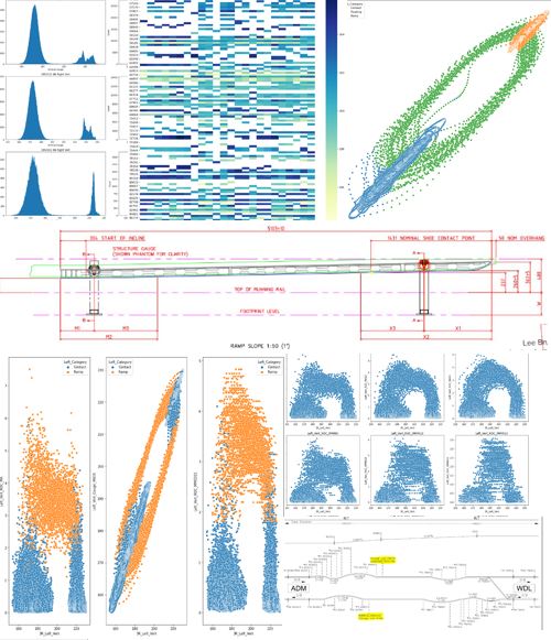
This project was personal project I was working on while at SMRT which I converted into a capstone project at Singapore Management University's Computer Science Masters Course over 6 months. Having worked as a subject matter expert on third rail systems in SMRT for the past year, I noticed that the ingredients were in place for a transition from the current preventive maintenance regime into a condition-based regime. The Linear Variable Differential Transformer mounted on the suspension system for current collection gave a reasonably accurate read on the power rail gauge relative to trains. With some data processing to make the data usable, statistical techniques to reduce the effects of inconsistencies in the data and machine learning coupled with additional data sources to augment the search for anomalous data points, the potential to classify section of power rail by their degree of sag and the associated risk of its current condition seemed high.
The notebook below documents the EDA process I underwent while trying to find a way to generate value out of the data. Early sections sought to process the data into a usable state. This was followed by quick visualizations that identified problems with the data and their respective solutions. Finally, a system was designed to classify both power rail and power rail ramps into various risk categories, allowing maintenance teams to prioritize sections of power rail based on their condition as opposed to a mindless cyclically scheduled sweep of the network.
This notebook documents the data engineering required to process 6 months (Jan 2021-Jun 2021) of SMRT LVDT datasets into usable data for the end goal of building a machine learning models to:
(1) Classify cases of potential degrading sections of 3R in the NSL into 4 catagories depending on urgency - e.g. SI1 - SI4
(2) Predict the time taken for a section of 3R identified to be problematic to degrade into a specific state - e.g. 160mm 3R Vertical Gauge
| Term/Abbreviation | Definition/Meaning |
|---|---|
| 3R | The third rail, a power rail running adjacent to the two running rails on which the train rolls on |
| CCD Shoe | The Current Collector Device shoe is a sheet of carbon attached to the CCD assembly to contact the 3R |
| Chainage | A referencing system for identifying locations on the track by distance, each unit difference between chainage is 1m |
| Contact Range | The chainage range where the 3R and CCD Shoe are in contact |
| Floating Range | The chainage range where the 3R and CCD Shoes are not in contact and the CCD shoe is 'floating' in the air |
| LVDT | A linear variable differential transformed sensor for measuring height of 3R and converting it to an electrical signal |
| MA | Moving Average |
| Ramp Contact Range | The chainage range where the CCD Shoes are in contact with the ramp |
| ROC | Rate of Change |
Note: Chainage is not necessarily in running order, for example chainage can jump from 1000 to 2000 with no physical location correspinding to chainage between 1000-2000. Additionally, a chainage can refer to two locations at once if not tagged with the sector it belongs to (e.g. Khatib-Yio Chu Kang could have a chainage 500 in its range and this chainage 500 could also exist in Admiralty-Woodlands)
This is done so that we do not need to iterate through all the csv files to concatenate the data in the future

import pandas as pd
pd.options.mode.chained_assignment = None # default='warn'
df = pd.DataFrame(columns=['Chainage1','Date1','Chainage2','3R_Left_Vert','3R_Right_Vert', 'Date', 'EMU', 'Bound'])
The cell below can be skipped if the 'lvdtdata.pkl' 'file is available for use
import os
import xlrd
import pandas as pd
os.chdir('C:/Users/jooer/OneDrive/Desktop/CAPSTONE PROJECT/LVDT')
path = os.getcwd()
files = os.listdir(path)
files_xls = [f for f in files if f[-3:] == 'csv'] #check the file type/extension, for multiple extensions, use files_xls = [f for f in files if (f[-4:] == 'xlsx' or f[-4:] == 'xlsm' or f[-3:] == 'csv' or f[-3:] == 'xls']
rel_bnds = ['NB','SB']
files_added = []
for f in files_xls:
for bnd in rel_bnds:
if bnd in f:
print(f + ' added to pkl')
files_added.append(f)
file_df = pd.read_csv(f,names=['Chainage1','Date1','Chainage2','3R_Left_Vert','3R_Right_Vert'])
file_df['EMU'] = f.split('_')[3].split('.')[0]
file_df['Bound'] = f.split('_')[2]
file_df['Date'] = f.split('_')[0]
#print(f.split('_')[0],f.split('_')[2],f.split('_')[3].split('.')[0])
df = df.append(file_df, ignore_index=True)
df.to_pickle("lvdtdata.pkl")
20210113_TRVL_NB_EMU533.csv added to pkl
20210113_TRVL_SB_EMU533.csv added to pkl
20210120_TRVL_NB_EMU532.csv added to pkl
20210120_TRVL_SB_EMU532.csv added to pkl
20210128_TRVL_NB_EMU533.csv added to pkl
20210128_TRVL_SB_EMU533.csv added to pkl
20210203_TRVL_NB_EMU532.csv added to pkl
20210203_TRVL_SB_EMU532.csv added to pkl
20210209_TRVL_NB_EMU532.csv added to pkl
20210209_TRVL_SB_EMU532.csv added to pkl
20210217_TRVL_NB_EMU533.csv added to pkl
20210217_TRVL_SB_EMU533.csv added to pkl
20210224_TRVL_NB_EMU533.csv added to pkl
20210224_TRVL_SB_EMU533.csv added to pkl
20210303_TRVL_NB_EMU533.csv added to pkl
20210303_TRVL_SB_EMU533.csv added to pkl
20210310_TRVL_NB_EMU533.csv added to pkl
20210310_TRVL_SB_EMU533.csv added to pkl
20210318_TRVL_NB_EMU533.csv added to pkl
20210318_TRVL_SB_EMU533.csv added to pkl
20210324_TRVL_NB_EMU533.csv added to pkl
20210324_TRVL_SB_EMU533.csv added to pkl
20210329_TRVL_NB_EMU533.csv added to pkl
20210329_TRVL_SB_EMU533.csv added to pkl
20210407_TRVL_NB_EMU532.csv added to pkl
Some quick improvements identified from browsing the data: (1) The dates are not in date format, (2) The decimal point values after 3 d.p. are unnecessary
import os
os.chdir('C:/Users/jooer/OneDrive/Desktop/CAPSTONE PROJECT/LVDT')
df = pd.read_pickle("lvdtdata.pkl")
# Convert dates to datetime and round decimal values
df['Date'] = pd.to_datetime(df['Date'])
df = df.round(3)
# Check number of rows
len(df)
21542717
df.sort_values(by=['Chainage1','Date'])
| Chainage1 | Date1 | Chainage2 | 3R_Left_Vert | 3R_Right_Vert | Date | EMU | Bound | |
|---|---|---|---|---|---|---|---|---|
| 459432 | 0.0 | 210113 | 81715.281 | 219.942 | 222.962 | 2021-01-13 | EMU533 | SB |
| 4950568 | 0.0 | 210217 | 82112.531 | 216.222 | 220.389 | 2021-02-17 | EMU533 | SB |
| 6746266 | 0.0 | 210303 | 82127.203 | 216.552 | 220.003 | 2021-03-03 | EMU533 | SB |
| 20207415 | 0.0 | 210616 | 62434.910 | 214.536 | 230.835 | 2021-06-16 | EMU533 | SB |
| 459431 | 0.1 | 210113 | 81715.273 | 221.531 | 222.441 | 2021-01-13 | EMU533 | SB |
| ... | ... | ... | ... | ... | ... | ... | ... | ... |
| 5837202 | 94912.0 | 210224 | 82156.344 | 170.735 | 208.151 | 2021-02-24 | EMU533 | NB |
| 12122643 | 94912.0 | 210414 | 73918.844 | 171.321 | 218.552 | 2021-04-14 | EMU532 | NB |
| 16604226 | 94912.0 | 210519 | 134001.920 | 171.987 | 226.958 | 2021-05-19 | EMU533 | NB |
| 19298002 | 94912.0 | 210611 | 95250.313 | 172.475 | 228.545 | 2021-06-11 | EMU533 | NB |
| 20196160 | 94912.0 | 210616 | 85212.203 | 170.956 | 224.971 | 2021-06-16 | EMU533 | NB |
21542717 rows × 8 columns
This step is done to understand the general charactersitics of the data. pandas_profiling is good for an initial general answer to some of these questions
from pandas_profiling import ProfileReport
profile = ProfileReport(df, minimal=True)
profile
Some quick insights identified: (1) 3R Vertical Gauge looks normally distributed. (2) Based on the Vert_Gauge histograms, >215 looks like the point where the LVDT hovers when not contacting the 3R or ramps, (3) The symmetry between the range 180-210 is likely the region when the LVDT is measuring 3R ramp vertical gauge

df.head()
| Chainage1 | Date1 | Chainage2 | 3R_Left_Vert | 3R_Right_Vert | Date | EMU | Bound | |
|---|---|---|---|---|---|---|---|---|
| 0 | 57231.8 | 210113 | 92955.969 | 169.133 | 220.880 | 2021-01-13 | EMU533 | NB |
| 1 | 57231.9 | 210113 | 93334.306 | 169.655 | 222.085 | 2021-01-13 | EMU533 | NB |
| 2 | 57232.0 | 210113 | 93334.558 | 169.712 | 222.091 | 2021-01-13 | EMU533 | NB |
| 3 | 57232.1 | 210113 | 93334.740 | 169.744 | 222.039 | 2021-01-13 | EMU533 | NB |
| 4 | 57232.2 | 210113 | 93334.874 | 169.844 | 222.038 | 2021-01-13 | EMU533 | NB |
#Get individual EMU dataframes
EMU533_df = df[df['EMU']=='EMU533']
EMU532_df = df[df['EMU']=='EMU532']
EMU501_df = df[df['EMU']=='EMU501']
# A way to find a number of bins for a given range
import numpy as np
x = EMU533_df['3R_Left_Vert']
q25, q75 = np.percentile(x,[.25,.75])
bin_width = 2*(q75 - q25)*len(x)**(-1/3)
bins = round((x.max() - x.min())/bin_width)
print("Freedman–Diaconis number of bins:", bins)
Freedman–Diaconis number of bins: 4770
Check if each sensors on the train (left and right) behave in the same way
Check if sensors on different different trains behave in the same way
import scipy.stats as st
import matplotlib.pyplot as plt
import numpy as np
bins = 4770
fig, axs = plt.subplots(3, 2, figsize=(15,15))
axs[0, 0].hist(EMU533_df['3R_Left_Vert'], bins = bins)
axs[0, 0].set_title('EMU 533 Left Vert')
axs[0, 1].hist(EMU533_df['3R_Right_Vert'], bins = bins)
axs[0, 1].set_title('EMU 533 Right Vert')
axs[1, 0].hist(EMU532_df['3R_Left_Vert'], bins = bins)
axs[1, 0].set_title('EMU532 Left Vert')
axs[1, 1].hist(EMU532_df['3R_Right_Vert'], bins = bins)
axs[1, 1].set_title('EMU 532 Right Vert')
axs[2, 0].hist(EMU501_df['3R_Left_Vert'], bins = bins)
axs[2, 0].set_title('EMU501 Left Vert')
axs[2, 1].hist(EMU501_df['3R_Right_Vert'], bins = bins)
axs[2, 1].set_title('EMU 501 Right Vert')
for ax in axs.flat:
ax.set(xlabel='Vertical Gauge', ylabel='Count')
plt.tight_layout()

First off, the good news is that the distributions for the vertical gauge range corresponding with contact between the 3R are generally normally distributed. This is important because it is expected that should the population of maintenence staff all attempt to gauge the 3R to the same value (170mm - the nominal value for 3R vertical gauge), the deviation from the target should indeed follow such a distribution.
Note: There is a slight but noticeable bias towards higher values for the measurements in the 'contacting range' (where the CCD shoe is touching the 3R) - this bias is either due to the sensor, or the actual physical state of the 3R (i.e. staff are intentionally fixing the 3R gauge slightly above 170mm.)
Statistically, having a normal distribution opens up the doors to many statistical analysis methods and tools for comparing and manipulating the distributions.
However, the vertical gauge in the 'floating range' (where the CCD shoe is not touching the 3R seems to be made up of multiple distributions - possibly due to the different resting positions of each sensor and the fluctuations it experiences while the train rumbles along the track. Using an example to explain this phenomenon, EMU501's and EMU533's left sensor seems to have one main rest spot around which the sensor readings fluctuate, hence the obvious single peak in both cases while EMU501's right sensor has 3 peaks, Potentially indicating 3 different resting spots of the CCD shoe.
Note: SMRT's convention of left and right is defined by the direction of increasing chainage, hence on both the NB and SB, left will refer to the same side and thus the same sensor
Hardware Hypotheses
As suspected, the different EMUs have slight but noticeable different distribution shapes for the vertical gauge measured, this could be due to sensor or installation differences or a change in the state of the EMU (e.g. wear or change of CCD shoe at some point in time, different voltage regulation, different mechanical resistance of the CCD assembly, route travelled e.g. more NB han SB) that resulted in variation in the data collected. It could also be that the calibration of the sensors were done differently.
The ideal case would have been identical distribution shapes shared by all the Left Verts (since they measure the same 3R on both bounds) and another distribution shared by all the Right Verts.
Software Hypotheses
In terms of software, it could also be that the sensor data logging and processing system may be artificially re-classifying data into certain values.
This may have implications further down the analysis when a vertical gauge comparisons across days and between EMUs is to be done (e.g. a EMUs may have a higher mean than another, suggesting an offset is required for fair comparison).
Let us test the bound difference hypothesis by further splitting the data by bound and zooming into the 3R gauge
#Get individual EMU dataframes and split by bound, the left and right needs to be split apart because to isolate bound differences
EMU533NB_df= EMU533_df.loc[(df['Bound'] == 'NB')]
EMU532NB_df= EMU532_df.loc[(df['Bound'] == 'NB')]
EMU501NB_df= EMU501_df.loc[(df['Bound'] == 'NB')]
EMU533SB_df= EMU533_df.loc[(df['Bound'] == 'SB')]
EMU532SB_df= EMU532_df.loc[(df['Bound'] == 'SB')]
EMU501SB_df= EMU501_df.loc[(df['Bound'] == 'SB')]
bins = 2000
fig, axs = plt.subplots(3, 2, figsize=(15,15))
axs[0, 0].hist(EMU533NB_df['3R_Left_Vert'], bins = bins)
axs[0, 0].set_title('EMU 533 NB Left Vert')
axs[0, 1].hist(EMU533SB_df['3R_Left_Vert'], bins = bins)
axs[0, 1].set_title('EMU 533 SB Left Vert')
axs[1, 0].hist(EMU532NB_df['3R_Left_Vert'], bins = bins)
axs[1, 0].set_title('EMU532 NB Left Vert')
axs[1, 1].hist(EMU532SB_df['3R_Left_Vert'], bins = bins)
axs[1, 1].set_title('EMU 532 SB Left Vert')
axs[2, 0].hist(EMU501NB_df['3R_Left_Vert'], bins = bins)
axs[2, 0].set_title('EMU501 NB Left Vert')
axs[2, 1].hist(EMU501SB_df['3R_Left_Vert'], bins = bins)
axs[2, 1].set_title('EMU 501 SB Left Vert')
for ax in axs.flat:
ax.set(xlabel='Vertical Gauge', ylabel='Count')
plt.tight_layout()

EMU533NB_df= EMU533_df.loc[(df['Bound'] == 'NB')]
EMU532NB_df= EMU532_df.loc[(df['Bound'] == 'NB')]
EMU501NB_df= EMU501_df.loc[(df['Bound'] == 'NB')]
EMU533SB_df= EMU533_df.loc[(df['Bound'] == 'SB')]
EMU532SB_df= EMU532_df.loc[(df['Bound'] == 'SB')]
EMU501SB_df= EMU501_df.loc[(df['Bound'] == 'SB')]
bins = 2000
fig, axs = plt.subplots(3, 2, figsize=(15,15))
axs[0, 0].hist(EMU533NB_df['3R_Right_Vert'], bins = bins)
axs[0, 0].set_title('EMU 533 NB Right Vert')
axs[0, 1].hist(EMU533SB_df['3R_Right_Vert'], bins = bins)
axs[0, 1].set_title('EMU 533 SB Right Vert')
axs[1, 0].hist(EMU532NB_df['3R_Right_Vert'], bins = bins)
axs[1, 0].set_title('EMU532 NB Right Vert')
axs[1, 1].hist(EMU532SB_df['3R_Right_Vert'], bins = bins)
axs[1, 1].set_title('EMU 532 SB Right Vert')
axs[2, 0].hist(EMU501NB_df['3R_Right_Vert'], bins = bins)
axs[2, 0].set_title('EMU501 NB Right Vert')
axs[2, 1].hist(EMU501SB_df['3R_Right_Vert'], bins = bins)
axs[2, 1].set_title('EMU 501 SB Right Vert')
for ax in axs.flat:
ax.set(xlabel='Vertical Gauge', ylabel='Count')
plt.tight_layout()

Clearly the bounds have a different distribution of Left 3R and Right 3R (it seems most of the 3R on the NB is on the right and most of the 3R in the SB is on the left). It makes sense that the Left and Right cases have an inverse relationship given that if there is 3R on the Left, no 3R is required on the Right.
Also noticeable is the different skews of floating positions of the LVDT of the Left and Right sensors for each train and the generally similar skews when the Left or Right sensors are on either bound
The LVDT 3R reading contact range (150-190) generally has the shape of a Normal Distribution.
For the floating range (200-230), sometimes a clear double peak can be seen regardless of whether its a majority/minority 3R on Left/Right situation.
For the ramp contact range, it can be understood that the range lies between the contact range and the floating range - merging into both distributions due to the noise and the fact that physically, the ramps are a transition from the normal 3R range to the floating range. One thing that is for sure is that the ramp/conductor-rail fraction is much smaller than 1 and the ramp has an almost constant gradient - meaning that we expect a uniform distribution for the measurements at the ramp contact range as samples are taken along the ramp at different heights. This means that the total area of the conductor-rail region is larger than the area of the ramp (transition length region) - the accuracy of which is contingent on the tachometer of the EMU (the LVDT has a constant sampling rate based on distance and does not give more LVDT readings/m at the ramp).
Note: The sampling rate of the LVDT is approximately 10/m, meaning that the resolution of 3R gauge is around 10cm.
Attempt to use rate of change to find chainages that belong to ramps under the assumption that the rate of change of 3R gauge across distance at ramps is greater than elsewhere (since ramps are a slanted and curved piece of 3R).
# The rate of change method. Take a single day on a single bound for a single train, can use multiple instances of this to get average length
EMU533_NB_LEFT_20210113 = EMU533_df.loc[(EMU533_df['Date'] == '20210113') & (EMU533_df['Bound'] == 'NB'),['Chainage1','3R_Left_Vert']]
EMU533_NB_LEFT_20210113.reset_index(drop=True, inplace=True)
EMU533_SB_LEFT_20210113 = EMU533_df.loc[(EMU533_df['Date'] == '20210113') & (EMU533_df['Bound'] == 'SB'),['Chainage1','3R_Left_Vert']]
EMU533_SB_LEFT_20210113.reset_index(drop=True, inplace=True)
EMU533_NB_LEFT_20210113
| Chainage1 | 3R_Left_Vert | |
|---|---|---|
| 0 | 92955.969 | 169.13252 |
| 1 | 93334.306 | 169.65469 |
| 2 | 93334.558 | 169.71207 |
| 3 | 93334.740 | 169.74395 |
| 4 | 93334.874 | 169.84377 |
| ... | ... | ... |
| 449137 | 104854.050 | 172.09806 |
| 449138 | 104854.320 | 171.95497 |
| 449139 | 104854.610 | 171.84392 |
| 449140 | 104854.930 | 171.72159 |
| 449141 | 104855.380 | 171.79628 |
449142 rows × 2 columns
# Collect the first two entries from the EMU533 NB left sensor on a specific day
s1 = pd.Series([EMU533_NB_LEFT_20210113['3R_Left_Vert'][0], EMU533_NB_LEFT_20210113['3R_Left_Vert'][1]])
s1
0 169.13252
1 169.65469
dtype: float64
# Collect the first two entries from the EMU533 SB left sensor on a specific day
s2 = pd.Series([EMU533_SB_LEFT_20210113['3R_Left_Vert'][0], EMU533_SB_LEFT_20210113['3R_Left_Vert'][1]])
s2
0 173.14427
1 172.56090
dtype: float64
# Remove the last two entries of vertical gauge and add it below the first two entries collected earlier
s1 = s1.append(EMU533_NB_LEFT_20210113['3R_Left_Vert'].drop(labels=[len(EMU533_NB_LEFT_20210113)-1,len(EMU533_NB_LEFT_20210113)-2]))
s1.reset_index(drop=True, inplace=True)
s2 = s2.append(EMU533_SB_LEFT_20210113['3R_Left_Vert'].drop(labels=[len(EMU533_SB_LEFT_20210113)-1,len(EMU533_SB_LEFT_20210113)-2]))
s2.reset_index(drop=True,inplace=True)
EMU533_NB_LEFT_20210113['3R_Left_Vert_Stagger2'] = list(s1)
EMU533_SB_LEFT_20210113['3R_Left_Vert_Stagger2'] = list(s2)
EMU533_NB_LEFT_20210113['3R_Left_Vert_ROC'] = EMU533_NB_LEFT_20210113['3R_Left_Vert'] - EMU533_NB_LEFT_20210113['3R_Left_Vert_Stagger2']
EMU533_SB_LEFT_20210113['3R_Left_Vert_ROC'] = EMU533_SB_LEFT_20210113['3R_Left_Vert'] - EMU533_SB_LEFT_20210113['3R_Left_Vert_Stagger2']
EMU533_NB_LEFT_20210113
| Chainage1 | 3R_Left_Vert | 3R_Left_Vert_Stagger2 | 3R_Left_Vert_ROC | |
|---|---|---|---|---|
| 0 | 92955.969 | 169.13252 | 169.13252 | 0.00000 |
| 1 | 93334.306 | 169.65469 | 169.65469 | 0.00000 |
| 2 | 93334.558 | 169.71207 | 169.13252 | 0.57955 |
| 3 | 93334.740 | 169.74395 | 169.65469 | 0.08926 |
| 4 | 93334.874 | 169.84377 | 169.71207 | 0.13170 |
| ... | ... | ... | ... | ... |
| 449137 | 104854.050 | 172.09806 | 172.02882 | 0.06924 |
| 449138 | 104854.320 | 171.95497 | 172.07408 | -0.11911 |
| 449139 | 104854.610 | 171.84392 | 172.09806 | -0.25414 |
| 449140 | 104854.930 | 171.72159 | 171.95497 | -0.23338 |
| 449141 | 104855.380 | 171.79628 | 171.84392 | -0.04764 |
449142 rows × 4 columns
EMU533_SB_LEFT_20210113
| Chainage1 | 3R_Left_Vert | 3R_Left_Vert_Stagger2 | 3R_Left_Vert_ROC | |
|---|---|---|---|---|
| 0 | 81343.828 | 173.14427 | 173.14427 | 0.00000 |
| 1 | 81607.187 | 172.56090 | 172.56090 | 0.00000 |
| 2 | 81607.440 | 172.60290 | 173.14427 | -0.54137 |
| 3 | 81607.624 | 172.50912 | 172.56090 | -0.05178 |
| 4 | 81607.752 | 172.48079 | 172.60290 | -0.12211 |
| ... | ... | ... | ... | ... |
| 448742 | 92954.949 | 170.03864 | 170.04701 | -0.00837 |
| 448743 | 92955.106 | 169.83432 | 170.05685 | -0.22253 |
| 448744 | 92955.298 | 169.75389 | 170.03864 | -0.28475 |
| 448745 | 92955.531 | 169.52178 | 169.83432 | -0.31254 |
| 448746 | 92955.969 | 169.13252 | 169.75389 | -0.62137 |
448747 rows × 4 columns
# The function that creates the ROC columms
# Note that the df must be for a specific train (e.g. EMU533), on a specific bound (e.g. NB), side ('3R_Left_Vert') and date '20210113'
pd.options.mode.chained_assignment = None # default='warn'
def create__roc(df, train_name, bound, date):
df = df.loc[(df['EMU']==train_name) & (df['Bound'] == bound) & (df['Date'] == date)]
df.reset_index(drop=True, inplace=True)
left_series_head = pd.Series([df['3R_Left_Vert'][0], df['3R_Left_Vert'][1]])
right_series_head = pd.Series([df['3R_Right_Vert'][0], df['3R_Right_Vert'][1]])
left_series = left_series_head.append(df['3R_Left_Vert'].drop(labels=[len(df)-1,len(df)-2]))
right_series = right_series_head.append(df['3R_Right_Vert'].drop(labels=[len(df)-1,len(df)-2]))
df['3R_Left_Vert_Stagger2'] = list(left_series)
df['3R_Right_Vert_Stagger2'] = list(right_series)
df['3R_Left_Vert_ROC'] = abs(df['3R_Left_Vert'] - df['3R_Left_Vert_Stagger2'])
df['3R_Right_Vert_ROC'] = abs(df['3R_Right_Vert'] - df['3R_Right_Vert_Stagger2'])
return df
# Access the available dates for a specific train with this code: set(df.loc[df['EMU']=='EMU501']['Date'])
create__roc(df, 'EMU501', 'NB', '20210505')
| Chainage1 | 3R_Left_Vert | 3R_Right_Vert | Date | EMU | Bound | 3R_Left_Vert_Stagger2 | 3R_Right_Vert_Stagger2 | 3R_Left_Vert_ROC | 3R_Right_Vert_ROC | |
|---|---|---|---|---|---|---|---|---|---|---|
| 0 | 82624.992 | 172.75864 | 211.85107 | 20210505 | EMU501 | NB | 172.75864 | 211.85107 | 0.00000 | 0.00000 |
| 1 | 82710.227 | 172.98694 | 213.18978 | 20210505 | EMU501 | NB | 172.98694 | 213.18978 | 0.00000 | 0.00000 |
| 2 | 82710.442 | 172.92351 | 213.15546 | 20210505 | EMU501 | NB | 172.75864 | 211.85107 | 0.16487 | 1.30439 |
| 3 | 82710.593 | 172.84922 | 213.21578 | 20210505 | EMU501 | NB | 172.98694 | 213.18978 | 0.13772 | 0.02600 |
| 4 | 82710.716 | 172.76356 | 213.22747 | 20210505 | EMU501 | NB | 172.92351 | 213.15546 | 0.15995 | 0.07201 |
| ... | ... | ... | ... | ... | ... | ... | ... | ... | ... | ... |
| 444618 | 93901.498 | 174.01534 | 211.46781 | 20210505 | EMU501 | NB | 174.02320 | 211.51296 | 0.00786 | 0.04515 |
| 444619 | 93901.733 | 174.07710 | 211.46553 | 20210505 | EMU501 | NB | 173.95742 | 211.46883 | 0.11968 | 0.00330 |
| 444620 | 93901.984 | 174.05698 | 211.47826 | 20210505 | EMU501 | NB | 174.01534 | 211.46781 | 0.04164 | 0.01045 |
| 444621 | 93902.251 | 174.18445 | 211.50060 | 20210505 | EMU501 | NB | 174.07710 | 211.46553 | 0.10735 | 0.03507 |
| 444622 | 93902.664 | 174.18434 | 211.54604 | 20210505 | EMU501 | NB | 174.05698 | 211.47826 | 0.12736 | 0.06778 |
444623 rows × 10 columns
EMU533_NB_20210113 = create__roc(df, 'EMU533', 'NB', '20210113')
EMU533_SB_20210113 = create__roc(df, 'EMU533', 'SB', '20210113')
x = EMU533_SB_20210113['Chainage1']
y = EMU533_SB_20210113['3R_Left_Vert_ROC']
plt.plot(x, y)
[<matplotlib.lines.Line2D at 0x1a9292d18e0>]

x = EMU533_NB_20210113['Chainage1']
y = EMU533_NB_20210113['3R_Left_Vert_ROC']
plt.plot(x, y)
[<matplotlib.lines.Line2D at 0x1a98441ed60>]

It is apparent that there are ROC spikes spaced out across the chainages, these could possibly correspond with ramp chainages
bins = 60
x = EMU533_NB_20210113['Chainage1']
y = EMU533_NB_20210113['3R_Left_Vert_ROC']
fig2, axs2 = plt.subplots(2, 2, figsize=(15,15))
axs2[0,0].hist(abs(EMU533_NB_20210113['3R_Left_Vert_ROC']), bins = bins)
axs2[0,0].set_title('Absolute EMU 533 NB Left Vert ROC')
axs2.flat[2].set(xlabel='ROC', ylabel='Count')
y = abs(EMU533_NB_20210113['3R_Left_Vert_ROC'])
axs2[0,1].plot(x, y)
axs2[0,1].set_title('Absolute EMU 533 NB Left Vert ROC Across Chainage')
axs2.flat[3].set(xlabel='Chainage', ylabel='ROC')
######################################################################
x = EMU533_SB_20210113['Chainage1']
y = EMU533_SB_20210113['3R_Left_Vert_ROC']
axs2[1,0].hist(abs(EMU533_SB_20210113['3R_Left_Vert_ROC']), bins = bins)
axs2[1,0].set_title('Absolute EMU 533 SB Left Vert ROC')
axs2.flat[2].set(xlabel='ROC', ylabel='Count')
y = abs(EMU533_SB_20210113['3R_Left_Vert_ROC'])
axs2[1,1].plot(x, y)
axs2[1,1].set_title('Absolute EMU 533 SB Left Vert ROC Across Chainage')
axs2.flat[3].set(xlabel='Chainage', ylabel='ROC')
plt.tight_layout()

Visually, 2-3mm/m looks like a good value to set a cutoff point between ROC at conductor-rail and ROC at ramps. To check this assumption, we take the quantile that corresponds to the 3mm ROC. This turns out to be the 99.5 percentile. Meaning that for every 99.5m of distance 0.5m is a ramp. A HSR on the mainline is roughly 5m long. Hence we expect to see one ramp for every 1km of 3R. This is possible considering we are only analyzing the 3R on one side of the train, meaning that when we consider both the left and right sides, the actual ramp frequency on a bound is 1 ramp/500m, giving a total of 400 ramps in the entire network.
As a worked example, at 4 ramps per km the cut-off point is 1.5799, this gives 800 ramps in 200km. However, remember that this is applied based on the assumption that ROC has a threshold that can differentiate 3R, ramps and float.
Additionally, it will be best to find out the actual number of ramps in the line and bring the value back to determine which percentile of ROC corresponds to the ROC at ramps (based on the ramp:conductor-rail length ratio)
Note that the NB is primarily made up of floating LVDT readings, while the SB readings is majority 3R conductor rails.
print('NB 99.5 Percentile ROC:', abs(EMU533_NB_20210113['3R_Left_Vert_ROC']).quantile(0.995))
print('NB 99.15 Percentile ROC:', abs(EMU533_NB_20210113['3R_Left_Vert_ROC']).quantile(0.9915))
print('NB 99.0 Percentile ROC:', abs(EMU533_NB_20210113['3R_Left_Vert_ROC']).quantile(0.99))
print('NB 98.4 Percentile ROC:', abs(EMU533_NB_20210113['3R_Left_Vert_ROC']).quantile(0.984))
print('NB 98.0 Percentile ROC:',abs(EMU533_NB_20210113['3R_Left_Vert_ROC']).quantile(0.98))
NB 99.5 Percentile ROC: 3.0315491499999903
NB 99.15 Percentile ROC: 1.7880921549999926
NB 99.0 Percentile ROC: 1.5760331000000127
NB 98.4 Percentile ROC: 1.2488662400000166
NB 98.0 Percentile ROC: 1.1426700000000096
print('SB 99.5 Percentile ROC:', abs(EMU533_SB_20210113['3R_Left_Vert_ROC']).quantile(0.995))
print('SB 99.0 Percentile ROC:', abs(EMU533_SB_20210113['3R_Left_Vert_ROC']).quantile(0.99))
print('SB 98.0 Percentile ROC:',abs(EMU533_SB_20210113['3R_Left_Vert_ROC']).quantile(0.98))
SB 99.5 Percentile ROC: 3.070204800000011
SB 99.0 Percentile ROC: 1.7684067999999875
SB 98.0 Percentile ROC: 1.257550000000009
EMU533_SB_20210113.loc[(EMU533_SB_20210113['3R_Left_Vert_ROC'] > 3) | (EMU533_SB_20210113['3R_Right_Vert_ROC'] > 3)]
| Chainage1 | 3R_Left_Vert | 3R_Right_Vert | Date | EMU | Bound | 3R_Left_Vert_Stagger2 | 3R_Right_Vert_Stagger2 | 3R_Left_Vert_ROC | 3R_Right_Vert_ROC | |
|---|---|---|---|---|---|---|---|---|---|---|
| 2 | 81607.440 | 172.60290 | 221.74053 | 20210113 | EMU533 | SB | 173.14427 | 217.50543 | 0.54137 | 4.23510 |
| 444 | 81616.219 | 169.49440 | 222.01135 | 20210113 | EMU533 | SB | 165.55645 | 221.66748 | 3.93795 | 0.34387 |
| 445 | 81616.226 | 171.03131 | 221.88456 | 20210113 | EMU533 | SB | 167.18396 | 221.95197 | 3.84735 | 0.06741 |
| 447 | 81616.250 | 174.54227 | 221.44112 | 20210113 | EMU533 | SB | 171.03131 | 221.88456 | 3.51096 | 0.44344 |
| 448 | 81616.258 | 176.14720 | 221.03262 | 20210113 | EMU533 | SB | 172.22745 | 221.69356 | 3.91975 | 0.66094 |
| ... | ... | ... | ... | ... | ... | ... | ... | ... | ... | ... |
| 447493 | 92937.228 | 174.66780 | 221.16375 | 20210113 | EMU533 | SB | 177.91184 | 221.10755 | 3.24404 | 0.05620 |
| 447494 | 92937.234 | 172.52888 | 221.28154 | 20210113 | EMU533 | SB | 177.17991 | 221.06302 | 4.65103 | 0.21852 |
| 447495 | 92937.242 | 171.30081 | 221.28251 | 20210113 | EMU533 | SB | 174.66780 | 221.16375 | 3.36699 | 0.11876 |
| 447496 | 92937.250 | 168.75226 | 221.39330 | 20210113 | EMU533 | SB | 172.52888 | 221.28154 | 3.77662 | 0.11176 |
| 448158 | 92943.109 | 171.73207 | 219.40137 | 20210113 | EMU533 | SB | 172.22628 | 222.64767 | 0.49421 | 3.24630 |
4081 rows × 10 columns
We build on the previous assumption that the 99.5th precentile for the SB is a good cut-off point to determine which ranges of 3R belong to ramps. Below this value, we assume the LVDT is in the float range or contact range.
import seaborn as sns
sns.scatterplot(data=EMU533_SB_20210113, x='3R_Left_Vert', y='3R_Left_Vert_ROC')
<AxesSubplot:xlabel='3R_Left_Vert', ylabel='3R_Left_Vert_ROC'>

Immediately, it is noticeable that most of the vertical gauge pairs with high ROC do correspond with the expected vertical gauge ranges of the ramps. However there are also borderline cases where the range is within the expected vertical gauge in the contact range. When we plot the ROC against the vertical gauge ranges, the reason becomes clear: the noise values are large enough create large ROC values that basically merge into the actual ROC values expected at ramps. This means that we need to process the data even further, or find a feature that can distinguish the ROC measurements at the ramp from the ROC measurements from noise.
Under the assumption that noise is random, there should not be a sustained range of records with high ROC due to noise. Perhaps a moving average will help to check for sustained rate of change characteristics of ramps.
EMU533_SB_20210113['Left_Vert_ROC_MA'] = EMU533_SB_20210113['3R_Left_Vert_ROC'].rolling(window=3).mean()
EMU533_SB_20210113.loc[(EMU533_SB_20210113['Left_Vert_ROC_MA'] > 3)]
| Chainage1 | 3R_Left_Vert | 3R_Right_Vert | Date | EMU | Bound | 3R_Left_Vert_Stagger2 | 3R_Right_Vert_Stagger2 | 3R_Left_Vert_ROC | 3R_Right_Vert_ROC | ... | Left_Vert_ROC_MMED10 | Left_Vert_ROC_MMED15 | Left_Vert_Gauge_MA5 | Left_Vert_Gauge_MA10 | Left_Vert_Gauge_MA15 | Left_Catergory | Left_Catgory | Left_Category | 3R_Left_Vert5 | 3R_Left_Vert3 | |
|---|---|---|---|---|---|---|---|---|---|---|---|---|---|---|---|---|---|---|---|---|---|
| 445 | 81616.226 | 171.03131 | 221.88456 | 20210113 | EMU533 | SB | 167.18396 | 221.95197 | 3.84735 | 0.06741 | ... | 0.643025 | 3.41340 | 170.895878 | 167.254330 | 166.135138 | Contact | NaN | Ramp | 170.895878 | 170.917720 |
| 446 | 81616.234 | 172.22745 | 221.69356 | 20210113 | EMU533 | SB | 169.49440 | 222.01135 | 2.73305 | 0.31779 | ... | 0.886535 | 3.51096 | 172.688526 | 167.310156 | 166.512421 | Contact | NaN | Ramp | 172.688526 | 172.600343 |
| 447 | 81616.250 | 174.54227 | 221.44112 | 20210113 | EMU533 | SB | 171.03131 | 221.88456 | 3.51096 | 0.44344 | ... | 1.631405 | 3.55760 | 174.409620 | 167.470526 | 167.075107 | Contact | NaN | Ramp | 174.409620 | 174.305640 |
| 448 | 81616.258 | 176.14720 | 221.03262 | 20210113 | EMU533 | SB | 172.22745 | 221.69356 | 3.91975 | 0.66094 | ... | 2.476000 | 3.55760 | 176.173632 | 167.727114 | 167.780111 | Contact | NaN | Ramp | 176.173632 | 176.263113 |
| 449 | 81616.268 | 178.09987 | 221.05626 | 20210113 | EMU533 | SB | 174.54227 | 221.44112 | 3.55760 | 0.38486 | ... | 3.122005 | 3.70417 | 178.030796 | 168.061012 | 168.620626 | Contact | NaN | Ramp | 178.030796 | 178.032813 |
| ... | ... | ... | ... | ... | ... | ... | ... | ... | ... | ... | ... | ... | ... | ... | ... | ... | ... | ... | ... | ... | ... |
| 447493 | 92937.228 | 174.66780 | 221.16375 | 20210113 | EMU533 | SB | 177.91184 | 221.10755 | 3.24404 | 0.05620 | ... | 3.392120 | 3.36699 | 174.717848 | 196.267651 | 187.734201 | Contact | Ramp | Ramp | 174.717848 | 174.792197 |
| 447494 | 92937.234 | 172.52888 | 221.28154 | 20210113 | EMU533 | SB | 177.17991 | 221.06302 | 4.65103 | 0.21852 | ... | 3.598770 | 3.24404 | 172.885932 | 194.555774 | 185.861909 | Contact | Ramp | Ramp | 172.885932 | 172.832497 |
| 447495 | 92937.242 | 171.30081 | 221.28251 | 20210113 | EMU533 | SB | 174.66780 | 221.16375 | 3.36699 | 0.11876 | ... | 3.598770 | 3.10001 | 171.177510 | 192.845958 | 184.075595 | Contact | Ramp | Ramp | 171.177510 | 170.860650 |
| 447496 | 92937.250 | 168.75226 | 221.39330 | 20210113 | EMU533 | SB | 172.52888 | 221.28154 | 3.77662 | 0.11176 | ... | 3.598770 | 3.01472 | 169.930858 | 191.058986 | 182.197481 | Contact | Ramp | Ramp | 169.930858 | 169.563623 |
| 447497 | 92937.258 | 168.63780 | 221.26775 | 20210113 | EMU533 | SB | 171.30081 | 221.28251 | 2.66301 | 0.01476 | ... | 3.512165 | 2.66301 | 168.991834 | 189.348724 | 180.429119 | Contact | Ramp | Ramp | 168.991834 | 168.608200 |
2437 rows × 28 columns
EMU533_SB_20210113.loc[(EMU533_SB_20210113['Left_Vert_ROC_MA'] > 3)][0:60]
| Chainage1 | 3R_Left_Vert | 3R_Right_Vert | Date | EMU | Bound | 3R_Left_Vert_Stagger2 | 3R_Right_Vert_Stagger2 | 3R_Left_Vert_ROC | 3R_Right_Vert_ROC | ... | Left_Vert_ROC_MMED10 | Left_Vert_ROC_MMED15 | Left_Vert_Gauge_MA5 | Left_Vert_Gauge_MA10 | Left_Vert_Gauge_MA15 | Left_Catergory | Left_Catgory | Left_Category | 3R_Left_Vert5 | 3R_Left_Vert3 | |
|---|---|---|---|---|---|---|---|---|---|---|---|---|---|---|---|---|---|---|---|---|---|
| 445 | 81616.226 | 171.03131 | 221.88456 | 20210113 | EMU533 | SB | 167.18396 | 221.95197 | 3.84735 | 0.06741 | ... | 0.643025 | 3.41340 | 170.895878 | 167.254330 | 166.135138 | Contact | NaN | Ramp | 170.895878 | 170.917720 |
| 446 | 81616.234 | 172.22745 | 221.69356 | 20210113 | EMU533 | SB | 169.49440 | 222.01135 | 2.73305 | 0.31779 | ... | 0.886535 | 3.51096 | 172.688526 | 167.310156 | 166.512421 | Contact | NaN | Ramp | 172.688526 | 172.600343 |
| 447 | 81616.250 | 174.54227 | 221.44112 | 20210113 | EMU533 | SB | 171.03131 | 221.88456 | 3.51096 | 0.44344 | ... | 1.631405 | 3.55760 | 174.409620 | 167.470526 | 167.075107 | Contact | NaN | Ramp | 174.409620 | 174.305640 |
| 448 | 81616.258 | 176.14720 | 221.03262 | 20210113 | EMU533 | SB | 172.22745 | 221.69356 | 3.91975 | 0.66094 | ... | 2.476000 | 3.55760 | 176.173632 | 167.727114 | 167.780111 | Contact | NaN | Ramp | 176.173632 | 176.263113 |
| 449 | 81616.268 | 178.09987 | 221.05626 | 20210113 | EMU533 | SB | 174.54227 | 221.44112 | 3.55760 | 0.38486 | ... | 3.122005 | 3.70417 | 178.030796 | 168.061012 | 168.620626 | Contact | NaN | Ramp | 178.030796 | 178.032813 |
| 450 | 81616.276 | 179.85137 | 221.55608 | 20210113 | EMU533 | SB | 176.14720 | 221.03262 | 3.70417 | 0.52346 | ... | 3.534280 | 3.74248 | 179.929696 | 168.497266 | 169.571043 | Contact | Ramp | Ramp | 179.929696 | 179.821503 |
| 451 | 81616.289 | 181.51327 | 221.45794 | 20210113 | EMU533 | SB | 178.09987 | 221.05626 | 3.41340 | 0.40168 | ... | 3.534280 | 3.81803 | 181.862046 | 168.999766 | 170.644601 | Contact | Ramp | Ramp | 181.862046 | 181.800470 |
| 452 | 81616.301 | 184.03677 | 220.91126 | 20210113 | EMU533 | SB | 179.85137 | 221.55608 | 4.18540 | 0.64482 | ... | 3.630885 | 3.81803 | 183.813032 | 169.622822 | 171.899719 | Contact | Ramp | Ramp | 183.813032 | 183.786330 |
| 453 | 81616.309 | 185.80895 | 220.77062 | 20210113 | EMU533 | SB | 181.51327 | 221.45794 | 4.29568 | 0.68732 | ... | 3.775760 | 3.81803 | 185.713420 | 170.347272 | 173.329246 | Contact | Ramp | Ramp | 185.713420 | 185.900173 |
| 454 | 81616.319 | 187.85480 | 220.89153 | 20210113 | EMU533 | SB | 184.03677 | 220.91126 | 3.81803 | 0.01973 | ... | 3.761100 | 3.91975 | 187.730222 | 171.165334 | 174.876021 | Contact | Ramp | Ramp | 187.730222 | 187.672353 |
| 455 | 81616.328 | 189.35331 | 220.85349 | 20210113 | EMU533 | SB | 185.80895 | 220.77062 | 3.54436 | 0.08287 | ... | 3.630885 | 4.05335 | 189.699616 | 172.058493 | 176.511093 | Contact | Ramp | Ramp | 189.699616 | 189.601797 |
| 456 | 81616.342 | 191.59728 | 220.69036 | 20210113 | EMU533 | SB | 187.85480 | 220.89153 | 3.74248 | 0.20117 | ... | 3.723325 | 4.18540 | 191.667952 | 173.059656 | 178.286577 | Contact | Ramp | Ramp | 191.667952 | 191.611443 |
| 457 | 81616.351 | 193.88374 | 220.78749 | 20210113 | EMU533 | SB | 189.35331 | 220.85349 | 4.53043 | 0.06600 | ... | 3.780255 | 4.18540 | 193.719412 | 174.170926 | 180.175063 | Contact | Ramp | Ramp | 193.719412 | 193.710550 |
| 458 | 81616.361 | 195.65063 | 220.53419 | 20210113 | EMU533 | SB | 191.59728 | 220.69036 | 4.05335 | 0.15617 | ... | 3.780255 | 4.22836 | 195.990748 | 175.374066 | 182.072841 | Contact | Ramp | Ramp | 195.990748 | 195.882157 |
| 459 | 81616.375 | 198.11210 | 220.49017 | 20210113 | EMU533 | SB | 193.88374 | 220.78749 | 4.22836 | 0.29732 | ... | 3.935690 | 4.22836 | 198.188054 | 176.678864 | 183.980688 | Contact | Ramp | Ramp | 198.188054 | 198.157573 |
| 460 | 81616.383 | 200.70999 | 220.59878 | 20210113 | EMU533 | SB | 195.65063 | 220.53419 | 5.05936 | 0.06459 | ... | 4.119375 | 4.22836 | 200.405192 | 178.083460 | 185.959267 | Contact | Ramp | Ramp | 200.405192 | 200.468633 |
| 461 | 81616.393 | 202.58381 | 220.54400 | 20210113 | EMU533 | SB | 198.11210 | 220.49017 | 4.47171 | 0.05383 | ... | 4.206880 | 4.19594 | 202.662076 | 179.570416 | 187.983024 | Contact | Ramp | Ramp | 202.662076 | 202.754410 |
| 462 | 81616.399 | 204.96943 | 220.27839 | 20210113 | EMU533 | SB | 200.70999 | 220.59878 | 4.25944 | 0.32039 | ... | 4.243900 | 4.19594 | 204.823858 | 181.160793 | 190.011501 | Contact | Ramp | Ramp | 204.823858 | 204.829430 |
| 463 | 81616.414 | 206.93505 | 220.28368 | 20210113 | EMU533 | SB | 202.58381 | 220.54400 | 4.35124 | 0.26032 | ... | 4.243900 | 4.19594 | 207.002638 | 182.863553 | 192.064025 | Contact | Ramp | Ramp | 207.002638 | 206.941830 |
| 464 | 81616.423 | 208.92101 | 220.18041 | 20210113 | EMU533 | SB | 204.96943 | 220.27839 | 3.95158 | 0.09798 | ... | 4.243900 | 4.19594 | 209.109266 | 184.634267 | 194.118767 | Contact | Ramp | Ramp | 209.109266 | 209.153317 |
| 465 | 81616.433 | 211.60389 | 220.25722 | 20210113 | EMU533 | SB | 206.93505 | 220.28368 | 4.66884 | 0.02646 | ... | 4.305340 | 4.05335 | 211.119846 | 186.505333 | 196.235602 | Contact | Ramp | Ramp | 211.119846 | 211.213950 |
| 466 | 81616.441 | 213.11695 | 220.00259 | 20210113 | EMU533 | SB | 208.92101 | 220.18041 | 4.19594 | 0.17782 | ... | 4.305340 | 3.95158 | 213.088368 | 188.431410 | 198.342514 | Contact | Ramp | Ramp | 213.088368 | 213.247723 |
| 467 | 81616.453 | 215.02233 | 219.87330 | 20210113 | EMU533 | SB | 211.60389 | 220.25722 | 3.41844 | 0.38392 | ... | 4.243900 | 3.66071 | 215.022466 | 190.410046 | 200.408218 | Contact | Ramp | Ramp | 215.022466 | 214.972313 |
| 468 | 81616.465 | 216.77766 | 220.08254 | 20210113 | EMU533 | SB | 213.11695 | 220.00259 | 3.66071 | 0.07995 | ... | 4.243900 | 3.56917 | 216.557740 | 192.393794 | 202.472799 | Contact | Ramp | Ramp | 216.557740 | 216.797163 |
| 469 | 81616.473 | 218.59150 | 220.19257 | 20210113 | EMU533 | SB | 215.02233 | 219.87330 | 3.56917 | 0.31927 | ... | 4.227690 | 3.52755 | 217.847472 | 194.357678 | 204.521912 | Contact | Ramp | Ramp | 217.847472 | 218.216473 |
| 470 | 81616.484 | 219.28026 | 220.21243 | 20210113 | EMU533 | SB | 216.77766 | 220.08254 | 2.50260 | 0.12989 | ... | 4.073760 | 3.41844 | 219.172062 | 196.287636 | 206.517042 | Contact | Ramp | Ramp | 219.172062 | 219.145790 |
| 1137 | 81621.918 | 214.76683 | 168.74358 | 20210113 | EMU533 | SB | 217.85415 | 169.02410 | 3.08732 | 0.28052 | ... | 0.180645 | 2.83891 | 214.009872 | 219.939397 | 219.576805 | Contact | NaN | Ramp | 214.009872 | 214.191107 |
| 1138 | 81621.930 | 211.96847 | 168.69442 | 20210113 | EMU533 | SB | 215.83802 | 168.84639 | 3.86955 | 0.15197 | ... | 0.346360 | 3.08732 | 212.182612 | 219.595562 | 219.023437 | Contact | NaN | Ramp | 212.182612 | 212.119063 |
| 1139 | 81621.932 | 209.62189 | 168.54738 | 20210113 | EMU533 | SB | 214.76683 | 168.74358 | 5.14494 | 0.19620 | ... | 1.642275 | 3.25062 | 210.415276 | 219.162654 | 218.309113 | Contact | NaN | Ramp | 210.415276 | 210.102737 |
| 1140 | 81621.938 | 208.71785 | 168.68583 | 20210113 | EMU533 | SB | 211.96847 | 168.69442 | 3.25062 | 0.00859 | ... | 2.963115 | 3.66576 | 208.263132 | 218.695502 | 217.528379 | Contact | NaN | Ramp | 208.263132 | 208.447027 |
| 1141 | 81621.945 | 207.00134 | 168.72380 | 20210113 | EMU533 | SB | 209.62189 | 168.54738 | 2.62055 | 0.17642 | ... | 2.963115 | 3.86955 | 206.481484 | 218.156886 | 216.626596 | Contact | NaN | Ramp | 206.481484 | 206.575100 |
| 1142 | 81621.953 | 204.00611 | 168.45175 | 20210113 | EMU533 | SB | 208.71785 | 168.68583 | 4.71174 | 0.23408 | ... | 3.168970 | 3.86955 | 204.827042 | 217.496786 | 215.523872 | Contact | Ramp | Ramp | 204.827042 | 204.689227 |
| 1143 | 81621.960 | 203.06023 | 168.40486 | 20210113 | EMU533 | SB | 207.00134 | 168.72380 | 3.94111 | 0.31894 | ... | 3.560085 | 3.86955 | 202.881738 | 216.792697 | 214.360099 | Contact | Ramp | Ramp | 202.881738 | 202.805340 |
| 1144 | 81621.969 | 201.34968 | 168.51953 | 20210113 | EMU533 | SB | 204.00611 | 168.45175 | 2.65643 | 0.06778 | ... | 3.560085 | 3.86955 | 201.018254 | 216.021717 | 213.087893 | Contact | Ramp | Ramp | 201.018254 | 201.133747 |
| 1145 | 81621.974 | 198.99133 | 168.78840 | 20210113 | EMU533 | SB | 203.06023 | 168.40486 | 4.06890 | 0.38354 | ... | 3.905330 | 3.89873 | 199.235552 | 215.159694 | 211.658217 | Contact | Ramp | Ramp | 199.235552 | 199.341643 |
| 1146 | 81621.984 | 197.68392 | 169.42144 | 20210113 | EMU533 | SB | 201.34968 | 168.51953 | 3.66576 | 0.90191 | ... | 3.767655 | 3.94111 | 197.200384 | 214.251889 | 210.140747 | Contact | Ramp | Ramp | 197.200384 | 197.255950 |
| 1147 | 81621.988 | 195.09260 | 171.53175 | 20210113 | EMU533 | SB | 198.99133 | 168.78840 | 3.89873 | 2.74335 | ... | 3.884140 | 3.94111 | 195.180488 | 213.245820 | 208.446788 | Contact | Ramp | Ramp | 195.180488 | 195.220303 |
| 1148 | 81621.999 | 192.88439 | 174.03458 | 20210113 | EMU533 | SB | 197.68392 | 169.42144 | 4.79953 | 4.61314 | ... | 3.919920 | 3.96970 | 193.248724 | 212.150436 | 206.592877 | Contact | Ramp | Ramp | 193.248724 | 193.075730 |
| 1149 | 81622.001 | 191.25020 | 175.97085 | 20210113 | EMU533 | SB | 195.09260 | 171.53175 | 3.84240 | 4.43910 | ... | 3.870565 | 4.06890 | 191.168040 | 210.986974 | 204.672467 | Contact | Ramp | Ramp | 191.168040 | 191.155700 |
| 1150 | 81622.008 | 189.33251 | 178.19735 | 20210113 | EMU533 | SB | 192.88439 | 174.03458 | 3.55188 | 4.16277 | ... | 3.870565 | 4.06890 | 189.123250 | 209.743120 | 202.771025 | Contact | Ramp | Ramp | 189.123250 | 189.287737 |
| 1151 | 81622.015 | 187.28050 | 180.55851 | 20210113 | EMU533 | SB | 191.25020 | 175.97085 | 3.96970 | 4.58766 | ... | 3.919920 | 4.09098 | 187.087284 | 208.413216 | 200.867190 | Contact | Ramp | Ramp | 187.087284 | 187.160553 |
| 1152 | 81622.023 | 184.86865 | 183.09115 | 20210113 | EMU533 | SB | 189.33251 | 178.19735 | 4.46386 | 4.89380 | ... | 3.919920 | 4.09098 | 184.929876 | 206.986084 | 198.873978 | Contact | Ramp | Ramp | 184.929876 | 184.951237 |
| 1153 | 81622.030 | 182.70456 | 184.54030 | 20210113 | EMU533 | SB | 187.28050 | 180.55851 | 4.57594 | 3.98179 | ... | 3.934215 | 4.09098 | 182.783128 | 205.473593 | 196.923051 | Contact | Ramp | Ramp | 182.783128 | 182.678790 |
| 1154 | 81622.039 | 180.46316 | 186.53151 | 20210113 | EMU533 | SB | 184.86865 | 183.09115 | 4.40549 | 3.44036 | ... | 4.019300 | 4.09098 | 180.601464 | 203.874809 | 194.979135 | Contact | Ramp | Ramp | 180.601464 | 180.588830 |
| 1155 | 81622.043 | 178.59877 | 188.87952 | 20210113 | EMU533 | SB | 182.70456 | 184.54030 | 4.10579 | 4.33922 | ... | 4.037745 | 4.09098 | 178.338806 | 202.201301 | 192.971197 | Contact | Ramp | Ramp | 178.338806 | 178.478037 |
| 1156 | 81622.054 | 176.37218 | 190.25358 | 20210113 | EMU533 | SB | 180.46316 | 186.53151 | 4.09098 | 3.72207 | ... | 4.098385 | 3.96970 | 176.120558 | 200.438349 | 190.929253 | Contact | Ramp | Ramp | 176.120558 | 176.175437 |
| 1157 | 81622.056 | 173.55536 | 192.03947 | 20210113 | EMU533 | SB | 178.59877 | 188.87952 | 5.04341 | 3.15995 | ... | 4.255640 | 3.96970 | 174.003984 | 198.560484 | 188.899203 | Contact | Ramp | Ramp | 174.003984 | 173.846953 |
| 1158 | 81622.063 | 171.61332 | 194.20555 | 20210113 | EMU533 | SB | 176.37218 | 190.25358 | 4.75886 | 3.95197 | ... | 4.255640 | 3.96970 | 171.849102 | 196.597294 | 186.802742 | Contact | Ramp | Ramp | 171.849102 | 171.682990 |
| 1159 | 81622.072 | 169.88029 | 195.78464 | 20210113 | EMU533 | SB | 173.55536 | 192.03947 | 3.67507 | 3.74517 | ... | 4.255640 | 3.78896 | 170.005494 | 194.590252 | 184.704783 | Contact | Ramp | Ramp | 170.005494 | 169.772657 |
| 1160 | 81622.078 | 167.82436 | 197.34871 | 20210113 | EMU533 | SB | 171.61332 | 194.20555 | 3.78896 | 3.14316 | ... | 4.255640 | 3.67507 | 168.720118 | 192.589061 | 182.626985 | Contact | Ramp | Ramp | 168.720118 | 168.286263 |
| 1161 | 81622.084 | 167.15414 | 199.26809 | 20210113 | EMU533 | SB | 169.88029 | 195.78464 | 2.72615 | 3.48345 | ... | 4.255640 | 2.72615 | 167.762354 | 190.641706 | 180.591666 | Contact | Ramp | Ramp | 167.762354 | 167.368993 |
| 9609 | 81711.097 | 170.25245 | 184.31396 | 20210113 | EMU533 | SB | 165.89882 | 187.27482 | 4.35363 | 2.96086 | ... | 0.431465 | 3.21495 | 170.170022 | 166.646018 | 165.841063 | Contact | NaN | Ramp | 170.170022 | 170.234657 |
| 9610 | 81711.107 | 172.20481 | 182.73193 | 20210113 | EMU533 | SB | 168.24671 | 185.82073 | 3.95810 | 3.08880 | ... | 0.555820 | 3.60315 | 172.074210 | 166.774192 | 166.217455 | Contact | NaN | Ramp | 172.074210 | 172.234860 |
| 9611 | 81711.109 | 174.24732 | 181.16681 | 20210113 | EMU533 | SB | 170.25245 | 184.31396 | 3.99487 | 3.14715 | ... | 1.101120 | 3.95810 | 173.897104 | 166.998599 | 166.755705 | Contact | NaN | Ramp | 173.897104 | 173.957297 |
| 9612 | 81711.117 | 175.41976 | 179.57979 | 20210113 | EMU533 | SB | 172.20481 | 182.73193 | 3.21495 | 3.15214 | ... | 2.357740 | 3.95810 | 175.866674 | 167.283532 | 167.386518 | Contact | NaN | Ramp | 175.866674 | 175.676087 |
| 9613 | 81711.125 | 177.36118 | 178.10873 | 20210113 | EMU533 | SB | 174.24732 | 181.16681 | 3.11386 | 3.05808 | ... | 3.164405 | 3.97955 | 177.933984 | 167.647858 | 168.165776 | Contact | NaN | Ramp | 177.933984 | 177.627080 |
| 9614 | 81711.128 | 180.10030 | 176.54076 | 20210113 | EMU533 | SB | 175.41976 | 179.57979 | 4.68054 | 3.03903 | ... | 3.409050 | 3.99487 | 179.948060 | 168.124115 | 169.152390 | Contact | NaN | Ramp | 179.948060 | 180.000947 |
| 9615 | 81711.133 | 182.54136 | 174.74976 | 20210113 | EMU533 | SB | 177.36118 | 178.10873 | 5.18018 | 3.35897 | ... | 3.780625 | 3.99487 | 182.193070 | 168.713963 | 170.307193 | Contact | Ramp | Ramp | 182.193070 | 182.319787 |
| 9616 | 81711.139 | 184.31770 | 172.90644 | 20210113 | EMU533 | SB | 180.10030 | 176.54076 | 4.21740 | 3.63432 | ... | 3.976485 | 3.99487 | 184.458648 | 169.387407 | 171.583920 | Contact | Ramp | Ramp | 184.458648 | 184.501290 |
| 9617 | 81711.148 | 186.64481 | 171.24086 | 20210113 | EMU533 | SB | 182.54136 | 174.74976 | 4.10345 | 3.50890 | ... | 4.049160 | 3.97955 | 186.541322 | 170.161537 | 173.059067 | Contact | Ramp | Ramp | 186.541322 | 186.550527 |
60 rows × 28 columns
Finally, this definitely looks like it has (very?) successfully captured the 3R ramp chainages. The vertical gauge can be seen climbing from a value within the 3R gauge contact range, all the way into the floating range before finding the next ramp. If the moving average (MA) of the ROC is a good way to filter out the ramps, it should be possible to find a clear boundary between the MAROC (moving average rate of change) values of noise in the floating range and the MAROC of noise in addition to minor gauge movements in the contact range. A chart of the MAROC against the vertical gauge will be useful for determining if we have succeeded - and will also be useful for determining the threshold to set MAROC at.
import seaborn as sns
import matplotlib.pyplot as plt
fig, axs = plt.subplots(3, 3, figsize=(15,15))
EMU533_SB_20210113['Left_Vert_ROC_MA5'] = EMU533_SB_20210113['3R_Left_Vert_ROC'].rolling(window=5, center=True).mean()
sns.scatterplot(data=EMU533_SB_20210113, x='3R_Left_Vert', y='Left_Vert_ROC_MA5', ax = axs[0,0]).set(title='Left_Vert_ROC_MA5')
EMU533_SB_20210113['Left_Vert_ROC_MA10'] = EMU533_SB_20210113['3R_Left_Vert_ROC'].rolling(window=10, center=True).mean()
sns.scatterplot(data=EMU533_SB_20210113, x='3R_Left_Vert', y='Left_Vert_ROC_MA10', ax = axs[0,1]).set(title='Left_Vert_ROC_MA10')
EMU533_SB_20210113['Left_Vert_ROC_MA15'] = EMU533_SB_20210113['3R_Left_Vert_ROC'].rolling(window=15, center=True).mean()
sns.scatterplot(data=EMU533_SB_20210113, x='3R_Left_Vert', y='Left_Vert_ROC_MA15', ax = axs[0,2]).set(title='Left_Vert_ROC_MA15')
######################################################################
EMU533_SB_20210113['Left_Vert_ROC_MMIN5'] = EMU533_SB_20210113['3R_Left_Vert_ROC'].rolling(window=5, center=True).min()
sns.scatterplot(data=EMU533_SB_20210113, x='3R_Left_Vert', y='Left_Vert_ROC_MMIN5', ax = axs[1,0]).set(title='Left_Vert_ROC_MMIN5')
EMU533_SB_20210113['Left_Vert_ROC_MMIN10'] = EMU533_SB_20210113['3R_Left_Vert_ROC'].rolling(window=10, center=True).min()
sns.scatterplot(data=EMU533_SB_20210113, x='3R_Left_Vert', y='Left_Vert_ROC_MMIN10', ax = axs[1,1]).set(title='Left_Vert_ROC_MMIN10')
EMU533_SB_20210113['Left_Vert_ROC_MMIN15'] = EMU533_SB_20210113['3R_Left_Vert_ROC'].rolling(window=15, center=True).min()
sns.scatterplot(data=EMU533_SB_20210113, x='3R_Left_Vert', y='Left_Vert_ROC_MMIN15', ax = axs[1,2]).set(title='Left_Vert_ROC_MMIN15')
######################################################################
EMU533_SB_20210113['Left_Vert_ROC_MMED5'] = EMU533_SB_20210113['3R_Left_Vert_ROC'].rolling(window=5, center=True).median()
sns.scatterplot(data=EMU533_SB_20210113, x='3R_Left_Vert', y='Left_Vert_ROC_MMED5', ax = axs[2,0]).set(title='Left_Vert_ROC_MMED5')
EMU533_SB_20210113['Left_Vert_ROC_MMED10'] = EMU533_SB_20210113['3R_Left_Vert_ROC'].rolling(window=10, center=True).median()
sns.scatterplot(data=EMU533_SB_20210113, x='3R_Left_Vert', y='Left_Vert_ROC_MMED10', ax = axs[2,1]).set(title='Left_Vert_ROC_MMED10')
EMU533_SB_20210113['Left_Vert_ROC_MMED15'] = EMU533_SB_20210113['3R_Left_Vert_ROC'].rolling(window=15, center=True).median()
sns.scatterplot(data=EMU533_SB_20210113, x='3R_Left_Vert', y='Left_Vert_ROC_MMED15', ax = axs[2,2]).set(title='Left_Vert_ROC_MMED15')
plt.tight_layout()

From the 'MAROC v 3R Left Vert' charts and the 'ROC v 3R Left Vert' charts, it is clear that the 3R vertical gauge range from 200-210 belongs strictly to the ramp (no small ROC/MAROC values characteristic of noise/actual minor gauge fluctuations). There is an option of conducting a search spread starting from values in this range, outwards, until the ROC/MAROC hits a value that is too low which indicates the ramp range has terminated. Alternatively, we can try increasing the MAROC window to identify sections of 3R that have a long sustained MAROC and simply label the range as ramps if it contains vertical gauge in the 200-210 range (note that this value may defer from dataset to dataset, but can be easily identified as the first vertical gauge value that has no ROC/MAROC values from the 0-1 range.
Unfortunately, it seems the second option of simply finding a window that can split the three clusters is not feasible, hence it will be necessary to consider the vertical gauge as well. One way could be to get the moving average of the vertical gauge and move it in tandem with the the MAROC to get both the average vertical gauge (it is expected to be higher than the contact range average, and lower than the floating range average) of a given window and its minimum ROC
Note: It is not necessary to match the windows since we are just using these values to characterize the vertical gauge at that point
fig, axs = plt.subplots(ncols=3,figsize=(15,15))
EMU533_SB_20210113['Left_Vert_Gauge_MA5'] = EMU533_SB_20210113['3R_Left_Vert'].rolling(window=5).mean()
sns.scatterplot(data=EMU533_SB_20210113, x='3R_Left_Vert', y='Left_Vert_Gauge_MA5', ax = axs[0]).set(title='Left_Vert_Gauge_MA5')
EMU533_SB_20210113['Left_Vert_Gauge_MA10'] = EMU533_SB_20210113['3R_Left_Vert'].rolling(window=10).mean()
sns.scatterplot(data=EMU533_SB_20210113, x='3R_Left_Vert', y='Left_Vert_Gauge_MA10', ax = axs[1]).set(title='Left_Vert_Gauge_MA10')
EMU533_SB_20210113['Left_Vert_Gauge_MA15'] = EMU533_SB_20210113['3R_Left_Vert'].rolling(window=15).mean()
sns.scatterplot(data=EMU533_SB_20210113, x='3R_Left_Vert', y='Left_Vert_Gauge_MA15', ax = axs[2]).set(title='Left_Vert_Gauge_MA15')
[Text(0.5, 1.0, 'Left_Vert_Gauge_MA15')]

Again, this is definitely bringing us one step closer to truly isolating the measurements on the ramp from the floats and contact range measurements. By getting the moving average with a forward window, readings that are above the y=x line refer to measurements that are heading into a stretch of increasing vertical gauge measurements - the trail of increasingly large vertical gauge measurements that departs from the contact range and enters the floating range from above the y=x line are instances where the sensor is moving out of a ramp towards the floating range while the trails that lead from the floating range back into the contact range (clockwise) are the instances of the sensor towards a region of lower vertical gauge. Interestingly, perhaps due to the controlled amount of data, it seems almost possible to follow the trails by eye.
Regardless, now that there are several features for us to identify the ramp gauge measurements, it is time to test out different methods of labeling the points and determining what is the best way to label them in the future.
Note that these vertical gauges are a forward window that averages the vertical gauge of 15 rows after the current point.
# The categories used will be 'Contact', 'Ramp' and 'Floating'
# Initialize column with contact as default
EMU533_SB_20210113['Left_Category'] = 'Contact'
# Identift Ramp Ranges
# Based on the plot comparison, median seems to be the best way to roll, makes sense because we do not want spikes to bias the average and taking the min can be too strict
EMU533_SB_20210113.loc[((EMU533_SB_20210113['Left_Vert_Gauge_MA15']>175) & (EMU533_SB_20210113['Left_Vert_Gauge_MA15']<215)) & (EMU533_SB_20210113['Left_Vert_ROC_MMED15'] > 1.8), 'Left_Category'] = 'Ramp'
sns.scatterplot(data=EMU533_SB_20210113, x='3R_Left_Vert', y='Left_Vert_ROC_MA', hue='Left_Category')
<AxesSubplot:xlabel='3R_Left_Vert', ylabel='Left_Vert_ROC_MA'>
D:\ANACONDA\lib\site-packages\IPython\core\pylabtools.py:132: UserWarning: Creating legend with loc="best" can be slow with large amounts of data.
fig.canvas.print_figure(bytes_io, **kw)

This labeling seems to miss out some ramp cases, possibly because the MA15 is outside the required range, it might be better to use the absolute difference between the MA15/MMED and the actual measurement to determine if it belongs to a ramp.
Note that MA15 looks forward by 15 rows to get the average of the sensor readings in those rows
# Initialize column with contact as default
EMU533_SB_20210113['Left_Category'] = 'Contact'
# Identift Ramp Ranges
# Based on the plot comparison, median seems to be the best way to roll, makes sense because we do not want spikes to bias the average and taking the min can be too strict
EMU533_SB_20210113.loc[(abs(EMU533_SB_20210113['3R_Left_Vert'] - EMU533_SB_20210113['Left_Vert_Gauge_MA15']) > 3) & (EMU533_SB_20210113['Left_Vert_ROC_MMED15'] > 1.8), 'Left_Category'] = 'Ramp'
sns.scatterplot(data=EMU533_SB_20210113, x='3R_Left_Vert', y='Left_Vert_ROC_MA', hue='Left_Category')
<AxesSubplot:xlabel='3R_Left_Vert', ylabel='Left_Vert_ROC_MA'>
D:\ANACONDA\lib\site-packages\IPython\core\pylabtools.py:132: UserWarning: Creating legend with loc="best" can be slow with large amounts of data.
fig.canvas.print_figure(bytes_io, **kw)

This much better, let us take a look at how the labeling looks like on other plots.
EMU533_SB_20210113['Left_Category'] = 'Contact'
# Identify Ramp Ranges
# Based on the plot comparison, median seems to be the best way to roll, makes sense because we do not want spikes to bias the average and taking the min can be too strict
EMU533_SB_20210113.loc[(abs(EMU533_SB_20210113['3R_Left_Vert'] - EMU533_SB_20210113['Left_Vert_Gauge_MA15']) > 3) & (EMU533_SB_20210113['Left_Vert_ROC_MMED15'] > 1.8), 'Left_Category'] = 'Ramp'
fig, axs = plt.subplots(ncols=3,figsize=(15,15))
sns.scatterplot(data=EMU533_SB_20210113, x='3R_Left_Vert', y='Left_Vert_ROC_MA', hue='Left_Category', ax=axs[0])
sns.scatterplot(data=EMU533_SB_20210113, x='3R_Left_Vert', y='Left_Vert_Gauge_MA15', hue='Left_Category', ax=axs[1])
sns.scatterplot(data=EMU533_SB_20210113, x='3R_Left_Vert', y='Left_Vert_ROC_MMED15', hue='Left_Category', ax=axs[2])
<AxesSubplot:xlabel='3R_Left_Vert', ylabel='Left_Vert_ROC_MMED15'>

The data labeling seems to be missing out the starting and ending of the ramp readings. Maybe the MMED15 filter is removing some of the points due to the threshold being too high. Additionally, now that it is clear that that the 3R_Left_Vert - Left Verti Gauge MA15 plot is a good way to visualize which points belong to ramps and which do not, we will use it to determine the success of the labeling.
fig, axs = plt.subplots(ncols=2,figsize=(15,15))
# Earlier plot
EMU533_SB_20210113['Left_Category'] = 'Contact'
EMU533_SB_20210113.loc[(abs(EMU533_SB_20210113['3R_Left_Vert'] - EMU533_SB_20210113['Left_Vert_Gauge_MA15']) > 3) & (EMU533_SB_20210113['Left_Vert_ROC_MMED15'] > 1.8), 'Left_Category'] = 'Ramp'
sns.scatterplot(data=EMU533_SB_20210113, x='3R_Left_Vert', y='Left_Vert_Gauge_MA15', hue='Left_Category', ax=axs[0])
# Later plot
EMU533_SB_20210113['Left_Category'] = 'Contact'
EMU533_SB_20210113.loc[(abs(EMU533_SB_20210113['3R_Left_Vert'] - EMU533_SB_20210113['Left_Vert_Gauge_MA15']) > 3) & (EMU533_SB_20210113['Left_Vert_ROC_MMED15'] > 1.2), 'Left_Category'] = 'Ramp'
sns.scatterplot(data=EMU533_SB_20210113, x='3R_Left_Vert', y='Left_Vert_Gauge_MA15', hue='Left_Category', ax=axs[1])
<AxesSubplot:xlabel='3R_Left_Vert', ylabel='Left_Vert_Gauge_MA15'>

Reducing the threshold does pick up more of the ramp labels, but also appears to mislabel some entries in the contact range. Let us try the MA filter with the same threshold.
fig, axs = plt.subplots(ncols=2,figsize=(15,15))
# Earlier plot
EMU533_SB_20210113['Left_Category'] = 'Contact'
EMU533_SB_20210113.loc[(abs(EMU533_SB_20210113['3R_Left_Vert'] - EMU533_SB_20210113['Left_Vert_Gauge_MA15']) > 3) & (EMU533_SB_20210113['Left_Vert_ROC_MMED15'] > 1.2), 'Left_Category'] = 'Ramp'
sns.scatterplot(data=EMU533_SB_20210113, x='3R_Left_Vert', y='Left_Vert_Gauge_MA15', hue='Left_Category', ax=axs[0])
# Later plot
EMU533_SB_20210113['Left_Category'] = 'Contact'
EMU533_SB_20210113.loc[(abs(EMU533_SB_20210113['3R_Left_Vert'] - EMU533_SB_20210113['Left_Vert_Gauge_MA15']) > 3) & (EMU533_SB_20210113['Left_Vert_ROC_MA15'] > 1.2), 'Left_Category'] = 'Ramp'
sns.scatterplot(data=EMU533_SB_20210113, x='3R_Left_Vert', y='Left_Vert_Gauge_MA15', hue='Left_Category', ax=axs[1])
<AxesSubplot:xlabel='3R_Left_Vert', ylabel='Left_Vert_Gauge_MA15'>

The MA filter does a much better job than the MMED filter possibly because the MMED when containing a skewed window of data will output a value heavily in favor of the skew instead of assuming a balance like MA. (e.g. 1,1,1,2,2,3,3,6,8,9,10 will give a median of 3 when the average is >4. Let us see if some noise can be removed by using a centered MA to approximate the measurements.
EMU533_SB_20210113['3R_Left_Vert15'] = EMU533_SB_20210113['3R_Left_Vert'].rolling(window=15, center=True).mean()
fig, axs = plt.subplots(ncols=2,figsize=(15,15))
# Earlier plot
EMU533_SB_20210113['Left_Category'] = 'Contact'
EMU533_SB_20210113.loc[(abs(EMU533_SB_20210113['3R_Left_Vert'] - EMU533_SB_20210113['Left_Vert_Gauge_MA15']) > 3) & (EMU533_SB_20210113['Left_Vert_ROC_MA15'] > 1.2), 'Left_Category'] = 'Ramp'
sns.scatterplot(data=EMU533_SB_20210113, x='3R_Left_Vert', y='Left_Vert_Gauge_MA15', hue='Left_Category', ax=axs[0])
# Later plot
EMU533_SB_20210113['Left_Category'] = 'Contact'
EMU533_SB_20210113.loc[(abs(EMU533_SB_20210113['3R_Left_Vert15'] - EMU533_SB_20210113['Left_Vert_Gauge_MA15']) > 3) & (EMU533_SB_20210113['Left_Vert_ROC_MA15'] > 1.2), 'Left_Category'] = 'Ramp'
sns.scatterplot(data=EMU533_SB_20210113, x='3R_Left_Vert', y='Left_Vert_Gauge_MA15', hue='Left_Category', ax=axs[1])
<AxesSubplot:xlabel='3R_Left_Vert', ylabel='Left_Vert_Gauge_MA15'>

Some mislabeled points were indeed corrected. One last modification which may improve the results is the construction of the ROC values based on a MA of the actual measurements (to reduce the flucatuations in ROC due to noise).
# Create the new function create_roc2 which allows ths step of the ROC to be defined and also works with 3R_Vert that is a MA
def create_roc2(df, train_name, bound, date, roc_step):
df = df.loc[(df['EMU']==train_name) & (df['Bound'] == bound) & (df['Date'] == date)]
df.reset_index(drop=True, inplace=True)
df['3R_Left_Vert'] = df['3R_Left_Vert'].rolling(window=5, center=True).mean()
df['3R_Right_Vert'] = df['3R_Right_Vert'].rolling(window=5, center=True).mean()
left_series_head = pd.Series([df['3R_Left_Vert'][i] for i in range(roc_step)])
right_series_head = pd.Series([df['3R_Right_Vert'][i] for i in range(roc_step)])
left_series = left_series_head.append(df['3R_Left_Vert'].drop(labels=[(len(df) - i) for i in range(1,roc_step+1)]))
right_series = right_series_head.append(df['3R_Right_Vert'].drop(labels=[(len(df) - i) for i in range(1,roc_step+1)]))
df['3R_Left_Vert_Stagger'+str(roc_step)] = list(left_series)
df['3R_Right_Vert_Stagger'+str(roc_step)] = list(right_series)
df['3R_Left_Vert_ROC'] = abs(df['3R_Left_Vert'] - df['3R_Left_Vert_Stagger'+str(roc_step)])
df['3R_Right_Vert_ROC'] = abs(df['3R_Right_Vert'] - df['3R_Right_Vert_Stagger'+str(roc_step)])
return df
EMU533_SB_20210113_2 = create_roc2(df, 'EMU533', 'SB', '20210113',3)
EMU533_SB_20210113_2['Left_Vert_ROC_MA5'] = EMU533_SB_20210113_2['3R_Left_Vert_ROC'].rolling(window=5, center=True).mean()
EMU533_SB_20210113_2['Left_Vert_ROC_MA10'] = EMU533_SB_20210113_2['3R_Left_Vert_ROC'].rolling(window=10, center=True).mean()
EMU533_SB_20210113_2['Left_Vert_ROC_MA15'] = EMU533_SB_20210113_2['3R_Left_Vert_ROC'].rolling(window=15, center=True).mean()
######################################################################
EMU533_SB_20210113_2['Left_Vert_ROC_MMIN5'] = EMU533_SB_20210113_2['3R_Left_Vert_ROC'].rolling(window=5, center=True).min()
EMU533_SB_20210113_2['Left_Vert_ROC_MMIN10'] = EMU533_SB_20210113_2['3R_Left_Vert_ROC'].rolling(window=10, center=True).min()
EMU533_SB_20210113_2['Left_Vert_ROC_MMIN15'] = EMU533_SB_20210113_2['3R_Left_Vert_ROC'].rolling(window=15, center=True).min()
######################################################################
EMU533_SB_20210113_2['Left_Vert_ROC_MMED5'] = EMU533_SB_20210113_2['3R_Left_Vert_ROC'].rolling(window=5, center=True).median()
EMU533_SB_20210113_2['Left_Vert_ROC_MMED10'] = EMU533_SB_20210113_2['3R_Left_Vert_ROC'].rolling(window=10, center=True).median()
EMU533_SB_20210113_2['Left_Vert_ROC_MMED15'] = EMU533_SB_20210113_2['3R_Left_Vert_ROC'].rolling(window=15, center=True).median()
######################################################################
EMU533_SB_20210113_2['Left_Vert_Gauge_MA5'] = EMU533_SB_20210113_2['3R_Left_Vert'].rolling(window=5).mean()
EMU533_SB_20210113_2['Left_Vert_Gauge_MA10'] = EMU533_SB_20210113_2['3R_Left_Vert'].rolling(window=10).mean()
EMU533_SB_20210113_2['Left_Vert_Gauge_MA15'] = EMU533_SB_20210113_2['3R_Left_Vert'].rolling(window=15).mean()
EMU533_SB_20210113_2['3R_Left_Vert15'] = EMU533_SB_20210113_2['3R_Left_Vert'].rolling(window=15, center=True).mean()
fig, axs = plt.subplots(ncols=2,figsize=(15,15))
# Earlier plot
EMU533_SB_20210113_2['Left_Category'] = 'Contact'
EMU533_SB_20210113_2.loc[(abs(EMU533_SB_20210113_2['3R_Left_Vert'] - EMU533_SB_20210113_2['Left_Vert_Gauge_MA15']) > 3) & (EMU533_SB_20210113_2['Left_Vert_ROC_MA15'] > 1.2), 'Left_Category'] = 'Ramp'
sns.scatterplot(data=EMU533_SB_20210113_2, x='3R_Left_Vert', y='Left_Vert_Gauge_MA15', hue='Left_Category', ax=axs[0])
# Later plot
EMU533_SB_20210113_2['Left_Category'] = 'Contact'
EMU533_SB_20210113_2.loc[(abs(EMU533_SB_20210113_2['3R_Left_Vert15'] - EMU533_SB_20210113_2['Left_Vert_Gauge_MA15']) > 3) & (EMU533_SB_20210113_2['Left_Vert_ROC_MA15'] > 1.2), 'Left_Category'] = 'Ramp'
sns.scatterplot(data=EMU533_SB_20210113_2, x='3R_Left_Vert', y='Left_Vert_Gauge_MA15', hue='Left_Category', ax=axs[1])
<AxesSubplot:xlabel='3R_Left_Vert', ylabel='Left_Vert_Gauge_MA15'>

EMU533_SB_20210113_2['3R_Left_Vert15'] = EMU533_SB_20210113_2['3R_Left_Vert'].rolling(window=15, center=True).mean()
fig, axs = plt.subplots(ncols=2,figsize=(15,15))
# Earlier plot
EMU533_SB_20210113_2['Left_Category'] = 'Contact'
EMU533_SB_20210113_2.loc[(abs(EMU533_SB_20210113_2['3R_Left_Vert15'] - EMU533_SB_20210113_2['Left_Vert_Gauge_MA15']) > 3) & (EMU533_SB_20210113_2['Left_Vert_ROC_MA15'] > 1.2), 'Left_Category'] = 'Ramp'
sns.scatterplot(data=EMU533_SB_20210113_2, x='3R_Left_Vert', y='Left_Vert_Gauge_MA15', hue='Left_Category', ax=axs[0])
# Later plot
EMU533_SB_20210113_2['Left_Category'] = 'Contact'
EMU533_SB_20210113_2.loc[(abs(EMU533_SB_20210113_2['3R_Left_Vert15'] - EMU533_SB_20210113_2['Left_Vert_Gauge_MA15']) > 3) & (EMU533_SB_20210113_2['Left_Vert_ROC_MA15'] > 1.8), 'Left_Category'] = 'Ramp'
sns.scatterplot(data=EMU533_SB_20210113_2, x='3R_Left_Vert', y='Left_Vert_Gauge_MA15', hue='Left_Category', ax=axs[1])
<AxesSubplot:xlabel='3R_Left_Vert', ylabel='Left_Vert_Gauge_MA15'>

EMU533_SB_20210113_2.loc[EMU533_SB_20210113_2['Left_Category'] == 'Ramp']
| Chainage1 | 3R_Left_Vert | 3R_Right_Vert | Date | EMU | Bound | 3R_Left_Vert_Stagger3 | 3R_Right_Vert_Stagger3 | 3R_Left_Vert_ROC | 3R_Right_Vert_ROC | ... | Left_Vert_ROC_MMIN10 | Left_Vert_ROC_MMIN15 | Left_Vert_ROC_MMED5 | Left_Vert_ROC_MMED10 | Left_Vert_ROC_MMED15 | Left_Vert_Gauge_MA5 | Left_Vert_Gauge_MA10 | Left_Vert_Gauge_MA15 | 3R_Left_Vert15 | Left_Category | |
|---|---|---|---|---|---|---|---|---|---|---|---|---|---|---|---|---|---|---|---|---|---|
| 443 | 81616.203 | 167.646226 | 221.938304 | 20210113 | EMU533 | SB | 164.873582 | 222.102330 | 2.772644 | 0.164026 | ... | 0.173264 | 0.173264 | 2.772644 | 2.186881 | 2.772644 | 165.833336 | 165.541156 | 165.890205 | 169.703220 | Ramp |
| 444 | 81616.219 | 169.098714 | 221.841784 | 20210113 | EMU533 | SB | 165.437166 | 222.048380 | 3.661548 | 0.206596 | ... | 0.173264 | 0.173264 | 3.661548 | 3.217096 | 3.661548 | 166.692220 | 165.887601 | 166.001401 | 170.813047 | Ramp |
| 445 | 81616.226 | 170.895878 | 221.796512 | 20210113 | EMU533 | SB | 166.405412 | 222.014098 | 4.490466 | 0.217586 | ... | 0.173264 | 0.173264 | 4.490466 | 4.076007 | 4.490466 | 167.896679 | 166.431603 | 166.263854 | 172.064126 | Ramp |
| 446 | 81616.234 | 172.688526 | 221.612642 | 20210113 | EMU533 | SB | 167.646226 | 221.938304 | 5.042300 | 0.325662 | ... | 0.543894 | 0.173264 | 5.042300 | 4.766383 | 5.042300 | 169.346951 | 167.178992 | 166.674157 | 173.452136 | Ramp |
| 447 | 81616.250 | 174.409620 | 221.421624 | 20210113 | EMU533 | SB | 169.098714 | 221.841784 | 5.310906 | 0.420160 | ... | 1.601118 | 0.173264 | 5.277754 | 5.160027 | 5.277754 | 170.947793 | 168.115269 | 167.224681 | 174.980531 | Ramp |
| ... | ... | ... | ... | ... | ... | ... | ... | ... | ... | ... | ... | ... | ... | ... | ... | ... | ... | ... | ... | ... | ... |
| 447497 | 92937.258 | 168.991834 | 221.253084 | 20210113 | EMU533 | SB | 172.885932 | 221.236824 | 3.894098 | 0.016260 | ... | 1.013432 | 0.011914 | 3.894098 | 4.340544 | 3.894098 | 171.540796 | 175.983660 | 180.538972 | 171.030632 | Ramp |
| 447498 | 92937.261 | 168.191042 | 221.249306 | 20210113 | EMU533 | SB | 171.177510 | 221.277770 | 2.986468 | 0.028464 | ... | 0.804226 | 0.011914 | 2.986468 | 3.440283 | 2.986468 | 170.235435 | 174.391911 | 178.858348 | 170.152742 | Ramp |
| 447499 | 92937.272 | 167.851536 | 221.187964 | 20210113 | EMU533 | SB | 169.930858 | 221.277758 | 2.079322 | 0.089794 | ... | 0.358956 | 0.011914 | 2.079322 | 2.532895 | 2.079322 | 169.228556 | 172.947015 | 177.288050 | 169.411322 | Ramp |
| 447500 | 92937.278 | 167.466926 | 221.195864 | 20210113 | EMU533 | SB | 168.991834 | 221.253084 | 1.524908 | 0.057220 | ... | 0.011914 | 0.011914 | 1.524908 | 1.802115 | 1.524908 | 168.486439 | 171.646943 | 175.809698 | 168.805356 | Ramp |
| 447501 | 92937.289 | 167.177610 | 221.226510 | 20210113 | EMU533 | SB | 168.191042 | 221.249306 | 1.013432 | 0.022796 | ... | 0.011914 | 0.011914 | 1.013432 | 1.269170 | 1.013432 | 167.935790 | 170.501623 | 174.429445 | 168.335763 | Ramp |
3977 rows × 24 columns
len(EMU533_SB_20210113_2.loc[EMU533_SB_20210113_2['Left_Category'] == 'Ramp'])/len(EMU533_SB_20210113_2)
0.008862454790784118
In total, on the NSL, there are 2 bounds, 27 stations 381 ramps at 5.1m each which approximates to around 1943m worth of ramps.
Although the SB is a majority 3R side, a similar run was was conducted on the NB Left and the length of ramps was found to be similar, implying that the total distance of ramps is approximately the same on the majority and minority side.
This distance is roughly 390m for the left and right sides, hence by multiplying by 4 to account for left and right sides on both bounds, we will arrive at an approximate total of 1580m worth of ramps. This means that as we make the final tuning for identifying ramp measurements we can afford to relax the thresholds a little to factor in measurements that may be on the borderline of being classified as ramp measurements.
Note: For sides with less 3R, the stretches of 3R are shorter, meaning that proportionally, the ratio of ramps is to 3R is much higher.

Ramp Documentation: Each ramp is roughly 5m long with a slope of 1:50 (a gain of 1mm every 50mm)
Since each reading is approximately 10cm=100mm apart, the gain between every reading at the ramp is expected to be 2mm.
With a forward window of size 3, this means that at the reading right before entering the ramp range, the values in the forward rows of the gain will be [0,2,2] inclusive of the reading right before the ramp, and the median of the window will be 2 and the mean will be 4/3.
If our ROC is defined as two rows ahead in this exercise, the expected gain between non-ramp and ramp values is 4mm, hence we expect that at the ramps, the ROC will be approximately 4.
Additional Ideas: It may be possible to set a looser threshold for the experimented filters above and then add an additional filter made up of a centered MA with a large window of around 15 and filtering by having the average of this large centered MA being above a certain gauge measurement (e.g.165mm). This may be able to remove the noise observed in the contact range cluster.
First we need to finalize the filter thresholds and methods once and for all. We take one of the more ramp-biased settings and attempt the minimum centered MA measurement threshold filter.
fig, axs = plt.subplots(ncols=2,figsize=(15,15))
# Earlier plot
EMU533_SB_20210113_2['Left_Category'] = 'Contact'
EMU533_SB_20210113_2.loc[(abs(EMU533_SB_20210113_2['3R_Left_Vert15'] - EMU533_SB_20210113_2['Left_Vert_Gauge_MA15']) > 3) & (EMU533_SB_20210113_2['Left_Vert_ROC_MA15'] > 1.2), 'Left_Category'] = 'Ramp'
sns.scatterplot(data=EMU533_SB_20210113_2, x='3R_Left_Vert', y='Left_Vert_Gauge_MA15', hue='Left_Category', ax=axs[0])
# Later plot
EMU533_SB_20210113_2['Left_Category'] = 'Contact'
EMU533_SB_20210113_2.loc[(abs(EMU533_SB_20210113_2['3R_Left_Vert15'] - EMU533_SB_20210113_2['Left_Vert_Gauge_MA15']) > 2.5) & (EMU533_SB_20210113_2['Left_Vert_ROC_MA15'] > 1.2), 'Left_Category'] = 'Ramp'
sns.scatterplot(data=EMU533_SB_20210113_2, x='3R_Left_Vert', y='Left_Vert_Gauge_MA15', hue='Left_Category', ax=axs[1])
<AxesSubplot:xlabel='3R_Left_Vert', ylabel='Left_Vert_Gauge_MA15'>

fig, axs = plt.subplots(ncols=3,figsize=(15,15))
# Earlier plot
EMU533_SB_20210113_2['Left_Category'] = 'Contact'
EMU533_SB_20210113_2.loc[(abs(EMU533_SB_20210113_2['3R_Left_Vert15'] - EMU533_SB_20210113_2['Left_Vert_Gauge_MA15']) > 3) & (EMU533_SB_20210113_2['Left_Vert_ROC_MA15'] > 1.2), 'Left_Category'] = 'Ramp'
sns.scatterplot(data=EMU533_SB_20210113_2, x='3R_Left_Vert', y='Left_Vert_Gauge_MA15', hue='Left_Category', ax=axs[0])
# Later plot
EMU533_SB_20210113_2['Left_Category'] = 'Contact'
EMU533_SB_20210113_2.loc[(abs(EMU533_SB_20210113_2['3R_Left_Vert15'] - EMU533_SB_20210113_2['Left_Vert_Gauge_MA15']) > 2.5) & (EMU533_SB_20210113_2['Left_Vert_ROC_MA15'] > 1.2) & ((EMU533_SB_20210113_2['3R_Left_Vert15']>160) & (EMU533_SB_20210113_2['3R_Left_Vert15']<230)), 'Left_Category'] = 'Ramp'
sns.scatterplot(data=EMU533_SB_20210113_2, x='3R_Left_Vert', y='Left_Vert_Gauge_MA15', hue='Left_Category', ax=axs[1])
# Most aggressive plot from experiments (removed ROC filter)
EMU533_SB_20210113['Left_Category'] = 'Contact'
EMU533_SB_20210113.loc[(abs(EMU533_SB_20210113['3R_Left_Vert'] - EMU533_SB_20210113['Left_Vert_Gauge_MA15']) > 3)& ((EMU533_SB_20210113_2['3R_Left_Vert15']>160) & (EMU533_SB_20210113_2['3R_Left_Vert15']<230)), 'Left_Category'] = 'Ramp'
sns.scatterplot(data=EMU533_SB_20210113, x='3R_Left_Vert', y='Left_Vert_Gauge_MA15', hue='Left_Category', ax=axs[2])
<AxesSubplot:xlabel='3R_Left_Vert', ylabel='Left_Vert_Gauge_MA15'>

Anticlimatic as it is, it seems the method that does not use the ROC filter gives something closest to what we are aiming for.
File "C:\Users\jooer\AppData\Local\Temp/ipykernel_5092/3450156972.py", line 1
Anticlimatic as it is, it seems the method that does not use the ROC filter gives something closest to what we are aiming for.
^
SyntaxError: invalid syntax
len(EMU533_SB_20210113.loc[EMU533_SB_20210113['Left_Category']=='Ramp'])/len(EMU533_SB_20210113)
0.011995623369069877
len(EMU533_SB_20210113.loc[EMU533_SB_20210113['Left_Category']=='Ramp'])
5383
Seems a little too aggresive so tone it down a little.
from matplotlib.pyplot import figure
figure(figsize=(14, 15), dpi=80)
EMU533_SB_20210113['Left_Category'] = 'Contact'
EMU533_SB_20210113.loc[(abs(EMU533_SB_20210113['3R_Left_Vert'] - EMU533_SB_20210113['Left_Vert_Gauge_MA15']) > 3)& ((EMU533_SB_20210113_2['3R_Left_Vert15']>163) & (EMU533_SB_20210113_2['3R_Left_Vert15']<227)), 'Left_Category'] = 'Ramp'
sns.scatterplot(data=EMU533_SB_20210113, x='3R_Left_Vert', y='Left_Vert_Gauge_MA15', hue='Left_Category')
<AxesSubplot:xlabel='3R_Left_Vert', ylabel='Left_Vert_Gauge_MA15'>

len(EMU533_SB_20210113.loc[EMU533_SB_20210113['Left_Category']=='Ramp'])/len(EMU533_SB_20210113)
0.011743811100687025
len(EMU533_SB_20210113.loc[EMU533_SB_20210113['Left_Category']=='Ramp'])
5270
Get the statistical equivalent of 165 and 225.
quantile_df = pd.DataFrame(columns=['Quantile','3R Vertical Gauge'])
quantile = 0
quantiles = []
gauges = []
while quantile <= 1.0:
quantiles.append(quantile)
gauges.append(EMU533_SB_20210113_2['3R_Left_Vert'].quantile(quantile))
quantile += 0.02
quantile_df = pd.DataFrame(columns=['Quantile','3R Vertical Gauge'] ,data=(zip(quantiles,gauges)))
quantile_df
| Quantile | 3R Vertical Gauge | |
|---|---|---|
| 0 | 0.00 | 153.773730 |
| 1 | 0.02 | 163.234113 |
| 2 | 0.04 | 164.787442 |
| 3 | 0.06 | 165.682350 |
| 4 | 0.08 | 166.405322 |
| 5 | 0.10 | 166.959077 |
| 6 | 0.12 | 167.439366 |
| 7 | 0.14 | 167.848762 |
| 8 | 0.16 | 168.204788 |
| 9 | 0.18 | 168.552075 |
| 10 | 0.20 | 168.875233 |
| 11 | 0.22 | 169.190552 |
| 12 | 0.24 | 169.491574 |
| 13 | 0.26 | 169.774847 |
| 14 | 0.28 | 170.041687 |
| 15 | 0.30 | 170.305761 |
| 16 | 0.32 | 170.559149 |
| 17 | 0.34 | 170.805776 |
| 18 | 0.36 | 171.049734 |
| 19 | 0.38 | 171.283468 |
| 20 | 0.40 | 171.518665 |
| 21 | 0.42 | 171.753073 |
| 22 | 0.44 | 171.986090 |
| 23 | 0.46 | 172.214513 |
| 24 | 0.48 | 172.450732 |
| 25 | 0.50 | 172.688674 |
| 26 | 0.52 | 172.933680 |
| 27 | 0.54 | 173.189390 |
| 28 | 0.56 | 173.448176 |
| 29 | 0.58 | 173.715590 |
| 30 | 0.60 | 173.993385 |
| 31 | 0.62 | 174.273389 |
| 32 | 0.64 | 174.575547 |
| 33 | 0.66 | 174.901251 |
| 34 | 0.68 | 175.264694 |
| 35 | 0.70 | 175.677299 |
| 36 | 0.72 | 176.152540 |
| 37 | 0.74 | 176.702539 |
| 38 | 0.76 | 177.380271 |
| 39 | 0.78 | 178.245233 |
| 40 | 0.80 | 179.621380 |
| 41 | 0.82 | 183.981814 |
| 42 | 0.84 | 218.243266 |
| 43 | 0.86 | 219.263815 |
| 44 | 0.88 | 219.789284 |
| 45 | 0.90 | 220.402195 |
| 46 | 0.92 | 221.346681 |
| 47 | 0.94 | 222.141085 |
| 48 | 0.96 | 222.849726 |
| 49 | 0.98 | 223.955576 |
from matplotlib.pyplot import figure
figure(figsize=(14, 15), dpi=80)
EMU533_SB_20210113['Left_Category'] = 'Contact'
EMU533_SB_20210113.loc[(abs(EMU533_SB_20210113['3R_Left_Vert'] - EMU533_SB_20210113['Left_Vert_Gauge_MA15']) > 3)& ((EMU533_SB_20210113_2['3R_Left_Vert15']>EMU533_SB_20210113_2['3R_Left_Vert15'].quantile(0.05)) & (EMU533_SB_20210113_2['3R_Left_Vert15']<EMU533_SB_20210113_2['3R_Left_Vert15'].quantile(0.99))), 'Left_Category'] = 'Ramp'
sns.scatterplot(data=EMU533_SB_20210113, x='3R_Left_Vert', y='Left_Vert_Gauge_MA15', hue='Left_Category')
<AxesSubplot:xlabel='3R_Left_Vert', ylabel='Left_Vert_Gauge_MA15'>

print(len(EMU533_SB_20210113.loc[EMU533_SB_20210113['Left_Category']=='Ramp']),len(EMU533_SB_20210113.loc[EMU533_SB_20210113['Left_Category']=='Ramp'])/len(EMU533_SB_20210113))
5087 0.011336008931536032
Close enough. With this the thresholds can adjust dynamically according to the data (except for the 3mm difference, but this value is related to the geometry of the ramp and not the data specifically). We will apply this feature engineering to the entire data set.
Final Ramp Labeling Pipeline
# df = pd.read_pickle("./lvdtdata.pkl")
# # Convert dates to datetime and round decimal values
# df['Date'] = pd.to_datetime(df['Date'])
# df = df.round(3)
# Build on create_roc2 to construct framework, this function will be called on for every variation of train, bound and date
def label_ramp_points(df, train_name, bound, date):
# First filter out the correct entries
df = df.loc[(df['EMU'] == train_name) & (
df['Bound'] == bound) & (df['Date'] == date)]
df.reset_index(drop=True, inplace=True)
df['3R_Left_Vert_OG'] = df['3R_Left_Vert']
df['3R_Right_Vert_OG'] = df['3R_Right_Vert']
# Replace single point with small centered window for smoothing ( +/- 20cm)
df['3R_Left_Vert'] = df['3R_Left_Vert'].rolling(
window=5, center=True).mean()
df['3R_Right_Vert'] = df['3R_Right_Vert'].rolling(
window=5, center=True).mean()
# Get forward window of measurements using a large window
df['3R_Left_Vert_Forward15'] = df['3R_Left_Vert'].rolling(
window=15, center=False).mean()
df['3R_Right_Vert_Forward15'] = df['3R_Right_Vert'].rolling(
window=15, center=False).mean()
# Get large window centered MA
df['3R_Left_Vert_Center15'] = df['3R_Left_Vert'].rolling(
window=25, center=True).mean()
df['3R_Right_Vert_Center15'] = df['3R_Right_Vert'].rolling(
window=25, center=True).mean()
# Create label columns 'Left_Category' and 'Right_Category'
df['Left_Category'] = 'Contact'
df.loc[(abs(df['3R_Left_Vert'] - df['3R_Left_Vert_Forward15']) > 3.2) &
((df['3R_Left_Vert_Center15'] >= df['3R_Left_Vert_Center15'].quantile(0.05)) &
(df['3R_Left_Vert_Center15'] <= df['3R_Left_Vert_Center15'].quantile(0.99))), 'Left_Category'] = 'Ramp'
df.loc[(df['Left_Category'] == 'Contact') & (df['3R_Left_Vert'] > 200), 'Left_Category'] = 'Floating'
df['Right_Category'] = 'Contact'
df.loc[(abs(df['3R_Right_Vert'] - df['3R_Right_Vert_Forward15']) > 3.2) &
((df['3R_Right_Vert_Center15'] >= df['3R_Right_Vert_Center15'].quantile(0.05)) &
(df['3R_Right_Vert_Center15'] <= df['3R_Right_Vert_Center15'].quantile(0.99))), 'Right_Category'] = 'Ramp'
df.loc[(df['Right_Category'] == 'Contact') & (df['3R_Right_Vert'] > 200), 'Right_Category'] = 'Floating'
# Pick up any remaining ramp values between the clusters
left_contact_range_max = df.loc[(df['Left_Category']=='Contact'),'3R_Left_Vert'].std()*6 + df.loc[(df['Left_Category']=='Contact'),'3R_Left_Vert'].dropna().mean()
left_floating_range_min = -df.loc[(df['Left_Category']=='Floating'),'3R_Left_Vert'].std()*6 + df.loc[(df['Left_Category']=='Floating'),'3R_Left_Vert'].dropna().mean()
df.loc[(df['3R_Left_Vert'] > left_contact_range_max) & (df['3R_Left_Vert'] < left_floating_range_min), 'Left_Category'] = 'Ramp'
right_contact_range_max = df.loc[(df['Right_Category']=='Contact'),'3R_Right_Vert'].std()*6 + df.loc[(df['Right_Category']=='Contact'),'3R_Right_Vert'].dropna().mean()
right_floating_range_min = -df.loc[(df['Right_Category']=='Floating'),'3R_Right_Vert'].std()*6 + df.loc[(df['Right_Category']=='Floating'),'3R_Right_Vert'].dropna().mean()
df.loc[(df['3R_Right_Vert'] > right_contact_range_max) & (df['3R_Right_Vert'] < right_floating_range_min), 'Right_Category'] = 'Ramp'
# df['EMU'] = train_name
# df['Bound'] = bound
# df['Date'] = date
print('Left Ramp Range: ' + str(left_contact_range_max) +'-'+ str(left_floating_range_min))
print('Right Ramp Range: ' + str(right_contact_range_max) +'-'+ str(right_floating_range_min))
return df
test_df = label_ramp_points(df, 'EMU533', 'SB', '20210113')
Left Ramp Range: 197.0662651651122-207.52578398691014
Right Ramp Range: 195.53921484924822-206.90685572873485
figure(figsize=(14, 15), dpi=80)
sns.scatterplot(data=test_df, x='3R_Left_Vert', y='3R_Left_Vert_Forward15', hue='Left_Category')
<AxesSubplot:xlabel='3R_Left_Vert', ylabel='3R_Left_Vert_Forward15'>

print(len(test_df.loc[test_df['Left_Category']=='Ramp']),len(test_df.loc[test_df['Left_Category']=='Ramp'])/len(test_df))
print(len(test_df.loc[test_df['Right_Category']=='Ramp']),len(test_df.loc[test_df['Right_Category']=='Ramp'])/len(test_df))
4519 0.010070262308160277
3632 0.008093647422712576
figure(figsize=(14, 15), dpi=80)
sns.scatterplot(data=test_df, x='3R_Right_Vert', y='3R_Right_Vert_Forward15', hue='Right_Category')
<AxesSubplot:xlabel='3R_Right_Vert', ylabel='3R_Right_Vert_Forward15'>

Any remaining corrections will be done will traversing the data down the chainage (e.g. detecting a chain of ramp labels and a random contact label in between = contact label is wrong, entire ramp chain is below the ramp mean = ramp labels are wrong and its a contact range with bad gauge).
The next step will be to analyze each of these distributions in isolation and normalize them according to a benchmark so that the different distributions can be better compared against one another."
Preparation for cross comparisons of data across different sensors/batches of data
First, we apply the labeling for the entire dataset.
# Run this segment if 'lvdt_labeled_data.pkl' is not available.
import pprint
list_of_subdf = []
for train in set(df['EMU']):
for bound in set(df['Bound']):
for date in set(df['Date']):
print('Train: '+train)
print('Bound: '+bound)
print('Date: '+str(date))
subdf = label_ramp_points(df, train, bound, date)
print(subdf.columns)
if len(subdf) > 0:
list_of_subdf.append(subdf)
print('Subdf appended.')
print('\n')
else:
print('Subdf not appended.')
print('\n')
Train: EMU501
Bound: NB
Date: 2021-01-28 00:00:00
Left Ramp Range: nan-nan
Right Ramp Range: nan-nan
Index(['Chainage1', 'Date1', 'Chainage2', '3R_Left_Vert', '3R_Right_Vert',
'Date', 'EMU', 'Bound', '3R_Left_Vert_OG', '3R_Right_Vert_OG',
'3R_Left_Vert_Forward15', '3R_Right_Vert_Forward15',
'3R_Left_Vert_Center15', '3R_Right_Vert_Center15', 'Left_Category',
'Right_Category'],
dtype='object')
Subdf not appended.
Train: EMU501
Bound: NB
Date: 2021-02-09 00:00:00
Left Ramp Range: nan-nan
Right Ramp Range: nan-nan
Index(['Chainage1', 'Date1', 'Chainage2', '3R_Left_Vert', '3R_Right_Vert',
'Date', 'EMU', 'Bound', '3R_Left_Vert_OG', '3R_Right_Vert_OG',
'3R_Left_Vert_Forward15', '3R_Right_Vert_Forward15',
'3R_Left_Vert_Center15', '3R_Right_Vert_Center15', 'Left_Category',
'Right_Category'],
dtype='object')
Subdf not appended.
Train: EMU533
Bound: NB
Date: 2021-05-27 00:00:00
Left Ramp Range: 197.0291727668083-210.01915802879685
Right Ramp Range: 197.38128900446185-220.0288325671721
Index(['Chainage1', 'Date1', 'Chainage2', '3R_Left_Vert', '3R_Right_Vert',
'Date', 'EMU', 'Bound', '3R_Left_Vert_OG', '3R_Right_Vert_OG',
'3R_Left_Vert_Forward15', '3R_Right_Vert_Forward15',
'3R_Left_Vert_Center15', '3R_Right_Vert_Center15', 'Left_Category',
'Right_Category'],
dtype='object')
Subdf appended.
Train: EMU533
Bound: SB
Date: 2021-05-05 00:00:00
Left Ramp Range: nan-nan
Right Ramp Range: nan-nan
Index(['Chainage1', 'Date1', 'Chainage2', '3R_Left_Vert', '3R_Right_Vert',
'Date', 'EMU', 'Bound', '3R_Left_Vert_OG', '3R_Right_Vert_OG',
'3R_Left_Vert_Forward15', '3R_Right_Vert_Forward15',
'3R_Left_Vert_Center15', '3R_Right_Vert_Center15', 'Left_Category',
'Right_Category'],
dtype='object')
Subdf not appended.
df_labeled = pd.concat(list_of_subdf)
df_labeled.to_pickle("lvdt_labeled_data.pkl")
import os
import pandas as pd
os.chdir('C:/Users/jooer/OneDrive/Desktop/CAPSTONE PROJECT/LVDT')
df_labeled = pd.read_pickle("lvdt_labeled_data.pkl")
df_labeled.columns
Index(['Chainage1', 'Date1', 'Chainage2', '3R_Left_Vert', '3R_Right_Vert',
'Date', 'EMU', 'Bound', '3R_Left_Vert_OG', '3R_Right_Vert_OG',
'3R_Left_Vert_Forward15', '3R_Right_Vert_Forward15',
'3R_Left_Vert_Center15', '3R_Right_Vert_Center15', 'Left_Category',
'Right_Category'],
dtype='object')
df_labeled.head()
| Chainage1 | Date1 | Chainage2 | 3R_Left_Vert | 3R_Right_Vert | Date | EMU | Bound | 3R_Left_Vert_OG | 3R_Right_Vert_OG | 3R_Left_Vert_Forward15 | 3R_Right_Vert_Forward15 | 3R_Left_Vert_Center15 | 3R_Right_Vert_Center15 | Left_Category | Right_Category | |
|---|---|---|---|---|---|---|---|---|---|---|---|---|---|---|---|---|
| 0 | 57648.8 | 210505 | 82624.992 | NaN | NaN | 2021-05-05 | EMU501 | NB | 172.759 | 211.851 | NaN | NaN | NaN | NaN | Contact | Contact |
| 1 | 57648.9 | 210505 | 82710.227 | NaN | NaN | 2021-05-05 | EMU501 | NB | 172.987 | 213.190 | NaN | NaN | NaN | NaN | Contact | Contact |
| 2 | 57649.0 | 210505 | 82710.442 | 172.8566 | 212.9278 | 2021-05-05 | EMU501 | NB | 172.924 | 213.155 | NaN | NaN | NaN | NaN | Contact | Floating |
| 3 | 57649.1 | 210505 | 82710.593 | 172.8362 | 213.2052 | 2021-05-05 | EMU501 | NB | 172.849 | 213.216 | NaN | NaN | NaN | NaN | Contact | Floating |
| 4 | 57649.2 | 210505 | 82710.716 | 172.7480 | 213.2168 | 2021-05-05 | EMU501 | NB | 172.764 | 213.227 | NaN | NaN | NaN | NaN | Contact | Floating |
len(df_labeled)
21542717
from matplotlib.pyplot import figure
import seaborn as sns
figure(figsize=(14, 15), dpi=80)
sns.histplot(data=df_labeled, x="Chainage1",bins=200)
<AxesSubplot:xlabel='Chainage1', ylabel='Count'>

Note that due to the chainage jump, there are duplicate chainages (exactly 2 instances) at specific ranges, this will be fixed by breaking the lengths into a 'before jump' and 'after jump' section before comparison of vertical gauges of specific chainages and labels between different dates.
Also note that there is trash at around Chainage1 == 0.


from matplotlib.pyplot import figure
import seaborn as sns
figure(figsize=(14, 15), dpi=80)
sns.histplot(data=df_labeled, x="Chainage2",bins=200)
<AxesSubplot:xlabel='Chainage2', ylabel='Count'>

Plotting the 'Chainage2' shows that there is some kind of chainage marking problems with the 'Chainage2' location marker hence we stick to 'Chainage1'.
Checking the labeled data reveals that some chainages are covered more than others (chainage duplicate? or some locations measured more than others?)
# Plot subdf that have anomalous ramp gauge ranges to visualize what is happening
from matplotlib.pyplot import figure
import seaborn as sns
subdf = df_labeled.loc[(df_labeled['EMU']=='EMU533') & (df_labeled['Date']=='2021-04-22') & (df_labeled['Bound']=='SB')]
figure(figsize=(14, 15), dpi=30)
sns.scatterplot(data=subdf, x='3R_Left_Vert', y='3R_Left_Vert_Forward15', hue='Left_Category')
<AxesSubplot:xlabel='3R_Left_Vert', ylabel='3R_Left_Vert_Forward15'>

# Plot subdf that have anomalous ramp gauge ranges to visualize what is happening
subdf = df_labeled.loc[(df_labeled['EMU']=='EMU533') & (df_labeled['Date']=='2021-05-27') & (df_labeled['Bound']=='NB')]
figure(figsize=(14, 15), dpi=30)
sns.scatterplot(data=subdf, x='3R_Right_Vert', y='3R_Right_Vert_Forward15', hue='Right_Category')
<AxesSubplot:xlabel='3R_Right_Vert', ylabel='3R_Right_Vert_Forward15'>

Everything seems to be in working order, and the labeling algorithm captures the different distributions well.
It is actually not critical that the values really represent the exact statistical parameters of the data since we are just using these values to generate a normal distribution for the contact range measurements and a uniform-ish distribution for the ramp range.
# Get average for each category of labels and use as the center for normalization
df_right_ramp = df_labeled.loc[df_labeled['Right_Category']=='Ramp','3R_Right_Vert']
df_left_ramp = df_labeled.loc[df_labeled['Left_Category']=='Ramp','3R_Left_Vert']
df_right_contact = df_labeled.loc[df_labeled['Right_Category']=='Contact','3R_Right_Vert']
df_left_contact = df_labeled.loc[df_labeled['Left_Category']=='Contact','3R_Left_Vert']
df_right_floating = df_labeled.loc[df_labeled['Right_Category']=='Floating','3R_Right_Vert']
df_left_floating = df_labeled.loc[df_labeled['Left_Category']=='Floating','3R_Left_Vert']
print(df_right_ramp.mean(),df_right_ramp.std())
195.2042515296177 17.116959141281498
print(df_left_ramp.mean(),df_left_ramp.std())
194.40892105763118 16.64370270608691
print(df_right_contact.mean(),df_right_contact.std())
172.2284343957416 4.09156283083654
print(df_left_contact.mean(),df_left_contact.std())
172.13406427050472 4.21170602039596
print(df_right_floating.mean(),df_right_floating.std())
220.30091598155758 5.647405701731045
print(df_left_floating.mean(),df_left_floating.std())
218.84045739094645 4.665171985546358
Based on the above, there are now approximate values we can use to reverse the normalized data. So we may proceed to normalize each dataset collected by each operation.
The statistical assumption here is that:
With the labeled data, we are able to fulfill the requirements above.
df_labeled.columns
Index(['Chainage1', 'Date1', 'Chainage2', '3R_Left_Vert', '3R_Right_Vert',
'Date', 'EMU', 'Bound', '3R_Left_Vert_OG', '3R_Right_Vert_OG',
'3R_Left_Vert_Forward15', '3R_Right_Vert_Forward15',
'3R_Left_Vert_Center15', '3R_Right_Vert_Center15', 'Left_Category',
'Right_Category'],
dtype='object')
# Cut df_labeled down to the relevant columns
import numpy as np
df_labeled_cut = df_labeled[['Chainage1','Chainage2', '3R_Left_Vert', '3R_Right_Vert',
'Date', 'EMU', 'Bound', 'Left_Category', 'Right_Category']]
list_of_subdf = []
for train in set(df_labeled_cut['EMU']):
for bound in set(df_labeled_cut['Bound']):
for date in set(df_labeled_cut['Date']):
# Same 3 categories apply to both sides
for category in set(df_labeled_cut['Left_Category']):
l_subdf = df_labeled_cut.loc[(df_labeled_cut['EMU'] == train) & (
df_labeled_cut['Bound'] == bound) &
(df_labeled_cut['Date'] == date) &
(df_labeled_cut['Left_Category'] == category)]
# Right values are not relevant to these rows
l_subdf['3R_Right_Vert'] = np.nan
l_subdf['Right_Category'] = np.nan
# Basic standardization
l_subdf['3R_Left_Vert'] = (l_subdf['3R_Left_Vert'] - l_subdf['3R_Left_Vert'].mean())/(l_subdf['3R_Left_Vert'].std())
r_subdf = df_labeled_cut.loc[(df_labeled_cut['EMU'] == train) & (
df_labeled_cut['Bound'] == bound) &
(df_labeled_cut['Date'] == date) &
(df_labeled_cut['Right_Category'] == category)]
# Left values are not relevant to these rows
r_subdf['3R_Left_Vert'] = np.nan
r_subdf['Left_Category'] = np.nan
# Basic standardization
r_subdf['3R_Right_Vert'] = (r_subdf['3R_Right_Vert'] - r_subdf['3R_Right_Vert'].mean())/(r_subdf['3R_Right_Vert'].std())
if len(l_subdf) != 0:
list_of_subdf.append(l_subdf)
list_of_subdf.append(r_subdf)
print('Train: '+train)
print('Bound: '+bound)
print('Date: '+str(date))
print('Category: '+category)
print('\n')
df_standard = pd.concat(list_of_subdf)
df_standard.to_pickle("lvdt_labeled_standardized_data.pkl")
Train: EMU501
Bound: NB
Date: 2021-05-05 00:00:00
Category: Ramp
Train: EMU501
Bound: NB
Date: 2021-05-05 00:00:00
Category: Contact
Train: EMU501
Bound: NB
Date: 2021-05-05 00:00:00
Category: Floating
Train: EMU532
Bound: SB
Date: 2021-02-03 00:00:00
Category: Ramp
Train: EMU532
Bound: SB
Date: 2021-02-03 00:00:00
Category: Contact
Train: EMU532
Bound: SB
Date: 2021-02-03 00:00:00
Category: Floating
df_standard = df_standard.loc[(df_standard['Chainage1'] > 40000)]
df_standard.to_pickle("lvdt_labeled_standardized_data.pkl")
df_standard
| Chainage1 | Chainage2 | 3R_Left_Vert | 3R_Right_Vert | Date | EMU | Bound | Left_Category | Right_Category | Jump | |
|---|---|---|---|---|---|---|---|---|---|---|
| 2037 | 57866.4 | 82730.179 | -0.885155 | NaN | 2021-05-05 | EMU501 | NB | Ramp | NaN | 0 |
| 2038 | 57866.5 | 82730.188 | -0.738657 | NaN | 2021-05-05 | EMU501 | NB | Ramp | NaN | 0 |
| 2039 | 57866.6 | 82730.189 | -0.592713 | NaN | 2021-05-05 | EMU501 | NB | Ramp | NaN | 0 |
| 2040 | 57866.7 | 82730.198 | -0.456528 | NaN | 2021-05-05 | EMU501 | NB | Ramp | NaN | 0 |
| 2041 | 57866.8 | 82730.203 | -0.327319 | NaN | 2021-05-05 | EMU501 | NB | Ramp | NaN | 0 |
| ... | ... | ... | ... | ... | ... | ... | ... | ... | ... | ... |
| 449009 | 57328.8 | 65133.035 | NaN | 0.980271 | 2021-02-03 | EMU532 | SB | NaN | Floating | 0 |
| 449010 | 57328.7 | 65133.185 | NaN | 0.978031 | 2021-02-03 | EMU532 | SB | NaN | Floating | 0 |
| 449011 | 57328.6 | 65133.361 | NaN | 0.978941 | 2021-02-03 | EMU532 | SB | NaN | Floating | 0 |
| 449012 | 57328.5 | 65133.550 | NaN | 0.979711 | 2021-02-03 | EMU532 | SB | NaN | Floating | 0 |
| 449013 | 57328.4 | 65133.789 | NaN | 0.980901 | 2021-02-03 | EMU532 | SB | NaN | Floating | 0 |
42790784 rows × 10 columns
# Check that trash has been removed successfully
from matplotlib.pyplot import figure
import seaborn as sns
figure(figsize=(14, 15), dpi=80)
sns.histplot(data=df_standard, x="Chainage1",bins=200)
<AxesSubplot:xlabel='Chainage1', ylabel='Count'>

import os
import xlrd
import pandas as pd
os.chdir('C:/Users/jooer/OneDrive/Desktop/CAPSTONE PROJECT/LVDT')
df_standard = pd.read_pickle("lvdt_labeled_standardized_data.pkl")
# Sanity check that the original data length was 21542717 and should have doubled since the left and right has been split
len(df_standard)
42790784
from matplotlib.pyplot import figure
import seaborn as sns
left_ramp_data = df_standard.loc[df_standard['Left_Category']=='Ramp']
figure(figsize=(14, 15), dpi=80)
sns.histplot(data=left_ramp_data, x="3R_Left_Vert",bins=200)
<AxesSubplot:xlabel='3R_Left_Vert', ylabel='Count'>

from matplotlib.pyplot import figure
import seaborn as sns
right_ramp_data = df_standard.loc[df_standard['Right_Category']=='Ramp']
figure(figsize=(14, 15), dpi=80)
sns.histplot(data=right_ramp_data, x="3R_Right_Vert",bins=200)
<AxesSubplot:xlabel='3R_Right_Vert', ylabel='Count'>

Ramp data is roughly uniform, as expected.
from matplotlib.pyplot import figure
import seaborn as sns
left_contact_data = df_standard.loc[df_standard['Left_Category']=='Contact']
figure(figsize=(14, 15), dpi=80)
sns.histplot(data=left_contact_data, x="3R_Left_Vert",bins=200)
<AxesSubplot:xlabel='3R_Left_Vert', ylabel='Count'>

left_contact_data['3R_Left_Vert'].describe()
count 1.033163e+07
mean 7.995841e-05
std 1.001139e+00
min -5.709413e+00
25% -6.199671e-01
50% 1.241306e-03
75% 6.126218e-01
max 7.057675e+00
Name: 3R_Left_Vert, dtype: float64
right_contact_data = df_standard.loc[df_standard['Right_Category']=='Contact']
figure(figsize=(14, 15), dpi=80)
sns.histplot(data=right_contact_data, x="3R_Right_Vert",bins=200)
<AxesSubplot:xlabel='3R_Right_Vert', ylabel='Count'>

Left and right data follows the normal distribution beautifully (with a slightly longer right rail). With the processed data coming out as expected, we can proceed to the final step which is comparing the data between dates.
This assumes that the difference in distribution peaks are due to a fixed displacement of each sensor due to differences in the set-ups - and the method corrects for this difference in displacement.
import os
import pandas as pd
os.chdir('C:/Users/jooer/OneDrive/Desktop/CAPSTONE PROJECT/LVDT')
df_labeled = pd.read_pickle("lvdt_labeled_data.pkl")
set(df_labeled['EMU'])
{'EMU501', 'EMU532', 'EMU533'}
# Since we are mainly interested in the contact region, and there should be no differences in the bounds (since maintenance standards, age, components across bounds are the same)
# The only differences in distributions should be caused by the EMU and the side of the sensor
df_labeled_501_left_contact = df_labeled.loc[(df_labeled['Left_Category']=='Contact') & (df_labeled['EMU']=='EMU501')]
df_labeled_501_right_contact = df_labeled.loc[(df_labeled['Right_Category']=='Contact') & (df_labeled['EMU']=='EMU501')]
df_labeled_532_left_contact = df_labeled.loc[(df_labeled['Left_Category']=='Contact') & (df_labeled['EMU']=='EMU532')]
df_labeled_532_right_contact = df_labeled.loc[(df_labeled['Right_Category']=='Contact') & (df_labeled['EMU']=='EMU532')]
df_labeled_533_left_contact = df_labeled.loc[(df_labeled['Left_Category']=='Contact') & (df_labeled['EMU']=='EMU533')]
df_labeled_533_right_contact = df_labeled.loc[(df_labeled['Right_Category']=='Contact') & (df_labeled['EMU']=='EMU533')]
#Identify the centre of the distribution - since we have established earlier on that this closely resembles a normal distribution, that would be the mean
df_labeled_501_left_contact['3R_Left_Vert'] = df_labeled_501_left_contact['3R_Left_Vert'] + (170-df_labeled_501_left_contact['3R_Left_Vert'].mean())
df_labeled_501_left_contact['3R_Left_Vert'].describe()
<ipython-input-80-1edf4a4e5751>:3: SettingWithCopyWarning:
A value is trying to be set on a copy of a slice from a DataFrame.
Try using .loc[row_indexer,col_indexer] = value instead
See the caveats in the documentation: https://pandas.pydata.org/pandas-docs/stable/user_guide/indexing.html#returning-a-view-versus-a-copy
df_labeled_501_left_contact['3R_Left_Vert'] = df_labeled_501_left_contact['3R_Left_Vert'] + (170-df_labeled_501_left_contact['3R_Left_Vert'].mean())
count 425110.000000
mean 170.000000
std 3.845791
min 153.409401
25% 167.638801
50% 169.983101
75% 172.255801
max 196.947801
Name: 3R_Left_Vert, dtype: float64
#Identify the centre of the distribution - since we have established earlier on that this closely resembles a normal distribution, that would be the mean
df_labeled_501_right_contact['3R_Right_Vert'] = df_labeled_501_right_contact['3R_Right_Vert'] + (170-df_labeled_501_right_contact['3R_Right_Vert'].mean())
df_labeled_501_right_contact['3R_Right_Vert'].describe()
<ipython-input-84-6600cfb9d506>:3: SettingWithCopyWarning:
A value is trying to be set on a copy of a slice from a DataFrame.
Try using .loc[row_indexer,col_indexer] = value instead
See the caveats in the documentation: https://pandas.pydata.org/pandas-docs/stable/user_guide/indexing.html#returning-a-view-versus-a-copy
df_labeled_501_right_contact['3R_Right_Vert'] = df_labeled_501_right_contact['3R_Right_Vert'] + (170-df_labeled_501_right_contact['3R_Right_Vert'].mean())
count 441243.000000
mean 170.000000
std 3.965456
min 154.273344
25% 167.473944
50% 170.024144
75% 172.466744
max 198.131944
Name: 3R_Right_Vert, dtype: float64
df_labeled_532_left_contact['3R_Left_Vert'] = df_labeled_532_left_contact['3R_Left_Vert'] + (170-df_labeled_532_left_contact['3R_Left_Vert'].mean())
df_labeled_532_left_contact['3R_Left_Vert'].describe()
<ipython-input-85-705b4c7bc711>:1: SettingWithCopyWarning:
A value is trying to be set on a copy of a slice from a DataFrame.
Try using .loc[row_indexer,col_indexer] = value instead
See the caveats in the documentation: https://pandas.pydata.org/pandas-docs/stable/user_guide/indexing.html#returning-a-view-versus-a-copy
df_labeled_532_left_contact['3R_Left_Vert'] = df_labeled_532_left_contact['3R_Left_Vert'] + (170-df_labeled_532_left_contact['3R_Left_Vert'].mean())
count 2.612961e+06
mean 1.700000e+02
std 4.338955e+00
min 1.465705e+02
25% 1.672699e+02
50% 1.699783e+02
75% 1.726639e+02
max 1.962091e+02
Name: 3R_Left_Vert, dtype: float64
df_labeled_532_right_contact['3R_Right_Vert'] = df_labeled_532_right_contact['3R_Right_Vert'] + (170-df_labeled_532_right_contact['3R_Right_Vert'].mean())
df_labeled_532_right_contact['3R_Right_Vert'].describe()
<ipython-input-86-82a3d63c8d33>:1: SettingWithCopyWarning:
A value is trying to be set on a copy of a slice from a DataFrame.
Try using .loc[row_indexer,col_indexer] = value instead
See the caveats in the documentation: https://pandas.pydata.org/pandas-docs/stable/user_guide/indexing.html#returning-a-view-versus-a-copy
df_labeled_532_right_contact['3R_Right_Vert'] = df_labeled_532_right_contact['3R_Right_Vert'] + (170-df_labeled_532_right_contact['3R_Right_Vert'].mean())
count 2.623257e+06
mean 1.700000e+02
std 4.050843e+00
min 1.501481e+02
25% 1.673639e+02
50% 1.699517e+02
75% 1.725139e+02
max 1.929631e+02
Name: 3R_Right_Vert, dtype: float64
df_labeled_533_left_contact['3R_Left_Vert'] = df_labeled_533_left_contact['3R_Left_Vert'] + (170-df_labeled_533_left_contact['3R_Left_Vert'].mean())
df_labeled_533_left_contact['3R_Left_Vert'].describe()
<ipython-input-87-b212f965b684>:1: SettingWithCopyWarning:
A value is trying to be set on a copy of a slice from a DataFrame.
Try using .loc[row_indexer,col_indexer] = value instead
See the caveats in the documentation: https://pandas.pydata.org/pandas-docs/stable/user_guide/indexing.html#returning-a-view-versus-a-copy
df_labeled_533_left_contact['3R_Left_Vert'] = df_labeled_533_left_contact['3R_Left_Vert'] + (170-df_labeled_533_left_contact['3R_Left_Vert'].mean())
count 7.355044e+06
mean 1.700000e+02
std 4.179874e+00
min 1.463901e+02
25% 1.674053e+02
50% 1.700091e+02
75% 1.725665e+02
max 1.948575e+02
Name: 3R_Left_Vert, dtype: float64
df_labeled_533_right_contact['3R_Right_Vert'] = df_labeled_533_right_contact['3R_Right_Vert'] + (170-df_labeled_533_right_contact['3R_Right_Vert'].mean())
df_labeled_533_right_contact['3R_Right_Vert'].describe()
<ipython-input-88-346ed8473275>:1: SettingWithCopyWarning:
A value is trying to be set on a copy of a slice from a DataFrame.
Try using .loc[row_indexer,col_indexer] = value instead
See the caveats in the documentation: https://pandas.pydata.org/pandas-docs/stable/user_guide/indexing.html#returning-a-view-versus-a-copy
df_labeled_533_right_contact['3R_Right_Vert'] = df_labeled_533_right_contact['3R_Right_Vert'] + (170-df_labeled_533_right_contact['3R_Right_Vert'].mean())
count 7.474431e+06
mean 1.700000e+02
std 4.110785e+00
min 1.481884e+02
25% 1.673046e+02
50% 1.699554e+02
75% 1.725640e+02
max 1.959566e+02
Name: 3R_Right_Vert, dtype: float64
Standardizing the distributions about a fixed value is as simple as translating the entire dataset by 170 - mean.
standardized_contact = pd.concat([df_labeled_501_left_contact,df_labeled_501_right_contact,df_labeled_532_left_contact,df_labeled_532_right_contact,df_labeled_533_left_contact,df_labeled_533_right_contact])
right_contact_data = standardized_contact.loc[standardized_contact['Right_Category']=='Contact']
figure(figsize=(14, 15), dpi=80)
sns.histplot(data=right_contact_data, x="3R_Right_Vert",bins=200)
<AxesSubplot:xlabel='3R_Right_Vert', ylabel='Count'>

right_contact_data['3R_Right_Vert'].describe()
count 1.054384e+07
mean 1.700020e+02
std 4.091130e+00
min 1.481884e+02
25% 1.673276e+02
50% 1.699591e+02
75% 1.725492e+02
max 1.999340e+02
Name: 3R_Right_Vert, dtype: float64
The distribution is almost identical to the method that involves converting each distribution to a standard normal distribution and retains the original standard deviation of all right-sensor readings (4.0915) and left-sensor readings (4.211). In the first method, the data from each sensor is standardized before being combined - essentially going through more steps in centering the mean to 0 and the standard deviation to 1, followed by reconverting the standardized values back into the equivalent actual values. From a procedure efficiency point of view, translation definitely surpasses standardizing each distribution and converting it back to its non-standardized form after recombining the distributions. From the perspective of the resultant distribution, the normal distribution parameters are expectedly similar. A key point to note is that the translation does not standardize the standard deviations of each distribution, the implications of this would be significant if the distributions had large dissimilar standard deviations (potentially warping the bell shaped normal distribution) but in this instance, it is apparent that the standard deviations of each sensor is roughly similar (3.8-4.3), allowing the translation procedure to work well.
from matplotlib.pyplot import figure
import seaborn as sns
left_contact_data = standardized_contact.loc[standardized_contact['Left_Category']=='Contact']
figure(figsize=(14, 15), dpi=80)
sns.histplot(data=left_contact_data, x="3R_Left_Vert",bins=200)
<AxesSubplot:xlabel='3R_Left_Vert', ylabel='Count'>

left_contact_data['3R_Left_Vert'].describe()
count 1.039803e+07
mean 1.701265e+02
std 4.252311e+00
min 1.463901e+02
25% 1.674731e+02
50% 1.701237e+02
75% 1.727439e+02
max 1.999952e+02
Name: 3R_Left_Vert, dtype: float64
from matplotlib.pyplot import figure
import seaborn as sns
left_ramp_data = standardized_contact.loc[standardized_contact['Left_Category']=='Ramp']
figure(figsize=(14, 15), dpi=80)
sns.histplot(data=left_ramp_data, x="3R_Left_Vert",bins=200)
<AxesSubplot:xlabel='3R_Left_Vert', ylabel='Count'>

from matplotlib.pyplot import figure
import seaborn as sns
right_ramp_data = standardized_contact.loc[standardized_contact['Right_Category']=='Ramp']
figure(figsize=(14, 15), dpi=80)
sns.histplot(data=right_ramp_data, x="3R_Right_Vert",bins=200)
<AxesSubplot:xlabel='3R_Right_Vert', ylabel='Count'>

from matplotlib.pyplot import figure
import seaborn as sns
left_float_data = standardized_contact.loc[standardized_contact['Left_Category']=='Float']
figure(figsize=(14, 15), dpi=80)
sns.histplot(data=left_float_data, x="3R_Left_Vert",bins=200)
Data from different trains will be considered as following the same distribution based on how we have processed the data so far.
The main comparisons will be done across time with the bound and the side fixed.
Due to the chainage jump, chainages will first need to be split
df_standard[:300165]
| Chainage1 | Chainage2 | 3R_Left_Vert | 3R_Right_Vert | Date | EMU | Bound | Left_Category | Right_Category | |
|---|---|---|---|---|---|---|---|---|---|
| 2037 | 57866.4 | 82730.179 | -0.885155 | NaN | 2021-05-05 | EMU501 | NB | Ramp | NaN |
| 2038 | 57866.5 | 82730.188 | -0.738657 | NaN | 2021-05-05 | EMU501 | NB | Ramp | NaN |
| 2039 | 57866.6 | 82730.189 | -0.592713 | NaN | 2021-05-05 | EMU501 | NB | Ramp | NaN |
| 2040 | 57866.7 | 82730.198 | -0.456528 | NaN | 2021-05-05 | EMU501 | NB | Ramp | NaN |
| 2041 | 57866.8 | 82730.203 | -0.327319 | NaN | 2021-05-05 | EMU501 | NB | Ramp | NaN |
| ... | ... | ... | ... | ... | ... | ... | ... | ... | ... |
| 282376 | 78556.1 | 91530.991 | NaN | 0.118326 | 2021-05-05 | EMU501 | NB | NaN | Contact |
| 282377 | 78556.2 | 91530.992 | NaN | 0.117189 | 2021-05-05 | EMU501 | NB | NaN | Contact |
| 282378 | 78556.3 | 91530.997 | NaN | 0.105031 | 2021-05-05 | EMU501 | NB | NaN | Contact |
| 282379 | 78556.4 | 91531.005 | NaN | 0.097074 | 2021-05-05 | EMU501 | NB | NaN | Contact |
| 282380 | 78556.5 | 91531.008 | NaN | 0.078096 | 2021-05-05 | EMU501 | NB | NaN | Contact |
300165 rows × 9 columns
df_standard[:238200]
| Chainage1 | Chainage2 | 3R_Left_Vert | 3R_Right_Vert | Date | EMU | Bound | Left_Category | Right_Category | |
|---|---|---|---|---|---|---|---|---|---|
| 2037 | 57866.4 | 82730.179 | -0.885155 | NaN | 2021-05-05 | EMU501 | NB | Ramp | NaN |
| 2038 | 57866.5 | 82730.188 | -0.738657 | NaN | 2021-05-05 | EMU501 | NB | Ramp | NaN |
| 2039 | 57866.6 | 82730.189 | -0.592713 | NaN | 2021-05-05 | EMU501 | NB | Ramp | NaN |
| 2040 | 57866.7 | 82730.198 | -0.456528 | NaN | 2021-05-05 | EMU501 | NB | Ramp | NaN |
| 2041 | 57866.8 | 82730.203 | -0.327319 | NaN | 2021-05-05 | EMU501 | NB | Ramp | NaN |
| ... | ... | ... | ... | ... | ... | ... | ... | ... | ... |
| 208524 | 78556.0 | 90353.905 | NaN | -0.118408 | 2021-05-05 | EMU501 | NB | NaN | Contact |
| 208525 | 78556.1 | 90353.909 | NaN | -0.125772 | 2021-05-05 | EMU501 | NB | NaN | Contact |
| 208526 | 78556.2 | 90353.919 | NaN | -0.127205 | 2021-05-05 | EMU501 | NB | NaN | Contact |
| 208527 | 78556.3 | 90353.922 | NaN | -0.124537 | 2021-05-05 | EMU501 | NB | NaN | Contact |
| 208528 | 78556.4 | 90353.931 | NaN | -0.110006 | 2021-05-05 | EMU501 | NB | NaN | Contact |
238200 rows × 9 columns
Case above shows for a given date, train, bound, the existence of two locations with the same chainage.
import pandas as pd
import os
pd.options.mode.chained_assignment = None # default='warn'
os.chdir('C:/Users/jooer/OneDrive/Desktop/CAPSTONE PROJECT/LVDT')
df_standard = pd.read_pickle("lvdt_labeled_standardized_data.pkl")
list_of_subdf = []
df_standard['Jump'] = 0
for train in set(df_standard['EMU']):
for bound in set(df_standard['Bound']):
for date in set(df_standard['Date']):
subdf = df_standard.loc[(df_standard['EMU'] == train) & (
df_standard['Bound'] == bound) &
(df_standard['Date'] == date)]
if len(subdf) > 0:
# Note that Chainage2 increases along the entire run and is unaffected by the chainage jump
subdf.sort_values(by=['Chainage2'], inplace=True)
subdf.reset_index(drop=True, inplace=True)
print('Train: '+train)
print('Bound: '+bound)
print('Date: '+str(date))
if bound == 'NB':
index = 0
while subdf['Chainage1'][index+1]+1000 >= subdf['Chainage1'][index]:
index += 1
print(subdf['Chainage1'][index],subdf['Chainage1'][index+1])
subdf['Jump'][index+1:] = 1
else:
index = 0
while subdf['Chainage1'][index+1]-1000 <= subdf['Chainage1'][index]:
index += 1
print(subdf['Chainage1'][index],subdf['Chainage1'][index+1])
subdf['Jump'][index+1:] = 1
list_of_subdf.append(subdf)
df_standard_jumped = pd.concat(list_of_subdf,ignore_index=True)
Train: EMU533
Bound: SB
Date: 2021-06-11 00:00:00
78450.1 85896.0
Note that because Chainage2 decimal points have been removed, there are multiple same chainages, messes up sorting by Chainage2 slightly. To fix this error, after isolating the post-jump from the pre-jump chainage, there needs to be a sorting done on both the pre-jump and post-jump chainage sets. This is only necessary if entries are being analyzed by index.
df_standard_jumped[:50]
| Chainage1 | Chainage2 | 3R_Left_Vert | 3R_Right_Vert | Date | EMU | Bound | Left_Category | Right_Category | Jump | |
|---|---|---|---|---|---|---|---|---|---|---|
| 0 | 57648.8 | 82624.992 | NaN | NaN | 2021-05-05 | EMU501 | NB | NaN | Contact | 0 |
| 1 | 57648.8 | 82624.992 | NaN | NaN | 2021-05-05 | EMU501 | NB | Contact | NaN | 0 |
| 2 | 57648.9 | 82710.227 | NaN | NaN | 2021-05-05 | EMU501 | NB | Contact | NaN | 0 |
| 3 | 57648.9 | 82710.227 | NaN | NaN | 2021-05-05 | EMU501 | NB | NaN | Contact | 0 |
| 4 | 57649.0 | 82710.442 | -0.054545 | NaN | 2021-05-05 | EMU501 | NB | Contact | NaN | 0 |
| 5 | 57649.0 | 82710.442 | NaN | 0.177507 | 2021-05-05 | EMU501 | NB | NaN | Floating | 0 |
| 6 | 57649.1 | 82710.593 | -0.059637 | NaN | 2021-05-05 | EMU501 | NB | Contact | NaN | 0 |
| 7 | 57649.1 | 82710.593 | NaN | 0.405521 | 2021-05-05 | EMU501 | NB | NaN | Floating | 0 |
| 8 | 57649.2 | 82710.716 | -0.081653 | NaN | 2021-05-05 | EMU501 | NB | Contact | NaN | 0 |
| 9 | 57649.2 | 82710.716 | NaN | 0.415056 | 2021-05-05 | EMU501 | NB | NaN | Floating | 0 |
| 10 | 57649.3 | 82710.827 | -0.106914 | NaN | 2021-05-05 | EMU501 | NB | Contact | NaN | 0 |
| 11 | 57649.3 | 82710.827 | NaN | 0.433139 | 2021-05-05 | EMU501 | NB | NaN | Floating | 0 |
| 12 | 57649.4 | 82710.924 | NaN | 0.446948 | 2021-05-05 | EMU501 | NB | NaN | Floating | 0 |
| 13 | 57649.4 | 82710.924 | -0.139763 | NaN | 2021-05-05 | EMU501 | NB | Contact | NaN | 0 |
| 14 | 57649.5 | 82711.011 | -0.179352 | NaN | 2021-05-05 | EMU501 | NB | Contact | NaN | 0 |
| 15 | 57649.5 | 82711.011 | NaN | 0.466675 | 2021-05-05 | EMU501 | NB | NaN | Floating | 0 |
| 16 | 57649.6 | 82711.096 | NaN | 0.485581 | 2021-05-05 | EMU501 | NB | NaN | Floating | 0 |
| 17 | 57649.6 | 82711.096 | -0.221836 | NaN | 2021-05-05 | EMU501 | NB | Contact | NaN | 0 |
| 18 | 57649.7 | 82711.166 | -0.261725 | NaN | 2021-05-05 | EMU501 | NB | Contact | NaN | 0 |
| 19 | 57649.7 | 82711.166 | NaN | 0.510568 | 2021-05-05 | EMU501 | NB | NaN | Floating | 0 |
| 20 | 57649.8 | 82711.237 | NaN | 0.537693 | 2021-05-05 | EMU501 | NB | NaN | Floating | 0 |
| 21 | 57649.8 | 82711.237 | -0.300814 | NaN | 2021-05-05 | EMU501 | NB | Contact | NaN | 0 |
| 22 | 57649.9 | 82711.310 | -0.336459 | NaN | 2021-05-05 | EMU501 | NB | Contact | NaN | 0 |
| 23 | 57649.9 | 82711.310 | NaN | 0.560544 | 2021-05-05 | EMU501 | NB | NaN | Floating | 0 |
| 24 | 57650.0 | 82711.374 | NaN | 0.574518 | 2021-05-05 | EMU501 | NB | NaN | Floating | 0 |
| 25 | 57650.0 | 82711.374 | -0.367311 | NaN | 2021-05-05 | EMU501 | NB | Contact | NaN | 0 |
| 26 | 57650.1 | 82711.435 | NaN | 0.585532 | 2021-05-05 | EMU501 | NB | NaN | Floating | 0 |
| 27 | 57650.1 | 82711.435 | -0.394419 | NaN | 2021-05-05 | EMU501 | NB | Contact | NaN | 0 |
| 28 | 57650.2 | 82711.493 | NaN | 0.597697 | 2021-05-05 | EMU501 | NB | NaN | Floating | 0 |
| 29 | 57650.2 | 82711.493 | -0.416485 | NaN | 2021-05-05 | EMU501 | NB | Contact | NaN | 0 |
| 30 | 57650.3 | 82711.548 | -0.435306 | NaN | 2021-05-05 | EMU501 | NB | Contact | NaN | 0 |
| 31 | 57650.3 | 82711.548 | NaN | 0.607725 | 2021-05-05 | EMU501 | NB | NaN | Floating | 0 |
| 32 | 57650.4 | 82711.603 | NaN | 0.614794 | 2021-05-05 | EMU501 | NB | NaN | Floating | 0 |
| 33 | 57650.4 | 82711.603 | -0.450433 | NaN | 2021-05-05 | EMU501 | NB | Contact | NaN | 0 |
| 34 | 57650.5 | 82711.658 | NaN | 0.619068 | 2021-05-05 | EMU501 | NB | NaN | Floating | 0 |
| 35 | 57650.5 | 82711.658 | -0.461466 | NaN | 2021-05-05 | EMU501 | NB | Contact | NaN | 0 |
| 36 | 57650.6 | 82711.713 | NaN | 0.623836 | 2021-05-05 | EMU501 | NB | NaN | Floating | 0 |
| 37 | 57650.6 | 82711.713 | -0.466757 | NaN | 2021-05-05 | EMU501 | NB | Contact | NaN | 0 |
| 38 | 57650.7 | 82711.760 | NaN | 0.621205 | 2021-05-05 | EMU501 | NB | NaN | Floating | 0 |
| 39 | 57650.7 | 82711.760 | -0.472848 | NaN | 2021-05-05 | EMU501 | NB | Contact | NaN | 0 |
| 40 | 57650.8 | 82711.813 | -0.478439 | NaN | 2021-05-05 | EMU501 | NB | Contact | NaN | 0 |
| 41 | 57650.8 | 82711.813 | NaN | 0.615780 | 2021-05-05 | EMU501 | NB | NaN | Floating | 0 |
| 42 | 57650.9 | 82711.859 | -0.480636 | NaN | 2021-05-05 | EMU501 | NB | Contact | NaN | 0 |
| 43 | 57650.9 | 82711.859 | NaN | 0.613150 | 2021-05-05 | EMU501 | NB | NaN | Floating | 0 |
| 44 | 57651.0 | 82711.902 | NaN | 0.616767 | 2021-05-05 | EMU501 | NB | NaN | Floating | 0 |
| 45 | 57651.0 | 82711.902 | -0.478340 | NaN | 2021-05-05 | EMU501 | NB | Contact | NaN | 0 |
| 46 | 57651.1 | 82711.949 | NaN | 0.621534 | 2021-05-05 | EMU501 | NB | NaN | Floating | 0 |
| 47 | 57651.1 | 82711.949 | -0.468555 | NaN | 2021-05-05 | EMU501 | NB | Contact | NaN | 0 |
| 48 | 57651.2 | 82711.998 | NaN | 0.619068 | 2021-05-05 | EMU501 | NB | NaN | Floating | 0 |
| 49 | 57651.2 | 82711.998 | -0.457821 | NaN | 2021-05-05 | EMU501 | NB | Contact | NaN | 0 |
# Bring all data back into the same expected scale
df_standard_jumped.loc[df_standard_jumped['Left_Category']=='Contact','3R_Left_Vert'] = df_standard_jumped.loc[df_standard_jumped['Left_Category']=='Contact','3R_Left_Vert']*4.2 + 170
df_standard_jumped.loc[df_standard_jumped['Left_Category']=='Ramp','3R_Left_Vert'] = df_standard_jumped.loc[df_standard_jumped['Left_Category']=='Ramp','3R_Left_Vert']*17 + 195
df_standard_jumped.loc[df_standard_jumped['Left_Category']=='Floating','3R_Left_Vert'] = df_standard_jumped.loc[df_standard_jumped['Left_Category']=='Floating','3R_Left_Vert']*0 + 240
df_standard_jumped.loc[df_standard_jumped['Right_Category']=='Contact','3R_Right_Vert'] = df_standard_jumped.loc[df_standard_jumped['Right_Category']=='Contact','3R_Right_Vert']*4.2 + 170
df_standard_jumped.loc[df_standard_jumped['Right_Category']=='Ramp','3R_Right_Vert'] = df_standard_jumped.loc[df_standard_jumped['Right_Category']=='Ramp','3R_Right_Vert']*17 + 195
df_standard_jumped.loc[df_standard_jumped['Right_Category']=='Floating','3R_Right_Vert'] = df_standard_jumped.loc[df_standard_jumped['Right_Category']=='Floating','3R_Right_Vert']*0 + 240
df_standard_jumped[:50]
| Chainage1 | Chainage2 | 3R_Left_Vert | 3R_Right_Vert | Date | EMU | Bound | Left_Category | Right_Category | Jump | |
|---|---|---|---|---|---|---|---|---|---|---|
| 0 | 57648.8 | 82624.992 | NaN | NaN | 2021-05-05 | EMU501 | NB | NaN | Contact | 0 |
| 1 | 57648.8 | 82624.992 | NaN | NaN | 2021-05-05 | EMU501 | NB | Contact | NaN | 0 |
| 2 | 57648.9 | 82710.227 | NaN | NaN | 2021-05-05 | EMU501 | NB | Contact | NaN | 0 |
| 3 | 57648.9 | 82710.227 | NaN | NaN | 2021-05-05 | EMU501 | NB | NaN | Contact | 0 |
| 4 | 57649.0 | 82710.442 | 169.770910 | NaN | 2021-05-05 | EMU501 | NB | Contact | NaN | 0 |
| 5 | 57649.0 | 82710.442 | NaN | 240.0 | 2021-05-05 | EMU501 | NB | NaN | Floating | 0 |
| 6 | 57649.1 | 82710.593 | 169.749523 | NaN | 2021-05-05 | EMU501 | NB | Contact | NaN | 0 |
| 7 | 57649.1 | 82710.593 | NaN | 240.0 | 2021-05-05 | EMU501 | NB | NaN | Floating | 0 |
| 8 | 57649.2 | 82710.716 | 169.657056 | NaN | 2021-05-05 | EMU501 | NB | Contact | NaN | 0 |
| 9 | 57649.2 | 82710.716 | NaN | 240.0 | 2021-05-05 | EMU501 | NB | NaN | Floating | 0 |
| 10 | 57649.3 | 82710.827 | 169.550960 | NaN | 2021-05-05 | EMU501 | NB | Contact | NaN | 0 |
| 11 | 57649.3 | 82710.827 | NaN | 240.0 | 2021-05-05 | EMU501 | NB | NaN | Floating | 0 |
| 12 | 57649.4 | 82710.924 | NaN | 240.0 | 2021-05-05 | EMU501 | NB | NaN | Floating | 0 |
| 13 | 57649.4 | 82710.924 | 169.412994 | NaN | 2021-05-05 | EMU501 | NB | Contact | NaN | 0 |
| 14 | 57649.5 | 82711.011 | 169.246721 | NaN | 2021-05-05 | EMU501 | NB | Contact | NaN | 0 |
| 15 | 57649.5 | 82711.011 | NaN | 240.0 | 2021-05-05 | EMU501 | NB | NaN | Floating | 0 |
| 16 | 57649.6 | 82711.096 | NaN | 240.0 | 2021-05-05 | EMU501 | NB | NaN | Floating | 0 |
| 17 | 57649.6 | 82711.096 | 169.068287 | NaN | 2021-05-05 | EMU501 | NB | Contact | NaN | 0 |
| 18 | 57649.7 | 82711.166 | 168.900756 | NaN | 2021-05-05 | EMU501 | NB | Contact | NaN | 0 |
| 19 | 57649.7 | 82711.166 | NaN | 240.0 | 2021-05-05 | EMU501 | NB | NaN | Floating | 0 |
| 20 | 57649.8 | 82711.237 | NaN | 240.0 | 2021-05-05 | EMU501 | NB | NaN | Floating | 0 |
| 21 | 57649.8 | 82711.237 | 168.736580 | NaN | 2021-05-05 | EMU501 | NB | Contact | NaN | 0 |
| 22 | 57649.9 | 82711.310 | 168.586872 | NaN | 2021-05-05 | EMU501 | NB | Contact | NaN | 0 |
| 23 | 57649.9 | 82711.310 | NaN | 240.0 | 2021-05-05 | EMU501 | NB | NaN | Floating | 0 |
| 24 | 57650.0 | 82711.374 | NaN | 240.0 | 2021-05-05 | EMU501 | NB | NaN | Floating | 0 |
| 25 | 57650.0 | 82711.374 | 168.457292 | NaN | 2021-05-05 | EMU501 | NB | Contact | NaN | 0 |
| 26 | 57650.1 | 82711.435 | NaN | 240.0 | 2021-05-05 | EMU501 | NB | NaN | Floating | 0 |
| 27 | 57650.1 | 82711.435 | 168.343439 | NaN | 2021-05-05 | EMU501 | NB | Contact | NaN | 0 |
| 28 | 57650.2 | 82711.493 | NaN | 240.0 | 2021-05-05 | EMU501 | NB | NaN | Floating | 0 |
| 29 | 57650.2 | 82711.493 | 168.250762 | NaN | 2021-05-05 | EMU501 | NB | Contact | NaN | 0 |
| 30 | 57650.3 | 82711.548 | 168.171714 | NaN | 2021-05-05 | EMU501 | NB | Contact | NaN | 0 |
| 31 | 57650.3 | 82711.548 | NaN | 240.0 | 2021-05-05 | EMU501 | NB | NaN | Floating | 0 |
| 32 | 57650.4 | 82711.603 | NaN | 240.0 | 2021-05-05 | EMU501 | NB | NaN | Floating | 0 |
| 33 | 57650.4 | 82711.603 | 168.108183 | NaN | 2021-05-05 | EMU501 | NB | Contact | NaN | 0 |
| 34 | 57650.5 | 82711.658 | NaN | 240.0 | 2021-05-05 | EMU501 | NB | NaN | Floating | 0 |
| 35 | 57650.5 | 82711.658 | 168.061844 | NaN | 2021-05-05 | EMU501 | NB | Contact | NaN | 0 |
| 36 | 57650.6 | 82711.713 | NaN | 240.0 | 2021-05-05 | EMU501 | NB | NaN | Floating | 0 |
| 37 | 57650.6 | 82711.713 | 168.039619 | NaN | 2021-05-05 | EMU501 | NB | Contact | NaN | 0 |
| 38 | 57650.7 | 82711.760 | NaN | 240.0 | 2021-05-05 | EMU501 | NB | NaN | Floating | 0 |
| 39 | 57650.7 | 82711.760 | 168.014038 | NaN | 2021-05-05 | EMU501 | NB | Contact | NaN | 0 |
| 40 | 57650.8 | 82711.813 | 167.990555 | NaN | 2021-05-05 | EMU501 | NB | Contact | NaN | 0 |
| 41 | 57650.8 | 82711.813 | NaN | 240.0 | 2021-05-05 | EMU501 | NB | NaN | Floating | 0 |
| 42 | 57650.9 | 82711.859 | 167.981329 | NaN | 2021-05-05 | EMU501 | NB | Contact | NaN | 0 |
| 43 | 57650.9 | 82711.859 | NaN | 240.0 | 2021-05-05 | EMU501 | NB | NaN | Floating | 0 |
| 44 | 57651.0 | 82711.902 | NaN | 240.0 | 2021-05-05 | EMU501 | NB | NaN | Floating | 0 |
| 45 | 57651.0 | 82711.902 | 167.990974 | NaN | 2021-05-05 | EMU501 | NB | Contact | NaN | 0 |
| 46 | 57651.1 | 82711.949 | NaN | 240.0 | 2021-05-05 | EMU501 | NB | NaN | Floating | 0 |
| 47 | 57651.1 | 82711.949 | 168.032070 | NaN | 2021-05-05 | EMU501 | NB | Contact | NaN | 0 |
| 48 | 57651.2 | 82711.998 | NaN | 240.0 | 2021-05-05 | EMU501 | NB | NaN | Floating | 0 |
| 49 | 57651.2 | 82711.998 | 168.077151 | NaN | 2021-05-05 | EMU501 | NB | Contact | NaN | 0 |
df_standard_jumped.to_pickle("lvdt_labeled_standardized_jumped_data.pkl")
import os
import xlrd
import pandas as pd
os.chdir('C:/Users/jooer/OneDrive/Desktop/CAPSTONE PROJECT/LVDT')
df_standard_jumped = pd.read_pickle("lvdt_labeled_standardized_jumped_data.pkl")
df_standard_prejump = df_standard_jumped.loc[(df_standard_jumped['Jump'] == 0)]
df_standard_prejump_NB = df_standard_prejump.loc[(df_standard_prejump['Bound'] == 'NB')]
df_standard_prejump_SB = df_standard_prejump.loc[(df_standard_prejump['Bound'] == 'SB')]
df_standard_postjump = df_standard_jumped.loc[(df_standard_jumped['Jump'] == 1)]
df_standard_postjump_NB = df_standard_postjump.loc[(df_standard_postjump['Bound'] == 'NB')]
df_standard_postjump_SB = df_standard_postjump.loc[(df_standard_postjump['Bound'] == 'SB')]
df_standard_jumped
| Chainage1 | Chainage2 | 3R_Left_Vert | 3R_Right_Vert | Date | EMU | Bound | Left_Category | Right_Category | Jump | |
|---|---|---|---|---|---|---|---|---|---|---|
| 0 | 57648.8 | 82624.992 | NaN | NaN | 2021-05-05 | EMU501 | NB | NaN | Contact | 0 |
| 1 | 57648.8 | 82624.992 | NaN | NaN | 2021-05-05 | EMU501 | NB | Contact | NaN | 0 |
| 2 | 57648.9 | 82710.227 | NaN | NaN | 2021-05-05 | EMU501 | NB | Contact | NaN | 0 |
| 3 | 57648.9 | 82710.227 | NaN | NaN | 2021-05-05 | EMU501 | NB | NaN | Contact | 0 |
| 4 | 57649.0 | 82710.442 | 169.77091 | NaN | 2021-05-05 | EMU501 | NB | Contact | NaN | 0 |
| ... | ... | ... | ... | ... | ... | ... | ... | ... | ... | ... |
| 42790779 | 57328.4 | 81658.844 | 240.00000 | NaN | 2021-02-09 | EMU532 | SB | Floating | NaN | 1 |
| 42790780 | 57328.3 | 81659.094 | NaN | NaN | 2021-02-09 | EMU532 | SB | Contact | NaN | 1 |
| 42790781 | 57328.3 | 81659.094 | NaN | NaN | 2021-02-09 | EMU532 | SB | NaN | Contact | 1 |
| 42790782 | 57328.2 | 81659.555 | NaN | NaN | 2021-02-09 | EMU532 | SB | Contact | NaN | 1 |
| 42790783 | 57328.2 | 81659.555 | NaN | NaN | 2021-02-09 | EMU532 | SB | NaN | Contact | 1 |
42790784 rows × 10 columns
# Check SB prejump chainages
from matplotlib.pyplot import figure
import seaborn as sns
figure(figsize=(14, 15), dpi=80)
sns.histplot(data=df_standard_prejump_SB, x="Chainage1",bins=200)
<AxesSubplot:xlabel='Chainage1', ylabel='Count'>

# Check SB postjump chainages
from matplotlib.pyplot import figure
import seaborn as sns
figure(figsize=(14, 15), dpi=80)
sns.histplot(data=df_standard_postjump_SB, x="Chainage1",bins=200)
<AxesSubplot:xlabel='Chainage1', ylabel='Count'>

# Check NB prejump chainages
from matplotlib.pyplot import figure
import seaborn as sns
figure(figsize=(14, 15), dpi=80)
sns.histplot(data=df_standard_prejump_NB, x="Chainage1",bins=200)
<AxesSubplot:xlabel='Chainage1', ylabel='Count'>

# Check NB postjump chainages
from matplotlib.pyplot import figure
import seaborn as sns
figure(figsize=(14, 15), dpi=80)
sns.histplot(data=df_standard_postjump_NB, x="Chainage1",bins=200)
<AxesSubplot:xlabel='Chainage1', ylabel='Count'>

Everything seems to be in order after the jump splits.
Technically we are ready to compare the measurements between dates at this point, however it is very likely that there is a chainage misalignment between different runs. This hypothesis was tested in the Annex ('Testing the LVDT chainage mapping').
Framing:
import pandas as pd
df_standard_jumped = pd.read_pickle("lvdt_labeled_standardized_jumped_data.pkl")
df_standard_prejump = df_standard_jumped.loc[(df_standard_jumped['Jump'] == 0)]
df_standard_prejump_NB = df_standard_prejump.loc[(df_standard_prejump['Bound'] == 'NB')]
df_standard_prejump_SB = df_standard_prejump.loc[(df_standard_prejump['Bound'] == 'SB')]
df_standard_postjump = df_standard_jumped.loc[(df_standard_jumped['Jump'] == 1)]
df_standard_postjump_NB = df_standard_postjump.loc[(df_standard_postjump['Bound'] == 'NB')]
df_standard_postjump_SB = df_standard_postjump.loc[(df_standard_postjump['Bound'] == 'SB')]
df_standard_prejump_NB
| Chainage1 | Chainage2 | 3R_Left_Vert | 3R_Right_Vert | Date | EMU | Bound | Left_Category | Right_Category | Jump | |
|---|---|---|---|---|---|---|---|---|---|---|
| 0 | 57648.8 | 82624.992 | NaN | NaN | 2021-05-05 | EMU501 | NB | NaN | Contact | 0 |
| 1 | 57648.8 | 82624.992 | NaN | NaN | 2021-05-05 | EMU501 | NB | Contact | NaN | 0 |
| 2 | 57648.9 | 82710.227 | NaN | NaN | 2021-05-05 | EMU501 | NB | Contact | NaN | 0 |
| 3 | 57648.9 | 82710.227 | NaN | NaN | 2021-05-05 | EMU501 | NB | NaN | Contact | 0 |
| 4 | 57649.0 | 82710.442 | 169.77091 | NaN | 2021-05-05 | EMU501 | NB | Contact | NaN | 0 |
| ... | ... | ... | ... | ... | ... | ... | ... | ... | ... | ... |
| 37074443 | 85889.7 | 90924.219 | 240.00000 | NaN | 2021-02-09 | EMU532 | NB | Floating | NaN | 0 |
| 37074444 | 85889.8 | 90924.220 | 240.00000 | NaN | 2021-02-09 | EMU532 | NB | Floating | NaN | 0 |
| 37074445 | 85889.8 | 90924.220 | NaN | 173.413253 | 2021-02-09 | EMU532 | NB | NaN | Contact | 0 |
| 37074446 | 85889.9 | 90924.228 | NaN | 173.401396 | 2021-02-09 | EMU532 | NB | NaN | Contact | 0 |
| 37074447 | 85889.9 | 90924.228 | 240.00000 | NaN | 2021-02-09 | EMU532 | NB | Floating | NaN | 0 |
13690473 rows × 10 columns
df_standard_prejump_NB_left_ramp = df_standard_prejump_NB.loc[(df_standard_prejump_NB['Left_Category'] == 'Ramp')]
df_standard_prejump_NB_left_ramp
| Chainage1 | Chainage2 | 3R_Left_Vert | 3R_Right_Vert | Date | EMU | Bound | Left_Category | Right_Category | Jump | |
|---|---|---|---|---|---|---|---|---|---|---|
| 4075 | 57866.4 | 82730.179 | 179.952363 | NaN | 2021-05-05 | EMU501 | NB | Ramp | NaN | 0 |
| 4077 | 57866.5 | 82730.188 | 182.442828 | NaN | 2021-05-05 | EMU501 | NB | Ramp | NaN | 0 |
| 4079 | 57866.6 | 82730.189 | 184.923879 | NaN | 2021-05-05 | EMU501 | NB | Ramp | NaN | 0 |
| 4080 | 57866.7 | 82730.198 | 187.239017 | NaN | 2021-05-05 | EMU501 | NB | Ramp | NaN | 0 |
| 4082 | 57866.8 | 82730.203 | 189.435573 | NaN | 2021-05-05 | EMU501 | NB | Ramp | NaN | 0 |
| ... | ... | ... | ... | ... | ... | ... | ... | ... | ... | ... |
| 37063765 | 85355.8 | 90853.898 | 220.615064 | NaN | 2021-02-09 | EMU532 | NB | Ramp | NaN | 0 |
| 37063767 | 85355.9 | 90853.914 | 220.554982 | NaN | 2021-02-09 | EMU532 | NB | Ramp | NaN | 0 |
| 37063769 | 85356.0 | 90853.922 | 220.485749 | NaN | 2021-02-09 | EMU532 | NB | Ramp | NaN | 0 |
| 37063770 | 85356.1 | 90853.937 | 220.509623 | NaN | 2021-02-09 | EMU532 | NB | Ramp | NaN | 0 |
| 37063772 | 85356.2 | 90853.947 | 220.580248 | NaN | 2021-02-09 | EMU532 | NB | Ramp | NaN | 0 |
58433 rows × 10 columns
date1 = '2021-01-13'
df_standard_prejump_NB_left_ramp_date1 = df_standard_prejump_NB_left_ramp.loc[(df_standard_prejump_NB_left_ramp['Date'] == date1)]
df_standard_prejump_NB_left_ramp_date1
| Chainage1 | Chainage2 | 3R_Left_Vert | 3R_Right_Vert | Date | EMU | Bound | Left_Category | Right_Category | Jump | |
|---|---|---|---|---|---|---|---|---|---|---|
| 15060623 | 57357.3 | 93350.217 | 171.601833 | NaN | 2021-01-13 | EMU533 | NB | Ramp | NaN | 0 |
| 15060624 | 57357.4 | 93350.221 | 173.512519 | NaN | 2021-01-13 | EMU533 | NB | Ramp | NaN | 0 |
| 15060626 | 57357.5 | 93350.232 | 175.568156 | NaN | 2021-01-13 | EMU533 | NB | Ramp | NaN | 0 |
| 15060629 | 57357.6 | 93350.234 | 177.461425 | NaN | 2021-01-13 | EMU533 | NB | Ramp | NaN | 0 |
| 15060631 | 57357.7 | 93350.246 | 179.333213 | NaN | 2021-01-13 | EMU533 | NB | Ramp | NaN | 0 |
| ... | ... | ... | ... | ... | ... | ... | ... | ... | ... | ... |
| 15619504 | 85356.2 | 102423.910 | 221.420175 | NaN | 2021-01-13 | EMU533 | NB | Ramp | NaN | 0 |
| 15619506 | 85356.3 | 102423.920 | 221.458493 | NaN | 2021-01-13 | EMU533 | NB | Ramp | NaN | 0 |
| 15619508 | 85356.4 | 102423.930 | 221.096986 | NaN | 2021-01-13 | EMU533 | NB | Ramp | NaN | 0 |
| 15619511 | 85356.5 | 102423.930 | 220.588979 | NaN | 2021-01-13 | EMU533 | NB | Ramp | NaN | 0 |
| 15619512 | 85356.6 | 102423.940 | 220.085617 | NaN | 2021-01-13 | EMU533 | NB | Ramp | NaN | 0 |
2645 rows × 10 columns
date2 = '2021-02-17'
df_standard_prejump_NB_left_ramp_date2 = df_standard_prejump_NB_left_ramp.loc[(df_standard_prejump_NB_left_ramp['Date'] == date2)]
df_standard_prejump_NB_left_ramp_date2
| Chainage1 | Chainage2 | 3R_Left_Vert | 3R_Right_Vert | Date | EMU | Bound | Left_Category | Right_Category | Jump | |
|---|---|---|---|---|---|---|---|---|---|---|
| 13262119 | 57356.9 | 93753.337 | 170.488752 | NaN | 2021-02-17 | EMU533 | NB | Ramp | NaN | 0 |
| 13262120 | 57357.0 | 93753.352 | 172.216210 | NaN | 2021-02-17 | EMU533 | NB | Ramp | NaN | 0 |
| 13262122 | 57357.1 | 93753.367 | 174.295411 | NaN | 2021-02-17 | EMU533 | NB | Ramp | NaN | 0 |
| 13262124 | 57357.2 | 93753.383 | 176.427063 | NaN | 2021-02-17 | EMU533 | NB | Ramp | NaN | 0 |
| 13262126 | 57357.3 | 93753.391 | 178.381666 | NaN | 2021-02-17 | EMU533 | NB | Ramp | NaN | 0 |
| ... | ... | ... | ... | ... | ... | ... | ... | ... | ... | ... |
| 13821001 | 85355.8 | 102802.790 | 221.189824 | NaN | 2021-02-17 | EMU533 | NB | Ramp | NaN | 0 |
| 13821002 | 85355.9 | 102802.800 | 221.181261 | NaN | 2021-02-17 | EMU533 | NB | Ramp | NaN | 0 |
| 13821004 | 85356.0 | 102802.810 | 221.123244 | NaN | 2021-02-17 | EMU533 | NB | Ramp | NaN | 0 |
| 13821007 | 85356.1 | 102802.830 | 221.126241 | NaN | 2021-02-17 | EMU533 | NB | Ramp | NaN | 0 |
| 13821008 | 85356.2 | 102802.840 | 221.175695 | NaN | 2021-02-17 | EMU533 | NB | Ramp | NaN | 0 |
2452 rows × 10 columns
# Since length of df_standard_prejump_NB_left_ramp_date1 > df_standard_prejump_NB_left_ramp_date2, merge on date1
df_compare_dates = df_standard_prejump_NB_left_ramp_date1.merge(df_standard_prejump_NB_left_ramp_date2, how='outer', on='Chainage1', suffixes=('_'+date1, '_'+date2))
df_compare_dates
| Chainage1 | Chainage2_2021-01-13 | 3R_Left_Vert_2021-01-13 | 3R_Right_Vert_2021-01-13 | Date_2021-01-13 | EMU_2021-01-13 | Bound_2021-01-13 | Left_Category_2021-01-13 | Right_Category_2021-01-13 | Jump_2021-01-13 | Chainage2_2021-02-17 | 3R_Left_Vert_2021-02-17 | 3R_Right_Vert_2021-02-17 | Date_2021-02-17 | EMU_2021-02-17 | Bound_2021-02-17 | Left_Category_2021-02-17 | Right_Category_2021-02-17 | Jump_2021-02-17 | |
|---|---|---|---|---|---|---|---|---|---|---|---|---|---|---|---|---|---|---|---|
| 0 | 57357.3 | 93350.217 | 171.601833 | NaN | 2021-01-13 | EMU533 | NB | Ramp | NaN | 0.0 | 93753.391 | 178.381666 | NaN | 2021-02-17 | EMU533 | NB | Ramp | NaN | 0.0 |
| 1 | 57357.4 | 93350.221 | 173.512519 | NaN | 2021-01-13 | EMU533 | NB | Ramp | NaN | 0.0 | 93753.406 | 180.231152 | NaN | 2021-02-17 | EMU533 | NB | Ramp | NaN | 0.0 |
| 2 | 57357.5 | 93350.232 | 175.568156 | NaN | 2021-01-13 | EMU533 | NB | Ramp | NaN | 0.0 | 93753.422 | 182.272246 | NaN | 2021-02-17 | EMU533 | NB | Ramp | NaN | 0.0 |
| 3 | 57357.6 | 93350.234 | 177.461425 | NaN | 2021-01-13 | EMU533 | NB | Ramp | NaN | 0.0 | 93753.435 | 184.050014 | NaN | 2021-02-17 | EMU533 | NB | Ramp | NaN | 0.0 |
| 4 | 57357.7 | 93350.246 | 179.333213 | NaN | 2021-01-13 | EMU533 | NB | Ramp | NaN | 0.0 | 93753.445 | 185.869957 | NaN | 2021-02-17 | EMU533 | NB | Ramp | NaN | 0.0 |
| ... | ... | ... | ... | ... | ... | ... | ... | ... | ... | ... | ... | ... | ... | ... | ... | ... | ... | ... | ... |
| 2955 | 85183.6 | NaN | NaN | NaN | NaT | NaN | NaN | NaN | NaN | NaN | 102636.820 | 214.528118 | NaN | 2021-02-17 | EMU533 | NB | Ramp | NaN | 0.0 |
| 2956 | 85352.8 | NaN | NaN | NaN | NaT | NaN | NaN | NaN | NaN | NaN | 102802.440 | 176.133337 | NaN | 2021-02-17 | EMU533 | NB | Ramp | NaN | 0.0 |
| 2957 | 85352.9 | NaN | NaN | NaN | NaT | NaN | NaN | NaN | NaN | NaN | 102802.450 | 177.373536 | NaN | 2021-02-17 | EMU533 | NB | Ramp | NaN | 0.0 |
| 2958 | 85353.0 | NaN | NaN | NaN | NaT | NaN | NaN | NaN | NaN | NaN | 102802.460 | 178.421914 | NaN | 2021-02-17 | EMU533 | NB | Ramp | NaN | 0.0 |
| 2959 | 85353.1 | NaN | NaN | NaN | NaT | NaN | NaN | NaN | NaN | NaN | 102802.480 | 179.600456 | NaN | 2021-02-17 | EMU533 | NB | Ramp | NaN | 0.0 |
2960 rows × 19 columns
df_compare_dates[['Chainage1','3R_Left_Vert'+'_'+date1, '3R_Left_Vert'+'_'+date2]]
| Chainage1 | 3R_Left_Vert_2021-01-13 | 3R_Left_Vert_2021-02-17 | |
|---|---|---|---|
| 0 | 57357.3 | 171.601833 | 178.381666 |
| 1 | 57357.4 | 173.512519 | 180.231152 |
| 2 | 57357.5 | 175.568156 | 182.272246 |
| 3 | 57357.6 | 177.461425 | 184.050014 |
| 4 | 57357.7 | 179.333213 | 185.869957 |
| ... | ... | ... | ... |
| 2955 | 85183.6 | NaN | 214.528118 |
| 2956 | 85352.8 | NaN | 176.133337 |
| 2957 | 85352.9 | NaN | 177.373536 |
| 2958 | 85353.0 | NaN | 178.421914 |
| 2959 | 85353.1 | NaN | 179.600456 |
2960 rows × 3 columns
It is apparent that the sub-meter resolution of the chainage mapping is definitely off, attempt a translation to reduce error. This will only work if a translation error is the problem (e.g. slightly different starting point)
Also, notice that the date2 df is quite a few readings short of the date1 df
df_compare_dates_cut = df_compare_dates[['Chainage1','3R_Left_Vert'+'_'+date1, '3R_Left_Vert'+'_'+date2]]
df_compare_dates_cut['Gauge_Difference'] = df_compare_dates_cut['3R_Left_Vert'+'_'+date1] - df_compare_dates_cut['3R_Left_Vert'+'_'+date2]
<ipython-input-85-2d17d65675eb>:1: SettingWithCopyWarning:
A value is trying to be set on a copy of a slice from a DataFrame.
Try using .loc[row_indexer,col_indexer] = value instead
See the caveats in the documentation: https://pandas.pydata.org/pandas-docs/stable/user_guide/indexing.html#returning-a-view-versus-a-copy
df_compare_dates_cut['Gauge_Difference'] = df_compare_dates_cut['3R_Left_Vert'+'_'+date1] - df_compare_dates_cut['3R_Left_Vert'+'_'+date2]
df_compare_dates_cut.describe()
| Chainage1 | 3R_Left_Vert_2021-01-13 | 3R_Left_Vert_2021-02-17 | Gauge_Difference | |
|---|---|---|---|---|
| count | 2960.000000 | 2645.000000 | 2452.000000 | 2137.000000 |
| mean | 69884.711520 | 194.803912 | 194.953744 | -1.215099 |
| std | 9168.630261 | 17.023746 | 17.146893 | 7.695605 |
| min | 57356.900000 | 162.825410 | 160.862600 | -18.976477 |
| 25% | 60954.175000 | 179.619632 | 180.355857 | -7.252916 |
| 50% | 69851.650000 | 195.136773 | 195.255262 | -1.165079 |
| 75% | 79486.025000 | 209.861617 | 209.944488 | 4.845519 |
| max | 85356.600000 | 225.250450 | 224.283363 | 20.598132 |
The statistics show that it is not a translation error, the mean difference would be larger if it was a translation error. This means that the error is distributed randomly at different locations of comparison. It also shows that the min can start from the 160 region which is definitely too early.
from matplotlib.pyplot import figure
import seaborn as sns
figure(figsize=(14, 15), dpi=80)
sns.scatterplot(data=df_compare_dates_cut, x="Chainage1", y="Gauge_Difference")
<AxesSubplot:xlabel='Chainage1', ylabel='Gauge_Difference'>

If it was a translation error, we would expect to see gauge differences mostly of the same sign (positive or negative). There may be no choice but to write an algorithm that centers each set of ramp readings around the highest points of the readings.
The algorithm will:
1) Check for a sufficiently long series of ramp readings for the ramp to be considered a ramp (relabel ramp label otherwise)
2) Label the ramps in the data from Ramp1 - RampN
3) Match ramps that exist in both datasets (based on chainage) against each other
4) Use a window method to minimize error between the two arrays of ramp measurements
5) Return a dataframe with each ramp number, the average chainage of the ramp number, the average vertical gauge readings and the difference between average vertical gauge readings
Note that because each run has been individually converted to a standard normal distribution, the gauge difference reflects a relative change in state between the two runs. For example, if all ramps wear the same amount, gauge difference is 0, BUT if one ramp wears more than the other ramps, the other ramps will experience 'growth' instead of wear except for the ramp that has worn more than the other ramps. This is because all of the measurements were fit to a normal distribution. Using this method enables us to find the ramps which experience the most wear by analyzing the Gauge_Difference, while identifying the most-worn ramps using the average 3R_Left_Vert of the ramp. IT DOES NOT give us the actual wear, nor the actual vertical gauge at the ramp (which is used to proxy ramp wear).
df_compare_dates_cut[:50]
| Chainage1 | 3R_Left_Vert_2021-01-13 | 3R_Left_Vert_2021-02-17 | Gauge_Difference | |
|---|---|---|---|---|
| 0 | 57357.3 | 171.601833 | 178.381666 | -6.779833 |
| 1 | 57357.4 | 173.512519 | 180.231152 | -6.718633 |
| 2 | 57357.5 | 175.568156 | 182.272246 | -6.704089 |
| 3 | 57357.6 | 177.461425 | 184.050014 | -6.588589 |
| 4 | 57357.7 | 179.333213 | 185.869957 | -6.536744 |
| 5 | 57357.8 | 181.296925 | 187.890284 | -6.593359 |
| 6 | 57357.9 | 183.194839 | 189.782588 | -6.587749 |
| 7 | 57358.0 | 185.126426 | 191.545156 | -6.418730 |
| 8 | 57358.1 | 186.989311 | 193.513032 | -6.523721 |
| 9 | 57358.2 | 188.849680 | 195.301505 | -6.451824 |
| 10 | 57358.3 | 190.632252 | 196.991926 | -6.359674 |
| 11 | 57358.4 | 192.433983 | 198.762201 | -6.328218 |
| 12 | 57358.5 | 194.181720 | 200.528837 | -6.347117 |
| 13 | 57358.6 | 195.729544 | 202.095730 | -6.366186 |
| 14 | 57358.7 | 197.240211 | 203.753824 | -6.513613 |
| 15 | 57358.8 | 199.014848 | 205.398003 | -6.383154 |
| 16 | 57358.9 | 200.461652 | 207.032976 | -6.571324 |
| 17 | 57359.0 | 201.957030 | 208.687859 | -6.730828 |
| 18 | 57359.1 | 203.530594 | 210.313840 | -6.783246 |
| 19 | 57359.2 | 204.839606 | 211.815866 | -6.976259 |
| 20 | 57359.3 | 206.181131 | 213.375480 | -7.194349 |
| 21 | 57359.4 | 207.680961 | 214.904481 | -7.223520 |
| 22 | 57359.5 | 208.855860 | 216.431983 | -7.576123 |
| 23 | 57359.6 | 210.209384 | 217.919236 | -7.709853 |
| 24 | 57359.7 | 211.742113 | 219.065665 | -7.323553 |
| 25 | 57359.8 | 213.078413 | 219.637060 | -6.558648 |
| 26 | 57359.9 | 214.420131 | 220.005502 | -5.585371 |
| 27 | 57360.0 | 216.013434 | 220.108263 | -4.094829 |
| 28 | 57360.1 | 217.353992 | 220.107621 | -2.753629 |
| 29 | 57360.2 | 218.737125 | 219.925862 | -1.188737 |
| 30 | 57360.3 | 219.762041 | 219.983879 | -0.221839 |
| 31 | 57360.4 | 220.514278 | NaN | NaN |
| 32 | 57360.5 | 220.973709 | NaN | NaN |
| 33 | 57360.6 | 221.119048 | NaN | NaN |
| 34 | 57360.7 | 220.852949 | NaN | NaN |
| 35 | 57360.8 | 220.580464 | NaN | NaN |
| 36 | 57360.9 | 220.209087 | NaN | NaN |
| 37 | 57376.1 | 216.925331 | 214.103158 | 2.822173 |
| 38 | 57376.2 | 215.318868 | 212.460478 | 2.858390 |
| 39 | 57376.3 | 213.816522 | 210.785685 | 3.030837 |
| 40 | 57376.4 | 212.308371 | 209.081990 | 3.226381 |
| 41 | 57376.5 | 210.676943 | 207.391569 | 3.285374 |
| 42 | 57376.6 | 209.082092 | 205.703931 | 3.378161 |
| 43 | 57376.7 | 207.368222 | 203.976259 | 3.391963 |
| 44 | 57376.8 | 205.471857 | 202.200632 | 3.271225 |
| 45 | 57376.9 | 203.913776 | 200.411946 | 3.501830 |
| 46 | 57377.0 | 202.247127 | 198.533343 | 3.713783 |
| 47 | 57377.1 | 200.420624 | 196.748724 | 3.671900 |
| 48 | 57377.2 | 198.929697 | 194.958968 | 3.970729 |
| 49 | 57377.3 | 197.394258 | 193.148016 | 4.246242 |
1) *Check for a sufficiently long series of ramp readings for the ramp to be considered a ramp*
2) Label the ramps in the data from Ramp1 - RampN
3) Match ramps that exist in both datasets (based on chainage) against each other
4) Use a window method to minimize error between the two arrays of ramp measurements
5) Return a dataframe with each ramp number, the average chainage of the ramp number, the average vertical gauge readings and the difference between average vertical gauge readings df_left_ramps_x = df_compare_dates_cut[['3R_Left_Vert'+'_'+date1,'Chainage1']].dropna()
df_left_ramps_y = df_compare_dates_cut[['3R_Left_Vert'+'_'+date2,'Chainage1']].dropna()
df_left_ramps_x
| 3R_Left_Vert_2021-01-13 | Chainage1 | |
|---|---|---|
| 0 | 171.601833 | 57357.3 |
| 1 | 173.512519 | 57357.4 |
| 2 | 175.568156 | 57357.5 |
| 3 | 177.461425 | 57357.6 |
| 4 | 179.333213 | 57357.7 |
| ... | ... | ... |
| 2640 | 221.420175 | 85356.2 |
| 2641 | 221.458493 | 85356.3 |
| 2642 | 221.096986 | 85356.4 |
| 2643 | 220.588979 | 85356.5 |
| 2644 | 220.085617 | 85356.6 |
2645 rows × 2 columns
df_left_ramps_y
| 3R_Left_Vert_2021-02-17 | Chainage1 | |
|---|---|---|
| 0 | 178.381666 | 57357.3 |
| 1 | 180.231152 | 57357.4 |
| 2 | 182.272246 | 57357.5 |
| 3 | 184.050014 | 57357.6 |
| 4 | 185.869957 | 57357.7 |
| ... | ... | ... |
| 2955 | 214.528118 | 85183.6 |
| 2956 | 176.133337 | 85352.8 |
| 2957 | 177.373536 | 85352.9 |
| 2958 | 178.421914 | 85353.0 |
| 2959 | 179.600456 | 85353.1 |
2452 rows × 2 columns
# Input df containing chains of supposed ramp measurements, this function will remove short chains that are not ramps
# df must contain Chainage1 which is used to build chains
def remove_short_chains(df_ramps):
df_ramps.reset_index(drop=True,inplace=True)
index = len(df_ramps)-1
while index-1 > 0:
# Note that this only applies to the NB where chainage is increasing, if the earlier reading is less than 0.5m away consider part of chain
count = 0
while index-1 > 0 and df_ramps['Chainage1'][index-1] + 0.5 > df_ramps['Chainage1'][index]:
index -= 1
count += 1
# If chain of ramp readings is less than 20 (2m)
if count < 20:
df_ramps.drop([i for i in range(index,index+count+1)],axis=0, inplace=True)
index -= 1
df_ramps.reset_index(drop=True,inplace=True)
return(df_ramps)
df_left_ramps_x = remove_short_chains(df_left_ramps_x)
df_left_ramps_y = remove_short_chains(df_left_ramps_y)
df_left_ramps_x
| 3R_Left_Vert_2021-01-13 | Chainage1 | |
|---|---|---|
| 0 | 171.601833 | 57357.3 |
| 1 | 173.512519 | 57357.4 |
| 2 | 175.568156 | 57357.5 |
| 3 | 177.461425 | 57357.6 |
| 4 | 179.333213 | 57357.7 |
| ... | ... | ... |
| 2480 | 221.420175 | 85356.2 |
| 2481 | 221.458493 | 85356.3 |
| 2482 | 221.096986 | 85356.4 |
| 2483 | 220.588979 | 85356.5 |
| 2484 | 220.085617 | 85356.6 |
2485 rows × 2 columns
df_left_ramps_y
| 3R_Left_Vert_2021-02-17 | Chainage1 | |
|---|---|---|
| 0 | 178.381666 | 57357.3 |
| 1 | 180.231152 | 57357.4 |
| 2 | 182.272246 | 57357.5 |
| 3 | 184.050014 | 57357.6 |
| 4 | 185.869957 | 57357.7 |
| ... | ... | ... |
| 2107 | 221.175695 | 85356.2 |
| 2108 | 170.488752 | 57356.9 |
| 2109 | 172.216210 | 57357.0 |
| 2110 | 174.295411 | 57357.1 |
| 2111 | 176.427063 | 57357.2 |
2112 rows × 2 columns
Decided to label ramps by their average chainage to remove some work from steps 2-5
1) Check for a sufficiently long series of ramp readings for the ramp to be considered a ramp (relabel ramp label otherwise)
2) *Label the ramps in the data from Ramp1 - RampN*
3) Match ramps that exist in both datasets (based on chainage) against each other
4) Use a window method to minimize error between the two arrays of ramp measurements
5) Return a dataframe with each ramp number, the average chainage of the ramp number, the average vertical gauge readings and the difference between average vertical gauge readings def label_ramps(df_ramps):
df_ramps['Ramp_Chainage'] = 0
index = len(df_ramps)-1
while index-1 > 0:
# Note that this only applies to the NB where chainage is increasing, if the earlier reading is less than 0.5m away consider part of chain
chainage_sum = df_ramps['Chainage1'][index]
count = 0
while index-1 > 0 and df_ramps['Chainage1'][index-1] + 0.5 > df_ramps['Chainage1'][index]:
index -= 1
count += 1
chainage_sum += df_ramps['Chainage1'][index-1]
# If chain of ramp readings is less than 20 (2m)
df_ramps['Ramp_Chainage'][index:index+count+1] = round(chainage_sum/(count+1))
index -= 1
df_ramps['Ramp_Chainage'][0] = df_ramps['Ramp_Chainage'][1]
return(df_ramps)
df_left_ramps_x2 = label_ramps(df_left_ramps_x)
<ipython-input-96-d1e3fbc81cb2>:20: SettingWithCopyWarning:
A value is trying to be set on a copy of a slice from a DataFrame
See the caveats in the documentation: https://pandas.pydata.org/pandas-docs/stable/user_guide/indexing.html#returning-a-view-versus-a-copy
df_ramps['Ramp_Chainage'][index:index+count+1] = round(chainage_sum/(count+1))
<ipython-input-96-d1e3fbc81cb2>:23: SettingWithCopyWarning:
A value is trying to be set on a copy of a slice from a DataFrame
See the caveats in the documentation: https://pandas.pydata.org/pandas-docs/stable/user_guide/indexing.html#returning-a-view-versus-a-copy
df_ramps['Ramp_Chainage'][0] = df_ramps['Ramp_Chainage'][1]
df_left_ramps_x2[:50]
| 3R_Left_Vert_2021-01-13 | Chainage1 | Ramp_Chainage | |
|---|---|---|---|
| 0 | 171.601833 | 57357.3 | 57359 |
| 1 | 173.512519 | 57357.4 | 57359 |
| 2 | 175.568156 | 57357.5 | 57359 |
| 3 | 177.461425 | 57357.6 | 57359 |
| 4 | 179.333213 | 57357.7 | 57359 |
| 5 | 181.296925 | 57357.8 | 57359 |
| 6 | 183.194839 | 57357.9 | 57359 |
| 7 | 185.126426 | 57358.0 | 57359 |
| 8 | 186.989311 | 57358.1 | 57359 |
| 9 | 188.849680 | 57358.2 | 57359 |
| 10 | 190.632252 | 57358.3 | 57359 |
| 11 | 192.433983 | 57358.4 | 57359 |
| 12 | 194.181720 | 57358.5 | 57359 |
| 13 | 195.729544 | 57358.6 | 57359 |
| 14 | 197.240211 | 57358.7 | 57359 |
| 15 | 199.014848 | 57358.8 | 57359 |
| 16 | 200.461652 | 57358.9 | 57359 |
| 17 | 201.957030 | 57359.0 | 57359 |
| 18 | 203.530594 | 57359.1 | 57359 |
| 19 | 204.839606 | 57359.2 | 57359 |
| 20 | 206.181131 | 57359.3 | 57359 |
| 21 | 207.680961 | 57359.4 | 57359 |
| 22 | 208.855860 | 57359.5 | 57359 |
| 23 | 210.209384 | 57359.6 | 57359 |
| 24 | 211.742113 | 57359.7 | 57359 |
| 25 | 213.078413 | 57359.8 | 57359 |
| 26 | 214.420131 | 57359.9 | 57359 |
| 27 | 216.013434 | 57360.0 | 57359 |
| 28 | 217.353992 | 57360.1 | 57359 |
| 29 | 218.737125 | 57360.2 | 57359 |
| 30 | 219.762041 | 57360.3 | 57359 |
| 31 | 220.514278 | 57360.4 | 57359 |
| 32 | 220.973709 | 57360.5 | 57359 |
| 33 | 221.119048 | 57360.6 | 57359 |
| 34 | 220.852949 | 57360.7 | 57359 |
| 35 | 220.580464 | 57360.8 | 57359 |
| 36 | 220.209087 | 57360.9 | 57359 |
| 37 | 216.925331 | 57376.1 | 57377 |
| 38 | 215.318868 | 57376.2 | 57377 |
| 39 | 213.816522 | 57376.3 | 57377 |
| 40 | 212.308371 | 57376.4 | 57377 |
| 41 | 210.676943 | 57376.5 | 57377 |
| 42 | 209.082092 | 57376.6 | 57377 |
| 43 | 207.368222 | 57376.7 | 57377 |
| 44 | 205.471857 | 57376.8 | 57377 |
| 45 | 203.913776 | 57376.9 | 57377 |
| 46 | 202.247127 | 57377.0 | 57377 |
| 47 | 200.420624 | 57377.1 | 57377 |
| 48 | 198.929697 | 57377.2 | 57377 |
| 49 | 197.394258 | 57377.3 | 57377 |
df_left_ramps_y2 = label_ramps(df_left_ramps_y)
<ipython-input-96-d1e3fbc81cb2>:20: SettingWithCopyWarning:
A value is trying to be set on a copy of a slice from a DataFrame
See the caveats in the documentation: https://pandas.pydata.org/pandas-docs/stable/user_guide/indexing.html#returning-a-view-versus-a-copy
df_ramps['Ramp_Chainage'][index:index+count+1] = round(chainage_sum/(count+1))
<ipython-input-96-d1e3fbc81cb2>:23: SettingWithCopyWarning:
A value is trying to be set on a copy of a slice from a DataFrame
See the caveats in the documentation: https://pandas.pydata.org/pandas-docs/stable/user_guide/indexing.html#returning-a-view-versus-a-copy
df_ramps['Ramp_Chainage'][0] = df_ramps['Ramp_Chainage'][1]
set(df_left_ramps_y2['Ramp_Chainage'])
{57359,
57377,
57517,
57540,
...
84838,
84927,
85178}
set(df_left_ramps_x2['Ramp_Chainage'])
{57359,
57377,
57517,
57540,
...
82984,
84841,
84928,
85178,
85350}
len(set(df_left_ramps_y2['Ramp_Chainage']))
73
len(set(df_left_ramps_x2['Ramp_Chainage']))
73
len(set(df_left_ramps_y2['Ramp_Chainage']) - set(df_left_ramps_x2['Ramp_Chainage']))
47
1) Check for a sufficiently long series of ramp readings for the ramp to be considered a ramp
2) Label the ramps in the data from Ramp1 - RampN
3) *Match ramps that exist in both datasets (based on chainage) against each other*
4) *Use a window method to minimize error between the two arrays of ramp measurements*
5) *Return a dataframe with each ramp number, the average chainage of the ramp number, the average vertical gauge readings and the difference between average vertical gauge readings*def match_ramps(df_ramp_1, df_ramp_2):
ramp_list1 = df_ramp_1['Ramp_Chainage'].unique()
ramp_list2 = df_ramp_2['Ramp_Chainage'].unique()
pointer1 = pointer2 = 0
matches = []
while pointer1 < len(ramp_list1) and pointer2 < len(ramp_list2):
# If difference between ramps of lists is less than 10m, match them
if abs(ramp_list1[pointer1] - ramp_list2[pointer2]) < 10:
matches.append((ramp_list1[pointer1],ramp_list2[pointer2]))
pointer1 += 1
pointer2 += 1
# Increase pointer on list with smaller ramp chainage that does not exist in other list
elif ramp_list1[pointer1] > ramp_list2[pointer2]:
pointer2 += 1
elif ramp_list1[pointer1] < ramp_list2[pointer2]:
pointer1 += 1
return(matches)
matches = match_ramps(df_left_ramps_x2,df_left_ramps_y2)
len(matches)
70
# Sliding window algorithm, whichever operation has a longer chain of ramp measurements will be the main array
# The smaller chain will be the window sliding along the main array and the sum error between the two windows is sought to be minimized
# Upon reflection, the sliding window algorithm is not the best choice in this case as it might simply push readings into alignment to minimize error
# The readings will be aligned using the max values in each ramp measurement array and the relevant array length will be increased until either arrays has exceeded its index range
import numpy as np
ramp_array1_ave_vert = []
ramp_array2_ave_vert = []
ramp_array_diff = []
for ramp_pair in matches:
ramp_array1 = list(
df_left_ramps_x2.loc[df_left_ramps_x2['Ramp_Chainage'] == ramp_pair[0]]['3R_Left_Vert'+'_'+date1])
ramp_array2 = list(
df_left_ramps_y2.loc[df_left_ramps_y2['Ramp_Chainage'] == ramp_pair[1]]['3R_Left_Vert'+'_'+date2])
# print('PRE-CUT')
# print(ramp_array1)
# print(ramp_array2)
max_ramp_array1_index = ramp_array1.index(max(ramp_array1))
max_ramp_array2_index = ramp_array2.index(max(ramp_array2))
# First identify if this is a increasing array or decreasing array
# Then remove all measurements that are likely contact range leading into ramp and floats
# Increasing
if ramp_array1[0] < ramp_array1[len(ramp_array1)-1]:
while ramp_array1[0] < 180:
ramp_array1.pop(0)
while ramp_array2[0] < 180:
ramp_array2.pop(0)
while ramp_array1[len(ramp_array1)-1] > 220 or ramp_array1[len(ramp_array1)-2]+1 > ramp_array1[len(ramp_array1)-1]:
ramp_array1.pop(len(ramp_array1)-1)
while ramp_array2[len(ramp_array2)-1] > 220 or ramp_array2[len(ramp_array2)-2]+1 > ramp_array2[len(ramp_array2)-1]:
ramp_array2.pop(len(ramp_array2)-1)
# Decreasing
if ramp_array1[0] > ramp_array1[len(ramp_array1)-1]:
while ramp_array1[0] > 220 or ramp_array1[0] > max(ramp_array1):
ramp_array1.pop(0)
while ramp_array2[0] > 220 or ramp_array2[0] > max(ramp_array2):
ramp_array2.pop(0)
while ramp_array1[len(ramp_array1)-1] < 180:
ramp_array1.pop(len(ramp_array1)-1)
while ramp_array2[len(ramp_array2)-1] < 180:
ramp_array2.pop(len(ramp_array2)-1)
# Since the ramp readings are cleared of float and contact readings, we may take reference from whichever end of the array is closest to each other
# After the reference end is selected, the window can be compared from the reference point
start_diff = abs(ramp_array1[0] - ramp_array2[0])
end_diff = abs(ramp_array1[len(ramp_array1)-1] -
ramp_array2[len(ramp_array2)-1])
shorter_array_len = min([len(ramp_array1), len(ramp_array2)])
if start_diff <= end_diff:
ramp_array1 = ramp_array1[0:shorter_array_len]
ramp_array2 = ramp_array2[0:shorter_array_len]
elif start_diff > end_diff:
ramp_array1 = ramp_array1[len(
ramp_array1)-shorter_array_len:len(ramp_array1)]
ramp_array2 = ramp_array2[len(
ramp_array2)-shorter_array_len:len(ramp_array2)]
# l1 = r1 = max_ramp_array1_index
# l2 = r2 = max_ramp_array2_index
# # Center all pointers on the index of the max value
# l1 = r1 = max_ramp_array1_index
# l2 = r2 = max_ramp_array2_index
# # Spread left until left index exceeds either list
# while l1 > 0 and l2 > 0:
# l1 -= 1
# l2 -= 1
# while r1 < len(ramp_array1) and r2 < len(ramp_array2):
# r1 += 1
# r2 += 1
# # Extract relevant arrays
# ramp_array1 = ramp_array1[l1:r1]
# ramp_array2 = ramp_array2[l2:r2]
print('POST-CUT')
# print(ramp_array1)
# print(ramp_array2)
# print(len(ramp_array1),len(ramp_array2))
# Assume array2 is from a later date, the larger the value, the more wear (most negative number means least wear)
print(np.sum(np.array(ramp_array2)-np.array(ramp_array1))/len(ramp_array1))
# Average vertical gauge readings of each ramp, higher vertical gauge means ramp more worn
print(np.sum(np.array(ramp_array2))/len(ramp_array2),
np.sum(np.array(ramp_array1))/len(ramp_array1))
ramp_array1_ave_vert.append(np.sum(np.array(ramp_array1))/len(ramp_array1))
ramp_array2_ave_vert.append(np.sum(np.array(ramp_array2))/len(ramp_array2))
ramp_array_diff.append(np.sum(np.array(ramp_array2)-np.array(ramp_array1))/len(ramp_array1))
df = pd.DataFrame(data={'Ramp_Chainage': matches,
'3R_Ramp_Average_Vert'+'_'+date1:ramp_array1_ave_vert ,
'3R_Ramp_Average_Vert'+'_'+date2:ramp_array2_ave_vert ,
'3R_Ramp_Diff''3R_Ramp_Average_Vert'+'_'+date1+'_'+date2:ramp_array_diff})
POST-CUT
-2.8119834032245046
200.7305766697665 203.542560072991
POST-CUT
2.616040746251586
198.2378823640122 195.6218416177606
...
POST-CUT
1.2578199706425142
200.17020007817365 198.91238010753113
POST-CUT
-3.216790039649997
196.26498236157477 199.48177240122476
With the above, the ramps with the (1) fastest wear rate and (2) most worn state can be identified between runs by using the difference between ramp gauge values of different runs and the average ramp gauge values of each run. Noting the moving average of the ranks of the ramps in each operation will identify the ramps with the highest wear rate and is most worn, thereby identifying ramps that require monitoring/intervention.
df.sort_values(by=['3R_Ramp_Average_Vert'+'_'+date1])
| Ramp_Chainage | 3R_Ramp_Average_Vert_2021-01-13 | 3R_Ramp_Average_Vert_2021-02-17 | 3R_Ramp_Diff3R_Ramp_Average_Vert_2021-01-13_2021-02-17 | |
|---|---|---|---|---|
| 61 | (81626, 81625) | 190.096416 | 191.492041 | 1.395625 |
| 56 | (80273, 80268) | 190.562143 | 192.244146 | 1.682003 |
| 63 | (82725, 82721) | 192.276316 | 195.435321 | 3.159005 |
| 35 | (67964, 67964) | 192.848129 | 193.910643 | 1.062514 |
| 27 | (64924, 64920) | 193.311374 | 194.714460 | 1.403087 |
| ... | ... | ... | ... | ... |
| 8 | (58496, 58494) | 206.164610 | 204.784253 | -1.380358 |
| 20 | (61088, 61087) | 206.516717 | 203.563407 | -2.953310 |
| 12 | (59136, 59133) | 208.195693 | 203.762361 | -4.433332 |
| 60 | (81610, 81610) | 208.728338 | 206.219891 | -2.508447 |
| 62 | (81695, 81693) | 210.264599 | 208.691070 | -1.573529 |
70 rows × 4 columns
To do so, we will need to cycle the code above (except for the matching, which is used to find differences between measurements across different dates) for different bounds(2 subdfs), left/right (4 subdfs) and jumps (8 subdfs) separately and do so for all dates
import pandas as pd
import os
os.chdir('C:/Users/jooer/OneDrive/Desktop/CAPSTONE PROJECT/LVDT')
df_standard_jumped = pd.read_pickle("lvdt_labeled_standardized_jumped_data.pkl")
df_standard_prejump = df_standard_jumped.loc[(df_standard_jumped['Jump'] == 0)]
df_standard_prejump_NB = df_standard_prejump.loc[(df_standard_prejump['Bound'] == 'NB')]
df_standard_prejump_SB = df_standard_prejump.loc[(df_standard_prejump['Bound'] == 'SB')]
df_standard_postjump = df_standard_jumped.loc[(df_standard_jumped['Jump'] == 1)]
df_standard_postjump_NB = df_standard_postjump.loc[(df_standard_postjump['Bound'] == 'NB')]
df_standard_postjump_SB = df_standard_postjump.loc[(df_standard_postjump['Bound'] == 'SB')]
# The 8 subdfs
df_standard_prejump_NB_Left = df_standard_prejump_NB.loc[~df_standard_prejump_NB['3R_Left_Vert'].isna()]
df_standard_prejump_NB_Right = df_standard_prejump_NB.loc[~df_standard_prejump_NB['3R_Right_Vert'].isna()]
df_standard_prejump_SB_Left = df_standard_prejump_SB.loc[~df_standard_prejump_SB['3R_Left_Vert'].isna()]
df_standard_prejump_SB_Right = df_standard_prejump_SB.loc[~df_standard_prejump_SB['3R_Right_Vert'].isna()]
df_standard_postjump_NB_Left = df_standard_postjump_NB.loc[~df_standard_postjump_NB['3R_Left_Vert'].isna()]
df_standard_postjump_NB_Right = df_standard_postjump_NB.loc[~df_standard_postjump_NB['3R_Right_Vert'].isna()]
df_standard_postjump_SB_Left = df_standard_postjump_SB.loc[~df_standard_postjump_SB['3R_Left_Vert'].isna()]
df_standard_postjump_SB_Right = df_standard_postjump_SB.loc[~df_standard_postjump_SB['3R_Right_Vert'].isna()]
# Extract only relevant columns
df_standard_prejump_NB_Left = df_standard_prejump_NB_Left[['Chainage1','3R_Left_Vert','Date','Left_Category']]
df_standard_prejump_NB_Right = df_standard_prejump_NB_Right[['Chainage1','3R_Right_Vert','Date','Right_Category']]
df_standard_prejump_SB_Left = df_standard_prejump_SB_Left[['Chainage1','3R_Left_Vert','Date','Left_Category']]
df_standard_prejump_SB_Right = df_standard_prejump_SB_Right[['Chainage1','3R_Right_Vert','Date','Right_Category']]
df_standard_postjump_NB_Left = df_standard_postjump_NB_Left[['Chainage1','3R_Left_Vert','Date','Left_Category']]
df_standard_postjump_NB_Right = df_standard_postjump_NB_Right[['Chainage1','3R_Right_Vert','Date','Right_Category']]
df_standard_postjump_SB_Left = df_standard_postjump_SB_Left[['Chainage1','3R_Left_Vert','Date','Left_Category']]
df_standard_postjump_SB_Right = df_standard_postjump_SB_Right[['Chainage1','3R_Right_Vert','Date','Right_Category']]
df_standard_prejump_NB_Left_Ramp = df_standard_prejump_NB_Left.loc[df_standard_prejump_NB_Left['Left_Category']=='Ramp']
df_standard_prejump_NB_Right_Ramp = df_standard_prejump_NB_Right.loc[df_standard_prejump_NB_Right['Right_Category']=='Ramp']
df_standard_prejump_SB_Left_Ramp = df_standard_prejump_SB_Left.loc[df_standard_prejump_SB_Left['Left_Category']=='Ramp']
df_standard_prejump_SB_Right_Ramp = df_standard_prejump_SB_Right.loc[df_standard_prejump_SB_Right['Right_Category']=='Ramp']
df_standard_postjump_NB_Left_Ramp = df_standard_postjump_NB_Left.loc[df_standard_postjump_NB_Left['Left_Category']=='Ramp']
df_standard_postjump_NB_Right_Ramp = df_standard_postjump_NB_Right.loc[df_standard_postjump_NB_Right['Right_Category']=='Ramp']
df_standard_postjump_SB_Left_Ramp = df_standard_postjump_SB_Left.loc[df_standard_postjump_SB_Left['Left_Category']=='Ramp']
df_standard_postjump_SB_Right_Ramp = df_standard_postjump_SB_Right.loc[df_standard_postjump_SB_Right['Right_Category']=='Ramp']
# Treatment of columns differs only between lefts and rights
left_subdfs = [df_standard_prejump_NB_Left_Ramp,df_standard_prejump_SB_Left_Ramp,df_standard_postjump_NB_Left_Ramp,df_standard_postjump_SB_Left_Ramp]
right_subdfs = [df_standard_prejump_NB_Right_Ramp,df_standard_prejump_SB_Right_Ramp,df_standard_postjump_NB_Right_Ramp,df_standard_postjump_SB_Right_Ramp]
def remove_short_chains(df_ramps):
df_ramps.reset_index(drop=True,inplace=True)
index = len(df_ramps)-1
while index-1 > 0:
# Note that this only applies to the NB where chainage is increasing, if the earlier reading is less than 0.5m away consider part of chain
count = 0
while index-1 > 0 and df_ramps['Chainage1'][index-1] + 0.5 > df_ramps['Chainage1'][index]:
index -= 1
count += 1
# If chain of ramp readings is less than 20 (2m)
if count < 20:
df_ramps.drop([i for i in range(index,index+count+1)],axis=0, inplace=True)
index -= 1
df_ramps.reset_index(drop=True,inplace=True)
return(df_ramps)
def label_ramps(df_ramps):
df_ramps['Ramp_Chainage'] = 0
index = len(df_ramps)-1
while index-1 > 0:
# Note that this only applies to the NB where chainage is increasing, if the earlier reading is less than 0.5m away consider part of chain
chainage_sum = df_ramps['Chainage1'][index]
count = 0
while index-1 > 0 and df_ramps['Chainage1'][index-1] + 0.5 > df_ramps['Chainage1'][index]:
index -= 1
count += 1
chainage_sum += df_ramps['Chainage1'][index-1]
# If chain of ramp readings is less than 20 (2m)
df_ramps['Ramp_Chainage'][index:index+count+1] = round(chainage_sum/(count+1))
index -= 1
df_ramps['Ramp_Chainage'][0] = df_ramps['Ramp_Chainage'][1]
return(df_ramps)
#Break by date contains functions that process ramp data after breaking the df by date
def break_by_date(df):
#Remove measurements <180 and >220, this is specific for ramp measurement treatment
if '3R_Left_Vert' in df.columns:
df = df.loc[(df['3R_Left_Vert']>180) & (df['3R_Left_Vert']<220)]
subdf_dates = dict()
for date in set(df['Date']):
sub_df = df.loc[df['Date']==date]
#Remove short ramp chains after breaking by date
sub_df = remove_short_chains(sub_df)
#Label ramps by chainage
sub_df = label_ramps(sub_df)
subdf_dates[date] = sub_df
return(subdf_dates)
# Dictionary of dates that correspond to date-filtered subdfs, here we choose df_standard_prejump_NB_Left_Ramp_Dates as 1/8 of the subdfs
pd.options.mode.chained_assignment = None
df_standard_prejump_NB_Left_Ramp_Dates = break_by_date(df_standard_prejump_NB_Left_Ramp)
df_standard_prejump_NB_Left_Ramp_Dates
{Timestamp('2021-03-29 00:00:00'): Chainage1 3R_Left_Vert Date Left_Category Ramp_Chainage
0 57357.9 180.647730 2021-03-29 Ramp 57359
1 57358.0 182.591891 2021-03-29 Ramp 57359
2 57358.2 186.199408 2021-03-29 Ramp 57359
3 57358.1 184.303595 2021-03-29 Ramp 57359
4 57358.4 190.011339 2021-03-29 Ramp 57359
... ... ... ... ... ...
1386 85355.6 213.961856 2021-03-29 Ramp 85348
1387 85355.9 218.746158 2021-03-29 Ramp 85348
1388 85355.8 217.176015 2021-03-29 Ramp 85348
1389 85355.7 215.616897 2021-03-29 Ramp 85348
1390 85356.0 219.970323 2021-03-29 Ramp 85348
[1391 rows x 5 columns],
Timestamp('2021-05-27 00:00:00'): Chainage1 3R_Left_Vert Date Left_Category Ramp_Chainage
0 57376.2 216.453389 2021-05-27 Ramp 57471
1 57473.9 181.380117 2021-05-27 Ramp 57471
2 57474.0 183.917963 2021-05-27 Ramp 57471
3 57474.1 186.073210 2021-05-27 Ramp 57471
4 57474.2 188.440988 2021-05-27 Ramp 57471
... ... ... ... ... ...
1142 85354.8 211.742642 2021-05-27 Ramp 85346
1143 85354.9 213.696756 2021-05-27 Ramp 85346
1144 85355.0 215.753001 2021-05-27 Ramp 85346
1145 85355.1 217.561183 2021-05-27 Ramp 85346
1146 85355.2 219.055598 2021-05-27 Ramp 85346
[1797 rows x 5 columns],
Timestamp('2021-02-17 00:00:00'): Chainage1 3R_Left_Vert Date Left_Category Ramp_Chainage
0 57357.4 180.231152 2021-02-17 Ramp 57359
1 57357.5 182.272246 2021-02-17 Ramp 57359
2 57357.6 184.050014 2021-02-17 Ramp 57359
3 57357.7 185.869957 2021-02-17 Ramp 57359
4 57357.8 187.890284 2021-02-17 Ramp 57359
... ... ... ... ... ...
1329 85355.0 211.555965 2021-02-17 Ramp 85347
1330 85355.1 213.605194 2021-02-17 Ramp 85347
1331 85355.2 215.548879 2021-02-17 Ramp 85347
1332 85355.3 217.375458 2021-02-17 Ramp 85347
1333 85355.4 219.048967 2021-02-17 Ramp 85347
[1334 rows x 5 columns]}
#Get all ramp chainages - these will be the entities for the panel data
ramp_chainages = []
for date in sorted(list(df_standard_prejump_NB_Left_Ramp_Dates.keys())):
for ramp_chainage in df_standard_prejump_NB_Left_Ramp_Dates[date]['Ramp_Chainage'].unique():
chainage_captured = False
for chainage in range(ramp_chainage-10,ramp_chainage+10):
if chainage in ramp_chainages:
chainage_captured = True
break
if chainage_captured == False:
ramp_chainages.append(ramp_chainage)
ramp_chainages
[57359,
57376,
57516,
57539,
73434]
# Get the average ramp readings for each ramp (if it exists) for a specific day's measurement
import numpy as np
all_dates_data = []
for date in sorted(list(df_standard_prejump_NB_Left_Ramp_Dates.keys())):
date_data = []
for known_ramp_chainage in sorted(ramp_chainages):
chainage_captured = False
for ramp_chainage in df_standard_prejump_NB_Left_Ramp_Dates[date]['Ramp_Chainage'].unique():
for chainage in range(ramp_chainage-10,ramp_chainage+10):
if chainage == known_ramp_chainage:
chainage_captured = True
break
if chainage_captured:
ramp_array = list(df_standard_prejump_NB_Left_Ramp_Dates[date].loc[df_standard_prejump_NB_Left_Ramp_Dates[date]['Ramp_Chainage'] == ramp_chainage,'3R_Left_Vert'])
date_data.append(sum(ramp_array)/len(ramp_array))
break
if chainage_captured == False:
date_data.append(np.NaN)
all_dates_data.append(date_data)
df_ramp_dates = pd.DataFrame(zip(*reversed(all_dates_data)), columns=sorted(list(df_standard_prejump_NB_Left_Ramp_Dates.keys())), index=sorted(ramp_chainages))
# It is clear that even with a 10m margin, some ramps are not registered as the same ramp, however because ramps can really be <20m apart, there is no choice but to map them out and visually determine which locations have potentially worn ramps.
df_ramp_dates[:20]
from matplotlib.pyplot import figure
import seaborn as sns
figure(figsize=(14, 15), dpi=80)
sns.heatmap(df_ramp_dates, cmap="YlGnBu")
<AxesSubplot:>

# Remove non-ramp measurements and take average of measurements to represent the ramp
import numpy as np
def truncate_ramp_data(df):
ramp_array1_ave_vert = []
ramp_array2_ave_vert = []
ramp_array_diff = []
for ramp_pair in matches:
ramp_array1 = list(
df_left_ramps_x2.loc[df_left_ramps_x2['Ramp_Chainage'] == ramp_pair[0]]['3R_Left_Vert'+'_'+date1])
ramp_array2 = list(
df_left_ramps_y2.loc[df_left_ramps_y2['Ramp_Chainage'] == ramp_pair[1]]['3R_Left_Vert'+'_'+date2])
# print('PRE-CUT')
# print(ramp_array1)
# print(ramp_array2)
max_ramp_array1_index = ramp_array1.index(max(ramp_array1))
max_ramp_array2_index = ramp_array2.index(max(ramp_array2))
# First identify if this is a increasing array or decreasing array
# Then remove all measurements that are likely contact range leading into ramp and floats
# Increasing
if ramp_array1[0] < ramp_array1[len(ramp_array1)-1]:
while ramp_array1[0] < 180:
ramp_array1.pop(0)
while ramp_array2[0] < 180:
ramp_array2.pop(0)
while ramp_array1[len(ramp_array1)-1] > 220 or ramp_array1[len(ramp_array1)-2]+1 > ramp_array1[len(ramp_array1)-1]:
ramp_array1.pop(len(ramp_array1)-1)
while ramp_array2[len(ramp_array2)-1] > 220 or ramp_array2[len(ramp_array2)-2]+1 > ramp_array2[len(ramp_array2)-1]:
ramp_array2.pop(len(ramp_array2)-1)
# Decreasing
if ramp_array1[0] > ramp_array1[len(ramp_array1)-1]:
while ramp_array1[0] > 220 or ramp_array1[0] > max(ramp_array1):
ramp_array1.pop(0)
while ramp_array2[0] > 220 or ramp_array2[0] > max(ramp_array2):
ramp_array2.pop(0)
while ramp_array1[len(ramp_array1)-1] < 180:
ramp_array1.pop(len(ramp_array1)-1)
while ramp_array2[len(ramp_array2)-1] < 180:
ramp_array2.pop(len(ramp_array2)-1)
# Since the ramp readings are cleared of float and contact readings, we may take reference from whichever end of the array is closest to each other
# After the reference end is selected, the window can be compared from the reference point
start_diff = abs(ramp_array1[0] - ramp_array2[0])
end_diff = abs(ramp_array1[len(ramp_array1)-1] -
ramp_array2[len(ramp_array2)-1])
shorter_array_len = min([len(ramp_array1), len(ramp_array2)])
if start_diff <= end_diff:
ramp_array1 = ramp_array1[0:shorter_array_len]
ramp_array2 = ramp_array2[0:shorter_array_len]
elif start_diff > end_diff:
ramp_array1 = ramp_array1[len(
ramp_array1)-shorter_array_len:len(ramp_array1)]
ramp_array2 = ramp_array2[len(
ramp_array2)-shorter_array_len:len(ramp_array2)]
# l1 = r1 = max_ramp_array1_index
# l2 = r2 = max_ramp_array2_index
# # Center all pointers on the index of the max value
# l1 = r1 = max_ramp_array1_index
# l2 = r2 = max_ramp_array2_index
# # Spread left until left index exceeds either list
# while l1 > 0 and l2 > 0:
# l1 -= 1
# l2 -= 1
# while r1 < len(ramp_array1) and r2 < len(ramp_array2):
# r1 += 1
# r2 += 1
# # Extract relevant arrays
# ramp_array1 = ramp_array1[l1:r1]
# ramp_array2 = ramp_array2[l2:r2]
print('POST-CUT')
# print(ramp_array1)
# print(ramp_array2)
# print(len(ramp_array1),len(ramp_array2))
# Assume array2 is from a later date, the larger the value, the more wear (most negative number means least wear)
print(np.sum(np.array(ramp_array2)-np.array(ramp_array1))/len(ramp_array1))
# Average vertical gauge readings of each ramp, higher vertical gauge means ramp more worn
print(np.sum(np.array(ramp_array2))/len(ramp_array2),
np.sum(np.array(ramp_array1))/len(ramp_array1))
ramp_array1_ave_vert.append(np.sum(np.array(ramp_array1))/len(ramp_array1))
ramp_array2_ave_vert.append(np.sum(np.array(ramp_array2))/len(ramp_array2))
ramp_array_diff.append(np.sum(np.array(ramp_array2)-np.array(ramp_array1))/len(ramp_array1))
df = pd.DataFrame(data={'Ramp_Chainage': matches,
'3R_Ramp_Average_Vert'+'_'+date1:ramp_array1_ave_vert ,
'3R_Ramp_Average_Vert'+'_'+date2:ramp_array2_ave_vert ,
'3R_Ramp_Diff''3R_Ramp_Average_Vert'+'_'+date1+'_'+date2:ramp_array_diff})
fig, axs = plt.subplots(ncols=2,figsize=(15,15))
# Earlier plot
EMU533_SB_20210113['Left_Category'] = 'Contact'
EMU533_SB_20210113.loc[(abs(EMU533_SB_20210113['3R_Left_Vert'] - EMU533_SB_20210113['Left_Vert_Gauge_MA15']) > 3) & (EMU533_SB_20210113['Left_Vert_ROC_MMED15'] > 1.2), 'Left_Category'] = 'Ramp'
sns.scatterplot(data=EMU533_SB_20210113, x='3R_Left_Vert', y='Left_Vert_Gauge_MA15', hue='Left_Category', ax=axs[0])
# Later plot
EMU533_SB_20210113['Left_Category'] = 'Contact'
EMU533_SB_20210113.loc[(abs(EMU533_SB_20210113['3R_Left_Vert'] - EMU533_SB_20210113['Left_Vert_Gauge_MA15']) > 3), 'Left_Category'] = 'Ramp'
sns.scatterplot(data=EMU533_SB_20210113, x='3R_Left_Vert', y='Left_Vert_Gauge_MA15', hue='Left_Category', ax=axs[1])
<AxesSubplot:xlabel='3R_Left_Vert', ylabel='Left_Vert_Gauge_MA15'>

fig, axs = plt.subplots(ncols=2,figsize=(15,15))
# Earlier plot
EMU533_SB_20210113['Left_Category'] = 'Contact'
EMU533_SB_20210113.loc[(abs(EMU533_SB_20210113['3R_Left_Vert'] - EMU533_SB_20210113['Left_Vert_Gauge_MA15']) > 3), 'Left_Category'] = 'Ramp'
sns.scatterplot(data=EMU533_SB_20210113, x='3R_Left_Vert', y='Left_Vert_Gauge_MA15', hue='Left_Category', ax=axs[0])
# Later plot
EMU533_SB_20210113['Left_Category'] = 'Contact'
EMU533_SB_20210113.loc[(abs(EMU533_SB_20210113['3R_Left_Vert'] - EMU533_SB_20210113['Left_Vert_Gauge_MA5']) > 3), 'Left_Category'] = 'Ramp'
sns.scatterplot(data=EMU533_SB_20210113, x='3R_Left_Vert', y='Left_Vert_Gauge_MA15', hue='Left_Category', ax=axs[1])
<AxesSubplot:xlabel='3R_Left_Vert', ylabel='Left_Vert_Gauge_MA15'>

EMU533_SB_20210113['3R_Left_Vert3'] = EMU533_SB_20210113['3R_Left_Vert'].rolling(window=3, center=True).mean()
fig, axs = plt.subplots(ncols=2,figsize=(15,15))
# Earlier plot
EMU533_SB_20210113['Left_Category'] = 'Contact'
EMU533_SB_20210113.loc[(abs(EMU533_SB_20210113['3R_Left_Vert'] - EMU533_SB_20210113['Left_Vert_Gauge_MA5']) > 3), 'Left_Category'] = 'Ramp'
sns.scatterplot(data=EMU533_SB_20210113, x='3R_Left_Vert', y='Left_Vert_Gauge_MA15', hue='Left_Category', ax=axs[0])
# Later plot
EMU533_SB_20210113['Left_Category'] = 'Contact'
EMU533_SB_20210113.loc[(abs(EMU533_SB_20210113['3R_Left_Vert3'] - EMU533_SB_20210113['Left_Vert_Gauge_MA5']) > 3), 'Left_Category'] = 'Ramp'
sns.scatterplot(data=EMU533_SB_20210113, x='3R_Left_Vert', y='Left_Vert_Gauge_MA15', hue='Left_Category', ax=axs[1])
<AxesSubplot:xlabel='3R_Left_Vert', ylabel='Left_Vert_Gauge_MA15'>

fig, axs = plt.subplots(ncols=2,figsize=(15,15))
# Earlier plot
EMU533_SB_20210113['Left_Category'] = 'Contact'
EMU533_SB_20210113.loc[(abs(EMU533_SB_20210113['3R_Left_Vert3'] - EMU533_SB_20210113['Left_Vert_Gauge_MA5']) > 3), 'Left_Category'] = 'Ramp'
sns.scatterplot(data=EMU533_SB_20210113, x='3R_Left_Vert', y='Left_Vert_Gauge_MA15', hue='Left_Category', ax=axs[0])
# Later plot
EMU533_SB_20210113['Left_Category'] = 'Contact'
EMU533_SB_20210113.loc[(abs(EMU533_SB_20210113['3R_Left_Vert3'] - EMU533_SB_20210113['Left_Vert_Gauge_MA5']) > 2), 'Left_Category'] = 'Ramp'
sns.scatterplot(data=EMU533_SB_20210113, x='3R_Left_Vert', y='Left_Vert_Gauge_MA15', hue='Left_Category', ax=axs[1])
<AxesSubplot:xlabel='3R_Left_Vert', ylabel='Left_Vert_Gauge_MA15'>

fig, axs = plt.subplots(ncols=2,figsize=(15,15))
# Earlier plot
EMU533_SB_20210113['Left_Category'] = 'Contact'
EMU533_SB_20210113.loc[(abs(EMU533_SB_20210113['3R_Left_Vert3'] - EMU533_SB_20210113['Left_Vert_Gauge_MA5']) > 2), 'Left_Category'] = 'Ramp'
sns.scatterplot(data=EMU533_SB_20210113, x='3R_Left_Vert', y='Left_Vert_Gauge_MA15', hue='Left_Category', ax=axs[0])
# Later plot
EMU533_SB_20210113['Left_Category'] = 'Contact'
EMU533_SB_20210113.loc[(abs(EMU533_SB_20210113['3R_Left_Vert3'] - EMU533_SB_20210113['Left_Vert_Gauge_MA10']) > 3), 'Left_Category'] = 'Ramp'
sns.scatterplot(data=EMU533_SB_20210113, x='3R_Left_Vert', y='Left_Vert_Gauge_MA15', hue='Left_Category', ax=axs[1])
<AxesSubplot:xlabel='3R_Left_Vert', ylabel='Left_Vert_Gauge_MA15'>

fig, axs = plt.subplots(ncols=2,figsize=(15,15))
# Earlier plot
EMU533_SB_20210113['Left_Category'] = 'Contact'
EMU533_SB_20210113.loc[(abs(EMU533_SB_20210113['3R_Left_Vert3'] - EMU533_SB_20210113['Left_Vert_Gauge_MA10']) > 3), 'Left_Category'] = 'Ramp'
sns.scatterplot(data=EMU533_SB_20210113, x='3R_Left_Vert', y='Left_Vert_Gauge_MA15', hue='Left_Category', ax=axs[0])
# Later plot
EMU533_SB_20210113['Left_Category'] = 'Contact'
EMU533_SB_20210113.loc[(abs(EMU533_SB_20210113['3R_Left_Vert3'] - EMU533_SB_20210113['Left_Vert_Gauge_MA10']) > 2.5), 'Left_Category'] = 'Ramp'
sns.scatterplot(data=EMU533_SB_20210113, x='3R_Left_Vert', y='Left_Vert_Gauge_MA15', hue='Left_Category', ax=axs[1])
Relaxing the MMED requirement caused some points in the contact range to be labeled as ramps. Maybe using just the difference between MA and actual measurements is the best way to go.
EMU533_SB_20210113['Left_Category'] = 'Contact'
# Identift Ramp Ranges
# Based on the plot comparison, median seems to be the best way to roll, makes sense because we do not want spikes to bias the average and taking the min can be too strict
EMU533_SB_20210113.loc[(abs(EMU533_SB_20210113['3R_Left_Vert'] - EMU533_SB_20210113['Left_Vert_Gauge_MA15']) > 3), 'Left_Category'] = 'Ramp'
fig, axs = plt.subplots(ncols=3,figsize=(15,15))
sns.scatterplot(data=EMU533_SB_20210113, x='3R_Left_Vert', y='Left_Vert_ROC_MA', hue='Left_Category', ax=axs[0])
sns.scatterplot(data=EMU533_SB_20210113, x='3R_Left_Vert', y='Left_Vert_Gauge_MA15', hue='Left_Category', ax=axs[1])
sns.scatterplot(data=EMU533_SB_20210113, x='3R_Left_Vert', y='Left_Vert_ROC_MMED15', hue='Left_Category', ax=axs[2])
<AxesSubplot:xlabel='3R_Left_Vert', ylabel='Left_Vert_ROC_MMED15'>

This potentially works. Perhaps if the actual measurement is represented a centered moving average and the forward points is represented by a forward moving average it will clean things up
EMU533_SB_20210113['Left_Category'] = 'Contact'
EMU533_SB_20210113['3R_Left_Vert5'] = EMU533_SB_20210113['3R_Left_Vert'].rolling(window=5, center=True).mean()
# Identift Ramp Ranges
# Based on the plot comparison, median seems to be the best way to roll, makes sense because we do not want spikes to bias the average and taking the min can be too strict
EMU533_SB_20210113.loc[(abs(EMU533_SB_20210113['3R_Left_Vert5'] - EMU533_SB_20210113['Left_Vert_Gauge_MA10']) > 3), 'Left_Category'] = 'Ramp'
fig, axs = plt.subplots(ncols=3,figsize=(15,15))
sns.scatterplot(data=EMU533_SB_20210113, x='3R_Left_Vert', y='Left_Vert_ROC_MA', hue='Left_Category', ax=axs[0])
sns.scatterplot(data=EMU533_SB_20210113, x='3R_Left_Vert', y='Left_Vert_Gauge_MA10', hue='Left_Category', ax=axs[1])
sns.scatterplot(data=EMU533_SB_20210113, x='3R_Left_Vert', y='Left_Vert_ROC_MMED15', hue='Left_Category', ax=axs[2])
<AxesSubplot:xlabel='3R_Left_Vert', ylabel='Left_Vert_ROC_MMED15'>

Representing the points as their moving average removed some labels in the contact range that were most likely not ramp points. Let us see if using the ROC MMED to remove points below ROC MMED 1 can filter out the remaining mislabeled points.
EMU533_SB_20210113['Left_Category'] = 'Contact'
EMU533_SB_20210113['3R_Left_Vert5'] = EMU533_SB_20210113['3R_Left_Vert'].rolling(
window=5, center=True).mean()
# Identift Ramp Ranges
# Based on the plot comparison, median seems to be the best way to roll, makes sense because we do not want spikes to bias the average and taking the min can be too strict
EMU533_SB_20210113.loc[(abs(EMU533_SB_20210113['3R_Left_Vert5'] - EMU533_SB_20210113['Left_Vert_Gauge_MA10']) > 3) & (EMU533_SB_20210113['Left_Vert_ROC_MMED15'] > 1), 'Left_Category']='Ramp'
fig, axs=plt.subplots(ncols=3, figsize=(15, 15))
sns.scatterplot(data=EMU533_SB_20210113, x='3R_Left_Vert',
y='Left_Vert_ROC_MA', hue='Left_Category', ax=axs[0])
sns.scatterplot(data=EMU533_SB_20210113, x='3R_Left_Vert',
y='Left_Vert_Gauge_MA10', hue='Left_Category', ax=axs[1])
sns.scatterplot(data=EMU533_SB_20210113, x='3R_Left_Vert',
y='Left_Vert_ROC_MMED15', hue='Left_Category', ax=axs[2])
<AxesSubplot:xlabel='3R_Left_Vert', ylabel='Left_Vert_ROC_MMED15'>

Applying the MMED filter removes labels on ramp points that are leaving the ramps and entering the floating range or contact range. Seems like the MMED as an absolute filtering method is not useful even though it seemed to be able to identify the ramp MMED values, too many of the MMED values in the contact and float ranges are similar to the ramp MMED values.
EMU533_SB_20210113['Left_Category'] = 'Contact'
EMU533_SB_20210113['3R_Left_Vert3'] = EMU533_SB_20210113['3R_Left_Vert'].rolling(window=3, center=True).mean()
# Identift Ramp Ranges
# Based on the plot comparison, median seems to be the best way to roll, makes sense because we do not want spikes to bias the average and taking the min can be too strict
EMU533_SB_20210113.loc[(abs(EMU533_SB_20210113['3R_Left_Vert3'] - EMU533_SB_20210113['Left_Vert_Gauge_MA10']) > 7), 'Left_Category'] = 'Ramp'
fig, axs = plt.subplots(ncols=3,figsize=(15,15))
sns.scatterplot(data=EMU533_SB_20210113, x='3R_Left_Vert', y='Left_Vert_ROC_MA', hue='Left_Category', ax=axs[0])
sns.scatterplot(data=EMU533_SB_20210113, x='3R_Left_Vert', y='Left_Vert_Gauge_MA10', hue='Left_Category', ax=axs[1])
sns.scatterplot(data=EMU533_SB_20210113, x='3R_Left_Vert', y='Left_Vert_ROC_MMED15', hue='Left_Category', ax=axs[2])
<AxesSubplot:xlabel='3R_Left_Vert', ylabel='Left_Vert_ROC_MMED15'>

EMU533_SB_20210113['Left_Category'] = 'Contact'
# Identift Ramp Ranges
# Based on the plot comparison, median seems to be the best way to roll, makes sense because we do not want spikes to bias the average and taking the min can be too strict
EMU533_SB_20210113.loc[(abs(EMU533_SB_20210113['3R_Left_Vert'] - EMU533_SB_20210113['Left_Vert_Gauge_MA5']) > 2) & (EMU533_SB_20210113['Left_Vert_ROC_MMED5'] > 1.5), 'Left_Category'] = 'Ramp'
fig, axs = plt.subplots(ncols=3,figsize=(15,15))
sns.scatterplot(data=EMU533_SB_20210113, x='3R_Left_Vert', y='Left_Vert_ROC_MA', hue='Left_Category', ax=axs[0])
sns.scatterplot(data=EMU533_SB_20210113, x='3R_Left_Vert', y='Left_Vert_Gauge_MA15', hue='Left_Category', ax=axs[1])
sns.scatterplot(data=EMU533_SB_20210113, x='3R_Left_Vert', y='Left_Vert_ROC_MMED15', hue='Left_Category', ax=axs[2])
<AxesSubplot:xlabel='3R_Left_Vert', ylabel='Left_Vert_ROC_MMED15'>

This method catches the entries into reach region well, with a few errors but not so much for the exiting from each region, which is surprising because the absolute of the difference between MA and actual measurement should make the two cases indistinguishable. I think the problem is the MMED, which when containing a skewed window of data will output a value heavily in favor of the skew instead of assuming a balance like MA. (e.g. 1,1,1,2,2,3,3,6,8,9,10 will give a median of 3 - this is a close analogy of the current cases of leaving the clusters, the earlier readings will have low ROC because its in the cluster).
EMU533_SB_20210113['Left_Category'] = 'Contact'
# Identift Ramp Ranges
# Based on the plot comparison, median seems to be the best way to roll, makes sense because we do not want spikes to bias the average and taking the min can be too strict
EMU533_SB_20210113.loc[(abs(EMU533_SB_20210113['3R_Left_Vert'] - EMU533_SB_20210113['Left_Vert_Gauge_MA5']) > 2) & (EMU533_SB_20210113['Left_Vert_ROC_MA15'] > 1.5), 'Left_Category'] = 'Ramp'
fig, axs = plt.subplots(ncols=3,figsize=(15,15))
sns.scatterplot(data=EMU533_SB_20210113, x='3R_Left_Vert', y='Left_Vert_ROC_MA', hue='Left_Category', ax=axs[0])
sns.scatterplot(data=EMU533_SB_20210113, x='3R_Left_Vert', y='Left_Vert_Gauge_MA15', hue='Left_Category', ax=axs[1])
sns.scatterplot(data=EMU533_SB_20210113, x='3R_Left_Vert', y='Left_Vert_ROC_MMED15', hue='Left_Category', ax=axs[2])
<AxesSubplot:xlabel='3R_Left_Vert', ylabel='Left_Vert_ROC_MMED15'>

Did not work, could it be the forward bias of the MA and MMED? Meaning that it only looks forward, hence if the ROC of the values in front are small, the MA and MMED will begin factoring this in early and not label the points as a ramp. In that case centering the window for the MAROC and MMED ROC and the would help.
EMU533_SB_20210113['Left_Vert_ROC_MMED15'] = EMU533_SB_20210113['3R_Left_Vert_ROC'].rolling(window=15,center=True).median()
EMU533_SB_20210113['Left_Vert_Gauge_MA15'] = EMU533_SB_20210113['3R_Left_Vert'].rolling(window=15,center=True).mean()
EMU533_SB_20210113['Left_Category'] = 'Contact'
# Identift Ramp Ranges
# Based on the plot comparison, median seems to be the best way to roll, makes sense because we do not want spikes to bias the average and taking the min can be too strict
EMU533_SB_20210113.loc[(abs(EMU533_SB_20210113['3R_Left_Vert'] - EMU533_SB_20210113['Left_Vert_Gauge_MA15']) > 0.3) & (EMU533_SB_20210113['Left_Vert_ROC_MMED15'] > 1.5), 'Left_Category'] = 'Ramp'
fig, axs = plt.subplots(ncols=3,figsize=(15,15))
sns.scatterplot(data=EMU533_SB_20210113, x='3R_Left_Vert', y='Left_Vert_ROC_MA', hue='Left_Category', ax=axs[0])
# We use MA10 to visualize the ramp points more easily
sns.scatterplot(data=EMU533_SB_20210113, x='3R_Left_Vert', y='Left_Vert_Gauge_MA10', hue='Left_Category', ax=axs[1])
sns.scatterplot(data=EMU533_SB_20210113, x='3R_Left_Vert', y='Left_Vert_ROC_MMED15', hue='Left_Category', ax=axs[2])
<AxesSubplot:xlabel='3R_Left_Vert', ylabel='Left_Vert_ROC_MMED15'>

EMU533_SB_20210113['Left_Vert_ROC_MMED15'] = EMU533_SB_20210113['3R_Left_Vert_ROC'].rolling(window=15,center=True).median()
EMU533_SB_20210113['Left_Vert_Gauge_MA15'] = EMU533_SB_20210113['3R_Left_Vert'].rolling(window=15).mean()
EMU533_SB_20210113['Left_Category'] = 'Contact'
# Identift Ramp Ranges
# Based on the plot comparison, median seems to be the best way to roll, makes sense because we do not want spikes to bias the average and taking the min can be too strict
EMU533_SB_20210113.loc[(abs(EMU533_SB_20210113['3R_Left_Vert'] - EMU533_SB_20210113['Left_Vert_Gauge_MA15']) > 1) & (EMU533_SB_20210113['Left_Vert_ROC_MMED15'] > 2), 'Left_Category'] = 'Ramp'
# We use MA10 to visualize the ramp points more easily
sns.scatterplot(data=EMU533_SB_20210113, x='3R_Left_Vert', y='Left_Vert_Gauge_MA10', hue='Left_Category', ax=axs[1])
<AxesSubplot:xlabel='3R_Left_Vert', ylabel='Left_Vert_ROC_MMED15'>

subdf_standard_SB_FLOAT = subdf_standard_SB.loc[subdf_standard_SB['Left_Category']=='Floating']
figure(figsize=(14, 15), dpi=80)
sns.scatterplot(data=subdf_standard_SB_FLOAT, x="Chainage1", y="3R_Left_Vert", hue="Date")
<AxesSubplot:xlabel='Chainage1', ylabel='3R_Left_Vert'>

set(df_standard['Date'])
{Timestamp('2021-01-13 00:00:00'),
Timestamp('2021-01-20 00:00:00'),
Timestamp('2021-01-28 00:00:00'),
Timestamp('2021-02-03 00:00:00'),
Timestamp('2021-02-09 00:00:00'),
Timestamp('2021-02-17 00:00:00'),
Timestamp('2021-02-24 00:00:00'),
Timestamp('2021-03-03 00:00:00'),
Timestamp('2021-03-10 00:00:00'),
Timestamp('2021-03-18 00:00:00'),
Timestamp('2021-03-24 00:00:00'),
Timestamp('2021-03-29 00:00:00'),
Timestamp('2021-04-07 00:00:00'),
Timestamp('2021-04-14 00:00:00'),
Timestamp('2021-04-22 00:00:00'),
Timestamp('2021-04-29 00:00:00'),
Timestamp('2021-05-05 00:00:00'),
Timestamp('2021-05-12 00:00:00'),
Timestamp('2021-05-19 00:00:00'),
Timestamp('2021-05-27 00:00:00'),
Timestamp('2021-06-03 00:00:00'),
Timestamp('2021-06-11 00:00:00'),
Timestamp('2021-06-16 00:00:00'),
Timestamp('2021-06-23 00:00:00')}
Interestingly, there seems to be some hardcoded chainage jumps in the Chainage2 data that leaves the readings at certain locations empty
Note that this chainage jump gives the impression that the data is well aligned when in fact it just means the sensor is not indexing readings under specific ranges of chainages
# The measurement frequency seems too high, reduce frequency to 1/50cm
subdf_standard_SB = subdf_standard_SB.iloc[::10]
figure(figsize=(14, 15), dpi=80)
sns.lineplot(data=subdf_standard_SB, x="Chainage1", y="3R_Left_Vert", hue="Date", style="Left_Category", size='Left_Category')
<AxesSubplot:xlabel='Chainage1', ylabel='3R_Left_Vert'>

import pandas as pd
import os
os.chdir('C:/Users/jooer/OneDrive/Desktop/CAPSTONE PROJECT/LVDT')
df_standard = pd.read_pickle("lvdt_labeled_standardized_data.pkl")
df_standard['Chainage1'].describe()
count 4.279078e+07
mean 7.698981e+04
std 1.011871e+04
min 5.723180e+04
25% 6.852377e+04
50% 7.907230e+04
75% 8.464400e+04
max 9.491200e+04
Name: Chainage1, dtype: float64
df_standard['Bound']
2037 NB
2038 NB
2039 NB
2040 NB
2041 NB
..
449009 SB
449010 SB
449011 SB
449012 SB
449013 SB
Name: Bound, Length: 42790784, dtype: object
# This chainage range does not exist on the NB
subdf_standard_SB = df_standard.loc[(df_standard['Chainage1']>70000) & (df_standard['Chainage1']<71000) & (df_standard['Bound']=='SB') & (df_standard['Date']<'2021-03-18')]
# Bring all data back into the same expected scale
subdf_standard_SB.loc[subdf_standard_SB['Left_Category']=='Contact','3R_Left_Vert'] = subdf_standard_SB.loc[subdf_standard_SB['Left_Category']=='Contact','3R_Left_Vert']*4.2 + 170
subdf_standard_SB.loc[subdf_standard_SB['Left_Category']=='Ramp','3R_Left_Vert'] = subdf_standard_SB.loc[subdf_standard_SB['Left_Category']=='Ramp','3R_Left_Vert']*17 + 195
subdf_standard_SB.loc[subdf_standard_SB['Left_Category']=='Floating','3R_Left_Vert'] = subdf_standard_SB.loc[subdf_standard_SB['Left_Category']=='Floating','3R_Left_Vert']*0 + 240
subdf_standard_SB.loc[subdf_standard_SB['Right_Category']=='Contact','3R_Right_Vert'] = subdf_standard_SB.loc[subdf_standard_SB['Right_Category']=='Contact','3R_Right_Vert']*4.2 + 170
subdf_standard_SB.loc[subdf_standard_SB['Right_Category']=='Ramp','3R_Right_Vert'] = subdf_standard_SB.loc[subdf_standard_SB['Right_Category']=='Ramp','3R_Right_Vert']*17 + 195
subdf_standard_SB.loc[subdf_standard_SB['Right_Category']=='Floating','3R_Right_Vert'] = subdf_standard_SB.loc[subdf_standard_SB['Right_Category']=='Floating','3R_Right_Vert']*0 + 240
D:\ANACONDA\lib\site-packages\pandas\core\indexing.py:1676: SettingWithCopyWarning:
A value is trying to be set on a copy of a slice from a DataFrame.
Try using .loc[row_indexer,col_indexer] = value instead
See the caveats in the documentation: https://pandas.pydata.org/pandas-docs/stable/user_guide/indexing.html#returning-a-view-versus-a-copy
self._setitem_single_column(ilocs[0], value, pi)
import seaborn as sns
from matplotlib.pyplot import figure
figure(figsize=(14, 15), dpi=80)
sns.lineplot(data=subdf_standard_SB, x="Chainage1", y="3R_Left_Vert", hue="Date")
<AxesSubplot:xlabel='Chainage1', ylabel='3R_Left_Vert'>

import seaborn as sns
from matplotlib.pyplot import figure
subdf_standard_SB_RAMP = subdf_standard_SB.loc[subdf_standard_SB['Left_Category']=='Ramp']
figure(figsize=(14, 15), dpi=80)
sns.scatterplot(data=subdf_standard_SB_RAMP, x="Chainage1", y="3R_Left_Vert", hue="Date")
<AxesSubplot:xlabel='Chainage1', ylabel='3R_Left_Vert'>

subdf_standard_SB_RAMP2 = subdf_standard_SB.loc[(subdf_standard_SB['Left_Category']=='Ramp') & (subdf_standard_SB['Date']<'2021-01-29')]
figure(figsize=(14, 15), dpi=80)
sns.scatterplot(data=subdf_standard_SB_RAMP2, x="Chainage1", y="3R_Left_Vert", hue="Date")
<AxesSubplot:xlabel='Chainage1', ylabel='3R_Left_Vert'>

Use anomaly detection and classify anomalies into different sections of 3R based on risk?
Noticeable problems
test_low_point_history1 = df_standard_prejump_NB.loc[(df_standard_prejump_NB['Chainage1']>84564) & (df_standard_prejump_NB['Chainage1']<84678) ]
test_low_point_history1
| Chainage1 | Chainage2 | 3R_Left_Vert | 3R_Right_Vert | Date | EMU | Bound | Left_Category | Right_Category | Jump | |
|---|---|---|---|---|---|---|---|---|---|---|
| 537210 | 84564.1 | 91258.031 | NaN | 177.331568 | 2021-05-05 | EMU501 | NB | NaN | Contact | 0 |
| 537211 | 84564.1 | 91258.031 | 240.0 | NaN | 2021-05-05 | EMU501 | NB | Floating | NaN | 0 |
| 537212 | 84564.2 | 91258.034 | NaN | 177.416258 | 2021-05-05 | EMU501 | NB | NaN | Contact | 0 |
| 537213 | 84564.2 | 91258.034 | 240.0 | NaN | 2021-05-05 | EMU501 | NB | Floating | NaN | 0 |
| 537214 | 84564.3 | 91258.042 | NaN | 177.530632 | 2021-05-05 | EMU501 | NB | NaN | Contact | 0 |
| ... | ... | ... | ... | ... | ... | ... | ... | ... | ... | ... |
| 37050203 | 84677.7 | 90658.074 | NaN | 180.055216 | 2021-02-09 | EMU532 | NB | NaN | Contact | 0 |
| 37050204 | 84677.8 | 90658.078 | 240.0 | NaN | 2021-02-09 | EMU532 | NB | Floating | NaN | 0 |
| 37050205 | 84677.8 | 90658.078 | NaN | 179.988943 | 2021-02-09 | EMU532 | NB | NaN | Contact | 0 |
| 37050206 | 84677.9 | 90658.082 | 240.0 | NaN | 2021-02-09 | EMU532 | NB | Floating | NaN | 0 |
| 37050207 | 84677.9 | 90658.082 | NaN | 179.938973 | 2021-02-09 | EMU532 | NB | NaN | Contact | 0 |
54672 rows × 10 columns
import seaborn as sns
from matplotlib.pyplot import figure
figure(figsize=(14, 15), dpi=80)
sns.lineplot(data=test_low_point_history1, x="Chainage1", y="3R_Right_Vert", hue="Date")
<AxesSubplot:xlabel='Chainage1', ylabel='3R_Right_Vert'>

test_low_point_history2 = df_standard_prejump_NB.loc[(df_standard_prejump_NB['Chainage1']>66085) & (df_standard_prejump_NB['Chainage1']<66095) ]
import seaborn as sns
from matplotlib.pyplot import figure
figure(figsize=(14, 15), dpi=80)
sns.lineplot(data=test_low_point_history2, x="Chainage1", y="3R_Right_Vert", hue="Date")
<AxesSubplot:xlabel='Chainage1', ylabel='3R_Right_Vert'>

# No noticeable decrease in 3R gauge leading up to detection
# Case details: SECT CH_S CH_E LEN TYPE VAL CH CLASS DATE CAPTURED VERIFIED LVDT_LOC
# Case details: NEW-NOV NB 66056 66083 27 THIRD RAIL HGT RGHT 32 66069 SAFETY 27/2/2021 163 66090
for date in sorted(list(set(test_low_point_history2['Date']))):
print(date,test_low_point_history2["3R_Right_Vert"].loc[test_low_point_history2["Date"]==date].mean())
2021-01-13 00:00:00 167.7473622116467
2021-01-20 00:00:00 167.94264159906183
2021-01-28 00:00:00 167.85218760293378
2021-02-03 00:00:00 167.99340384001155
2021-02-09 00:00:00 168.67847482764074
2021-02-17 00:00:00 168.31324421849334
2021-02-24 00:00:00 167.59344456840097
2021-03-03 00:00:00 167.96775329673383
2021-03-10 00:00:00 168.64828329198332
2021-03-18 00:00:00 168.05814389028
2021-03-24 00:00:00 167.9290120232375
2021-03-29 00:00:00 168.58916079042982
2021-04-07 00:00:00 168.0376176976371
2021-04-14 00:00:00 167.76557206366425
2021-04-22 00:00:00 168.04670084444092
2021-04-29 00:00:00 168.23412010749786
2021-05-05 00:00:00 168.27563715218022
2021-05-12 00:00:00 168.1418918565672
2021-05-19 00:00:00 169.05848691877742
2021-05-27 00:00:00 168.9877713104666
2021-06-03 00:00:00 168.48718171522677
2021-06-11 00:00:00 168.20651803060653
2021-06-16 00:00:00 167.83653029393585
2021-06-23 00:00:00 167.77715988988996
#YIS-KTB SB 79371 79369 2 THIRD RAIL HGT LEFT 20 79370 SAFETY 24/4/2021 163 79390
test_low_point_history3 = df_standard_postjump_SB.loc[(df_standard_postjump_SB['Chainage1']>79390) & (df_standard_postjump_SB['Chainage1']<79392)]
import seaborn as sns
from matplotlib.pyplot import figure
figure(figsize=(14, 15), dpi=80)
sns.lineplot(data=test_low_point_history3, x="Chainage1", y="3R_Left_Vert", hue="Date")
<AxesSubplot:xlabel='Chainage1', ylabel='3R_Left_Vert'>

# No noticeable decrease in 3R gauge leading up to detection
# Case details: SECT CH_S CH_E LEN TYPE VAL CH CLASS DATE CAPTURED VERIFIED LVDT_LOC
# Case details: YIS-KTB SB 79371 79369 2 THIRD RAIL HGT LEFT 20 79370 SAFETY 24/4/2021 163 79390
for date in sorted(list(set(test_low_point_history3['Date']))):
print(date,test_low_point_history3["3R_Left_Vert"].loc[test_low_point_history3["Date"]==date].mean())
# Over a 6 month timeframe there is no noticeable decrease in 3R gauge
2021-01-13 00:00:00 165.23551856949257
2021-01-20 00:00:00 164.12703562332126
2021-01-28 00:00:00 163.49181819507862
2021-02-03 00:00:00 164.82605365405007
2021-02-09 00:00:00 164.80044141966926
2021-02-17 00:00:00 163.82246595456695
2021-02-24 00:00:00 163.8653287515598
2021-03-03 00:00:00 163.5841429410757
2021-03-10 00:00:00 164.97545370151423
2021-03-18 00:00:00 163.88717089426268
2021-03-24 00:00:00 164.37641327981996
2021-03-29 00:00:00 165.15719229413713
2021-04-07 00:00:00 165.04640473500578
2021-04-14 00:00:00 164.77582915895417
2021-04-22 00:00:00 165.74093057124236
2021-04-29 00:00:00 164.84926282308197
2021-05-05 00:00:00 165.23158702483366
2021-05-12 00:00:00 163.98447199283078
2021-05-19 00:00:00 163.9403753832087
2021-05-27 00:00:00 164.36102772423456
2021-06-03 00:00:00 164.23020902804
2021-06-11 00:00:00 164.6812135189591
2021-06-16 00:00:00 164.82380476579957
2021-06-23 00:00:00 164.70049764996855
# State that the data leading up to the verification of the defect is not sufficient to show a degradation of 3R or perhaps after degradation, an equilibrium is reached
test_low_point_history3 = df_standard_postjump_SB.loc[(df_standard_postjump_SB["3R_Left_Vert"]<155)]
test_low_point_history3
| Chainage1 | Chainage2 | 3R_Left_Vert | 3R_Right_Vert | Date | EMU | Bound | Left_Category | Right_Category | Jump | |
|---|---|---|---|---|---|---|---|---|---|---|
| 1200596 | 85776.9 | 73632.227 | 154.735124 | NaN | 2021-05-05 | EMU501 | SB | Contact | NaN | 1 |
| 1200598 | 85776.8 | 73632.231 | 154.474471 | NaN | 2021-05-05 | EMU501 | SB | Contact | NaN | 1 |
| 1200601 | 85776.7 | 73632.238 | 154.217777 | NaN | 2021-05-05 | EMU501 | SB | Contact | NaN | 1 |
| 1200602 | 85776.6 | 73632.242 | 154.002876 | NaN | 2021-05-05 | EMU501 | SB | Contact | NaN | 1 |
| 1200604 | 85776.5 | 73632.246 | 153.839445 | NaN | 2021-05-05 | EMU501 | SB | Contact | NaN | 1 |
| ... | ... | ... | ... | ... | ... | ... | ... | ... | ... | ... |
| 42652910 | 64253.7 | 80115.932 | 153.820978 | NaN | 2021-02-09 | EMU532 | SB | Contact | NaN | 1 |
| 42652912 | 64253.6 | 80115.938 | 154.095530 | NaN | 2021-02-09 | EMU532 | SB | Contact | NaN | 1 |
| 42652915 | 64253.5 | 80115.943 | 154.373030 | NaN | 2021-02-09 | EMU532 | SB | Contact | NaN | 1 |
| 42652917 | 64253.4 | 80115.952 | 154.658195 | NaN | 2021-02-09 | EMU532 | SB | Contact | NaN | 1 |
| 42652918 | 64253.3 | 80115.954 | 154.936874 | NaN | 2021-02-09 | EMU532 | SB | Contact | NaN | 1 |
2670 rows × 10 columns
test_low_point_history3 = df_standard_postjump_SB.loc[(df_standard_postjump_SB['Chainage1']>85775) & (df_standard_postjump_SB['Chainage1']<85778)]
for date in sorted(list(set(test_low_point_history3['Date']))):
print(date,test_low_point_history3["3R_Left_Vert"].loc[test_low_point_history3["Date"]==date].mean())
2021-01-13 00:00:00 154.61042283609734
2021-01-20 00:00:00 154.68496245132144
2021-01-28 00:00:00 156.28472263815132
2021-02-03 00:00:00 156.64643108829412
2021-02-09 00:00:00 156.99091445320926
2021-02-17 00:00:00 155.9578600581996
2021-02-24 00:00:00 155.91278019567898
2021-03-03 00:00:00 156.2357799413551
2021-03-10 00:00:00 155.09322824366345
2021-03-18 00:00:00 155.9749213196061
2021-03-24 00:00:00 155.47488149238717
2021-03-29 00:00:00 155.87941772687248
2021-04-07 00:00:00 154.54129877866106
2021-04-14 00:00:00 155.5750599686491
2021-04-22 00:00:00 155.46950822637822
2021-04-29 00:00:00 154.67484009250254
2021-05-05 00:00:00 154.62226159890568
2021-05-12 00:00:00 155.92531119086013
2021-05-19 00:00:00 156.16021983391062
2021-05-27 00:00:00 155.8499854218022
2021-06-03 00:00:00 155.89348764699963
2021-06-11 00:00:00 155.6753495305769
2021-06-16 00:00:00 156.03653897070078
2021-06-23 00:00:00 155.83403440049702
for date in sorted(list(set(test_low_point_history3['Date']))):
print(test_low_point_history3["3R_Left_Vert"].loc[test_low_point_history3["Date"]==date].mean())
154.61042283609734
154.68496245132144
156.28472263815132
156.64643108829412
156.99091445320926
155.9578600581996
155.91278019567898
156.2357799413551
155.09322824366345
155.9749213196061
155.47488149238717
155.87941772687248
154.54129877866106
155.5750599686491
155.46950822637822
154.67484009250254
154.62226159890568
155.92531119086013
156.16021983391062
155.8499854218022
155.89348764699963
155.6753495305769
156.03653897070078
155.83403440049702
Logic is that the verified 3R low points can be labeled as risky sections of 3R. There are variables aside from the 3R gauge associated with the low points that can be attributed to the increased risk By running a regression across all variables, if there are variables that are strongly correlated with the 3R low point, we can use that correlation to determine the risk levels at other sections of 3R.
NB_prejump_sectors = ['MSO-MSP','MSP-MRB','MRB-RFP','RFP-CTH','CTH-DBG','DBG-SOM','SOM-ORC','ORC-NEW','NEW-NOV','NOV-TAP','TAP-BDL','BDL-BSH','BSH-AMK','AMK-YCK','YCK-KTB','KTB-YIS','YIS-CBR','CBR-SBW','SBW-ADM']
NB_postjump_sectors = ['WDL-MSL','MSL-KRJ','KRJ-YWT','YWT-CCK','CCK-BGB','BGB-BBT','BBT-JUR']
SB_prejump_sectors = ['ADM-SBW','SBW-CBR','CBR-YIS','YIS-KTB','KTB-YCK','YCK-AMK','AMK-BSH','BSH-BDL','BDL-TAP','TAP-NOV','NOV-NEW','NEW-ORC','ORC-SOM','SOM-DBG','DBG-CTH','CTH-RFP','RFP-MRB','MRB-MSP','MSP-MSO',]
SB_postjump_sectors = ['JUR-BBT','BBT-BGB','BGB-CCK','CCK-YWT','YWT-KRJ','KRJ-MSL','MSL-WDL',]
#if sector is ADM-WDL or WDL-ADM need to split by chainage to determine if pre or post jump
Outstanding Steps:
os.chdir('C:/Users/jooer/OneDrive/Desktop/CAPSTONE PROJECT/DATA SOURCES')
path = os.getcwd()
path
'C:\\Users\\jooer\\OneDrive\\Desktop\\CAPSTONE PROJECT\\DATA SOURCES'
low_points = pd.read_excel('3R_LOW_POINTS.xlsx')
low_points = low_points.sort_values(by=['LVDT_LOC'])
low_points.reset_index(drop=True,inplace=True)
low_points
| SECT | CH_S | CH_E | LEN | TYPE | VAL | CH | CLASS | DATE CAPTURED | VERIFIED | LVDT_LOC | |
|---|---|---|---|---|---|---|---|---|---|---|---|
| 0 | NEW-ORC SB | 64278 | 64274 | 3 | THIRD RAIL HGT LEFT | 22 | 64276 | SAFETY | 2021-02-26 | 163 | 64266 |
| 1 | NEW-ORC SB | 64335 | 64331 | 4 | THIRD RAIL HGT LEFT | 23 | 64333 | SAFETY | 2021-02-26 | 163 | 64323 |
| 2 | ORC-NEW NB | 64395 | 64405 | 9 | THIRD RAIL HGT RGHT | 21 | 64400 | SAFETY | 2021-03-20 | 163 | 64388 |
| 3 | NEW-ORC SB | 64579 | 64573 | 6 | THIRD RAIL HGT LEFT | 23 | 64576 | SAFETY | 2021-02-26 | 161 | 64587 |
| 4 | NEW-ORC SB | 64713 | 64710 | 3 | THIRD RAIL HGT LEFT | 20 | 64711 | SAFETY | 2021-02-26 | 165 | 64723 |
| ... | ... | ... | ... | ... | ... | ... | ... | ... | ... | ... | ... |
| 67 | BGB-CCK SB | 90360 | 90359 | 1 | THIRD RAIL HGT LEFT | 22 | 90359 | SAFETY | 2021-04-18 | 163 | 90353 |
| 68 | CCK-BGB NB | 90555 | 90555 | 1 | THIRD RAIL HGT RGHT | 28 | 90555 | SAFETY | 2021-01-12 | 162 | 90549 |
| 69 | BGB-CCK SB | 90549 | 90546 | 3 | THIRD RAIL HGT LEFT | 21 | 90547 | SAFETY | 2021-04-18 | 159 | 90563 |
| 70 | BGB-BBT NB | 91619 | 91619 | 1 | THIRD RAIL HGT LEFT | 21 | 91619 | SAFETY | 2021-01-12 | 164 | 91596 |
| 71 | BBT-BGB SB | 92157 | 92156 | 2 | THIRD RAIL HGT LEFT | 21 | 92156 | SAFETY | 2021-04-18 | 155 | 92137 |
72 rows × 11 columns
cable_terminals = pd.read_excel('CABLE TERMINALS.xlsx')
cable_terminals
| BOUND | SECTOR | CT_CH | |
|---|---|---|---|
| 0 | NB | SBW-ADM | 84886 |
| 1 | NB | SBW-ADM | 84890 |
| 2 | NB | SBW-ADM | 84918 |
| 3 | NB | SBW-ADM | 84947 |
| 4 | NB | SBW-ADM | 84950 |
| ... | ... | ... | ... |
| 428 | NB | YWT-CCK | 88170 |
| 429 | SB | CCK-YWT | 88122 |
| 430 | SB | CCK-YWT | 86920 |
| 431 | SB | CCK-YWT | 86917 |
| 432 | SB | CCK-YWT | 86753 |
433 rows × 3 columns
mfv_defects = pd.read_excel('MFV DEFECTS.xlsx')
#note that PARAMETER is a categorical variable, but the maximum attached to it is a continuous variable - need to transform
mfv_defects_twist = mfv_defects.loc[mfv_defects['PARAMETER']=='TWIST']
mfv_defects_twist = mfv_defects_twist.sort_values(by=['FROM'])
mfv_defects_twist.reset_index(drop=True,inplace=True)
mfv_defects_gauge = mfv_defects.loc[mfv_defects['PARAMETER']=='GAUGE']
mfv_defects_gauge = mfv_defects_gauge.sort_values(by=['FROM'])
mfv_defects_gauge.reset_index(drop=True,inplace=True)
encoded_zpia = pd.read_excel('ENCODED_ZPIA.xlsx')
encoded_zpia = encoded_zpia.sort_values(by=['Chainage Number (High Value)'])
encoded_zpia.reset_index(drop=True,inplace=True)
encoded_zpia
| Unnamed: 0 | Item text | SMRT Track Sector | Chainage Number (High Value) | Chainage Number (Low Value) | Severity Index | Bound | COVER | WEAR | RAIL | ... | BROKEN | IRJ | ARCING | CORRODED | LEAK | PITT | SEEPAGE | UNWELDED | MUT | 3R | |
|---|---|---|---|---|---|---|---|---|---|---|---|---|---|---|---|---|---|---|---|---|---|
| 0 | 152 | 57072 070L B PLATE THINNING 3NOS B STOP | MSP-MSO | 57072 | 57070 | 3 | SB | 0 | 0 | 0 | ... | 0 | 0 | 0 | 0 | 0 | 0 | 0 | 0 | 0 | 0 |
| 1 | 548 | 57087R BASEPLATE BADLY CORRODED 1NO | MSP-MSO | 57087 | 57087 | 3 | SB | 0 | 0 | 0 | ... | 0 | 0 | 0 | 1 | 0 | 0 | 0 | 0 | 0 | 0 |
| 2 | 698 | 57106R LEAK ONTO 3R COVER | MSP-MSO | 57106 | 57106 | 2 | SB | 1 | 0 | 0 | ... | 0 | 0 | 0 | 0 | 1 | 0 | 0 | 0 | 0 | 1 |
| 3 | 682 | 57107L 3R BRACKET BASEPLATE PLINTH CRACK | MSO-MSP | 57107 | 57107 | 3 | NB | 0 | 0 | 0 | ... | 1 | 0 | 0 | 0 | 0 | 0 | 0 | 0 | 0 | 1 |
| 4 | 697 | 57135R 3R BRACKET BASEPLATE PLINTH CRACK | MSP-MSO | 57135 | 57135 | 3 | SB | 0 | 0 | 0 | ... | 1 | 0 | 0 | 0 | 0 | 0 | 0 | 0 | 0 | 1 |
| ... | ... | ... | ... | ... | ... | ... | ... | ... | ... | ... | ... | ... | ... | ... | ... | ... | ... | ... | ... | ... | ... |
| 773 | 165 | 94265R MUT HAZ WBURN WEAR DEPTH 12 24MM | JUR-BBT | 94265 | 94265 | 4 | SB | 0 | 1 | 0 | ... | 0 | 0 | 0 | 0 | 0 | 0 | 0 | 0 | 1 | 0 |
| 774 | 511 | 94334L T WELD H L CRACK HAZ(10MM) | BBT-JUR | 94334 | 94334 | 4 | NB | 0 | 0 | 0 | ... | 0 | 0 | 0 | 0 | 0 | 0 | 0 | 0 | 0 | 0 |
| 775 | 681 | 94372 75R SHELLING GCN 51MM | JUR-BBT | 94375 | 94372 | 1 | SB | 0 | 0 | 0 | ... | 0 | 0 | 0 | 0 | 0 | 0 | 0 | 0 | 0 | 0 |
| 776 | 680 | 94405R T WELD H L CRK HAZ 10MM | BBT-JUR | 94405 | 94405 | 4 | NB | 0 | 0 | 0 | ... | 0 | 0 | 0 | 0 | 0 | 0 | 0 | 0 | 0 | 0 |
| 777 | 718 | 94698L RRL HLC TOP 25MM W221 | BBT-JUR | 94698 | 94698 | 4 | NB | 0 | 0 | 0 | ... | 0 | 0 | 0 | 0 | 0 | 0 | 0 | 0 | 0 | 0 |
778 rows × 39 columns
key_words = ['COVER', 'WEAR', 'RAIL', 'CONCRETE', 'CHIP', 'CRACK',
'WBURN', 'CORRUGATION', 'RESILIENT', 'SPALL', 'BALLAST', 'DEFICIENT',
'STEP', 'WELD', 'BASEPLATE', 'FLAKING', 'CLAMP','CLAMP', 'GREASE',
'MISSING', 'HOLD/DOWN', 'STUD', 'HAZ','BROKEN','IRJ','ARCING','CORRODED',
'LEAK', 'PITT','SEEPAGE','UNWELDED','MUT','3R']
for key_word in key_words:
low_points[key_word] = 0
low_points
| SECT | CH_S | CH_E | LEN | TYPE | VAL | CH | CLASS | DATE CAPTURED | VERIFIED | ... | BROKEN | IRJ | ARCING | CORRODED | LEAK | PITT | SEEPAGE | UNWELDED | MUT | 3R | |
|---|---|---|---|---|---|---|---|---|---|---|---|---|---|---|---|---|---|---|---|---|---|
| 0 | NEW-ORC SB | 64278 | 64274 | 3 | THIRD RAIL HGT LEFT | 22 | 64276 | SAFETY | 2021-02-26 | 163 | ... | 0 | 0 | 0 | 0 | 0 | 0 | 0 | 0 | 0 | 0 |
| 1 | NEW-ORC SB | 64335 | 64331 | 4 | THIRD RAIL HGT LEFT | 23 | 64333 | SAFETY | 2021-02-26 | 163 | ... | 0 | 0 | 0 | 0 | 0 | 0 | 0 | 0 | 0 | 0 |
| 2 | ORC-NEW NB | 64395 | 64405 | 9 | THIRD RAIL HGT RGHT | 21 | 64400 | SAFETY | 2021-03-20 | 163 | ... | 0 | 0 | 0 | 0 | 0 | 0 | 0 | 0 | 0 | 0 |
| 3 | NEW-ORC SB | 64579 | 64573 | 6 | THIRD RAIL HGT LEFT | 23 | 64576 | SAFETY | 2021-02-26 | 161 | ... | 0 | 0 | 0 | 0 | 0 | 0 | 0 | 0 | 0 | 0 |
| 4 | NEW-ORC SB | 64713 | 64710 | 3 | THIRD RAIL HGT LEFT | 20 | 64711 | SAFETY | 2021-02-26 | 165 | ... | 0 | 0 | 0 | 0 | 0 | 0 | 0 | 0 | 0 | 0 |
| ... | ... | ... | ... | ... | ... | ... | ... | ... | ... | ... | ... | ... | ... | ... | ... | ... | ... | ... | ... | ... | ... |
| 67 | BGB-CCK SB | 90360 | 90359 | 1 | THIRD RAIL HGT LEFT | 22 | 90359 | SAFETY | 2021-04-18 | 163 | ... | 0 | 0 | 0 | 0 | 0 | 0 | 0 | 0 | 0 | 0 |
| 68 | CCK-BGB NB | 90555 | 90555 | 1 | THIRD RAIL HGT RGHT | 28 | 90555 | SAFETY | 2021-01-12 | 162 | ... | 0 | 0 | 0 | 0 | 0 | 0 | 0 | 0 | 0 | 0 |
| 69 | BGB-CCK SB | 90549 | 90546 | 3 | THIRD RAIL HGT LEFT | 21 | 90547 | SAFETY | 2021-04-18 | 159 | ... | 0 | 0 | 0 | 0 | 0 | 0 | 0 | 0 | 0 | 0 |
| 70 | BGB-BBT NB | 91619 | 91619 | 1 | THIRD RAIL HGT LEFT | 21 | 91619 | SAFETY | 2021-01-12 | 164 | ... | 0 | 0 | 0 | 0 | 0 | 0 | 0 | 0 | 0 | 0 |
| 71 | BBT-BGB SB | 92157 | 92156 | 2 | THIRD RAIL HGT LEFT | 21 | 92156 | SAFETY | 2021-04-18 | 155 | ... | 0 | 0 | 0 | 0 | 0 | 0 | 0 | 0 | 0 | 0 |
72 rows × 43 columns
#need to consider that a single location can have multiple defects
key_words = ['COVER', 'WEAR', 'RAIL', 'CONCRETE', 'CHIP', 'CRACK',
'WBURN', 'CORRUGATION', 'RESILIENT', 'SPALL', 'BALLAST', 'DEFICIENT',
'STEP', 'WELD', 'BASEPLATE', 'FLAKING', 'CLAMP','CLAMP', 'GREASE',
'MISSING', 'HOLD/DOWN', 'STUD', 'HAZ','BROKEN','IRJ','ARCING','CORRODED',
'LEAK', 'PITT','SEEPAGE','UNWELDED','MUT','3R']
for df_entry in range(len(low_points)):
#low_point_sector contains both bound and sector: NEW-NOV NB
low_point_sector = low_points['SECT'][df_entry]
low_point_ch = low_points['LVDT_LOC'][df_entry]
cycle = 0
while cycle < 5:
matched_encoded_zpia_index = binary_search(encoded_zpia, 'Chainage Number (High Value)', 0, len(encoded_zpia), low_point_ch, buffer = 30)
#SMRT Track Sector data has form: NEW-NOV
if matched_encoded_zpia_index and encoded_zpia['SMRT Track Sector'][matched_encoded_zpia_index] in low_point_sector:
print(low_point_ch,low_point_sector,encoded_zpia['Item text'][matched_encoded_zpia_index])
#change 0 to 1 in the event key word present
for column_header in key_words:
if encoded_zpia[column_header][matched_encoded_zpia_index] == 1:
low_points[column_header][df_entry] = 1
print(column_header)
encoded_zpia.drop(matched_encoded_zpia_index,inplace=True)
encoded_zpia.reset_index(drop=True,inplace=True)
cycle+=1
low_points.to_excel('LOW_POINTS_ZPIA.xlsx')
65681 NOV-NEW SB 65661C TUNNEL LEAK 4FT <6DRIP MIN(DRY)
LEAK
65814 NOV-NEW SB 65740 830R RAIL FLAKING PITTING TOP
RAIL
FLAKING
PITT
71835 BSH-AMK NB 71838C NOSE CHIPPED OFF 35X10X2MM N215A
CHIP
73318 YCK-AMK SB 73321R IRJ RAIL END ARCHING
RAIL
IRJ
ARCING
75515 KTB-YCK SB 75490C CHAINAGEMARKER METAL PLATE LOOSEN
CHIP
MUT
77863 KTB-YCK SB 77836R T WELD HLC AT HAZ 15MM
WELD
HAZ
78869 WDL-ADM SB MUT78860R HAZ GCC WEAR DEPTH 18 38MM
WEAR
HAZ
MUT
78960 WDL-ADM SB MUT 78941R GCC WEAR DEPTH 15 08MM
WEAR
MUT
79390 YIS-KTB SB 79396R IRJ RAIL END ARCHING
RAIL
IRJ
ARCING
79718 WDL-MSL NB 79706L TRANSVERSE HLC AT HEAD 20MM
79718 WDL-MSL NB 79690C XING NOSE CHIP OFF 12X5X1MM NW213
CHIP
80316 YIS-CBR NB 80305L CHECK RAIL BOLT LOOSEN 1NO N226A
RAIL
80316 YIS-CBR NB 80338L WHEEL BURN W CRK 25MM G90
WBURN
80759 CBR-YIS SB 80767L C SCREW LOOSEN 2NOS SWT RL N229B
80759 CBR-YIS SB 80748R CHECK RAIL BOLT LOOSEN 1NO N229B
RAIL
81209 KRJ-MSL SB 81205R T WELD CRACK AT HAZ 10MM
CRACK
WELD
HAZ
81209 KRJ-MSL SB 81223R T WELD CRK AT HAZ 12MM
WELD
HAZ
81209 KRJ-MSL SB 81188R T WELD CRK AT HAZ 15MM
WELD
HAZ
82731 SBW-CBR SB 82718C XING NOSE MULTIPLE CRK 20MM N213A
MUT
83972 YWT-KRJ SB 83964R T WELD HLC AT HAZ 15MM
WELD
HAZ
86690 YWT-KRJ SB 86704R T WELD HLC AT HAZ 20MM
WELD
HAZ
<ipython-input-91-cf2fa55166fd>:23: SettingWithCopyWarning:
A value is trying to be set on a copy of a slice from a DataFrame
See the caveats in the documentation: https://pandas.pydata.org/pandas-docs/stable/user_guide/indexing.html#returning-a-view-versus-a-copy
low_points[column_header][df_entry] = 1
88157 CCK-YWT SB 88170R VEGETATION ON BALLAST AT 6FT
BALLAST
90353 BGB-CCK SB 90372R VEGETATION ON BALLAST AT 6FT
BALLAST
90563 BGB-CCK SB 90539L MUT WB GCC DEPTH WEAR 16 13 MM
WEAR
MUT
90563 BGB-CCK SB 90490 550L GREASE ON GAUGE CORNER
GREASE
92137 BBT-BGB SB 92122 92133L SHELLING AT RAIL TOP 32MM
RAIL
92137 BBT-BGB SB 92109L MUT HAZ GCC WB DEPTH WEAR 17 22MM
WEAR
HAZ
MUT
92137 BBT-BGB SB 92126L MUT WBURN DEPTH WEAR 14 24MM
WEAR
WBURN
MUT
def binary_search(df, ch_col_name, index_low, index_high, target_value, buffer = 5.6):
index_middle = round((index_low + index_high)/2)
if index_middle == index_low or index_middle == index_high: #exhausted all possibilities, no match
return(False)
if round(target_value) > round(df[ch_col_name][index_middle]) - buffer and round(target_value) < round(df[ch_col_name][index_middle]) + buffer:
return(index_middle)
elif target_value > df[ch_col_name][index_middle]:
return(binary_search(df, ch_col_name, index_middle, index_high, target_value, buffer = buffer))
else:
return(binary_search(df, ch_col_name, index_low, index_middle, target_value, buffer = buffer))
Encoded ZPIA labeled for all entries
# Map in cable terminal data
low_points_zpia = low_points.copy()
low_points_zpia['CT'] = 0
for df_entry in range(len(low_points_zpia)):
#low_point_sector contains both bound and sector: NEW-NOV NB
low_point_sector = low_points_zpia['SECT'][df_entry]
low_point_ch = low_points_zpia['LVDT_LOC'][df_entry]
matched_CT_index = binary_search(cable_terminals, 'CT_CH', 0, len(cable_terminals), low_point_ch, buffer = 60)
#SECTOR has form: NEW-NOV
if matched_CT_index and cable_terminals['SECTOR'][matched_CT_index] in low_point_sector:
print(low_point_ch,low_point_sector,cable_terminals['CT_CH'][matched_CT_index],cable_terminals['SECTOR'][matched_CT_index])
low_points_zpia['CT'][df_entry] = 1
79718 WDL-MSL NB 79723 WDL-MSL
79726 WDL-MSL NB 79723 WDL-MSL
80316 YIS-CBR NB 80330 YIS-CBR
80734 CBR-YIS SB 80716 CBR-YIS
80759 CBR-YIS SB 80716 CBR-YIS
<ipython-input-102-eeb7c80eb9c4>:13: SettingWithCopyWarning:
A value is trying to be set on a copy of a slice from a DataFrame
See the caveats in the documentation: https://pandas.pydata.org/pandas-docs/stable/user_guide/indexing.html#returning-a-view-versus-a-copy
low_points_zpia['CT'][df_entry] = 1
low_points_zpia_CT = low_points_zpia.copy()
low_points_zpia_CT.to_excel('LOW_POINTS_ZPIA_CT.xlsx')
low_points_zpia_CT['GAUGE'] = 0
low_points_zpia_CT['TWIST'] = 0
for df_entry in range(len(low_points_zpia_CT)):
#low_point_sector contains both bound and sector: NEW-NOV NB
low_point_sector = low_points_zpia_CT['SECT'][df_entry]
low_point_ch = low_points_zpia_CT['LVDT_LOC'][df_entry]
matched_gauge_index = binary_search(mfv_defects_gauge, 'FROM', 0, len(mfv_defects_gauge), low_point_ch, buffer = 60)
#SECTOR has form: NEW-NOV
if matched_gauge_index and mfv_defects_gauge['SECTOR'][matched_gauge_index] in low_point_sector:
print('GAUGE',low_point_ch,low_point_sector,mfv_defects_gauge['FROM'][matched_gauge_index],mfv_defects_gauge['SECTOR'][matched_gauge_index])
low_points_zpia_CT['GAUGE'][df_entry] = mfv_defects_gauge['MAXIMUM'][matched_gauge_index]
matched_twist_index = binary_search(mfv_defects_twist, 'FROM', 0, len(mfv_defects_twist), low_point_ch, buffer = 60)
#SECTOR has form: NEW-NOV
if matched_twist_index and mfv_defects_twist['SECTOR'][matched_twist_index] in low_point_sector:
print('TWIST',low_point_ch,low_point_sector,mfv_defects_twist['FROM'][matched_twist_index],mfv_defects_twist['SECTOR'][matched_twist_index])
low_points_zpia_CT['TWIST'][df_entry] = mfv_defects_twist['MAXIMUM'][matched_twist_index]
GAUGE 64266 NEW-ORC SB 64229 NEW-ORC
GAUGE 64723 NEW-ORC SB 64741 NEW-ORC
GAUGE 71607 AMK-BSH SB 71616 AMK-BSH
GAUGE 71675 AMK-BSH SB 71616 AMK-BSH
GAUGE 71675 AMK-BSH SB 71616 AMK-BSH
GAUGE 72229 YCK-AMK SB 72173 YCK-AMK
TWIST 73318 YCK-AMK SB 73319 YCK-AMK
TWIST 79390 YIS-KTB SB 79399 YIS-KTB
GAUGE 79718 WDL-MSL NB 79724 WDL-MSL
GAUGE 79726 WDL-MSL NB 79724 WDL-MSL
GAUGE 80316 YIS-CBR NB 80375 YIS-CBR
GAUGE 80811 MSL-WDL SB 80834 MSL-WDL
GAUGE 80865 MSL-WDL SB 80834 MSL-WDL
GAUGE 81151 CBR-YIS SB 81106 CBR-YIS
TWIST 81209 KRJ-MSL SB 81151 KRJ-MSL
TWIST 81210 KRJ-MSL SB 81151 KRJ-MSL
GAUGE 82250 SBW-CBR SB 82211 SBW-CBR
TWIST 82731 SBW-CBR SB 82727 SBW-CBR
TWIST 84125 ADM-SBW SB 84171 ADM-SBW
TWIST 87938 CCK-YWT SB 87896 CCK-YWT
TWIST 89607 BGB-CCK SB 89611 BGB-CCK
TWIST 90563 BGB-CCK SB 90564 BGB-CCK
<ipython-input-111-3313f20b449c>:15: SettingWithCopyWarning:
A value is trying to be set on a copy of a slice from a DataFrame
See the caveats in the documentation: https://pandas.pydata.org/pandas-docs/stable/user_guide/indexing.html#returning-a-view-versus-a-copy
low_points_zpia_CT['GAUGE'][df_entry] = mfv_defects_gauge['MAXIMUM'][matched_gauge_index]
<ipython-input-111-3313f20b449c>:23: SettingWithCopyWarning:
A value is trying to be set on a copy of a slice from a DataFrame
See the caveats in the documentation: https://pandas.pydata.org/pandas-docs/stable/user_guide/indexing.html#returning-a-view-versus-a-copy
low_points_zpia_CT['TWIST'][df_entry] = mfv_defects_twist['MAXIMUM'][matched_twist_index]
low_points_zpia_CT_MFV = low_points_zpia_CT.copy()
low_points_zpia_CT_MFV.to_excel('LOW_POINTS_ZPIA_CT_MFV.xlsx')
Successfully mapped ZPIA, CT and MFV positives to the low-points
The original workflow of simply using a supervised machine learning model to train on validated cases 3R sag has proven to be unfeasible. Having isolated and labeled the validated cases, the new workflow is to detect anomalies and group that - followed by identifying a group that most closely resembles the validated cases of 3R sag, this will be categorized as 'high risk' sections of 3R. The other anomalous clusters of 3R sections will be studied to determine if there are any insights that can be drawn from them.
df_standard_jumped = pd.read_pickle("lvdt_labeled_standardized_jumped_data.pkl")
#get only the data that we want label before classification (only the contact category)
df_standard_jumped_contact = df_standard_jumped.loc[(df_standard_jumped['Left_Category'] =='Contact') |(df_standard_jumped['Right_Category'] =='Contact')]
#since the additional variables that affect 3R apply to both the left and the right, we can remerge the measurements
df_standard_jumped_contact
df_standard_jumped_contact.reset_index(drop=True,inplace=True)
measurements = df_standard_jumped_contact['3R_Left_Vert'].combine_first(df_standard_jumped_contact['3R_Right_Vert'],)
df_standard_jumped_contact['3R_Vert'] = measurements
<ipython-input-148-831a997d04c8>:1: SettingWithCopyWarning:
A value is trying to be set on a copy of a slice from a DataFrame.
Try using .loc[row_indexer,col_indexer] = value instead
See the caveats in the documentation: https://pandas.pydata.org/pandas-docs/stable/user_guide/indexing.html#returning-a-view-versus-a-copy
df_standard_jumped_contact['3R_Vert'] = measurements
df_standard_jumped_contact_selective = df_standard_jumped_contact[['Bound','Chainage1','3R_Vert','Date','Jump']]
df_standard_jumped_contact_selective
| Bound | Chainage1 | 3R_Vert | Date | Jump | |
|---|---|---|---|---|---|
| 0 | NB | 57648.8 | NaN | 2021-05-05 | 0 |
| 1 | NB | 57648.8 | NaN | 2021-05-05 | 0 |
| 2 | NB | 57648.9 | NaN | 2021-05-05 | 0 |
| 3 | NB | 57648.9 | NaN | 2021-05-05 | 0 |
| 4 | NB | 57649.0 | 169.770910 | 2021-05-05 | 0 |
| ... | ... | ... | ... | ... | ... |
| 20792065 | SB | 57328.4 | 166.060232 | 2021-02-09 | 1 |
| 20792066 | SB | 57328.3 | NaN | 2021-02-09 | 1 |
| 20792067 | SB | 57328.3 | NaN | 2021-02-09 | 1 |
| 20792068 | SB | 57328.2 | NaN | 2021-02-09 | 1 |
| 20792069 | SB | 57328.2 | NaN | 2021-02-09 | 1 |
20792070 rows × 5 columns
#label the latest data
df_standard_jumped_contact_selective_latest = df_standard_jumped_contact_selective.loc[df_standard_jumped_contact_selective['Date']=='2021-06-23 00:00:00']
df_standard_jumped_contact_selective_latest
df_standard_jumped_contact_selective_latest.reset_index(drop=True,inplace=True)
df_standard_jumped_contact_selective_latest
| Bound | Chainage1 | 3R_Vert | Date | Jump | Sector | |
|---|---|---|---|---|---|---|
| 0 | NB | 57328.2 | NaN | 2021-06-23 | 0 | 0 |
| 1 | NB | 57328.2 | NaN | 2021-06-23 | 0 | 0 |
| 2 | NB | 57328.3 | NaN | 2021-06-23 | 0 | 0 |
| 3 | NB | 57328.3 | NaN | 2021-06-23 | 0 | 0 |
| 4 | NB | 57328.4 | 165.735013 | 2021-06-23 | 0 | 0 |
| ... | ... | ... | ... | ... | ... | ... |
| 863133 | SB | 57328.4 | 166.202042 | 2021-06-23 | 1 | 0 |
| 863134 | SB | 57328.3 | NaN | 2021-06-23 | 1 | 0 |
| 863135 | SB | 57328.3 | NaN | 2021-06-23 | 1 | 0 |
| 863136 | SB | 57328.2 | NaN | 2021-06-23 | 1 | 0 |
| 863137 | SB | 57328.2 | NaN | 2021-06-23 | 1 | 0 |
863138 rows × 6 columns
sector_data = pd.read_excel('pdss_sector_boundaries_v2.xlsx')
sector_data
| Order | Corridor | Track | Sector | Start Chainage | End Chainage | Unnamed: 6 | |
|---|---|---|---|---|---|---|---|
| 0 | 1 | NSL | NB | MSO-MSP | 57060.0 | 57779.0 | 719.0 |
| 1 | 2 | NSL | NB | MSP-MRB | 57779.0 | 59126.0 | 1347.0 |
| 2 | 3 | NSL | NB | MRB-RFP | 59126.0 | 60072.0 | 946.0 |
| 3 | 4 | NSL | NB | RFP-CTH | 60072.0 | 61092.0 | 1020.0 |
| 4 | 5 | NSL | NB | CTH-DBG | 61092.0 | 62083.0 | 991.0 |
| ... | ... | ... | ... | ... | ... | ... | ... |
| 129 | 130 | CAL | CALEB | XPO-CGA | 94889.0 | 99389.0 | 4500.0 |
| 130 | 131 | CAL | CALEB | CGA-CGO | 99389.0 | 99537.0 | 148.0 |
| 131 | 132 | CAL | CALWB | CGO-CGA | 99230.0 | 99515.0 | 285.0 |
| 132 | 133 | CAL | CALWB | CGA-XPO | 94721.0 | 99230.0 | 4509.0 |
| 133 | 134 | CAL | CALWB | XPO-TNM | 93434.0 | 94721.0 | 1287.0 |
134 rows × 7 columns
#append sectors to data
NB_prejump = sector_data.loc[sector_data['Sector'].isin(NB_prejump_sectors)]
NB_prejump.reset_index(drop=True,inplace=True)
NB_postjump = sector_data.loc[sector_data['Sector'].isin(NB_postjump_sectors)]
NB_postjump.reset_index(drop=True,inplace=True)
SB_prejump = sector_data.loc[sector_data['Sector'].isin(SB_prejump_sectors)]
SB_prejump.reset_index(drop=True,inplace=True)
SB_postjump = sector_data.loc[sector_data['Sector'].isin(SB_postjump_sectors)]
SB_postjump.reset_index(drop=True,inplace=True)
df_standard_jumped_contact_selective_latest['Sector'] = 0
for df_entry in range(len(df_standard_jumped_contact_selective_latest)):
jump = df_standard_jumped_contact_selective_latest['Jump'][df_entry]
bound = df_standard_jumped_contact_selective_latest['Bound'][df_entry]
chainage = df_standard_jumped_contact_selective_latest['Chainage1'][df_entry]
# if bound == 'NB':
# if jump:
# for sector_entry in range(len(NB_postjump)):
# sector = NB_postjump['Sector'][sector_entry]
# sector_start = NB_postjump['Start Chainage'][sector_entry]
# sector_end = NB_postjump['End Chainage'][sector_entry]
# if chainage > sector_start and chainage < sector_end:
# df_standard_jumped_contact_selective_latest['Sector'][df_entry] = sector
# break
# else:
# for sector_entry in range(len(NB_prejump)):
# sector = NB_prejump['Sector'][sector_entry]
# sector_start = NB_prejump['Start Chainage'][sector_entry]
# sector_end = NB_prejump['End Chainage'][sector_entry]
# if chainage > sector_start and chainage < sector_end:
# df_standard_jumped_contact_selective_latest['Sector'][df_entry] = sector
# break
if bound == 'SB':
if jump:
for sector_entry in range(len(SB_prejump)):
sector = SB_prejump['Sector'][sector_entry]
sector_start = SB_prejump['Start Chainage'][sector_entry]
sector_end = SB_prejump['End Chainage'][sector_entry]
if chainage > sector_start and chainage < sector_end:
df_standard_jumped_contact_selective_latest['Sector'][df_entry] = sector
break
else:
for sector_entry in range(len(SB_postjump)):
sector = SB_postjump['Sector'][sector_entry]
sector_start = SB_postjump['Start Chainage'][sector_entry]
sector_end = SB_postjump['End Chainage'][sector_entry]
if chainage > sector_start and chainage < sector_end:
df_standard_jumped_contact_selective_latest['Sector'][df_entry] = sector
break
<ipython-input-175-9cecadb408f2>:1: SettingWithCopyWarning:
A value is trying to be set on a copy of a slice from a DataFrame.
Try using .loc[row_indexer,col_indexer] = value instead
See the caveats in the documentation: https://pandas.pydata.org/pandas-docs/stable/user_guide/indexing.html#returning-a-view-versus-a-copy
df_standard_jumped_contact_selective_latest['Sector'] = 0
<ipython-input-175-9cecadb408f2>:50: SettingWithCopyWarning:
A value is trying to be set on a copy of a slice from a DataFrame
See the caveats in the documentation: https://pandas.pydata.org/pandas-docs/stable/user_guide/indexing.html#returning-a-view-versus-a-copy
df_standard_jumped_contact_selective_latest['Sector'][df_entry] = sector
D:\ANACONDA\lib\site-packages\pandas\core\indexing.py:1637: SettingWithCopyWarning:
A value is trying to be set on a copy of a slice from a DataFrame
See the caveats in the documentation: https://pandas.pydata.org/pandas-docs/stable/user_guide/indexing.html#returning-a-view-versus-a-copy
self._setitem_single_block(indexer, value, name)
D:\ANACONDA\lib\site-packages\pandas\core\indexing.py:692: SettingWithCopyWarning:
A value is trying to be set on a copy of a slice from a DataFrame
See the caveats in the documentation: https://pandas.pydata.org/pandas-docs/stable/user_guide/indexing.html#returning-a-view-versus-a-copy
iloc._setitem_with_indexer(indexer, value, self.name)
D:\ANACONDA\lib\site-packages\IPython\core\interactiveshell.py:3437: SettingWithCopyWarning:
A value is trying to be set on a copy of a slice from a DataFrame
See the caveats in the documentation: https://pandas.pydata.org/pandas-docs/stable/user_guide/indexing.html#returning-a-view-versus-a-copy
exec(code_obj, self.user_global_ns, self.user_ns)
<ipython-input-175-9cecadb408f2>:39: SettingWithCopyWarning:
A value is trying to be set on a copy of a slice from a DataFrame
See the caveats in the documentation: https://pandas.pydata.org/pandas-docs/stable/user_guide/indexing.html#returning-a-view-versus-a-copy
df_standard_jumped_contact_selective_latest['Sector'][df_entry] = sector
df_standard_jumped_contact_selective_latest
| Bound | Chainage1 | 3R_Vert | Date | Jump | Sector | |
|---|---|---|---|---|---|---|
| 0 | NB | 57328.2 | NaN | 2021-06-23 | 0 | 0 |
| 1 | NB | 57328.2 | NaN | 2021-06-23 | 0 | 0 |
| 2 | NB | 57328.3 | NaN | 2021-06-23 | 0 | 0 |
| 3 | NB | 57328.3 | NaN | 2021-06-23 | 0 | 0 |
| 4 | NB | 57328.4 | 165.735013 | 2021-06-23 | 0 | 0 |
| ... | ... | ... | ... | ... | ... | ... |
| 863133 | SB | 57328.4 | 166.202042 | 2021-06-23 | 1 | MSP-MSO |
| 863134 | SB | 57328.3 | NaN | 2021-06-23 | 1 | MSP-MSO |
| 863135 | SB | 57328.3 | NaN | 2021-06-23 | 1 | MSP-MSO |
| 863136 | SB | 57328.2 | NaN | 2021-06-23 | 1 | MSP-MSO |
| 863137 | SB | 57328.2 | NaN | 2021-06-23 | 1 | MSP-MSO |
863138 rows × 6 columns
df_standard_jumped_contact_selective_latest.to_excel('lvdt_sector_SB.xlsx')
df_standard_jumped_contact_selective_latest.dropna(subset=['3R_Vert'])
| Bound | Chainage1 | 3R_Vert | Date | Jump | Sector | |
|---|---|---|---|---|---|---|
| 4 | NB | 57328.4 | 165.735013 | 2021-06-23 | 0 | MSO-MSP |
| 5 | NB | 57328.5 | 165.646584 | 2021-06-23 | 0 | MSO-MSP |
| 6 | NB | 57328.6 | 165.680472 | 2021-06-23 | 0 | MSO-MSP |
| 7 | NB | 57328.7 | 165.659618 | 2021-06-23 | 0 | MSO-MSP |
| 8 | NB | 57328.8 | 165.647988 | 2021-06-23 | 0 | MSO-MSP |
| ... | ... | ... | ... | ... | ... | ... |
| 863129 | SB | 57328.8 | 166.247575 | 2021-06-23 | 1 | 0 |
| 863130 | SB | 57328.7 | 166.233097 | 2021-06-23 | 1 | 0 |
| 863131 | SB | 57328.6 | 166.216730 | 2021-06-23 | 1 | 0 |
| 863132 | SB | 57328.5 | 166.220297 | 2021-06-23 | 1 | 0 |
| 863133 | SB | 57328.4 | 166.202042 | 2021-06-23 | 1 | 0 |
863126 rows × 6 columns
df_standard_jumped_contact_selective_latest = pd.read_excel('lvdt_sector.xlsx')
df_standard_jumped_contact_selective_latest
| Unnamed: 0 | Bound | Chainage1 | 3R_Vert | Date | Jump | Sector | |
|---|---|---|---|---|---|---|---|
| 0 | 4 | NB | 57328.4 | 165.735013 | 2021-06-23 | 0 | MSO-MSP |
| 1 | 5 | NB | 57328.5 | 165.646584 | 2021-06-23 | 0 | MSO-MSP |
| 2 | 6 | NB | 57328.6 | 165.680472 | 2021-06-23 | 0 | MSO-MSP |
| 3 | 7 | NB | 57328.7 | 165.659618 | 2021-06-23 | 0 | MSO-MSP |
| 4 | 8 | NB | 57328.8 | 165.647988 | 2021-06-23 | 0 | MSO-MSP |
| ... | ... | ... | ... | ... | ... | ... | ... |
| 863079 | 863129 | SB | 57328.8 | 166.247575 | 2021-06-23 | 1 | MSP-MSO |
| 863080 | 863130 | SB | 57328.7 | 166.233097 | 2021-06-23 | 1 | MSP-MSO |
| 863081 | 863131 | SB | 57328.6 | 166.216730 | 2021-06-23 | 1 | MSP-MSO |
| 863082 | 863132 | SB | 57328.5 | 166.220297 | 2021-06-23 | 1 | MSP-MSO |
| 863083 | 863133 | SB | 57328.4 | 166.202042 | 2021-06-23 | 1 | MSP-MSO |
863084 rows × 7 columns
#append defects to latest LVDT readings
#need to consider that a single location can have multiple defects
key_words = ['COVER', 'WEAR', 'RAIL', 'CONCRETE', 'CHIP', 'CRACK',
'WBURN', 'CORRUGATION', 'RESILIENT', 'SPALL', 'BALLAST', 'DEFICIENT',
'STEP', 'WELD', 'BASEPLATE', 'FLAKING', 'CLAMP','CLAMP', 'GREASE',
'MISSING', 'HOLD/DOWN', 'STUD', 'HAZ','BROKEN','IRJ','ARCING','CORRODED',
'LEAK', 'PITT','SEEPAGE','UNWELDED','MUT','3R']
for key_word in key_words:
df_standard_jumped_contact_selective_latest[key_word] = 0
len_df_standard_jumped_contact_selective_latest = len(df_standard_jumped_contact_selective_latest)
for df_entry in range(len_df_standard_jumped_contact_selective_latest):
#low_point_sector contains both bound and sector: NEW-NOV NB
low_point_sector = df_standard_jumped_contact_selective_latest['Sector'][df_entry]
low_point_ch = df_standard_jumped_contact_selective_latest['Chainage1'][df_entry]
matched_encoded_zpia_index = binary_search(encoded_zpia, 'Chainage Number (High Value)', 0, len(encoded_zpia), low_point_ch, buffer = 30)
#SMRT Track Sector data has form: NEW-NOV
if matched_encoded_zpia_index and encoded_zpia['SMRT Track Sector'][matched_encoded_zpia_index] in low_point_sector:
print(low_point_ch,low_point_sector,encoded_zpia['Item text'][matched_encoded_zpia_index])
#change 0 to 1 in the event key word present
for column_header in key_words:
if encoded_zpia[column_header][matched_encoded_zpia_index] == 1:
#instead of the individual low points, we are now on a map, so blast the entire area around the defect
count = 0
while count < 60 and df_entry+count < len_df_standard_jumped_contact_selective_latest and df_standard_jumped_contact_selective_latest['Sector'][df_entry+count] == low_point_sector:
df_standard_jumped_contact_selective_latest[column_header][df_entry+count] = 1
print(df_standard_jumped_contact_selective_latest['Chainage1'][df_entry+count],low_point_sector,encoded_zpia['Item text'][matched_encoded_zpia_index])
count+=1
encoded_zpia.drop(matched_encoded_zpia_index,inplace=True)
encoded_zpia.reset_index(drop=True,inplace=True)
df_standard_jumped_contact_selective_latest.to_excel('LVDT_ZPIA.xlsx')
60264.6 RFP-CTH 60250 260R RAIL TOP CONTINOUS PITTING
60264.6 RFP-CTH 60250 260R RAIL TOP CONTINOUS PITTING
60264.7 RFP-CTH 60250 260R RAIL TOP CONTINOUS PITTING
...
60270.3 RFP-CTH 60250 260R RAIL TOP CONTINOUS PITTING
60270.4 RFP-CTH 60250 260R RAIL TOP CONTINOUS PITTING
60270.5 RFP-CTH 60250 260R RAIL TOP CONTINOUS PITTING
<ipython-input-184-3009726980db>:33: SettingWithCopyWarning:
A value is trying to be set on a copy of a slice from a DataFrame
See the caveats in the documentation: https://pandas.pydata.org/pandas-docs/stable/user_guide/indexing.html#returning-a-view-versus-a-copy
df_standard_jumped_contact_selective_latest[column_header][df_entry+count] = 1
60445.5 RFP-CTH 60410 475R RAIL TOP CONTINOUS PITTING
60445.5 RFP-CTH 60410 475R RAIL TOP CONTINOUS PITTING
60445.6 RFP-CTH 60410 475R RAIL TOP CONTINOUS PITTING
...
92602.6 BBT-BGB 92560 92575R SHELLING AT RAIL TOP 20MM
92602.5 BBT-BGB 92560 92575R SHELLING AT RAIL TOP 20MM
...
87869.4 CCK-YWT 87840R T WELD CRACK AT HAZ 10MM
87869.3 CCK-YWT 87840R T WELD CRACK AT HAZ 10MM
...
86490.1 YWT-KRJ 86461 463L GREASE ON SWT RAIL T O NW205B
86490.0 YWT-KRJ 86461 463L GREASE ON SWT RAIL T O NW205B
...
80894.9 MSL-WDL 80920R MUT HAZ WB WEAR DEPTH 19 35MM
80894.8 MSL-WDL 80920R MUT HAZ WB WEAR DEPTH 19 35MM
...
79371.1 WDL-ADM MUT 79350R IRJ GCC WEAR DEPTH 13 75MM
79371.0 WDL-ADM MUT 79350R IRJ GCC WEAR DEPTH 13 75MM
...
84757.1 ADM-SBW 84732L C CLAMP ON T WELD JOINT
84757.0 ADM-SBW 84732L C CLAMP ON T WELD JOINT
...
81396.3 CBR-YIS 81335 370R VEGETATION ON BALLAST AT 6FT
81396.2 CBR-YIS 81335 370R VEGETATION ON BALLAST AT 6FT
...
76548.9 KTB-YCK 76525L MUT SHELLING DEP WEAR 15 52MM
76548.8 KTB-YCK 76525L MUT SHELLING DEP WEAR 15 52MM
...
71433.1 AMK-BSH 71407R RAIL CHIPOFF 18X10X2MM AT GCN
71433.0 AMK-BSH 71407R RAIL CHIPOFF 18X10X2MM AT GCN
...
68738.9 BSH-BDL 68715R P\CLIP MISSING 1NO R\RL 4FT
68738.8 BSH-BDL 68715R P\CLIP MISSING 1NO R\RL 4FT
...
65668.7 NOV-NEW 65641L T LEAKS ON 3R COVER<6 DRIPS (DRY)
65668.6 NOV-NEW 65641L T LEAKS ON 3R COVER<6 DRIPS (DRY)
...
57453.9 MSP-MSO 57425R 3R BRACKET PLINTH CRACK
57453.8 MSP-MSO 57425R 3R BRACKET PLINTH CRACK
df_standard_jumped_contact_selective_latest['CT'] = 0
for df_entry in range(len(df_standard_jumped_contact_selective_latest)):
#low_point_sector contains both bound and sector: NEW-NOV NB
low_point_sector = df_standard_jumped_contact_selective_latest['Sector'][df_entry]
low_point_ch = df_standard_jumped_contact_selective_latest['Chainage1'][df_entry]
matched_CT_index = binary_search(cable_terminals, 'CT_CH', 0, len(cable_terminals), low_point_ch, buffer = 60)
#SECTOR has form: NEW-NOV
if matched_CT_index and cable_terminals['SECTOR'][matched_CT_index] in low_point_sector:
print(low_point_ch,low_point_sector,cable_terminals['CT_CH'][matched_CT_index],cable_terminals['SECTOR'][matched_CT_index])
df_standard_jumped_contact_selective_latest['CT'][df_entry] = 1
df_standard_jumped_contact_selective_latest.to_excel('LVDT_ZPIA_CT.xlsx')
63708.6 SOM-ORC 63768 SOM-ORC
63708.7 SOM-ORC 63768 SOM-ORC
63708.8 SOM-ORC 63768 SOM-ORC
63708.9 SOM-ORC 63768 SOM-ORC
...
<ipython-input-186-3ce4cf6d5038>:15: SettingWithCopyWarning:
A value is trying to be set on a copy of a slice from a DataFrame
See the caveats in the documentation: https://pandas.pydata.org/pandas-docs/stable/user_guide/indexing.html#returning-a-view-versus-a-copy
df_standard_jumped_contact_selective_latest['CT'][df_entry] = 1
63719.1 SOM-ORC 63768 SOM-ORC
63719.2 SOM-ORC 63768 SOM-ORC
63719.3 SOM-ORC 63768 SOM-ORC
...
df_standard_jumped_contact_selective_latest['GAUGE'] = 0
df_standard_jumped_contact_selective_latest['TWIST'] = 0
for df_entry in range(len(df_standard_jumped_contact_selective_latest)):
#low_point_sector contains both bound and sector: NEW-NOV NB
low_point_sector = df_standard_jumped_contact_selective_latest['Sector'][df_entry]
low_point_ch = df_standard_jumped_contact_selective_latest['Chainage1'][df_entry]
matched_gauge_index = binary_search(mfv_defects_gauge, 'FROM', 0, len(mfv_defects_gauge), low_point_ch, buffer = 60)
#SECTOR has form: NEW-NOV
if matched_gauge_index and mfv_defects_gauge['SECTOR'][matched_gauge_index] in low_point_sector:
print('GAUGE',low_point_ch,low_point_sector,mfv_defects_gauge['FROM'][matched_gauge_index],mfv_defects_gauge['SECTOR'][matched_gauge_index])
df_standard_jumped_contact_selective_latest['GAUGE'][df_entry] = mfv_defects_gauge['MAXIMUM'][matched_gauge_index]
matched_twist_index = binary_search(mfv_defects_twist, 'FROM', 0, len(mfv_defects_twist), low_point_ch, buffer = 60)
#SECTOR has form: NEW-NOV
if matched_twist_index and mfv_defects_twist['SECTOR'][matched_twist_index] in low_point_sector:
print('TWIST',low_point_ch,low_point_sector,mfv_defects_twist['FROM'][matched_twist_index],mfv_defects_twist['SECTOR'][matched_twist_index])
df_standard_jumped_contact_selective_latest['TWIST'][df_entry] = mfv_defects_twist['MAXIMUM'][matched_twist_index]
df_standard_jumped_contact_selective_latest.to_excel('LVDT_ZPIA_CT_MFV.xlsx')
GAUGE 65019.7 ORC-NEW 65000 ORC-NEW
GAUGE 65019.8 ORC-NEW 65000 ORC-NEW
GAUGE 65019.9 ORC-NEW 65000 ORC-NEW
GAUGE 65020.0 ORC-NEW 65000 ORC-NEW
GAUGE 65020.1 ORC-NEW 65000 ORC-NEW
GAUGE 65020.2 ORC-NEW 65000 ORC-NEW
GAUGE 65020.3 ORC-NEW 65000 ORC-NEW
GAUGE 65020.4 ORC-NEW 65000 ORC-NEW
GAUGE 65020.5 ORC-NEW 65000 ORC-NEW
GAUGE 65020.6 ORC-NEW 65000 ORC-NEW
GAUGE 65020.7 ORC-NEW 65000 ORC-NEW
GAUGE 65020.8 ORC-NEW 65000 ORC-NEW
<ipython-input-187-3c6a38120bf3>:14: SettingWithCopyWarning:
A value is trying to be set on a copy of a slice from a DataFrame
See the caveats in the documentation: https://pandas.pydata.org/pandas-docs/stable/user_guide/indexing.html#returning-a-view-versus-a-copy
df_standard_jumped_contact_selective_latest['GAUGE'][df_entry] = mfv_defects_gauge['MAXIMUM'][matched_gauge_index]
GAUGE 65020.9 ORC-NEW 65000 ORC-NEW
GAUGE 65021.0 ORC-NEW 65000 ORC-NEW
...
TWIST 67234.9 NOV-TAP 67288 NOV-TAP
...
GAUGE 64742.3 NEW-ORC 64741 NEW-ORC
import pandas as pd
import os
os.chdir('C:/Users/jooer/OneDrive/Desktop/CAPSTONE PROJECT/DATA SOURCES')
unlabelled_data = pd.read_excel('LVDT_ZPIA_CT_MFV.xlsx')
# make it a pickle for faster loading in the future
unlabelled_data = pd.read_pickle("LVDT_ZPIA_CT_MFV.pkl")
#remove all empty columns
unlabelled_data = unlabelled_data.loc[:, (unlabelled_data != 0).any(axis=0)]
unlabelled_data.columns
Index(['Unnamed: 0', 'Unnamed: 0.1', 'Bound', 'Chainage1', '3R_Vert', 'Date',
'Jump', 'Sector', 'COVER', 'WEAR', 'RAIL', 'CONCRETE', 'CHIP', 'CRACK',
'WBURN', 'CORRUGATION', 'RESILIENT', 'SPALL', 'BALLAST', 'STEP', 'WELD',
'BASEPLATE', 'FLAKING', 'CLAMP', 'GREASE', 'MISSING', 'HOLD/DOWN',
'STUD', 'HAZ', 'BROKEN', 'IRJ', 'ARCING', 'CORRODED', 'LEAK', 'PITT',
'SEEPAGE', 'UNWELDED', 'MUT', '3R', 'CT', 'GAUGE', 'TWIST'],
dtype='object')
unlabelled_data
| Unnamed: 0 | Unnamed: 0.1 | Bound | Chainage1 | 3R_Vert | Date | Jump | Sector | COVER | WEAR | ... | CORRODED | LEAK | PITT | SEEPAGE | UNWELDED | MUT | 3R | CT | GAUGE | TWIST | |
|---|---|---|---|---|---|---|---|---|---|---|---|---|---|---|---|---|---|---|---|---|---|
| 0 | 0 | 4 | NB | 57328.4 | 165.735013 | 2021-06-23 | 0 | MSO-MSP | 0 | 0 | ... | 0 | 0 | 0 | 0 | 0 | 0 | 0 | 0 | 0 | 0 |
| 1 | 1 | 5 | NB | 57328.5 | 165.646584 | 2021-06-23 | 0 | MSO-MSP | 0 | 0 | ... | 0 | 0 | 0 | 0 | 0 | 0 | 0 | 0 | 0 | 0 |
| 2 | 2 | 6 | NB | 57328.6 | 165.680472 | 2021-06-23 | 0 | MSO-MSP | 0 | 0 | ... | 0 | 0 | 0 | 0 | 0 | 0 | 0 | 0 | 0 | 0 |
| 3 | 3 | 7 | NB | 57328.7 | 165.659618 | 2021-06-23 | 0 | MSO-MSP | 0 | 0 | ... | 0 | 0 | 0 | 0 | 0 | 0 | 0 | 0 | 0 | 0 |
| 4 | 4 | 8 | NB | 57328.8 | 165.647988 | 2021-06-23 | 0 | MSO-MSP | 0 | 0 | ... | 0 | 0 | 0 | 0 | 0 | 0 | 0 | 0 | 0 | 0 |
| ... | ... | ... | ... | ... | ... | ... | ... | ... | ... | ... | ... | ... | ... | ... | ... | ... | ... | ... | ... | ... | ... |
| 863079 | 863079 | 863129 | SB | 57328.8 | 166.247575 | 2021-06-23 | 1 | MSP-MSO | 0 | 0 | ... | 0 | 0 | 0 | 0 | 0 | 0 | 0 | 0 | 0 | 0 |
| 863080 | 863080 | 863130 | SB | 57328.7 | 166.233097 | 2021-06-23 | 1 | MSP-MSO | 0 | 0 | ... | 0 | 0 | 0 | 0 | 0 | 0 | 0 | 0 | 0 | 0 |
| 863081 | 863081 | 863131 | SB | 57328.6 | 166.216730 | 2021-06-23 | 1 | MSP-MSO | 0 | 0 | ... | 0 | 0 | 0 | 0 | 0 | 0 | 0 | 0 | 0 | 0 |
| 863082 | 863082 | 863132 | SB | 57328.5 | 166.220297 | 2021-06-23 | 1 | MSP-MSO | 0 | 0 | ... | 0 | 0 | 0 | 0 | 0 | 0 | 0 | 0 | 0 | 0 |
| 863083 | 863083 | 863133 | SB | 57328.4 | 166.202042 | 2021-06-23 | 1 | MSP-MSO | 0 | 0 | ... | 0 | 0 | 0 | 0 | 0 | 0 | 0 | 0 | 0 | 0 |
863084 rows × 42 columns
#note that this is a forest method, hence no need to standardize the data (decisions vs distance)
unlabelled_data.columns
#specify the column names to be modelled
to_model_columns=['3R_Vert','COVER', 'WEAR', 'RAIL', 'CONCRETE', 'CHIP', 'CRACK',
'WBURN', 'CORRUGATION', 'RESILIENT', 'SPALL', 'BALLAST', 'STEP', 'WELD',
'BASEPLATE', 'FLAKING', 'CLAMP', 'GREASE', 'MISSING', 'HOLD/DOWN',
'STUD', 'HAZ', 'BROKEN', 'IRJ', 'ARCING', 'CORRODED', 'LEAK', 'PITT',
'SEEPAGE', 'UNWELDED', 'MUT', '3R', 'CT', 'GAUGE', 'TWIST']
from sklearn.ensemble import IsolationForest
#contamination is the main parameter for this model, we know that the anomalies make up an extremely small portion of the entire dataset so we start off with a smaller value
clf=IsolationForest(n_estimators=100, max_samples='auto', contamination=float(.01), \
max_features=1.0, bootstrap=False, n_jobs=-1, random_state=42, verbose=0)
clf.fit(unlabelled_data[to_model_columns])
pred = clf.predict(unlabelled_data[to_model_columns])
unlabelled_data['anomaly']=pred
outliers=unlabelled_data.loc[unlabelled_data['anomaly']==-1]
outlier_index=list(outliers.index)
#print(outlier_index)
#Find the number of anomalies and normal points here points classified -1 are anomalous
print(unlabelled_data['anomaly'].value_counts())
1 854454
-1 8630
Name: anomaly, dtype: int64
unlabelled_data.loc[unlabelled_data['anomaly']==-1]
| Unnamed: 0 | Unnamed: 0.1 | Bound | Chainage1 | 3R_Vert | Date | Jump | Sector | COVER | WEAR | ... | LEAK | PITT | SEEPAGE | UNWELDED | MUT | 3R | CT | GAUGE | TWIST | anomaly | |
|---|---|---|---|---|---|---|---|---|---|---|---|---|---|---|---|---|---|---|---|---|---|
| 60459 | 60459 | 60468 | NB | 63763.1 | 181.464149 | 2021-06-23 | 0 | SOM-ORC | 0 | 0 | ... | 0 | 0 | 0 | 0 | 0 | 0 | 1 | 0 | 0 | -1 |
| 60460 | 60460 | 60469 | NB | 63763.2 | 181.572831 | 2021-06-23 | 0 | SOM-ORC | 0 | 0 | ... | 0 | 0 | 0 | 0 | 0 | 0 | 1 | 0 | 0 | -1 |
| 60461 | 60461 | 60470 | NB | 63763.3 | 181.651434 | 2021-06-23 | 0 | SOM-ORC | 0 | 0 | ... | 0 | 0 | 0 | 0 | 0 | 0 | 1 | 0 | 0 | -1 |
| 60462 | 60462 | 60471 | NB | 63763.4 | 181.737457 | 2021-06-23 | 0 | SOM-ORC | 0 | 0 | ... | 0 | 0 | 0 | 0 | 0 | 0 | 1 | 0 | 0 | -1 |
| 60463 | 60463 | 60472 | NB | 63763.5 | 181.719811 | 2021-06-23 | 0 | SOM-ORC | 0 | 0 | ... | 0 | 0 | 0 | 0 | 0 | 0 | 1 | 0 | 0 | -1 |
| ... | ... | ... | ... | ... | ... | ... | ... | ... | ... | ... | ... | ... | ... | ... | ... | ... | ... | ... | ... | ... | ... |
| 840193 | 840193 | 840241 | SB | 59839.9 | 169.691325 | 2021-06-23 | 1 | RFP-MRB | 0 | 0 | ... | 1 | 0 | 0 | 0 | 0 | 0 | 1 | 0 | 0 | -1 |
| 840194 | 840194 | 840242 | SB | 59839.8 | 169.883715 | 2021-06-23 | 1 | RFP-MRB | 0 | 0 | ... | 1 | 0 | 0 | 0 | 0 | 0 | 1 | 0 | 0 | -1 |
| 840195 | 840195 | 840243 | SB | 59839.7 | 170.092470 | 2021-06-23 | 1 | RFP-MRB | 0 | 0 | ... | 1 | 0 | 0 | 0 | 0 | 0 | 1 | 0 | 0 | -1 |
| 840196 | 840196 | 840244 | SB | 59839.6 | 170.205764 | 2021-06-23 | 1 | RFP-MRB | 0 | 0 | ... | 1 | 0 | 0 | 0 | 0 | 0 | 1 | 0 | 0 | -1 |
| 840197 | 840197 | 840245 | SB | 59839.5 | 170.304582 | 2021-06-23 | 1 | RFP-MRB | 0 | 0 | ... | 1 | 0 | 0 | 0 | 0 | 0 | 1 | 0 | 0 | -1 |
8630 rows × 43 columns
unlabelled_data.loc[unlabelled_data['anomaly']==-1].describe()
#it seems like as as expected, it is picking up all the defects and exceptions as anomalous cases, how to get it to focus on low points?
| Unnamed: 0 | Unnamed: 0.1 | Chainage1 | 3R_Vert | Jump | COVER | WEAR | RAIL | CONCRETE | CHIP | ... | LEAK | PITT | SEEPAGE | UNWELDED | MUT | 3R | CT | GAUGE | TWIST | anomaly | |
|---|---|---|---|---|---|---|---|---|---|---|---|---|---|---|---|---|---|---|---|---|---|
| count | 8630.000000 | 8630.00000 | 8630.000000 | 8630.000000 | 8630.000000 | 8630.000000 | 8630.000000 | 8630.000000 | 8630.000000 | 8630.000000 | ... | 8630.000000 | 8630.000000 | 8630.0 | 8630.0 | 8630.000000 | 8630.000000 | 8630.000000 | 8630.000000 | 8630.000000 | 8630.0 |
| mean | 500188.044148 | 500218.24832 | 80884.576605 | 170.078870 | 0.626535 | 0.005678 | 0.243569 | 0.151912 | 0.002317 | 0.069873 | ... | 0.014716 | 0.012283 | 0.0 | 0.0 | 0.236732 | 0.005678 | 0.245307 | -1.797219 | 0.131054 | -1.0 |
| std | 177518.538818 | 177527.07848 | 7826.899310 | 5.534110 | 0.483752 | 0.075142 | 0.429260 | 0.358956 | 0.048087 | 0.254947 | ... | 0.120421 | 0.110151 | 0.0 | 0.0 | 0.425101 | 0.075142 | 0.430294 | 5.959934 | 4.226450 | 0.0 |
| min | 60459.000000 | 60468.00000 | 59839.500000 | 154.553131 | 0.000000 | 0.000000 | 0.000000 | 0.000000 | 0.000000 | 0.000000 | ... | 0.000000 | 0.000000 | 0.0 | 0.0 | 0.000000 | 0.000000 | 0.000000 | -13.000000 | -15.000000 | -1.0 |
| 25% | 364346.250000 | 364368.25000 | 77018.125000 | 166.356177 | 0.000000 | 0.000000 | 0.000000 | 0.000000 | 0.000000 | 0.000000 | ... | 0.000000 | 0.000000 | 0.0 | 0.0 | 0.000000 | 0.000000 | 0.000000 | -5.000000 | 0.000000 | -1.0 |
| 50% | 495198.500000 | 495230.50000 | 80131.600000 | 170.300701 | 1.000000 | 0.000000 | 0.000000 | 0.000000 | 0.000000 | 0.000000 | ... | 0.000000 | 0.000000 | 0.0 | 0.0 | 0.000000 | 0.000000 | 0.000000 | 0.000000 | 0.000000 | -1.0 |
| 75% | 668879.750000 | 668917.75000 | 87821.675000 | 173.670141 | 1.000000 | 0.000000 | 0.000000 | 0.000000 | 0.000000 | 0.000000 | ... | 0.000000 | 0.000000 | 0.0 | 0.0 | 0.000000 | 0.000000 | 0.000000 | 0.000000 | 0.000000 | -1.0 |
| max | 840197.000000 | 840245.00000 | 94294.500000 | 187.779460 | 1.000000 | 1.000000 | 1.000000 | 1.000000 | 1.000000 | 1.000000 | ... | 1.000000 | 1.000000 | 0.0 | 0.0 | 1.000000 | 1.000000 | 1.000000 | 20.000000 | 13.000000 | -1.0 |
8 rows × 40 columns
from matplotlib.pyplot import figure
import seaborn as sns
figure(figsize=(14, 15), dpi=80)
sns.histplot(data=unlabelled_data.loc[unlabelled_data['anomaly']==-1], x="3R_Vert",bins=30)
# the roughly normal distribution of the anomalies across the vertical gauge seems to imply defects are evenly scattered across all ranges of 3R gauge
<AxesSubplot:xlabel='3R_Vert', ylabel='Count'>

from sklearn.decomposition import PCA
# Create principal components
pca = PCA()
X_pca = pca.fit_transform(unlabelled_data[to_model_columns])
# Convert to dataframe
component_names = [f"PC{i+1}" for i in range(X_pca.shape[1])]
X_pca = pd.DataFrame(X_pca, columns=component_names)
X_pca
| PC1 | PC2 | PC3 | PC4 | PC5 | PC6 | PC7 | PC8 | PC9 | PC10 | ... | PC26 | PC27 | PC28 | PC29 | PC30 | PC31 | PC32 | PC33 | PC34 | PC35 | |
|---|---|---|---|---|---|---|---|---|---|---|---|---|---|---|---|---|---|---|---|---|---|
| 0 | -4.263340 | -0.007532 | 0.354833 | -0.017866 | -0.012462 | -0.002469 | -0.002514 | 0.001254 | -0.001726 | -0.000167 | ... | -0.000242 | 0.000038 | -0.000109 | -0.000093 | 0.000172 | -0.000013 | -0.000029 | -0.000024 | 0.000059 | -0.000025 |
| 1 | -4.351762 | -0.007049 | 0.353792 | -0.017903 | -0.012431 | -0.002486 | -0.002505 | 0.001261 | -0.001710 | -0.000160 | ... | -0.000241 | 0.000040 | -0.000111 | -0.000091 | 0.000175 | -0.000012 | -0.000029 | -0.000023 | 0.000061 | -0.000025 |
| 2 | -4.317877 | -0.007234 | 0.354191 | -0.017889 | -0.012443 | -0.002480 | -0.002508 | 0.001258 | -0.001716 | -0.000163 | ... | -0.000241 | 0.000039 | -0.000110 | -0.000092 | 0.000174 | -0.000013 | -0.000029 | -0.000024 | 0.000060 | -0.000025 |
| 3 | -4.338729 | -0.007120 | 0.353946 | -0.017897 | -0.012436 | -0.002484 | -0.002506 | 0.001260 | -0.001712 | -0.000161 | ... | -0.000241 | 0.000040 | -0.000111 | -0.000092 | 0.000175 | -0.000013 | -0.000029 | -0.000023 | 0.000061 | -0.000025 |
| 4 | -4.350358 | -0.007056 | 0.353809 | -0.017902 | -0.012432 | -0.002486 | -0.002505 | 0.001261 | -0.001710 | -0.000160 | ... | -0.000241 | 0.000040 | -0.000111 | -0.000091 | 0.000175 | -0.000012 | -0.000029 | -0.000023 | 0.000061 | -0.000025 |
| ... | ... | ... | ... | ... | ... | ... | ... | ... | ... | ... | ... | ... | ... | ... | ... | ... | ... | ... | ... | ... | ... |
| 863079 | -3.750822 | -0.010332 | 0.360866 | -0.017649 | -0.012643 | -0.002369 | -0.002563 | 0.001208 | -0.001820 | -0.000208 | ... | -0.000248 | 0.000025 | -0.000097 | -0.000100 | 0.000156 | -0.000018 | -0.000031 | -0.000031 | 0.000049 | -0.000026 |
| 863080 | -3.765299 | -0.010253 | 0.360696 | -0.017655 | -0.012637 | -0.002372 | -0.002562 | 0.001210 | -0.001817 | -0.000207 | ... | -0.000248 | 0.000025 | -0.000097 | -0.000100 | 0.000156 | -0.000018 | -0.000030 | -0.000030 | 0.000049 | -0.000026 |
| 863081 | -3.781664 | -0.010163 | 0.360503 | -0.017662 | -0.012632 | -0.002375 | -0.002560 | 0.001211 | -0.001814 | -0.000206 | ... | -0.000247 | 0.000025 | -0.000098 | -0.000100 | 0.000157 | -0.000018 | -0.000030 | -0.000030 | 0.000050 | -0.000026 |
| 863082 | -3.778097 | -0.010183 | 0.360545 | -0.017661 | -0.012633 | -0.002374 | -0.002560 | 0.001211 | -0.001815 | -0.000206 | ... | -0.000247 | 0.000025 | -0.000098 | -0.000100 | 0.000157 | -0.000018 | -0.000030 | -0.000030 | 0.000049 | -0.000026 |
| 863083 | -3.796351 | -0.010083 | 0.360330 | -0.017668 | -0.012627 | -0.002378 | -0.002559 | 0.001212 | -0.001812 | -0.000204 | ... | -0.000247 | 0.000026 | -0.000098 | -0.000100 | 0.000157 | -0.000018 | -0.000030 | -0.000030 | 0.000050 | -0.000026 |
863084 rows × 35 columns
loadings = pd.DataFrame(
pca.components_.T, # transpose the matrix of loadings
columns=component_names, # so the columns are the principal components
index=unlabelled_data[to_model_columns].columns, # and the rows are the original features
)
loadings
| PC1 | PC2 | PC3 | PC4 | PC5 | PC6 | PC7 | PC8 | PC9 | PC10 | ... | PC26 | PC27 | PC28 | PC29 | PC30 | PC31 | PC32 | PC33 | PC34 | PC35 | |
|---|---|---|---|---|---|---|---|---|---|---|---|---|---|---|---|---|---|---|---|---|---|
| 3R_Vert | 9.999156e-01 | -5.462824e-03 | 0.011770 | 0.000423 | -0.000352 | 0.000195 | -0.000097 | -0.000088 | -0.000184 | -0.000080 | ... | -0.000011 | -0.000026 | 0.000023 | -0.000015 | -0.000032 | -1.005516e-05 | -0.000003 | -1.210162e-05 | -0.000020 | -2.823027e-06 |
| COVER | 9.970409e-05 | -1.184767e-04 | 0.000098 | 0.000489 | 0.003811 | 0.006055 | 0.010005 | -0.005888 | 0.309698 | -0.013218 | ... | -0.003544 | 0.365077 | 0.633775 | 0.203704 | -0.069381 | -2.410127e-02 | -0.023938 | -5.249675e-05 | 0.018322 | 1.951263e-03 |
| WEAR | -2.822449e-04 | 5.691583e-05 | -0.000183 | 0.249024 | 0.000464 | 0.578231 | -0.140372 | -0.010032 | -0.019150 | -0.074241 | ... | -0.005382 | 0.053860 | 0.024438 | 0.003183 | -0.010641 | -1.031278e-01 | -0.004873 | -5.307090e-05 | 0.003431 | 1.682622e-03 |
| RAIL | -5.044985e-05 | -3.335428e-04 | 0.000137 | 0.092176 | 0.011193 | 0.127677 | 0.888668 | -0.119792 | -0.084488 | -0.051710 | ... | 0.002282 | -0.003909 | 0.006673 | -0.050643 | 0.006917 | 5.066811e-03 | 0.002259 | 7.951623e-05 | -0.019659 | 5.440015e-03 |
| CONCRETE | 3.559534e-05 | -2.275244e-06 | 0.000047 | 0.007069 | -0.000114 | -0.003906 | 0.027676 | 0.080415 | 0.014287 | -0.023543 | ... | -0.029811 | 0.777683 | -0.242479 | -0.075873 | 0.024974 | 3.014148e-02 | 0.091970 | 1.681405e-04 | -0.010356 | 5.165268e-03 |
| CHIP | 1.104153e-04 | -4.696531e-06 | -0.000404 | 0.067193 | 0.005359 | 0.004663 | 0.136401 | -0.141552 | -0.029851 | 0.721503 | ... | -0.000959 | 0.008080 | -0.006395 | 0.010749 | 0.001531 | -2.804989e-02 | 0.001118 | 1.185760e-05 | 0.004692 | -3.428385e-03 |
| CRACK | -1.463900e-06 | -1.549266e-04 | 0.000005 | 0.326085 | 0.004987 | -0.092882 | 0.154050 | 0.911861 | 0.029420 | 0.074249 | ... | 0.001536 | -0.052651 | 0.024204 | 0.019820 | 0.004133 | -1.160940e-02 | -0.001684 | 1.020450e-06 | 0.003898 | -4.427362e-03 |
| WBURN | -1.204526e-04 | -3.946935e-04 | 0.000130 | 0.131725 | 0.000428 | 0.328713 | 0.003233 | 0.019712 | -0.055799 | 0.039384 | ... | 0.001023 | -0.008623 | 0.000008 | 0.009575 | 0.012234 | 1.023351e-02 | -0.000795 | 1.315800e-05 | 0.002764 | 4.684344e-03 |
| CORRUGATION | 1.355417e-05 | -1.133845e-04 | -0.000140 | 0.000044 | -0.000333 | 0.001187 | 0.018334 | -0.005642 | 0.010954 | -0.004009 | ... | 0.002370 | -0.068748 | 0.034563 | 0.030291 | 0.181409 | 2.232063e-02 | 0.008311 | 1.097942e-04 | -0.002850 | -1.564972e-03 |
| RESILIENT | 1.198041e-05 | -5.381765e-07 | 0.000010 | -0.000049 | -0.000072 | -0.000009 | -0.000050 | 0.000015 | -0.000090 | -0.000026 | ... | -0.000108 | -0.000053 | 0.000031 | -0.000106 | -0.000174 | -3.109209e-04 | -0.000633 | 9.999958e-01 | 0.002759 | 3.147957e-04 |
| SPALL | 1.276122e-05 | -1.598261e-06 | 0.000038 | -0.000201 | -0.000276 | -0.000032 | 0.000278 | -0.000332 | 0.000727 | -0.000890 | ... | 0.999243 | 0.032699 | -0.008953 | -0.006168 | 0.000733 | 8.565553e-04 | -0.001778 | 1.102590e-04 | -0.000321 | 1.738746e-04 |
| BALLAST | -5.682272e-05 | -1.031297e-04 | 0.000047 | -0.000370 | -0.000354 | -0.000098 | -0.000326 | 0.000233 | -0.000460 | -0.000024 | ... | 0.000795 | -0.000095 | -0.000031 | 0.000776 | -0.000109 | 8.367987e-05 | 0.000074 | 5.700891e-05 | -0.000032 | -1.807585e-04 |
| STEP | 1.176406e-04 | -6.060199e-06 | 0.000119 | 0.005118 | -0.000792 | 0.004187 | -0.008355 | -0.017077 | 0.020907 | 0.082592 | ... | -0.000235 | 0.029944 | -0.030672 | -0.015655 | 0.101330 | -6.769237e-01 | 0.005374 | -1.570765e-04 | 0.014088 | -4.190292e-02 |
| WELD | -2.402853e-04 | -5.282268e-04 | -0.000135 | 0.585033 | 0.014371 | -0.375808 | -0.108335 | -0.220155 | 0.045419 | 0.371070 | ... | -0.001631 | 0.037753 | 0.010087 | -0.009201 | -0.009802 | 3.427000e-02 | -0.007229 | 3.328920e-05 | -0.002961 | 2.632116e-02 |
| BASEPLATE | -9.189818e-06 | -9.086442e-07 | 0.000027 | -0.000148 | -0.000055 | 0.000096 | 0.002853 | -0.003198 | 0.048643 | -0.001234 | ... | -0.003949 | 0.012091 | -0.043850 | 0.011368 | -0.025907 | -2.045980e-02 | -0.030922 | 1.972918e-03 | -0.715681 | 2.525248e-02 |
| FLAKING | 1.415379e-05 | -4.770737e-06 | 0.000120 | 0.007583 | -0.000369 | -0.001047 | 0.082754 | -0.039762 | 0.085481 | -0.081582 | ... | -0.007355 | -0.074288 | 0.055621 | 0.024504 | -0.004168 | 9.917381e-03 | 0.015383 | 2.490359e-05 | 0.001990 | -6.007920e-04 |
| CLAMP | -5.110323e-05 | 1.448457e-04 | 0.000085 | 0.017497 | 0.000032 | -0.021896 | 0.006476 | -0.034053 | 0.003881 | 0.141094 | ... | 0.001607 | -0.034471 | -0.011712 | 0.011014 | 0.003163 | -1.733409e-02 | 0.001858 | 7.077997e-05 | -0.001065 | -1.413894e-01 |
| GREASE | 1.304901e-05 | -2.013459e-04 | 0.000020 | 0.001750 | 0.000006 | 0.000648 | 0.027487 | -0.009887 | -0.005763 | -0.005519 | ... | 0.003631 | -0.001357 | -0.311716 | 0.947017 | -0.008148 | -7.975139e-03 | -0.002612 | 4.921246e-05 | 0.019615 | -6.956242e-03 |
| MISSING | 5.185705e-05 | -4.127716e-04 | 0.000098 | -0.000727 | 0.003519 | 0.000258 | 0.001975 | 0.000223 | 0.138358 | -0.008471 | ... | 0.004275 | -0.153959 | -0.004823 | 0.001806 | -0.024477 | -4.274832e-03 | 0.037045 | 7.377255e-05 | 0.006350 | -1.670188e-03 |
| HOLD/DOWN | -1.133901e-05 | -5.195346e-07 | 0.000018 | 0.000014 | -0.000137 | 0.000100 | 0.002970 | 0.001616 | 0.010210 | -0.007320 | ... | 0.001246 | 0.069317 | -0.024022 | -0.004827 | -0.055718 | 1.683078e-03 | 0.914756 | 6.849147e-04 | -0.040641 | -2.046047e-02 |
| STUD | -8.580333e-06 | -1.927844e-06 | 0.000053 | 0.003689 | -0.000230 | -0.001290 | 0.023097 | 0.007438 | 0.027771 | -0.038364 | ... | -0.010382 | 0.339043 | -0.177749 | -0.054940 | 0.081454 | 2.938211e-02 | -0.376424 | -2.224428e-04 | 0.006710 | 1.053354e-02 |
| HAZ | -2.308094e-04 | -6.434085e-04 | -0.000220 | 0.629367 | 0.014779 | -0.157572 | -0.031948 | -0.222166 | -0.061104 | -0.500585 | ... | 0.001605 | -0.018320 | -0.016786 | 0.000444 | 0.009646 | -2.170449e-02 | 0.010038 | 2.472786e-05 | 0.001662 | -2.038074e-02 |
| BROKEN | 1.661459e-05 | -4.660745e-06 | -0.000001 | 0.015136 | -0.000583 | 0.009160 | 0.073825 | 0.023520 | 0.142696 | -0.061590 | ... | 0.011899 | -0.275695 | 0.166249 | 0.052936 | -0.063422 | -2.994671e-02 | -0.044067 | -6.153851e-05 | 0.014241 | 1.212675e-03 |
| IRJ | 3.742182e-05 | -1.577999e-04 | -0.000284 | 0.009005 | 0.004909 | 0.020295 | 0.196653 | -0.094696 | -0.057340 | -0.017373 | ... | -0.001204 | 0.015555 | 0.084846 | 0.055389 | 0.686436 | 9.673366e-02 | 0.053758 | 2.633314e-04 | -0.024627 | -9.069647e-04 |
| ARCING | 4.535750e-06 | -1.606651e-04 | -0.000273 | 0.007818 | 0.004949 | 0.010897 | 0.217492 | -0.091272 | -0.060206 | -0.022150 | ... | -0.002858 | 0.041376 | -0.101732 | -0.015961 | -0.667066 | -8.565855e-02 | -0.049526 | -2.557670e-04 | 0.037451 | 2.153294e-04 |
| CORRODED | 1.834919e-05 | -1.352595e-06 | 0.000029 | 0.000157 | -0.000086 | 0.001115 | 0.015438 | -0.004731 | 0.023854 | -0.002619 | ... | -0.004120 | 0.013938 | -0.085909 | -0.033436 | 0.035349 | 2.490907e-02 | 0.032027 | -1.835943e-03 | 0.691466 | -2.478667e-02 |
| LEAK | 6.615457e-05 | -1.532178e-05 | 0.000681 | 0.002233 | 0.015038 | 0.007206 | 0.077729 | -0.058284 | 0.756252 | -0.012979 | ... | 0.002645 | -0.009079 | 0.087886 | 0.033188 | -0.014144 | -7.273308e-03 | -0.002300 | -3.776051e-05 | 0.035585 | -2.247565e-03 |
| PITT | 9.011467e-05 | -1.589668e-04 | 0.000584 | 0.009924 | 0.000119 | 0.015321 | 0.111353 | -0.064852 | 0.135452 | -0.053910 | ... | -0.012426 | 0.038987 | 0.006153 | 0.025775 | -0.009056 | -2.373508e-02 | 0.020403 | 5.927168e-05 | 0.005600 | -1.996541e-03 |
| SEEPAGE | 1.232353e-04 | -5.787149e-06 | 0.000110 | -0.000332 | -0.000863 | 0.000358 | -0.000820 | -0.004592 | 0.014351 | 0.040979 | ... | -0.000970 | 0.000847 | 0.017507 | 0.012997 | -0.097903 | 6.996502e-01 | -0.001604 | 2.835098e-04 | -0.015490 | 4.126367e-02 |
| UNWELDED | 3.180903e-07 | 1.468733e-04 | 0.000015 | 0.000042 | -0.000110 | -0.000215 | 0.000127 | -0.000881 | 0.000079 | 0.004880 | ... | 0.000448 | -0.012355 | -0.006339 | 0.007056 | 0.009853 | -6.115574e-02 | 0.025336 | -4.078940e-04 | 0.036287 | 9.866498e-01 |
| MUT | -1.986580e-04 | -4.624576e-06 | -0.000049 | 0.248057 | 0.000157 | 0.604225 | -0.123191 | -0.023225 | 0.067237 | 0.174463 | ... | 0.003879 | -0.032260 | -0.029502 | -0.005951 | -0.010815 | 1.095432e-01 | 0.001537 | 7.003594e-05 | -0.003478 | 7.659478e-04 |
| 3R | 1.456852e-04 | -1.208510e-04 | 0.000144 | 0.004120 | 0.003969 | 0.002435 | 0.023377 | 0.002123 | 0.482088 | -0.018377 | ... | -0.001785 | -0.127988 | -0.582755 | -0.195672 | 0.090768 | 2.467974e-02 | 0.015864 | 1.429565e-04 | -0.036846 | -6.993005e-04 |
| CT | 3.994294e-04 | 7.867259e-04 | -0.003285 | -0.021064 | 0.999532 | 0.005949 | -0.012618 | 0.005807 | -0.013000 | -0.001038 | ... | 0.000234 | -0.000516 | -0.001348 | -0.000152 | 0.000064 | 1.432459e-04 | -0.000116 | 6.999218e-05 | -0.000330 | 5.262125e-05 |
| GAUGE | -1.187733e-02 | -2.024296e-02 | 0.999718 | 0.000173 | 0.003300 | 0.000009 | -0.000186 | -0.000074 | -0.000801 | 0.000249 | ... | -0.000031 | -0.000049 | -0.000018 | -0.000024 | 0.000040 | -6.171702e-09 | -0.000014 | -9.717848e-06 | -0.000019 | -9.269955e-07 |
| TWIST | 5.222525e-03 | 9.997792e-01 | 0.020309 | 0.000860 | -0.000696 | -0.000163 | 0.000355 | -0.000196 | 0.000101 | -0.000148 | ... | 0.000002 | -0.000029 | -0.000055 | 0.000188 | 0.000019 | 2.255337e-05 | 0.000017 | 4.181650e-07 | -0.000003 | -1.234770e-04 |
35 rows × 35 columns
The first loading primarily captures variance about the 3R vertical measurements which has a positive covariance with twist and a negative covariance with gauge.
The second loading primarily captures the variance about the gauge which again has a negative covariance with 3R vertical measurements and a positive covariance with twist
The third loading primarily captures the covariance between gauge and twist which is negative, and also captures the covariance between CT and 3R vertical measurements, which is negative.
The relationships generally concurs with the engineering knowledge for this asset. When gauge is positive, it is known as wide gauge and the train sinks lower as the tracks are further apart - hence the negative correlation. For twist, it is less apparent that there is a correlation between 3R vertical measurements and the track twist as the actual effect of twist depends on whether the 3R is on the left or right side of the tracks.
For cable terminals, we expect a negative correlation as these terminals pull down the 3R when present, this relationship is significantly captured in the loadings of PC2 and PC3.
However, in terms of the conclusions drawn from this exercise, it may just mean that 3R low points at these locations are explainable and hence should not be considered 'risky' since the causes are known and the effects are expected. It might not actually mean that these locations are the ones that maintenance efforts should be prioritized on due to risk.
import numpy as np
# Look at explained variance
def plot_variance(pca, width=8, dpi=100):
# Create figure
fig, axs = plt.subplots(1, 2)
n = pca.n_components_
grid = np.arange(1, n + 1)
# Explained variance
evr = pca.explained_variance_ratio_
axs[0].bar(grid, evr)
axs[0].set(
xlabel="Component", title="% Explained Variance", ylim=(0.0, 1.0)
)
# Cumulative Variance
cv = np.cumsum(evr)
axs[1].plot(np.r_[0, grid], np.r_[0, cv], "o-")
axs[1].set(
xlabel="Component", title="% Cumulative Variance", ylim=(0.0, 1.0)
)
# Set up figure
fig.set(figwidth=8, dpi=100)
return axs
# Scree Plot - shows which PC contributes the most variance to the data
plot_variance(pca);
#PCA results suggest that dimensionality can be cut from 35 to 3

import matplotlib.pyplot as plt
from sklearn.decomposition import PCA
from sklearn.preprocessing import StandardScaler
from mpl_toolkits.mplot3d import Axes3D
pca = PCA(n_components=3) # Reduce to k=3 dimensions
scaler = StandardScaler()
#normalize the metrics
X = scaler.fit_transform(unlabelled_data[to_model_columns])
X_reduce = pca.fit_transform(X)
fig = plt.figure(figsize=(15,15))
ax = fig.add_subplot(111, projection='3d')
ax.set_xlabel("x_composite_1")
ax.set_ylabel("x_composite_2")
ax.set_zlabel("x_composite_3")
# Plot the compressed data points
ax.scatter(X_reduce[:, 0], X_reduce[:, 1], zs=X_reduce[:, 2], s=4, lw=1, label="inliers",c="green")
# Plot x's for the ground truth outliers
ax.scatter(X_reduce[outlier_index,0],X_reduce[outlier_index,1], X_reduce[outlier_index,2],
lw=2, s=60, marker="x", c="red", label="outliers")
ax.legend()
plt.show()

In conclusion, we will focus on the non-anomalous data with low 3R vertical gauge and consider them as the high risk sections of 3R. This corresponds to the green points with low x_composite_1 values.
unlabelled_data.loc[(unlabelled_data['anomaly']==1) & (unlabelled_data['3R_Vert']<160)]
| Unnamed: 0 | Unnamed: 0.1 | Bound | Chainage1 | 3R_Vert | Date | Jump | Sector | COVER | WEAR | ... | LEAK | PITT | SEEPAGE | UNWELDED | MUT | 3R | CT | GAUGE | TWIST | anomaly | |
|---|---|---|---|---|---|---|---|---|---|---|---|---|---|---|---|---|---|---|---|---|---|
| 12243 | 12243 | 12248 | NB | 58730.7 | 159.989533 | 2021-06-23 | 0 | MSP-MRB | 0 | 0 | ... | 0 | 0 | 0 | 0 | 0 | 0 | 0 | 0 | 0 | 1 |
| 12244 | 12244 | 12249 | NB | 58730.8 | 159.878646 | 2021-06-23 | 0 | MSP-MRB | 0 | 0 | ... | 0 | 0 | 0 | 0 | 0 | 0 | 0 | 0 | 0 | 1 |
| 12245 | 12245 | 12250 | NB | 58730.9 | 159.782597 | 2021-06-23 | 0 | MSP-MRB | 0 | 0 | ... | 0 | 0 | 0 | 0 | 0 | 0 | 0 | 0 | 0 | 1 |
| 12246 | 12246 | 12251 | NB | 58731.0 | 159.710410 | 2021-06-23 | 0 | MSP-MRB | 0 | 0 | ... | 0 | 0 | 0 | 0 | 0 | 0 | 0 | 0 | 0 | 1 |
| 12247 | 12247 | 12252 | NB | 58731.1 | 159.738283 | 2021-06-23 | 0 | MSP-MRB | 0 | 0 | ... | 0 | 0 | 0 | 0 | 0 | 0 | 0 | 0 | 0 | 1 |
| ... | ... | ... | ... | ... | ... | ... | ... | ... | ... | ... | ... | ... | ... | ... | ... | ... | ... | ... | ... | ... | ... |
| 858308 | 858308 | 858357 | SB | 57895.2 | 158.653119 | 2021-06-23 | 1 | MRB-MSP | 0 | 0 | ... | 0 | 0 | 0 | 0 | 0 | 0 | 0 | 0 | 0 | 1 |
| 858309 | 858309 | 858358 | SB | 57895.1 | 158.902157 | 2021-06-23 | 1 | MRB-MSP | 0 | 0 | ... | 0 | 0 | 0 | 0 | 0 | 0 | 0 | 0 | 0 | 1 |
| 858310 | 858310 | 858359 | SB | 57895.0 | 159.172594 | 2021-06-23 | 1 | MRB-MSP | 0 | 0 | ... | 0 | 0 | 0 | 0 | 0 | 0 | 0 | 0 | 0 | 1 |
| 858311 | 858311 | 858360 | SB | 57894.9 | 159.482055 | 2021-06-23 | 1 | MRB-MSP | 0 | 0 | ... | 0 | 0 | 0 | 0 | 0 | 0 | 0 | 0 | 0 | 1 |
| 858312 | 858312 | 858361 | SB | 57894.8 | 159.746408 | 2021-06-23 | 1 | MRB-MSP | 0 | 0 | ... | 0 | 0 | 0 | 0 | 0 | 0 | 0 | 0 | 0 | 1 |
9120 rows × 43 columns
Since each reading is 10cm, this equates to 900m of high risk 3R sections. The next stage would be to verify if these locations are indeed sections of high risk 3R (3R that are in the midst of undergoing failure).
Possible Extension: Split data into 3 categories based on 3R vertical gauge and then run the ML/regressions to determine correlations between each group and the regressors/variables.
Possible Extension: Test to see if the variance was changing over time? Split periods into 3, hypothesis is that the variation in readings should increase with looser 3R bolts
NB_prejump_low_points = []
NB_postjump_low_points = []
SB_prejump_low_points = []
SB_postjump_low_points = []
for df_entry in range(len(low_points)):
sector = low_points['SECT'][df_entry]
for NB_prejump_sector in NB_prejump_sectors:
if NB_prejump_sector in sector :
NB_prejump_low_points.append(df_entry)
for NB_postjump_sector in NB_postjump_sectors:
if NB_postjump_sector in sector:
NB_postjump_low_points.append(df_entry)
for SB_prejump_sector in SB_prejump_sectors:
if SB_prejump_sector in sector:
SB_prejump_low_points.append(df_entry)
for SB_postjump_sector in SB_postjump_sectors:
if SB_postjump_sector in sector:
SB_postjump_low_points.append(df_entry)
NB_prejump_low_points_df = low_points.loc[NB_prejump_low_points].reset_index(drop=True)
NB_postjump_low_points_df = low_points.loc[NB_postjump_low_points].reset_index(drop=True)
SB_prejump_low_points_df = low_points.loc[SB_prejump_low_points].reset_index(drop=True)
SB_postjump_low_points_df = low_points.loc[SB_postjump_low_points].reset_index(drop=True)
NB_prejump_low_points_df
| SECT | CH_S | CH_E | LEN | TYPE | VAL | CH | CLASS | DATE CAPTURED | VERIFIED | LVDT_LOC | |
|---|---|---|---|---|---|---|---|---|---|---|---|
| 0 | ORC-NEW NB | 64395 | 64405 | 9 | THIRD RAIL HGT RGHT | 21 | 64400 | SAFETY | 2021-03-20 | 163 | 64388 |
| 1 | NEW-NOV NB | 66056 | 66083 | 27 | THIRD RAIL HGT RGHT | 32 | 66069 | SAFETY | 2021-02-27 | 163 | 66090 |
| 2 | NOV-TAP NB | 67509 | 67516 | 8 | THIRD RAIL HGT RGHT | 22 | 67512 | SAFETY | 2021-02-27 | 163 | 67491 |
| 3 | BSH-AMK NB | 71823 | 71828 | 5 | THIRD RAIL HGT LEFT | 24 | 71825 | SAFETY | 2021-03-19 | 163 | 71835 |
| 4 | AMK-YCK NB | 72182 | 72185 | 3 | THIRD RAIL HGT LEFT | 21 | 72183 | SAFETY | 2021-03-19 | 163 | 72198 |
| 5 | YCK-KTB NB | 73612 | 73613 | 1 | THIRD RAIL HGT LEFT | 27 | 73612 | SAFETY | 2021-02-07 | 164 | 73613 |
| 6 | KTB-YIS NB | 78715 | 78716 | 2 | THIRD RAIL HGT RGHT | 20 | 78715 | SAFETY | 2021-02-07 | 164 | 78729 |
| 7 | KTB-YIS NB | 79344 | 79346 | 2 | THIRD RAIL HGT RGHT | 21 | 79345 | SAFETY | 2021-02-07 | 162 | 79333 |
| 8 | YIS-CBR NB | 80304 | 80306 | 2 | THIRD RAIL HGT LEFT | 23 | 80305 | SAFETY | 2021-02-07 | 164 | 80316 |
| 9 | CBR-SBW NB | 82812 | 82812 | 1 | THIRD RAIL HGT LEFT | 22 | 82812 | SAFETY | 2021-02-07 | 165 | 82802 |
| 10 | SBW-ADM NB | 84564 | 84570 | 6 | THIRD RAIL HGT RGHT | 26 | 84567 | SAFETY | 2021-01-29 | 156 | 84564 |
| 11 | SBW-ADM NB | 84646 | 84678 | 32 | THIRD RAIL HGT RGHT | 25 | 84662 | SAFETY | 2021-01-29 | 162 | 84659 |
NB_postjump_low_points_df
| SECT | CH_S | CH_E | LEN | TYPE | VAL | CH | CLASS | DATE CAPTURED | VERIFIED | LVDT_LOC | |
|---|---|---|---|---|---|---|---|---|---|---|---|
| 0 | WDL-MSL NB | 79700 | 79701 | 1 | THIRD RAIL HGT LEFT | 20 | 79700 | SAFETY | 2021-01-29 | 162 | 79718 |
| 1 | WDL-MSL NB | 79689 | 79693 | 4 | THIRD RAIL HGT LEFT | 23 | 79691 | SAFETY | 2021-01-29 | 160 | 79726 |
| 2 | KRJ-YWT NB | 82875 | 82876 | 1 | THIRD RAIL HGT RGHT | 21 | 82875 | SAFETY | 2021-03-30 | 159 | 82875 |
| 3 | CCK-BGB NB | 90555 | 90555 | 1 | THIRD RAIL HGT RGHT | 28 | 90555 | SAFETY | 2021-01-12 | 162 | 90549 |
| 4 | BGB-BBT NB | 91619 | 91619 | 1 | THIRD RAIL HGT LEFT | 21 | 91619 | SAFETY | 2021-01-12 | 164 | 91596 |
SB_prejump_low_points_df
| SECT | CH_S | CH_E | LEN | TYPE | VAL | CH | CLASS | DATE CAPTURED | VERIFIED | LVDT_LOC | |
|---|---|---|---|---|---|---|---|---|---|---|---|
| 0 | NEW-ORC SB | 64278 | 64274 | 3 | THIRD RAIL HGT LEFT | 22 | 64276 | SAFETY | 2021-02-26 | 163 | 64266 |
| 1 | NEW-ORC SB | 64335 | 64331 | 4 | THIRD RAIL HGT LEFT | 23 | 64333 | SAFETY | 2021-02-26 | 163 | 64323 |
| 2 | NEW-ORC SB | 64579 | 64573 | 6 | THIRD RAIL HGT LEFT | 23 | 64576 | SAFETY | 2021-02-26 | 161 | 64587 |
| 3 | NEW-ORC SB | 64713 | 64710 | 3 | THIRD RAIL HGT LEFT | 20 | 64711 | SAFETY | 2021-02-26 | 165 | 64723 |
| 4 | NOV-NEW SB | 65555 | 65554 | 1 | THIRD RAIL HGT LEFT | 20 | 65554 | SAFETY | 2021-02-26 | 165 | 65577 |
| 5 | NOV-NEW SB | 65548 | 65542 | 6 | THIRD RAIL HGT LEFT | 23 | 65545 | SAFETY | 2021-02-26 | 157 | 65590 |
| 6 | NOV-NEW SB | 65676 | 65673 | 3 | THIRD RAIL HGT LEFT | 21 | 65674 | SAFETY | 2021-02-26 | 165 | 65681 |
| 7 | NOV-NEW SB | 65807 | 65806 | 2 | THIRD RAIL HGT LEFT | 20 | 65806 | SAFETY | 2021-02-26 | 164 | 65814 |
| 8 | TAP-NOV SB | 67001 | 67000 | 2 | THIRD RAIL HGT LEFT | 21 | 67000 | SAFETY | 2021-02-26 | 165 | 67003 |
| 9 | BDL-TAP SB | 68356 | 68354 | 2 | THIRD RAIL HGT LEFT | 20 | 68355 | SAFETY | 2021-02-26 | 165 | 68341 |
| 10 | AMK-BSH SB | 71634 | 71624 | 10 | THIRD RAIL HGT LEFT | 23 | 71629 | SAFETY | 2021-02-08 | 165 | 71607 |
| 11 | AMK-BSH SB | 71651 | 71646 | 6 | THIRD RAIL HGT LEFT | 26 | 71648 | SAFETY | 2021-02-08 | 164 | 71675 |
| 12 | AMK-BSH SB | 71664 | 71663 | 1 | THIRD RAIL HGT LEFT | 20 | 71663 | SAFETY | 2021-02-08 | 164 | 71675 |
| 13 | YCK-AMK SB | 72225 | 72224 | 2 | THIRD RAIL HGT LEFT | 23 | 72224 | SAFETY | 2021-02-08 | 165 | 72229 |
| 14 | YCK-AMK SB | 73304 | 73303 | 2 | THIRD RAIL HGT LEFT | 21 | 73303 | SAFETY | 2021-02-08 | 159 | 73318 |
| 15 | YCK-AMK SB | 73541 | 73540 | 1 | THIRD RAIL HGT RGHT | 24 | 73540 | SAFETY | 2021-02-08 | 163 | 73517 |
| 16 | KTB-YCK SB | 75527 | 75526 | 1 | THIRD RAIL HGT LEFT | 21 | 75526 | SAFETY | 2021-04-24 | 164 | 75515 |
| 17 | KTB-YCK SB | 76183 | 76183 | 1 | THIRD RAIL HGT LEFT | 21 | 76183 | SAFETY | 2021-04-24 | 164 | 76162 |
| 18 | KTB-YCK SB | 77865 | 77864 | 1 | THIRD RAIL HGT LEFT | 22 | 77864 | SAFETY | 2021-04-24 | 165 | 77863 |
| 19 | YIS-KTB SB | 79322 | 79287 | 35 | THIRD RAIL HGT LEFT | 25 | 79304 | SAFETY | 2021-04-24 | 164 | 79326 |
| 20 | YIS-KTB SB | 79371 | 79369 | 2 | THIRD RAIL HGT LEFT | 20 | 79370 | SAFETY | 2021-04-24 | 163 | 79390 |
| 21 | YIS-KTB SB | 79521 | 79519 | 2 | THIRD RAIL HGT RGHT | 22 | 79520 | SAFETY | 2021-04-24 | 161 | 79531 |
| 22 | CBR-YIS SB | 80734 | 80730 | 4 | THIRD RAIL HGT RGHT | 24 | 80732 | SAFETY | 2021-01-30 | 165 | 80734 |
| 23 | CBR-YIS SB | 80758 | 80757 | 1 | THIRD RAIL HGT RGHT | 23 | 80757 | SAFETY | 2021-01-30 | 162 | 80759 |
| 24 | CBR-YIS SB | 81149 | 81148 | 1 | THIRD RAIL HGT LEFT | 21 | 81148 | SAFETY | 2021-01-30 | 163 | 81151 |
| 25 | SBW-CBR SB | 81809 | 81808 | 1 | THIRD RAIL HGT LEFT | 20 | 81808 | SAFETY | 2021-01-30 | 163 | 81805 |
| 26 | SBW-CBR SB | 81953 | 81951 | 3 | THIRD RAIL HGT LEFT | 21 | 81952 | SAFETY | 2021-01-30 | 165 | 81959 |
| 27 | SBW-CBR SB | 82250 | 82248 | 2 | THIRD RAIL HGT LEFT | 22 | 82249 | SAFETY | 2021-01-30 | 162 | 82250 |
| 28 | SBW-CBR SB | 82533 | 82531 | 2 | THIRD RAIL HGT LEFT | 27 | 82532 | SAFETY | 2021-01-30 | 165 | 82533 |
| 29 | SBW-CBR SB | 82722 | 82721 | 1 | THIRD RAIL HGT RGHT | 23 | 82721 | SAFETY | 2021-01-30 | 161 | 82731 |
| 30 | ADM-SBW SB | 84156 | 84151 | 5 | THIRD RAIL HGT LEFT | 22 | 84153 | SAFETY | 2021-01-30 | 165 | 84125 |
| 31 | ADM-SBW SB | 84913 | 84912 | 2 | THIRD RAIL HGT RGHT | 23 | 84912 | SAFETY | 2021-01-30 | 165 | 84923 |
| 32 | ADM-SBW SB | 84983 | 84982 | 1 | THIRD RAIL HGT LEFT | 22 | 84982 | SAFETY | 2021-01-30 | 163 | 84983 |
SB_postjump_low_points_df
| SECT | CH_S | CH_E | LEN | TYPE | VAL | CH | CLASS | DATE CAPTURED | VERIFIED | LVDT_LOC | |
|---|---|---|---|---|---|---|---|---|---|---|---|
| 0 | MSL-WDL SB | 80068 | 80067 | 1 | THIRD RAIL HGT RGHT | 20 | 80067 | SAFETY | 2021-01-13 | 162 | 80055 |
| 1 | MSL-WDL SB | 80818 | 80817 | 1 | THIRD RAIL HGT LEFT | 27 | 80817 | SAFETY | 2021-01-13 | 165 | 80811 |
| 2 | MSL-WDL SB | 80847 | 80844 | 3 | THIRD RAIL HGT LEFT | 21 | 80845 | SAFETY | 2021-01-13 | 163 | 80865 |
| 3 | KRJ-MSL SB | 81222 | 81221 | 1 | THIRD RAIL HGT LEFT | 20 | 81221 | SAFETY | 2021-01-13 | 165 | 81209 |
| 4 | KRJ-MSL SB | 81238 | 81236 | 3 | THIRD RAIL HGT LEFT | 21 | 81237 | SAFETY | 2021-01-13 | 165 | 81210 |
| 5 | KRJ-MSL SB | 81266 | 81256 | 10 | THIRD RAIL HGT LEFT | 21 | 81261 | SAFETY | 2021-01-13 | 164 | 81273 |
| 6 | YWT-KRJ SB | 83948 | 83947 | 1 | THIRD RAIL HGT LEFT | 20 | 83947 | SAFETY | 2021-04-18 | 165 | 83972 |
| 7 | YWT-KRJ SB | 83951 | 83950 | 1 | THIRD RAIL HGT LEFT | 20 | 83950 | SAFETY | 2021-03-04 | 165 | 83972 |
| 8 | YWT-KRJ SB | 84740 | 84739 | 1 | THIRD RAIL HGT LEFT | 23 | 84739 | SAFETY | 2021-04-18 | 165 | 84744 |
| 9 | YWT-KRJ SB | 84931 | 84930 | 1 | THIRD RAIL HGT LEFT | 20 | 84930 | SAFETY | 2021-03-04 | 163 | 84912 |
| 10 | YWT-KRJ SB | 85402 | 85401 | 1 | THIRD RAIL HGT LEFT | 22 | 85401 | SAFETY | 2021-03-04 | 165 | 85397 |
| 11 | YWT-KRJ SB | 86669 | 86655 | 14 | THIRD RAIL HGT LEFT | 22 | 86662 | SAFETY | 2021-03-04 | 165 | 86690 |
| 12 | CCK-YWT SB | 87925 | 87924 | 1 | THIRD RAIL HGT LEFT | 26 | 87924 | SAFETY | 2021-03-04 | 162 | 87938 |
| 13 | CCK-YWT SB | 88172 | 88169 | 2 | THIRD RAIL HGT LEFT | 21 | 88170 | SAFETY | 2021-04-18 | 165 | 88157 |
| 14 | CCK-YWT SB | 88171 | 88170 | 1 | THIRD RAIL HGT LEFT | 20 | 88170 | SAFETY | 2021-03-04 | 165 | 88157 |
| 15 | BGB-CCK SB | 89607 | 89606 | 1 | THIRD RAIL HGT LEFT | 28 | 89606 | SAFETY | 2021-03-04 | 165 | 89607 |
| 16 | BGB-CCK SB | 90360 | 90359 | 1 | THIRD RAIL HGT LEFT | 22 | 90359 | SAFETY | 2021-04-18 | 163 | 90353 |
| 17 | BGB-CCK SB | 90549 | 90546 | 3 | THIRD RAIL HGT LEFT | 21 | 90547 | SAFETY | 2021-04-18 | 159 | 90563 |
| 18 | BBT-BGB SB | 92157 | 92156 | 2 | THIRD RAIL HGT LEFT | 21 | 92156 | SAFETY | 2021-04-18 | 155 | 92137 |
NB_prejump_sectors = ['MSO-MSP','MSP-MRB','MRB-RFP','RFP-CTH','CTH-DBG','DBG-SOM','SOM-ORC','ORC-NEW','NEW-NOV','NOV-TAP','TAP-BDL','BDL-BSH','BSH-AMK','AMK-YCK','YCK-KTB','KTB-YIS','YIS-CBR','CBR-SBW','SBW-ADM']
NB_postjump_sectors = ['WDL-MSL','MSL-KRJ','KRJ-YWT','YWT-CCK','CCK-BGB','BGB-BBT','BBT-JUR']
SB_prejump_sectors = ['ADM-SBW','SBW-CBR','CBR-YIS','YIS-KTB','KTB-YCK','YCK-AMK','AMK-BSH','BSH-BDL','BDL-TAP','TAP-NOV','NOV-NEW','NEW-ORC','ORC-SOM','SOM-DBG','DBG-CTH','CTH-RFP','RFP-MRB','MRB-MSP','MSP-MSO',]
SB_postjump_sectors = ['JUR-BBT','BBT-BGB','BGB-CCK','CCK-YWT','YWT-KRJ','KRJ-MSL','MSL-WDL',]
import pandas as pd
import os
os.chdir('C:/Users/jooer/OneDrive/Desktop/CAPSTONE PROJECT/LVDT')
df_standard_jumped = pd.read_pickle("lvdt_labeled_standardized_jumped_data.pkl")
df_standard_prejump = df_standard_jumped.loc[(df_standard_jumped['Jump'] == 0)]
df_standard_prejump_NB = df_standard_prejump.loc[(df_standard_prejump['Bound'] == 'NB')]
df_standard_prejump_SB = df_standard_prejump.loc[(df_standard_prejump['Bound'] == 'SB')]
df_standard_postjump = df_standard_jumped.loc[(df_standard_jumped['Jump'] == 1)]
df_standard_postjump_NB = df_standard_postjump.loc[(df_standard_postjump['Bound'] == 'NB')]
df_standard_postjump_SB = df_standard_postjump.loc[(df_standard_postjump['Bound'] == 'SB')]
list_of_NB_prejump_df = []
for low_point_index in range(len(NB_prejump_low_points_df)):
d = {'date': [], 'days': [], 'vert': []}
low_point_history = df_standard_prejump_NB.loc[(df_standard_prejump_NB['Chainage1']>NB_prejump_low_points_df['LVDT_LOC'][low_point_index]-30) & (df_standard_prejump_NB['Chainage1']<NB_prejump_low_points_df['LVDT_LOC'][low_point_index]+30)]
print('LOW POINT INDEX',low_point_index)
side = NB_prejump_low_points_df['TYPE'][low_point_index]
sector = NB_prejump_low_points_df['SECT'][low_point_index]
chainage = NB_prejump_low_points_df['LVDT_LOC'][low_point_index]
if 'LEFT' in side:
for date in sorted(list(set(low_point_history['Date']))):
print(date,low_point_history["3R_Left_Vert"].loc[low_point_history["Date"]==date].min())
d['date'].append(date)
d['days'].append(date - d['date'][0])
d['vert'].append(low_point_history["3R_Left_Vert"].loc[low_point_history["Date"]==date].min())
else:
for date in sorted(list(set(low_point_history['Date']))):
print(date,low_point_history["3R_Right_Vert"].loc[low_point_history["Date"]==date].min())
d['date'].append(date)
d['days'].append(date - d['date'][0])
d['vert'].append(low_point_history["3R_Left_Vert"].loc[low_point_history["Date"]==date].min())
if sum(d['vert'])/len(d['vert']) < 170:
df = pd.DataFrame(data=d)
df['days'] = df['days'].dt.days
list_of_NB_prejump_df.append(['|{} {}|'.format(sector,chainage),df])
LOW POINT INDEX 0
2021-01-13 00:00:00 161.0805949758327
2021-01-20 00:00:00 159.32561964463292
2021-01-28 00:00:00 160.80334006832686
2021-02-03 00:00:00 160.39692521241906
2021-02-09 00:00:00 161.35951634838162
2021-02-17 00:00:00 161.64194920951067
2021-02-24 00:00:00 160.26887024333053
2021-03-03 00:00:00 161.76625382438104
2021-03-10 00:00:00 161.48790550195315
2021-03-18 00:00:00 161.53769034854142
2021-03-24 00:00:00 160.87886275283802
2021-03-29 00:00:00 160.8906715598418
2021-04-07 00:00:00 160.2097696553703
2021-04-14 00:00:00 160.80622656223338
2021-04-22 00:00:00 160.10048926083437
2021-04-29 00:00:00 159.6712322601036
2021-05-05 00:00:00 160.79078156190644
2021-05-12 00:00:00 160.9455184727815
2021-05-19 00:00:00 161.86062120672185
2021-05-27 00:00:00 161.91683958702674
2021-06-03 00:00:00 160.81196316760406
2021-06-11 00:00:00 161.45782721578595
2021-06-16 00:00:00 161.14883441528792
2021-06-23 00:00:00 160.83151392069834
...
import statsmodels.formula.api as smf
list_of_OLS_models = []
for df in list_of_NB_prejump_df:
# Fit regression model
model = smf.ols("vert ~ days ", data=df[1]).fit(cov_type='HC1')
list_of_OLS_models.append(model)
for model in list_of_OLS_reports:
print(model.summary())
OLS Regression Results
==============================================================================
Dep. Variable: vert R-squared: 0.000
Model: OLS Adj. R-squared: -0.045
Method: Least Squares F-statistic: 0.006759
Date: Tue, 21 Dec 2021 Prob (F-statistic): 0.935
Time: 21:32:42 Log-Likelihood: -34.877
No. Observations: 24 AIC: 73.75
Df Residuals: 22 BIC: 76.11
Df Model: 1
Covariance Type: HC1
==============================================================================
coef std err z P>|z| [0.025 0.975]
------------------------------------------------------------------------------
Intercept 161.0004 0.493 326.500 0.000 160.034 161.967
days -0.0004 0.005 -0.082 0.934 -0.009 0.009
==============================================================================
Omnibus: 2.752 Durbin-Watson: 1.548
Prob(Omnibus): 0.253 Jarque-Bera (JB): 1.382
Skew: 0.539 Prob(JB): 0.501
Kurtosis: 3.470 Cond. No. 182.
==============================================================================
Notes:
[1] Standard Errors are heteroscedasticity robust (HC1)
OLS Regression Results
==============================================================================
Dep. Variable: vert R-squared: 0.026
Model: OLS Adj. R-squared: -0.018
Method: Least Squares F-statistic: 0.9783
Date: Tue, 21 Dec 2021 Prob (F-statistic): 0.333
Time: 21:32:42 Log-Likelihood: -34.462
No. Observations: 24 AIC: 72.92
Df Residuals: 22 BIC: 75.28
Df Model: 1
Covariance Type: HC1
==============================================================================
coef std err z P>|z| [0.025 0.975]
------------------------------------------------------------------------------
Intercept 159.4257 0.411 387.853 0.000 158.620 160.231
days -0.0034 0.003 -0.989 0.323 -0.010 0.003
==============================================================================
Omnibus: 5.553 Durbin-Watson: 1.835
Prob(Omnibus): 0.062 Jarque-Bera (JB): 4.407
Skew: 1.050 Prob(JB): 0.110
Kurtosis: 3.030 Cond. No. 182.
==============================================================================
Notes:
[1] Standard Errors are heteroscedasticity robust (HC1)
OLS Regression Results
==============================================================================
Dep. Variable: vert R-squared: 0.319
Model: OLS Adj. R-squared: 0.288
Method: Least Squares F-statistic: 9.682
Date: Tue, 21 Dec 2021 Prob (F-statistic): 0.00509
Time: 21:32:42 Log-Likelihood: -18.958
No. Observations: 24 AIC: 41.92
Df Residuals: 22 BIC: 44.27
Df Model: 1
Covariance Type: HC1
==============================================================================
coef std err z P>|z| [0.025 0.975]
------------------------------------------------------------------------------
Intercept 162.7588 0.271 599.502 0.000 162.227 163.291
days -0.0075 0.002 -3.112 0.002 -0.012 -0.003
==============================================================================
Omnibus: 0.728 Durbin-Watson: 0.927
Prob(Omnibus): 0.695 Jarque-Bera (JB): 0.719
Skew: -0.160 Prob(JB): 0.698
Kurtosis: 2.215 Cond. No. 182.
==============================================================================
Notes:
[1] Standard Errors are heteroscedasticity robust (HC1)
OLS Regression Results
==============================================================================
Dep. Variable: vert R-squared: 0.046
Model: OLS Adj. R-squared: 0.003
Method: Least Squares F-statistic: 2.938
Date: Tue, 21 Dec 2021 Prob (F-statistic): 0.101
Time: 21:32:42 Log-Likelihood: -13.721
No. Observations: 24 AIC: 31.44
Df Residuals: 22 BIC: 33.80
Df Model: 1
Covariance Type: HC1
==============================================================================
coef std err z P>|z| [0.025 0.975]
------------------------------------------------------------------------------
Intercept 158.6989 0.146 1088.963 0.000 158.413 158.985
days 0.0019 0.001 1.714 0.087 -0.000 0.004
==============================================================================
Omnibus: 5.557 Durbin-Watson: 2.719
Prob(Omnibus): 0.062 Jarque-Bera (JB): 4.933
Skew: 0.278 Prob(JB): 0.0849
Kurtosis: 5.150 Cond. No. 182.
==============================================================================
Notes:
[1] Standard Errors are heteroscedasticity robust (HC1)
OLS Regression Results
==============================================================================
Dep. Variable: vert R-squared: 0.123
Model: OLS Adj. R-squared: 0.083
Method: Least Squares F-statistic: 3.397
Date: Tue, 21 Dec 2021 Prob (F-statistic): 0.0788
Time: 21:32:42 Log-Likelihood: -18.508
No. Observations: 24 AIC: 41.02
Df Residuals: 22 BIC: 43.37
Df Model: 1
Covariance Type: HC1
==============================================================================
coef std err z P>|z| [0.025 0.975]
------------------------------------------------------------------------------
Intercept 160.7836 0.246 654.918 0.000 160.302 161.265
days 0.0040 0.002 1.843 0.065 -0.000 0.008
==============================================================================
Omnibus: 2.611 Durbin-Watson: 1.445
Prob(Omnibus): 0.271 Jarque-Bera (JB): 1.798
Skew: -0.670 Prob(JB): 0.407
Kurtosis: 2.951 Cond. No. 182.
==============================================================================
Notes:
[1] Standard Errors are heteroscedasticity robust (HC1)
from stargazer.stargazer import Stargazer
stargazer = Stargazer(list_of_OLS_models)
stargazer.significant_digits(5)
# Adjust the covariate order. The names can be seen in `stargazer2.cov_names`
stargazer.covariate_order(['Intercept','days'])
stargazer.title('3R Vertical Gauge (NB Prejump) OLS Regression Models')
stargazer.custom_columns([name_df[0] for name_df in list_of_NB_prejump_df], [1]*len(list_of_OLS_models))
stargazer.rename_covariates({'days': 'Days (from first measurement)'})
# Uncomment to see the resulting HTML
with open('NB_Prejump_Models.html','w') as f_out:
f_out.write(stargazer.render_html())
# Note that because covariate order must contain subset of existing covariates, and {'female_age2', 'bachelor_age2'} are not. They will be removed from the table.
list_of_NB_postjump_df = []
for low_point_index in range(len(NB_postjump_low_points_df)):
d = {'date': [], 'days': [], 'vert': []}
low_point_history = df_standard_postjump_NB.loc[(df_standard_postjump_NB['Chainage1']>NB_postjump_low_points_df['LVDT_LOC'][low_point_index]-30) & (df_standard_postjump_NB['Chainage1']<NB_postjump_low_points_df['LVDT_LOC'][low_point_index]+30)]
print('LOW POINT INDEX',low_point_index)
side = NB_postjump_low_points_df['TYPE'][low_point_index]
sector = NB_postjump_low_points_df['SECT'][low_point_index]
chainage = NB_postjump_low_points_df['LVDT_LOC'][low_point_index]
if 'LEFT' in side:
for date in sorted(list(set(low_point_history['Date']))):
print(date,low_point_history["3R_Left_Vert"].loc[low_point_history["Date"]==date].min())
d['date'].append(date)
d['days'].append(date - d['date'][0])
d['vert'].append(low_point_history["3R_Left_Vert"].loc[low_point_history["Date"]==date].min())
else:
for date in sorted(list(set(low_point_history['Date']))):
print(date,low_point_history["3R_Right_Vert"].loc[low_point_history["Date"]==date].min())
d['date'].append(date)
d['days'].append(date - d['date'][0])
d['vert'].append(low_point_history["3R_Left_Vert"].loc[low_point_history["Date"]==date].min())
if sum(d['vert'])/len(d['vert']) < 170:
df = pd.DataFrame(data=d)
df['days'] = df['days'].dt.days
list_of_NB_postjump_df.append(['|{} {}|'.format(sector,chainage),df])
LOW POINT INDEX 0
2021-01-13 00:00:00 161.13347341073182
2021-01-20 00:00:00 161.13798418789585
2021-01-28 00:00:00 162.77876938133312
2021-02-03 00:00:00 162.8680407894068
2021-02-09 00:00:00 162.08165877213526
2021-02-17 00:00:00 162.41122053979896
2021-02-24 00:00:00 163.08558231120898
2021-03-03 00:00:00 163.0272178541026
2021-03-10 00:00:00 162.33430322622075
2021-03-18 00:00:00 162.95205806711252
2021-03-24 00:00:00 162.82945418992898
2021-03-29 00:00:00 162.33211194924206
2021-04-07 00:00:00 161.85369914227041
2021-04-14 00:00:00 162.45333586301962
2021-04-22 00:00:00 163.59412435041298
2021-04-29 00:00:00 161.88015428972105
2021-05-05 00:00:00 161.84978521621522
2021-05-12 00:00:00 162.38039365230213
2021-05-19 00:00:00 162.35957152916436
2021-05-27 00:00:00 162.77840716252547
2021-06-03 00:00:00 162.17955702918576
2021-06-11 00:00:00 162.25400621717358
2021-06-16 00:00:00 162.0046309555718
2021-06-23 00:00:00 162.29140830286082
...
import statsmodels.formula.api as smf
list_of_OLS_models = []
for df in list_of_NB_postjump_df:
# Fit regression model
model = smf.ols("vert ~ days ", data=df[1]).fit(cov_type='HC1')
list_of_OLS_models.append(model)
for model in list_of_OLS_reports:
print(model.summary())
OLS Regression Results
==============================================================================
Dep. Variable: vert R-squared: 0.000
Model: OLS Adj. R-squared: -0.045
Method: Least Squares F-statistic: 0.006759
Date: Tue, 21 Dec 2021 Prob (F-statistic): 0.935
Time: 21:49:09 Log-Likelihood: -34.877
No. Observations: 24 AIC: 73.75
Df Residuals: 22 BIC: 76.11
Df Model: 1
Covariance Type: HC1
==============================================================================
coef std err z P>|z| [0.025 0.975]
------------------------------------------------------------------------------
Intercept 161.0004 0.493 326.500 0.000 160.034 161.967
days -0.0004 0.005 -0.082 0.934 -0.009 0.009
==============================================================================
Omnibus: 2.752 Durbin-Watson: 1.548
Prob(Omnibus): 0.253 Jarque-Bera (JB): 1.382
Skew: 0.539 Prob(JB): 0.501
Kurtosis: 3.470 Cond. No. 182.
==============================================================================
Notes:
[1] Standard Errors are heteroscedasticity robust (HC1)
OLS Regression Results
==============================================================================
Dep. Variable: vert R-squared: 0.026
Model: OLS Adj. R-squared: -0.018
Method: Least Squares F-statistic: 0.9783
Date: Tue, 21 Dec 2021 Prob (F-statistic): 0.333
Time: 21:49:09 Log-Likelihood: -34.462
No. Observations: 24 AIC: 72.92
Df Residuals: 22 BIC: 75.28
Df Model: 1
Covariance Type: HC1
==============================================================================
coef std err z P>|z| [0.025 0.975]
------------------------------------------------------------------------------
Intercept 159.4257 0.411 387.853 0.000 158.620 160.231
days -0.0034 0.003 -0.989 0.323 -0.010 0.003
==============================================================================
Omnibus: 5.553 Durbin-Watson: 1.835
Prob(Omnibus): 0.062 Jarque-Bera (JB): 4.407
Skew: 1.050 Prob(JB): 0.110
Kurtosis: 3.030 Cond. No. 182.
==============================================================================
Notes:
[1] Standard Errors are heteroscedasticity robust (HC1)
OLS Regression Results
==============================================================================
Dep. Variable: vert R-squared: 0.319
Model: OLS Adj. R-squared: 0.288
Method: Least Squares F-statistic: 9.682
Date: Tue, 21 Dec 2021 Prob (F-statistic): 0.00509
Time: 21:49:09 Log-Likelihood: -18.958
No. Observations: 24 AIC: 41.92
Df Residuals: 22 BIC: 44.27
Df Model: 1
Covariance Type: HC1
==============================================================================
coef std err z P>|z| [0.025 0.975]
------------------------------------------------------------------------------
Intercept 162.7588 0.271 599.502 0.000 162.227 163.291
days -0.0075 0.002 -3.112 0.002 -0.012 -0.003
==============================================================================
Omnibus: 0.728 Durbin-Watson: 0.927
Prob(Omnibus): 0.695 Jarque-Bera (JB): 0.719
Skew: -0.160 Prob(JB): 0.698
Kurtosis: 2.215 Cond. No. 182.
==============================================================================
Notes:
[1] Standard Errors are heteroscedasticity robust (HC1)
OLS Regression Results
==============================================================================
Dep. Variable: vert R-squared: 0.046
Model: OLS Adj. R-squared: 0.003
Method: Least Squares F-statistic: 2.938
Date: Tue, 21 Dec 2021 Prob (F-statistic): 0.101
Time: 21:49:09 Log-Likelihood: -13.721
No. Observations: 24 AIC: 31.44
Df Residuals: 22 BIC: 33.80
Df Model: 1
Covariance Type: HC1
==============================================================================
coef std err z P>|z| [0.025 0.975]
------------------------------------------------------------------------------
Intercept 158.6989 0.146 1088.963 0.000 158.413 158.985
days 0.0019 0.001 1.714 0.087 -0.000 0.004
==============================================================================
Omnibus: 5.557 Durbin-Watson: 2.719
Prob(Omnibus): 0.062 Jarque-Bera (JB): 4.933
Skew: 0.278 Prob(JB): 0.0849
Kurtosis: 5.150 Cond. No. 182.
==============================================================================
Notes:
[1] Standard Errors are heteroscedasticity robust (HC1)
OLS Regression Results
==============================================================================
Dep. Variable: vert R-squared: 0.123
Model: OLS Adj. R-squared: 0.083
Method: Least Squares F-statistic: 3.397
Date: Tue, 21 Dec 2021 Prob (F-statistic): 0.0788
Time: 21:49:09 Log-Likelihood: -18.508
No. Observations: 24 AIC: 41.02
Df Residuals: 22 BIC: 43.37
Df Model: 1
Covariance Type: HC1
==============================================================================
coef std err z P>|z| [0.025 0.975]
------------------------------------------------------------------------------
Intercept 160.7836 0.246 654.918 0.000 160.302 161.265
days 0.0040 0.002 1.843 0.065 -0.000 0.008
==============================================================================
Omnibus: 2.611 Durbin-Watson: 1.445
Prob(Omnibus): 0.271 Jarque-Bera (JB): 1.798
Skew: -0.670 Prob(JB): 0.407
Kurtosis: 2.951 Cond. No. 182.
==============================================================================
Notes:
[1] Standard Errors are heteroscedasticity robust (HC1)
from stargazer.stargazer import Stargazer
stargazer = Stargazer(list_of_OLS_models)
stargazer.significant_digits(5)
# Adjust the covariate order. The names can be seen in `stargazer2.cov_names`
stargazer.covariate_order(['Intercept','days'])
stargazer.title('3R Vertical Gauge (NB Postjump) OLS Regression Models')
stargazer.custom_columns([name_df[0] for name_df in list_of_NB_postjump_df], [1]*len(list_of_OLS_models))
stargazer.rename_covariates({'days': 'Days (from first measurement)'})
# Uncomment to see the resulting HTML
with open('NB_Postjump_Models.html','w') as f_out:
f_out.write(stargazer.render_html())
# Note that because covariate order must contain subset of existing covariates, and {'female_age2', 'bachelor_age2'} are not. They will be removed from the table.
list_of_SB_postjump_df = []
for low_point_index in range(len(SB_postjump_low_points_df)):
d = {'date': [], 'days': [], 'vert': []}
low_point_history = df_standard_postjump_SB.loc[(df_standard_postjump_SB['Chainage1']>SB_postjump_low_points_df['LVDT_LOC'][low_point_index]-30) & (df_standard_postjump_SB['Chainage1']<SB_postjump_low_points_df['LVDT_LOC'][low_point_index]+30)]
print('LOW POINT INDEX',low_point_index)
side = SB_postjump_low_points_df['TYPE'][low_point_index]
sector = SB_postjump_low_points_df['SECT'][low_point_index]
chainage = SB_postjump_low_points_df['LVDT_LOC'][low_point_index]
print(sector,chainage)
if 'LEFT' in side:
for date in sorted(list(set(low_point_history['Date']))):
print(date,low_point_history["3R_Left_Vert"].loc[low_point_history["Date"]==date].min())
d['date'].append(date)
d['days'].append(date - d['date'][0])
d['vert'].append(low_point_history["3R_Left_Vert"].loc[low_point_history["Date"]==date].min())
else:
for date in sorted(list(set(low_point_history['Date']))):
print(date,low_point_history["3R_Right_Vert"].loc[low_point_history["Date"]==date].min())
d['date'].append(date)
d['days'].append(date - d['date'][0])
d['vert'].append(low_point_history["3R_Left_Vert"].loc[low_point_history["Date"]==date].min())
try:
if sum(d['vert'])/len(d['vert']) < 170:
df = pd.DataFrame(data=d)
df['days'] = df['days'].dt.days
list_of_SB_postjump_df.append(['|{} {}|'.format(sector,chainage),df])
except:
pass
LOW POINT INDEX 0
...
LOW POINT INDEX 10
YWT-KRJ SB 85397
2021-01-13 00:00:00 161.0704101146519
2021-01-20 00:00:00 161.05662586425896
2021-01-28 00:00:00 160.8366979065252
2021-02-03 00:00:00 160.92176333554795
2021-02-09 00:00:00 161.2674889561836
2021-02-17 00:00:00 160.865925645433
2021-02-24 00:00:00 161.1288386761374
2021-03-03 00:00:00 161.00711969691721
2021-03-10 00:00:00 161.09721412407504
2021-03-18 00:00:00 161.2601332333707
2021-03-24 00:00:00 161.0997543668774
2021-03-29 00:00:00 161.5493219027215
2021-04-07 00:00:00 161.32317366227733
2021-04-14 00:00:00 160.36131961861878
2021-04-22 00:00:00 160.7175469219507
2021-04-29 00:00:00 161.44271508575852
2021-05-05 00:00:00 160.7963522423722
2021-05-12 00:00:00 161.44472368102905
2021-05-19 00:00:00 161.60747150424837
2021-05-27 00:00:00 161.4604541098767
2021-06-03 00:00:00 161.5472544178201
2021-06-11 00:00:00 161.46247977214264
2021-06-16 00:00:00 161.44742028430815
2021-06-23 00:00:00 161.55785525322074
LOW POINT INDEX 11
YWT-KRJ SB 86690
LOW POINT INDEX 12
CCK-YWT SB 87938
LOW POINT INDEX 13
CCK-YWT SB 88157
LOW POINT INDEX 14
CCK-YWT SB 88157
LOW POINT INDEX 15
BGB-CCK SB 89607
LOW POINT INDEX 16
BGB-CCK SB 90353
LOW POINT INDEX 17
BGB-CCK SB 90563
LOW POINT INDEX 18
BBT-BGB SB 92137
import statsmodels.formula.api as smf
list_of_OLS_models = []
for df in list_of_SB_postjump_df:
# Fit regression model
model = smf.ols("vert ~ days ", data=df[1]).fit(cov_type='HC1')
list_of_OLS_models.append(model)
for model in list_of_OLS_reports:
print(model.summary())
OLS Regression Results
==============================================================================
Dep. Variable: vert R-squared: 0.000
Model: OLS Adj. R-squared: -0.045
Method: Least Squares F-statistic: 0.006759
Date: Tue, 21 Dec 2021 Prob (F-statistic): 0.935
Time: 21:52:57 Log-Likelihood: -34.877
No. Observations: 24 AIC: 73.75
Df Residuals: 22 BIC: 76.11
Df Model: 1
Covariance Type: HC1
==============================================================================
coef std err z P>|z| [0.025 0.975]
------------------------------------------------------------------------------
Intercept 161.0004 0.493 326.500 0.000 160.034 161.967
days -0.0004 0.005 -0.082 0.934 -0.009 0.009
==============================================================================
Omnibus: 2.752 Durbin-Watson: 1.548
Prob(Omnibus): 0.253 Jarque-Bera (JB): 1.382
Skew: 0.539 Prob(JB): 0.501
Kurtosis: 3.470 Cond. No. 182.
==============================================================================
Notes:
[1] Standard Errors are heteroscedasticity robust (HC1)
OLS Regression Results
==============================================================================
Dep. Variable: vert R-squared: 0.026
Model: OLS Adj. R-squared: -0.018
Method: Least Squares F-statistic: 0.9783
Date: Tue, 21 Dec 2021 Prob (F-statistic): 0.333
Time: 21:52:57 Log-Likelihood: -34.462
No. Observations: 24 AIC: 72.92
Df Residuals: 22 BIC: 75.28
Df Model: 1
Covariance Type: HC1
==============================================================================
coef std err z P>|z| [0.025 0.975]
------------------------------------------------------------------------------
Intercept 159.4257 0.411 387.853 0.000 158.620 160.231
days -0.0034 0.003 -0.989 0.323 -0.010 0.003
==============================================================================
Omnibus: 5.553 Durbin-Watson: 1.835
Prob(Omnibus): 0.062 Jarque-Bera (JB): 4.407
Skew: 1.050 Prob(JB): 0.110
Kurtosis: 3.030 Cond. No. 182.
==============================================================================
Notes:
[1] Standard Errors are heteroscedasticity robust (HC1)
OLS Regression Results
==============================================================================
Dep. Variable: vert R-squared: 0.319
Model: OLS Adj. R-squared: 0.288
Method: Least Squares F-statistic: 9.682
Date: Tue, 21 Dec 2021 Prob (F-statistic): 0.00509
Time: 21:52:57 Log-Likelihood: -18.958
No. Observations: 24 AIC: 41.92
Df Residuals: 22 BIC: 44.27
Df Model: 1
Covariance Type: HC1
==============================================================================
coef std err z P>|z| [0.025 0.975]
------------------------------------------------------------------------------
Intercept 162.7588 0.271 599.502 0.000 162.227 163.291
days -0.0075 0.002 -3.112 0.002 -0.012 -0.003
==============================================================================
Omnibus: 0.728 Durbin-Watson: 0.927
Prob(Omnibus): 0.695 Jarque-Bera (JB): 0.719
Skew: -0.160 Prob(JB): 0.698
Kurtosis: 2.215 Cond. No. 182.
==============================================================================
Notes:
[1] Standard Errors are heteroscedasticity robust (HC1)
OLS Regression Results
==============================================================================
Dep. Variable: vert R-squared: 0.046
Model: OLS Adj. R-squared: 0.003
Method: Least Squares F-statistic: 2.938
Date: Tue, 21 Dec 2021 Prob (F-statistic): 0.101
Time: 21:52:57 Log-Likelihood: -13.721
No. Observations: 24 AIC: 31.44
Df Residuals: 22 BIC: 33.80
Df Model: 1
Covariance Type: HC1
==============================================================================
coef std err z P>|z| [0.025 0.975]
------------------------------------------------------------------------------
Intercept 158.6989 0.146 1088.963 0.000 158.413 158.985
days 0.0019 0.001 1.714 0.087 -0.000 0.004
==============================================================================
Omnibus: 5.557 Durbin-Watson: 2.719
Prob(Omnibus): 0.062 Jarque-Bera (JB): 4.933
Skew: 0.278 Prob(JB): 0.0849
Kurtosis: 5.150 Cond. No. 182.
==============================================================================
Notes:
[1] Standard Errors are heteroscedasticity robust (HC1)
OLS Regression Results
==============================================================================
Dep. Variable: vert R-squared: 0.123
Model: OLS Adj. R-squared: 0.083
Method: Least Squares F-statistic: 3.397
Date: Tue, 21 Dec 2021 Prob (F-statistic): 0.0788
Time: 21:52:57 Log-Likelihood: -18.508
No. Observations: 24 AIC: 41.02
Df Residuals: 22 BIC: 43.37
Df Model: 1
Covariance Type: HC1
==============================================================================
coef std err z P>|z| [0.025 0.975]
------------------------------------------------------------------------------
Intercept 160.7836 0.246 654.918 0.000 160.302 161.265
days 0.0040 0.002 1.843 0.065 -0.000 0.008
==============================================================================
Omnibus: 2.611 Durbin-Watson: 1.445
Prob(Omnibus): 0.271 Jarque-Bera (JB): 1.798
Skew: -0.670 Prob(JB): 0.407
Kurtosis: 2.951 Cond. No. 182.
==============================================================================
Notes:
[1] Standard Errors are heteroscedasticity robust (HC1)
from stargazer.stargazer import Stargazer
stargazer = Stargazer(list_of_OLS_models[:5])
stargazer.significant_digits(5)
# Adjust the covariate order. The names can be seen in `stargazer2.cov_names`
stargazer.covariate_order(['Intercept','days'])
stargazer.title('3R Vertical Gauge (SB Postjump) OLS Regression Models(1)')
stargazer.custom_columns([name_df[0] for name_df in list_of_SB_postjump_df[:5]], [1]*len(list_of_OLS_models[:5]))
stargazer.rename_covariates({'days': 'Days (from first measurement)'})
# Uncomment to see the resulting HTML
with open('SB_Postjump_Models(1).html','w') as f_out:
f_out.write(stargazer.render_html())
# Note that because covariate order must contain subset of existing covariates, and {'female_age2', 'bachelor_age2'} are not. They will be removed from the table.
from stargazer.stargazer import Stargazer
stargazer = Stargazer(list_of_OLS_models[5:])
stargazer.significant_digits(5)
# Adjust the covariate order. The names can be seen in `stargazer2.cov_names`
stargazer.covariate_order(['Intercept','days'])
stargazer.title('3R Vertical Gauge (SB Postjump) OLS Regression Models(2)')
stargazer.custom_columns([name_df[0] for name_df in list_of_SB_postjump_df[5:]], [1]*len(list_of_OLS_models[5:]))
stargazer.rename_covariates({'days': 'Days (from first measurement)'})
# Uncomment to see the resulting HTML
with open('SB_Postjump_Models(2).html','w') as f_out:
f_out.write(stargazer.render_html())
# Note that because covariate order must contain subset of existing covariates, and {'female_age2', 'bachelor_age2'} are not. They will be removed from the table.
list_of_SB_prejump_df = []
for low_point_index in range(len(SB_prejump_low_points_df)):
d = {'date': [], 'days': [], 'vert': []}
low_point_history = df_standard_prejump_SB.loc[(df_standard_prejump_SB['Chainage1']>SB_prejump_low_points_df['LVDT_LOC'][low_point_index]-30) & (df_standard_prejump_SB['Chainage1']<SB_prejump_low_points_df['LVDT_LOC'][low_point_index]+30)]
print('LOW POINT INDEX',low_point_index)
side = SB_prejump_low_points_df['TYPE'][low_point_index]
sector = SB_prejump_low_points_df['SECT'][low_point_index]
chainage = SB_prejump_low_points_df['LVDT_LOC'][low_point_index]
print(sector,chainage)
if 'LEFT' in side:
for date in sorted(list(set(low_point_history['Date']))):
print(date,low_point_history["3R_Left_Vert"].loc[low_point_history["Date"]==date].min())
d['date'].append(date)
d['days'].append(date - d['date'][0])
d['vert'].append(low_point_history["3R_Left_Vert"].loc[low_point_history["Date"]==date].min())
else:
for date in sorted(list(set(low_point_history['Date']))):
print(date,low_point_history["3R_Right_Vert"].loc[low_point_history["Date"]==date].min())
d['date'].append(date)
d['days'].append(date - d['date'][0])
d['vert'].append(low_point_history["3R_Left_Vert"].loc[low_point_history["Date"]==date].min())
try:
if sum(d['vert'])/len(d['vert']) < 170:
df = pd.DataFrame(data=d)
df['days'] = df['days'].dt.days
list_of_SB_prejump_df.append(['|{} {}|'.format(sector,chainage),df])
except:
next
LOW POINT INDEX 32
ADM-SBW SB 84983
2021-01-13 00:00:00 161.8976474979116
2021-01-20 00:00:00 161.9545902319254
2021-01-28 00:00:00 162.56579631159593
2021-02-03 00:00:00 161.98694823116907
2021-02-09 00:00:00 161.94001361025573
2021-02-17 00:00:00 162.39901163402993
2021-02-24 00:00:00 162.37388745996242
2021-03-03 00:00:00 162.50235734646412
2021-03-10 00:00:00 162.14631535639654
2021-03-18 00:00:00 162.59850390877966
2021-03-24 00:00:00 162.5360857887756
2021-03-29 00:00:00 162.75590365667028
2021-04-07 00:00:00 161.968216224143
2021-04-14 00:00:00 161.52641337643468
2021-04-22 00:00:00 162.33802682729097
2021-04-29 00:00:00 162.09973402511088
2021-05-05 00:00:00 162.3937045174627
2021-05-12 00:00:00 162.31651696868295
2021-05-19 00:00:00 162.48189069543054
2021-05-27 00:00:00 162.41511790697427
2021-06-03 00:00:00 162.26339056717774
2021-06-11 00:00:00 162.1997374816036
2021-06-16 00:00:00 162.28475518901018
2021-06-23 00:00:00 162.22712986905663
import statsmodels.formula.api as smf
list_of_OLS_models = []
for df in list_of_SB_prejump_df:
# Fit regression model
model = smf.ols("vert ~ days ", data=df[1]).fit(cov_type='HC1')
list_of_OLS_models.append(model)
for model in list_of_OLS_reports:
print(model.summary())
OLS Regression Results
==============================================================================
Dep. Variable: vert R-squared: 0.000
Model: OLS Adj. R-squared: -0.045
Method: Least Squares F-statistic: 0.006759
Date: Tue, 21 Dec 2021 Prob (F-statistic): 0.935
Time: 21:58:45 Log-Likelihood: -34.877
No. Observations: 24 AIC: 73.75
Df Residuals: 22 BIC: 76.11
Df Model: 1
Covariance Type: HC1
==============================================================================
coef std err z P>|z| [0.025 0.975]
------------------------------------------------------------------------------
Intercept 161.0004 0.493 326.500 0.000 160.034 161.967
days -0.0004 0.005 -0.082 0.934 -0.009 0.009
==============================================================================
Omnibus: 2.752 Durbin-Watson: 1.548
Prob(Omnibus): 0.253 Jarque-Bera (JB): 1.382
Skew: 0.539 Prob(JB): 0.501
Kurtosis: 3.470 Cond. No. 182.
==============================================================================
Notes:
[1] Standard Errors are heteroscedasticity robust (HC1)
OLS Regression Results
==============================================================================
Dep. Variable: vert R-squared: 0.026
Model: OLS Adj. R-squared: -0.018
Method: Least Squares F-statistic: 0.9783
Date: Tue, 21 Dec 2021 Prob (F-statistic): 0.333
Time: 21:58:45 Log-Likelihood: -34.462
No. Observations: 24 AIC: 72.92
Df Residuals: 22 BIC: 75.28
Df Model: 1
Covariance Type: HC1
==============================================================================
coef std err z P>|z| [0.025 0.975]
------------------------------------------------------------------------------
Intercept 159.4257 0.411 387.853 0.000 158.620 160.231
days -0.0034 0.003 -0.989 0.323 -0.010 0.003
==============================================================================
Omnibus: 5.553 Durbin-Watson: 1.835
Prob(Omnibus): 0.062 Jarque-Bera (JB): 4.407
Skew: 1.050 Prob(JB): 0.110
Kurtosis: 3.030 Cond. No. 182.
==============================================================================
Notes:
[1] Standard Errors are heteroscedasticity robust (HC1)
OLS Regression Results
==============================================================================
Dep. Variable: vert R-squared: 0.319
Model: OLS Adj. R-squared: 0.288
Method: Least Squares F-statistic: 9.682
Date: Tue, 21 Dec 2021 Prob (F-statistic): 0.00509
Time: 21:58:45 Log-Likelihood: -18.958
No. Observations: 24 AIC: 41.92
Df Residuals: 22 BIC: 44.27
Df Model: 1
Covariance Type: HC1
==============================================================================
coef std err z P>|z| [0.025 0.975]
------------------------------------------------------------------------------
Intercept 162.7588 0.271 599.502 0.000 162.227 163.291
days -0.0075 0.002 -3.112 0.002 -0.012 -0.003
==============================================================================
Omnibus: 0.728 Durbin-Watson: 0.927
Prob(Omnibus): 0.695 Jarque-Bera (JB): 0.719
Skew: -0.160 Prob(JB): 0.698
Kurtosis: 2.215 Cond. No. 182.
==============================================================================
Notes:
[1] Standard Errors are heteroscedasticity robust (HC1)
OLS Regression Results
==============================================================================
Dep. Variable: vert R-squared: 0.046
Model: OLS Adj. R-squared: 0.003
Method: Least Squares F-statistic: 2.938
Date: Tue, 21 Dec 2021 Prob (F-statistic): 0.101
Time: 21:58:45 Log-Likelihood: -13.721
No. Observations: 24 AIC: 31.44
Df Residuals: 22 BIC: 33.80
Df Model: 1
Covariance Type: HC1
==============================================================================
coef std err z P>|z| [0.025 0.975]
------------------------------------------------------------------------------
Intercept 158.6989 0.146 1088.963 0.000 158.413 158.985
days 0.0019 0.001 1.714 0.087 -0.000 0.004
==============================================================================
Omnibus: 5.557 Durbin-Watson: 2.719
Prob(Omnibus): 0.062 Jarque-Bera (JB): 4.933
Skew: 0.278 Prob(JB): 0.0849
Kurtosis: 5.150 Cond. No. 182.
==============================================================================
Notes:
[1] Standard Errors are heteroscedasticity robust (HC1)
OLS Regression Results
==============================================================================
Dep. Variable: vert R-squared: 0.123
Model: OLS Adj. R-squared: 0.083
Method: Least Squares F-statistic: 3.397
Date: Tue, 21 Dec 2021 Prob (F-statistic): 0.0788
Time: 21:58:45 Log-Likelihood: -18.508
No. Observations: 24 AIC: 41.02
Df Residuals: 22 BIC: 43.37
Df Model: 1
Covariance Type: HC1
==============================================================================
coef std err z P>|z| [0.025 0.975]
------------------------------------------------------------------------------
Intercept 160.7836 0.246 654.918 0.000 160.302 161.265
days 0.0040 0.002 1.843 0.065 -0.000 0.008
==============================================================================
Omnibus: 2.611 Durbin-Watson: 1.445
Prob(Omnibus): 0.271 Jarque-Bera (JB): 1.798
Skew: -0.670 Prob(JB): 0.407
Kurtosis: 2.951 Cond. No. 182.
==============================================================================
Notes:
[1] Standard Errors are heteroscedasticity robust (HC1)
from stargazer.stargazer import Stargazer
stargazer = Stargazer(list_of_OLS_models[:5])
stargazer.significant_digits(5)
# Adjust the covariate order. The names can be seen in `stargazer2.cov_names`
stargazer.covariate_order(['Intercept','days'])
stargazer.title('3R Vertical Gauge (SB Prejump) OLS Regression Models (1)')
stargazer.custom_columns([name_df[0] for name_df in list_of_SB_prejump_df[:5]], [1]*len(list_of_OLS_models[:5]))
stargazer.rename_covariates({'days': 'Days (from first measurement)'})
# Uncomment to see the resulting HTML
with open('SB_Prejump_Models(1).html','w') as f_out:
f_out.write(stargazer.render_html())
from stargazer.stargazer import Stargazer
stargazer = Stargazer(list_of_OLS_models[5:])
stargazer.significant_digits(5)
# Adjust the covariate order. The names can be seen in `stargazer2.cov_names`
stargazer.covariate_order(['Intercept','days'])
stargazer.title('3R Vertical Gauge (SB Prejump) OLS Regression Models (2)')
stargazer.custom_columns([name_df[0] for name_df in list_of_SB_prejump_df[5:]], [1]*len(list_of_OLS_models[5:]))
stargazer.rename_covariates({'days': 'Days (from first measurement)'})
# Uncomment to see the resulting HTML
with open('SB_Prejump_Models(2).html','w') as f_out:
f_out.write(stargazer.render_html())